Outsourcing choice 13 Jul 2006
72 comments Latest by Des Traynor
Leona’s vs. The Hummus Place
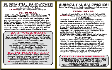
The 37signals office used to be located next to Leona’s, an Italian restaurant. Every time we’d go there, we’d crack up over the length of the menu (PDF). It’s huuuuge: seven pages and over 2,500 words. The beast should come with an executive summary. Here’s just one sample spread:
On the other hand, here’s the menu at The Hummus Place in NYC. Three options and that’s it. Sure, you don’t get a vast array of wraps, sides, and pastas. But you don’t have to spend a century reading the thing either.
Less choice = less suffering
The problem with the Leona’s approach is choice has a cost. It’s one of the reasons why we always talk about less here: Endless options can actually produce genuine suffering. “The Paradox of Choice” (good summary at the New Yorker) talks about how options can actually be “de-motivating.” Offering shoppers samples of six items yields more sales than offering samples of 24, students who are offered six extra credit topics are more likely to write a paper than students who are offered 30, etc. In some cases, just one additional choice can produce outright analysis paralysis. People wind up frozen by indecision.
Interface choices
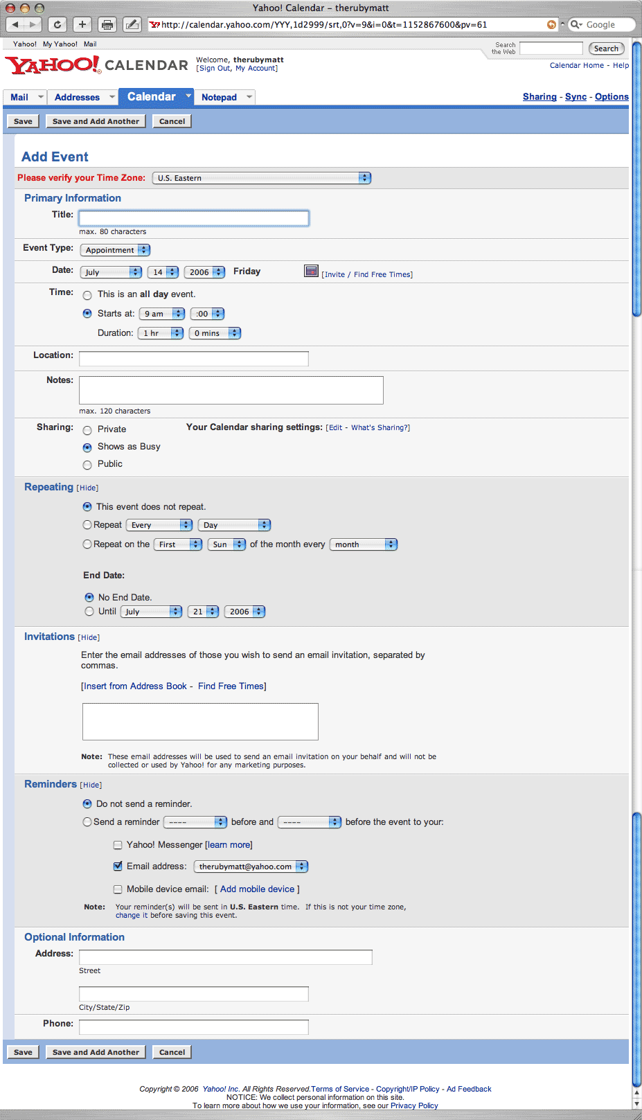
This concept applies to interfaces too. Here’s one way to do an event form:
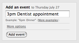
Here’s a “less” way (from the calendar coming soon to Backpack):
Minimizing choice noise
Options seem like a nice idea. But each one adds up. Once you realize the evil impact they can have, you start to look at them differently.
As lessheads, we try to eliminate superfluous choices whenever we can. Some choices are unnecessary because the alternatives aren’t really all that much different. Something good enough will work out fine. For example, at Basecamp, it’s 25 messages per page. No option to change it. That’s good enough so that’s the way it is. Done.
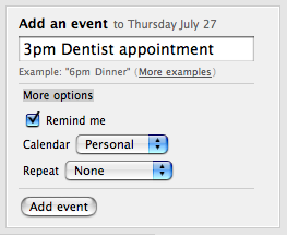
If an option proves it’s worth, we’ll still try to find a way to minimize the choice noise (i.e. anything that makes people think). We offer fewer choices and keep the ones we do offer offscreen unless someone requests them via a click, like in the Backpack calendar shot above. The result is less “huh?” moments and more flow.
UI as benevolent dictator
People want to outsource choice (see the Robert Reich bit here). They want experts to make decisions for them. It feels a bit counterintuitive. In fact, it seems almost undemocratic to go around taking away freedom of choice. But think about it this way: By paring down options, you give people the gift of time and attention they can spend elsewhere.
Related: Video of Barry Schwartz, “The Paradox of Choice” author, speaking at Google
Update 7/14: Changed the more-choice interface shot in this post to one from Yahoo! Calendar.
72 comments so far (Jump to latest)
andrew 13 Jul 06
Leona’s should spend less time on the length of their menu, and more time on the taste of their food. I always left Leona’s feeling slightly ill. Bleh.
Jon Maddox 13 Jul 06
Remember back in the late 90’s when blockbuster only had about 60 movies to choose from on DVD? It was great, you were in and out. All you had to do was look at one rack, rather than walk the perimeter of the building.
The same goes for your dvd collection. When it was around 10-15 movies it was easy to pick one and toss it on for background noise or viewing. Now, with over 200 some movies, its almost impossible to choose what to watch, especially when 2+ people are trying to be pleased. More times than not, I end up not choosing at all. I think this is pretty typical.
Jan 13 Jul 06
And I thought that usability experts like you guys would never ever put a ‘more options’ or ‘advanced’ button in a GUI :)
Brian Baute 13 Jul 06
I don’t think that’s quite a fair comparison with the screen shot of 30Boxes. I’m excited that Backpack is getting a calendar and may switch from 30Boxes, but I’ve been happy with the interface and usability of 30B. You’re comparing apples and oranges by showing their “edit” function vs. your “add” function - your add function is very, very similar to theirs with intelligent text entry, etc., which is the primary way I interface with 30B. I very rarely use the edit function, and when I do I don’t find it to be cumbersome.
CR 13 Jul 06
After seeing DHH’s Keynote and reading posts like this one, it seems like all of you 37signals guys are in absolute agreement about your philosophies on choice. I find it comforting that the same concepts govern the development of Rails and your applications. It would be very easy to be hypocritical regarding this point. Maybe there is more benefit to formalizing your philosophies (i.e. Getting Real: The book) than I initially thought.
clifyt 13 Jul 06
Wow! You’ve explained the oversimplification movement pretty well…
On the first calendar, almost everything except the Date and the Name are option and anyone that is actually planning on using this application for more than a single entry will understand that these are not REQUIRED OPTIONS and just ignore them.
I agree, the MORE OPTIONS button is nice and a great application would give you the best of the first and second calendar screenshots. The 3rd almost seems like a waste of DHTML.
For instance, if someone needs to ditch out of the office for a few days, how does one do this intuatively? Your More Options calendar seems to indicate that one will either have to re-do the calendar entry a second or third or fourth time…I’m sure there is going to be some nifty ajax drag element that will allow more than one time — but how does the person doing this for the first time know this?
The same way the person putting an entry in the first time in the first. They realize the options are optional and unless they are a complete idiot, they will not be paralized by the options.
This is the core of the oversimplification movement. You simplify things and then to overcome these simplifications one needs to learn some rather unintuative UI that would have just been simpler to give a START AND STOP date.
Want some notes on where exactly your calendar appointment is going to occur? Sorry — its either in the title or not at all.
Need to be across town where as most of your meetings are in the conference room? Its a shame that you don’t allow for the reminder to be set an hour earlier while the ones occuring in your office are set at a standard 5 minutes before hand.
I understand the whole frozen by decisions idea…I design online testing as well as other types of psychometric instruments that need all but the most important elements removed. But just because YOU don’t need it doesn’t mean its not important. This is even worse than being frozen by too many decisions — the idea that you are going to have to radically alter your idea of the usage of a tool to get any real work done.
Limits are good, artificial limits just to give them aren’t.
Keane 13 Jul 06
Hmm. I get the interface design message but I’m unconvinced by the menu example.
I actually think the Leona’s menu is great. Yeah, there’s a lot of choice, but it seems quite well written to help you make that choice: big, bold headings, explanations and clarifications (I especially like the unpretentious pasta shape descriptions), and some ballsy persuasive writing.
Often when I go to eat I don’t know what I want until I’ve had a browse through the menu to see if something stands out. And if I know what I want, I just flick through — yep, they’ve got it (big headings help) — and I’m done. Unfortunately, if I don’t want hummus, I’m stuck at The Hummus Place (but then I probably wouldn’t have gone there if I didn’t want hummus, so…) Sometimes less isn’t always best.
Anyway, back on topic of UI, that ‘More options’ link on the calendar item is a bit mystery meat, isn’t it? I have to click on it in order to find out what other options there are… maybe not “Huh?” but perhaps “Eh? Ah.” Not sure what a better text would be. “Reminders, Calendars and Repeats” doesn’t quite cut it!
Kathy Sierra 13 Jul 06
The “Paradox of Choice” was an eye opener for me *personally* as well as professionally… especially the idea of trying to purchase things that are non-refundable/returnable so that once the purchase is made, you can relax!
Bookstores are the worst for me… there is no such thing as a “quick pop into Borders”— I won’t go there unless I have at least a couple of hours free.
The importance of finding a filter/attenuator just keeps growing (the theme of the last ETech’s conference). But now there are too many choices for who should make your choices!
Great post Matt. Fortunately, choosing to read this blog (out of the 40+ million) is a no-brainer.
Kandace 13 Jul 06
While I usually agree with the “Less is More” ideal, this example doesn’t hold up when thinking about real-life needs for events. In the first option, logical choices are shown on one screen. In the second, I would almost always have to click on “more options” and even then don’t have the option for time or repeat events. I’d choose the first interface as much more useful.
ML 13 Jul 06
Brian: “You�re comparing apples and oranges by showing their �edit� function vs. your �add� function”
Our calendar’s edit form looks the same as the add form shown above, just without the “Add an event” text at the top.
clifyt: “They realize the options are optional and unless they are a complete idiot, they will not be paralized by the options.”
Taking away choices doesn’t mean you think people are idiots. It means you’re respecting their time. Even smart people like to not be bothered with things they don’t want to bother with.
RS 13 Jul 06
When it comes to features, nothing is universally important. It depends on who is using the software and what they want out of it. Different things will be important for different people. So yes, if we don’t need it, it’s maybe not important for us or the people who like our software style.
There are others who make software with more options and preferences because those things are important to them, and they have like-minded customers who dig that as well.
Jan 13 Jul 06
I don’t really remember where I read it, but the problem with ‘more options’ is really that it is yet another option. Tests also showed that most new users clicked on the option to see if there is anything important there. So in this case they get 3 more options. (actually 4 if you count ‘hide extra options’).
So you might think that by using ‘extra options’, you reduced the number of options from 3 to 1. In reality a new user will wade through 5 options instead of 3 if you do away with the ‘extra options’.
Even for a more advanced user this is annoying. When seeing the ‘extra options’, he has to try to remember what options are hidden. He has to mentally consider if he needs any of those extra options. That one option requires a lot more brain power from the user than if you just gave him the 3 options directly.
So in conclusion: kill all ‘extra options’ and ‘advanced’ buttons :)
George 13 Jul 06
I’m a Brit and on my first trip I was dazzled by the choices on offer in the States. Most of the time I found this a good thing but at times it became overwhelming. Ordering a coffee for example - I just wanted a coffee and I had to go through the choice of beans, what type of milk, size, topping etc etc. About five minutes later I had a black filter coffee. For me the same problem arises in User Interface Design.
I am happy to have less choice in UI if it matches my needs. The real skill then comes in defining what people want to do and how much choice they want. Returning to the coffee example some people do want to choose so I have no problem with using a ‘More Options’ button to satisfy both parties.
Great post by the way.
Michal Migurski 13 Jul 06
“By paring down options, you give people the gift of time and attention they can spend elsewhere.”
Maybe, but which options to pare down?
If you pare down the wrong options, you’re worse than useless.
Carlos 13 Jul 06
The menu analogy is weak…restaurants don’t necessarily serve fewer items, or lay them out more simply, for brevity’s sake. Most people like to take the time to read a menu and feel like they have a fair amount of variety. Perhaps the big menu is part of Leona’s differentiating factors.
It’s not fair to leave out the context of the 6 items versus 24 items. It sounds like you’re referring to the jelly samples research recently mentioned in “Blink” by Malcolm Gladwell. That scenario is shoppers making an impulse buy, and yes that research concluded that fewer items/choices yielded more sales. It’s findings are also related to people SAYING they want choice, but designers and product developers knowing better.
I do agree with your user interface examples. It goes directly to some thinking I’ve been doing that Web sites should not have a learning curve.
Phil 13 Jul 06
You guys need to take a lesson from Goldilocks. Too much choice is bad, but too LITTLE choice is bad too. Three choices to a menu is too few. 300 is too many. That one calendar had too many choices, but your’s has too few. Your adding so much more complexity, confusion and margin for error by having people freetext their times instead of just having a select box, which every other program uses. MS Project has TOO much, but Backpack has TOO little. I want something “Just right”.
JF 13 Jul 06
If you pare down the wrong options, you�re worse than useless.
Wow, worse than useless. I’m trying to visualize that one.
Jan 13 Jul 06
Kathy Sierra — Bookstores are the worst for me� there is no such thing as a �quick pop into Borders�� I won�t go there unless I have at least a couple of hours free
Well, ok, but would you like to shop at a bookstore that has only 4 books? I wouldn’t. Personally I enjoy the hours I sometimes spend in a bookstore checking out a whole bunch of books. ‘Lots of choices’ isn’t always a bad thing..
e.j. 13 Jul 06
i will try to gloss over the fact that you pilfered 30boxes ‘onebox’ field for entering an event, as i actually appreciate that you made it more core to your system.
i personally can see myself preferring the ‘onebox’ style used throughout. but this reminds me of the ‘knowledge on the screen’ vs ‘knowledge in the head’ stuff from the oldskool don norman way of thinking about UIs. meaning the knowledge of how to use a system should be shown on the screen, and not count on a user knowing the secret language of the system.
u know… that whole section where he talks about 1980s phone systems being controlled by coded sequences of buttons.
isnt this just a command line calendar? will less savvy users be more comfortable with their options spelled out on the screen?
that said, for my own selfish reasons, i would beg 37s and 30B to make sure you can add reminders from your text entry system :)
Josh Hughes 13 Jul 06
ML: Our calendar�s edit form looks the same as the add form shown above, just without the �Add an event� text at the top.
Sounds like that puts a lot of faith into the natural language translation. In my experience, there are always going to be things that don’t translate so well, and it’s nice to have a way of explicitly setting event properties.
Would probably have to have some additional translation as well, if say a person edits an event “Meeting today” two days later.
- Josh
JF 13 Jul 06
i will try to gloss over the fact that you pilfered 30boxes �onebox� field for entering an event
pilfered? We had this single box with “free-form entry” for Backpack reminders since early 2005 when Backpack launched. That was way before 30boxes was even around.
Erik 13 Jul 06
I’m curious about the “more options” version of the Backpack calendar form: are you planning to add a function that allows the user to choose when (or how far in advance) to be reminded of an event?
Rahul 13 Jul 06
Great job explaining the ideology, Nathan. If only more people had the ability (desire?) to understand it.
e.j. 13 Jul 06
pilfered? We had this single box with �free-form entry� for Backpack reminders since early 2005 when Backpack launched. That was way before 30boxes was even around.
hmm. if that is the case i stand corrected. however, i have a backpack account and it looks to me like you enter the reminder text in the field, and then select the time from the pulldown beneath it.
when i referred to the onebox entry i meant the way you can type in natural language dates, times, etc, in one string, and 30boxes will turn it into an event. if backpack reminders work this way, i confess, i did not know. and currently i see no indication on the site that it works this way. i would l
for readers unfamiliar with 30boxes.com, it is the screenshot that is shown in this post as an example of ‘too many options’. that same product allows you to add events through a single text box and has worked this way since its launch. this makes it all the more interesting that 37s shows it out of context and without attribution.
e.j. 13 Jul 06
e.j, try entering �9pm Do this� in the Backpack reminder field, for example (more on this). You can also use this shorthand in the field.
this is interesting, because after your initial comment, i immediately went to backpackit.com and tried some reminders like text me 2:30, text me 5:30 and it didnt work.
getting away from the pilfer issue, this does speak to the whole issue of knowledge on the head vs knowledge on the screen. i didnt enter the time before the message, i entered it after… so it didnt work. i didnt know the secret language of the system so it didnt work for me. reading this post, i kind of think this issue is more pertinent than the whole issue of simplification.
now i suppose your interpereter could be good enough to solve deal with all permutations, but if it doesnt work the way you want it to, you get into a situation like all those microsoft “smart” bullet list features.
RS 13 Jul 06
ej, we’re aware of the Mystery Meat pitfalls, and we’re pleased with how the Backpack calendar works with and accommodates them.
Ed Moore 13 Jul 06
I am big fans of some of your products and this blog, but I felt I had to post to express how unfair I feel it is to draw a comparison between 30boxes’ “edit” or “advanced entry” form and your own one-box style entry. To intentionally ignore 30boxes’ excellent one-box system and instead take a capture of something with an entirely different purpose is a pretty poor way of making a point, and to be honest I felt it was a bit of an abuse of the trust this blog’s readership puts in your usually-insightful usability meanderings.
reid 13 Jul 06
For me, one of the mysteries in going to a restaurant like Leona’s is that people get caught up in the menu and can’t make a decision. Really? We’re at an Italian-ish place and you have to read the whole menu? You have no idea what you might want?
It’s like they think there’s going to be some magical Uber Menu Item that will make their taste buds do backflips and fill their life with meaning. And if only they spend enough time looking they’ll find it and all of the wrongs in the world will be right.
It’s only food. Learn to make a decision already.
Greg 13 Jul 06
I don’t think that most people realize that they really don’t want more choices. We develop e-learning solutions for companies. The biggest time waister in developing e-learning content is deciding:
* The screen layout
* The navigation
* The graphical “look”
You have to spend hours in meetings before you even begin writng the actual learning content - the part that really matters.
So we just stamdardized pretty much everything - navigation, layout, etc. Our clients are only able to choose a skin color and put their logo in. That is it.
Whenever we meet with a client for the first time they always ask about customizing the interface (I think mainly because that is what they are accustomed to). We just tell them they can’t and that if customization is really important to them we are the wrong company for the project. End of conversation. We haven’t lost a single customer because of this.
The real bonus is that we eliminate hours of meetings and approvals by making these decisions for them. This allows us to drastically decrease the time it takes to create one of these projects. So what happens - we have the reputation in our industry of being incredibly fast and that is what our customers value most.
Those who value customization over speed will go somewhere else but we are finding that there are plenty of customers out there that would rather get things done than have to make a gazillion decisions.
Peter Cooper 13 Jul 06
I think the “long menu” thing is actually a bad example to use here. It’s these menus and their hundreds of suggestions that make the character of many of those places. Jerry’s Deli would not be the same without the many pages of options. People would just order a few basic items without it. The dizzying number of choices is part of the appeal of the place.
e.j. 13 Jul 06
ej, we�re aware of the Mystery Meat pitfalls, and we�re very pleased with how the Backpack calendar works with and accommodates them.
thats great. tho your response leaves me a bit flat. i didnt bring it up to imply you guys were clueless about the issue, i brought it up because i though ‘mystery meat’ is what the conversation should be about. the whole simple vs complex issue is well-worn here, with comments falling into their usual stances.
talking about some of your insights into the mystery meat issue would definitely make for more interesting reading.
Jared White 13 Jul 06
I agree with some of what you’re saying in principle — however, I generally like choice. I much prefer a large menu to a small menu. What if the tiny number of choices on the menu don’t appeal to me? I leave the place and take my hard-earned money with me.
With UIs, there’s an awesome third option — you can actually offer a choice between simple and complex. There’s no reason you couldn’t have both calendar entry methods available (other than extended development time). Each one can be easy to use, of course, but one’s quicker and less thought-intensive than the other.
Phil 13 Jul 06
ej, that is my point exactly… learning the language of the calendar is not real simple, and the development from 37signals point of view is certainly not simple. Just to think of all the various combinations one can enter (3 pm, 3 p.m., 3 p m, 3pm, three pm, etc..) boggle my mind, but even more so are the random things people might do. “lunch with jim later” “meeting an hour after lunch” I’m guessing you can’t handle all of these, and why bother? No one is confused by a simple time text box or drop down list.
Narendra 13 Jul 06
Matt/Jason,
WTF?
We are big fans of 37signals, but why in the world would you choose our “detailed entry” form which we deliberately bury as a juxtaposition for less/more.
I designed the 30 Boxes calendar entirely out of a loathing for the brain overload caused by MS Outlook and the entire interface is there to reduce noise and options. Very few people interact with our detailed entry / edit forms and though they aren’t perfectly minimal they accomodate the bare minimum for they whiny (err vocal) power users.
We’d appreciate it if you got up in Google’s face instead because they have a search field as the most visible UI element on a calendar.
Other points of clarification. For anyone out there curious, our mission is to build a light productivity suite that gracefully creates a social network. Our target market is the college crowd and those without well-formed scheduling habits. We are three people, and have declined any VC funding to date. If and when the costs for 30B become an issue, we will either start a tiered subscription service, or if such a product exists in the future, weave relevant event and location based text advertising into the application.
Narendra
Nathan 13 Jul 06
The Cheesecake Factory has a very long menu as well. I think some people are missing the point, I like to eat at the Cheesecake Factor (or insert place with long menu here), but not all the time. Most of the time, I want a quick meal at somewhere like Chipotle, Panera Bread, etc…There is also a great place in Columbus, OH called Northstar that has like 3 categories with a few options each…it’s great.
I use something with more when I need more. Usually, I need less than more…
You know what I mean.
Nathan Henderson 13 Jul 06
learning the language of the calendar is not real simple, and the development from 37signals point of view is certainly not simple. No one is confused by a simple time text box or drop down list.
An excellent point. If you’ve ever used a Palm-powered organizer, you may have mastered Graffiti pretty quickly. Unfortunately, for many folks, Graffiti had enough of a learning curve to be a barrier to entry. Just look at the current dominance of mini-keyboard handhelds like the Treo.
It’s important to take a step back and think of how regular folks will use your app (if regular folks are, in fact, your ideal customers). A blank slate can be daunting for many users. The technologically elite (including people to reply to 37signals blog entries) might be okay with learning the ‘rules’ of using a one-line entry system. My father would probably prefer something he recognizes: drop down menus, and radio buttons.
For anyone out there curious, our mission is to build a light productivity suite that gracefully creates a social network. Our target market is the college crowd and those without well-formed scheduling habits.
Thanks for clearing that up Narendra. One concern I (and I’m sure many others) have is: how many social networks do I need to build? If I already use Facebook, Tribe, LinkedIn, Meetup, & (god forbid) MySpace, and all of those services already offer event scheduling, do I really need social networking in my dedicated calendar too? I’m not saying that social calendaring is inherently a bad idea, but there is a tipping point of users that must be reached before such a feature is truly useful.
Matt 13 Jul 06
Coupland coined it best in his first book: he called it ‘option paralysis’. I’ve been trying to avoid it ever since.
qwerty 13 Jul 06
A language for events is like the Unix command line: very powerful if you know it, and hell otherwise. That’s why casual users prefer a WYSIWYG interface. Providing examples for the syntax is the key to make it work.
ML 13 Jul 06
Why in the world would you choose our “detailed entry” form which we deliberately bury as a juxtaposition for less/more.
Narendra, that’s a screenshot of your edit event screen. Our edit event screen is just like the one shown above too (just without the “add new event” text up top). I mentioned this in a previous comment but to avoid confusion I just added a note to the orig post too.
I chose these screens in order to make a point about deciding which choices to give, which ones to hide, and which ones to eliminate. Although 30boxes does limit these choices to a buried edit screen, you’ve nonetheless chosen to show options that we’ve chosen to eliminate. I wanted to explain why we chose the route we’ve taken.
Fwiw, I think you provide a reasonable explanation for your decision: “Very few people interact with our detailed entry / edit forms and though they aren’t perfectly minimal they accomodate the bare minimum for they whiny (err vocal) power users.” We’ve just decided to take a different path.
Alan 13 Jul 06
I just want to echo some of the comments made previously about how needing to know “the language of the system” in user interfaces can be a problem.
There are discoverability issues, naturally, but a more important problem is that because not all conceivable ways of specifiying a date/time can be accepted, the software’s interpretation of what you type ends up being somewhat nondeterministic. The user knows it will work for basic cases (e.g. Dentist’s appointment Friday at 3pm), but the user can’t be sure if more complex cases will work as anticipated (e.g. “7:30-8:30 Conference Room - Strategy Meeting” typically does not parse out “Conference Room” as the location for the meeting instead of the even title… but worse than that, the user has forgotten to specify AM/PM, so it’s possible the event will get scheduled at either 7:30am or 7:30pm). Because of the potential for nondeterminism, what happens is the user ends up having to verify appointments added, making sure they were interpreted correctly. At the very least, a UI with a complex internal “language” needs some amount of visual feedback integrated in order to see that what was done was what the user intended.
Mitch Kapor’s original Lotus Agenda had a similar natural language inference system for adding appointments, and I tended not to use it because I found it too nondeterministic.
Booga 13 Jul 06
If it’s a nice restaurant and simpatico people work there I really like to see an excerpt of the menu and then the extended version. This way maybe your stomach and your brain falls in love with this place.
e.j. 13 Jul 06
alan, thanks for the thoughtful post. some things get a bit deeper than more vs less. id love to hear 37s chime in on any learning or insights they have come up with in regards to this issue. just pushing the simplicity thing is sometimes a red herring that can be used to justify anything:
http://www.37signals.com/svn/archives2/should_calendars_online_look_like_calendars_offline.php
narendra, if you are still listening, alans points definitely come into play with 30 boxes. with important things, i do find myself looking to the details to see if my onebox entry went in correctly. and with 30 boxes this can definitely be a pain. it takes a right click (tricky in a web ui, at least on my mac) or a few clicks to get to event details.
i never understood why clicking on the event in my calender opens up the day view and not the event details. also its a shame that opening up the edit view obfuscates the rest of the calendar. these are two situations where the backpack calendar (as far as i can tell from the video) definitely has you beat.
Erik Dungan 13 Jul 06
Great point. Another good example here on the left coast is In-n-Out Burger. Burger, double burger, fries, shakes. That is all - yet wildly successful.
Narendra 13 Jul 06
Just a quick follow up to Matt:
1) We considered putting some of the additional items behind some hidden divs but chose to expose the entire form because those people that actually got to it would be most likely looking for an advanced option and another click would have been irritating.
2) A far more dramatic/amusing comparison is to compare the 37signals form to the existing entry forms of the “heavyweights.” Google’s entry has some 20 form elements and Yahoo a whopping 40! Now that is enough to have anyone say, “Screw this, I’ll write it down.”
flowb33 13 Jul 06
I actually recommend against eating at restaurants with large menus, simply because there’s no way everything listed can be kept fresh. If you’re the customer choosing that oddball dish on page 3 of the menu, that no one has ordered for 3 months, you can be sure its coming from the darkest corner of the walk-in, possibly freezer burnt in its hibernation, and hastily revived to meet the unique demands only an excessively large menu can provide.
With just 3 items on a menu, you can be more sure what you’re getting is fresh, ordered regularly and likely from a preferred supplier.
Somewhere in this recommendation there lies a moral for entry forms, as well.
Jan 13 Jul 06
Most dishes are just different combinations of the same basic ingredients. The best chefs are not the guys that can find the most unique rare ingredients, but the guys that can create an amazing dish with plain basic ingredients.
Nathan Bowers 13 Jul 06
The “too much choice” problem doesn’t really exist. When you’re in the toothpaste aisle is the problem really that there are too many options or that the shelf display is picked over and messy?
Rather than counting the number of choices, focus on providing useful choices and designing them to reduce users’ cognitive overhead.
Glenn 13 Jul 06
I’m a fan of 37signals, but it’s not fair to compare with a small business, that’s work as hard as you do to beat the big enemy. Why don’t you choose microsoft/google interface? 30boxes is GREAT apps, just like you do.
In gettingreal you said ‘pick an enemy’, but this time you pick a wrong enemy.
AndrewH 13 Jul 06
Less choice = less suffering
Amen and amen. Especially for an indecisive screwball like me
JF 13 Jul 06
I�m a fan of 37signals, but it�s not fair to compare with a small business, that�s work as hard as you do to beat the big enemy. Why don�t you choose microsoft/google interface? 30boxes is GREAT apps, just like you do.
A few things…
1. We’re a small business too. We’re a lot closer to 30boxes than we are to Microsoft and Google. About 99.9% closer. The company size doesn’t matter in this case anyway.
2. We’re not trying to beat on or pick on 30boxes — we’re providing a compare/contrast. 30boxes is a nice product, it’s just different than ours. We were highlighting one point of difference. In fact 30boxes wasn’t even mentioned by name in the post.
3. We’ve also updated the post to link to the Yahoo calendar which has over 40 form elements.
FredS 13 Jul 06
30boxes version just needs some prototype action. Why show all those extra fields with “opt” under them? Hide ‘em. Then show them when they’re needed (eg. event repeats link). I’d actually prefer that to the backpack coded text method. You can go simple (a couple essential fields with most hidden) or complicated (everything expanded like the screenshot). Less or more! I win.
rayray 14 Jul 06
you guys really cant draw a line from basecamp reminders to basecamp calendar without passing thru 30boxes. i think anyone paying attention would see that you were inspired by their product, especially in light of your earlier posts mocking grid based calendars online. why the change of heart? response to market demands they they truly helped foster i suppose.
it looks like you took what they did, realized you could push their magic textfield deeper into the app and executed it. basically standing on their shoulders.
which is fine, the cool thing about all this web 2.0 stuff is everyone pushing eachothers ideas. but putting them up as the example of complexity by showing the only complex part of their app was intellectually dishonest. and ‘not mentioning’ them while showing their work is hardly doing them a favor.
pretty lame really.
Eben 14 Jul 06
A the ‘sweet shop’ paradox as we call it in blighty (well I do) sure it’s simple when there are only three bars of chocolate to choose from - sure when its a shop full of sweets it gets tricky and can take hours (just take a four year old in to see this in action).
What no one has mentioned yet is what are we freeing up peoples time for….making more choices about more important stuff - it’s all about balance; sometimes you need choice, sometimes it’s there to stop you being able to make the right decision (cell phone plans, train tickets etc), sometimes you are better off with 3 choices.
The key surely lies in deciding where to allow choice and for whom and in what situation.
Josh Sowin 14 Jul 06
If less is more, than the command line is the ultimate UI. Graphics, smashics. Give me C:\>!
Bryan Costin 14 Jul 06
I’d be fine with either calendar app, I think. But I’m used to using Outlook’s decidedly non-streamlined approach, so I’m probably ruined for life. The one problem I have with the Backpack calendar dialog is that the “less options” version does not indicate the defaults for the hidden options. Which calendar will my entry appear on? Will there be a reminder or not? I guess it’s assumed that I’ve set those things somewhere else and know what they are.
On the whole topic of “choice”. I think it’s important to keep in mind that we’re not actually talking about eliminating choices for anyone. No one would suggest that the Federal Dept of Menu Design should step in and save us from restaurant indecision. And if Food Lion draws the line and doesn’t carry that 101st kind of salad dressing then the Safeway down the block probably will have it.
When it’s something trivial (to me) like salad dressing or lunch I may not care much, but I’d probably resent the same lack of choice when shopping for something more expensive or more long-term, like a new car or an expensive digital camera. It’s all about knowing your customers, and finding the right balance of choice that appeals to them.
iTodd 14 Jul 06
Awesome stuff. I notice this a lot with menu’s as well. I never understood why chinese/thai menus have a line-item for every single variation of starch/veggie/meat/sauce…
Or a burrito place makes a name for every possible combination of ingredients. That’s why I love Chipotle, you got the choices right there and just pick ‘em… no ordering the Double Spicey Jack with no onions and add black beans and guac.
simplicity!
Sam 14 Jul 06
It might be fair to mention that Yahoo! also has a Quick Add Event form. If you don’t need any of the advanced options, you don’t need to use the page with 40 form elements.
Also, I don’t think it’s completely accurate to say that the Yahoo! page has 40 “options.” Options imply a that you have to make a choice between similar or equivalent objects. To use your menu example, I have to decide between the baked italian beef, the vegan burger, the chicken club wrap, the tuna and jack…. You’re trying to choose from a set of options that all serve the same purpose.
The form elements on the Yahoo! page don’t all serve the same purpose. Each one controls a discreet piece of data. It’s not like I’m trying to decide, “should I fill in the Location field or should I fill in the Repeating Event field? I can only choose one! Which is the best?” They’re different. I use one field, or a few fields, or all of them, depending on my need.
The analogy seems a little off.
pwb 14 Jul 06
I second the In-n-Out Burger reference. And the results are startling. If you ever see an In-n-Out right next to a McDonalds, you will invariably see a line out the door at In-n-Out and an empty restaurant at McDonalds.
With restaurants, a large menu should be disconcerting because it would be extremely difficult just to keep all the ingredients fresh, much less just being able to make all the different meals well.
ML 14 Jul 06
FYI: The 30boxes screenshot in the original post has been replaced by a more complex one from Yahoo! Calendar.
ML 14 Jul 06
It might be fair to mention that Yahoo! also has a Quick Add Event form.
That’s true. Then again, click on a time and this is the “add event” screen you see.
Backpack’s calendar will have just one form. Quick is your only option.
Aran 14 Jul 06
In-n-Out Burger has a very stringent standard as far as freshness of materials. They never freeze any of their products. In order to stick to their standards, they had to severly restrict their menu options. I think their general reputation as being high quality has a lot more to do with their popularity, than a simple menu.
My girlfriend doesn’t eat beef or chicken, so we never go to In-n-Out. If we had to choose, we would end up at the McDonalds, because they have a fish-wich. So, their simple menu does backfire on them.
Mathew Patterson 14 Jul 06
My girlfriend doesn�t eat beef or chicken, so we never go to In-n-Out. If we had to choose, we would end up at the McDonalds, because they have a fish-wich. So, their simple menu does backfire on them.
There is no possible way their menu could ever contain items to suit every possible dietary choice, so they are going to have to lose some people anyway. From the ‘lines out the door’ mentioned above it seems to be working.
RJB 15 Jul 06
I think the menu is the only thing that brings people back to Leonas… It at least gets people talking.
As to the forms… Each creates a very different story. The 37signals team knows their audience really well. I think the average yahoo user would be baffled by backpack, and the BP event form above… and that is a good thing!
I know which of my clients to show yahoo’s tools to and which to show 37signals to.