Penguin’s Great Ideas = great design 31 Aug 2006
15 comments Latest by anseljh
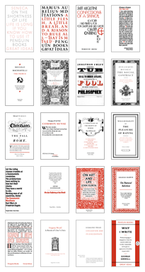
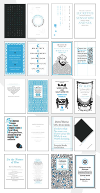
The covers to Penguin’s Great Ideas books (red series 1 & blue series 2) are sweet: minimal color (black and one spot color), classic styling, pretty illustrations, and debossed printing.
 �
� 
With publishing companies shaking in their boots over digital publishing, this is a great example of how a company can differentiate by using a product’s “realness.” These are classic books that look classic. The kind you want to keep on your shelf for years to come. A PDF can’t compete with that.
New ways to judge books by their covers discusses the Penguin books and why more publishers may start looking to design as a differentiator.
It began in 2004 with Great Ideas, a collection of political and philosophical polemics. The project had a small budget and its design was entrusted to a recent graduate, David Pearson. His brief was to produce a coherent series of paperbacks selling for 3.99 each. Dressing each cover with a typographic style typical of the time and spirit of the text, Pearson limited printing to two colors - black and burgundy - on uncoated paper, leaving him with enough money for a few decorative details. Great Ideas won numerous design awards, and Penguin sold two million books. “Some were bought by people who wanted accessible versions of the text, and some by people who liked the packaging,” says Stoddart.
You can also read more about the Great Ideas design at Eye Magazine’s “Type-only Penguins sell a million” shock.
Some other interesting Penguin book covers, past and present:
Penguin Graphic Classics
70 Years of Penguin Design
Penguin books at Design Museum
15 comments so far (Jump to latest)
Peter Cooper 31 Aug 06
I wonder if we’ll see a similarly successful attempt at mid 1990s Web design appearing anytime soon :)
KTO 31 Aug 06
Might I also suggest Bleak House Books and the stellar design of one Peter Streicher as a reference point?
http://www.bleakhousebooks.com/books.htm
KTO 31 Aug 06
Might I also suggest Bleak House Books and the stellar design of one Peter Streicher as a reference point?
http://www.bleakhousebooks.com/books.htm
dreed 31 Aug 06
A great book as well:
Penguin by Design: A Cover Story 1935-2005
John 31 Aug 06
A little word wrap error gives us Sigmund Freud: A Room of One’s Own and other tantalizing possibilities here: http://www.penguin.co.uk/static/cs/uk/0/articles/greatideas/
ramanan 31 Aug 06
I love these book covers, but the paper in themselves is horrible. They’re mass-market paperbacks with lovely covers; such a shame.
Chris 31 Aug 06
I’ve bought a few of these books, they were 3 for $20 CDN. The artwork on the front is nice, but the best thing about them is that they are true pocketbooks - I can actually fit one in my back pocket, coat pocket, backpack - and carry it around. So far, Orwell’s ‘Why I Write’ is the best of the bunch that I’ve read, with ‘Fear and Trembling’ being the most incomprehensible.
Thinking of the books I’ve read, most could follow this small, pocket format. The trend in recent books to be over large, with the wierd ‘ragged’ edge paper, makes them, IMHO, harder to use, and definitely harder to carry around.
Craig 31 Aug 06
These Penguin books are beautiful. What I really love is that this is sort of brazenly coming out of one of the big houses. Showing that not maybe, but yes, there is a market for good looking, simple things. And the fact that they’re dirt cheap doesn’t hurt!
Arnie McKinnis 01 Sep 06
Business is basic Darwinism - which in its purest form is not about survival-of-the-fittest, but about adaptibility.
anseljh 12 Sep 06
I love the cover designs too, but there are some other factors at work here:
1. These are books that are worth owning and reading
2. They’re hella cheap