Last week we pushed an update to the Basecamp help section. The goal was two fold: 1) Make it easier and faster for people to find answers to questions they had and 2) Make it easier on us by reducing the need for people to contact us directly for help.
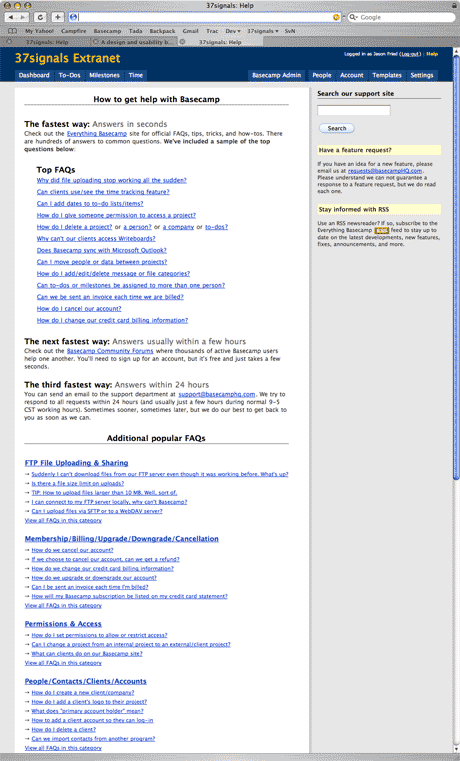
The old help section looked like this. A list of common general FAQs at the top, a few other help links below those, and then a long list of common FAQs for each section below.
Based on the type of support requests we were getting it became obvious people weren’t looking below that initial list. We had to do something better.
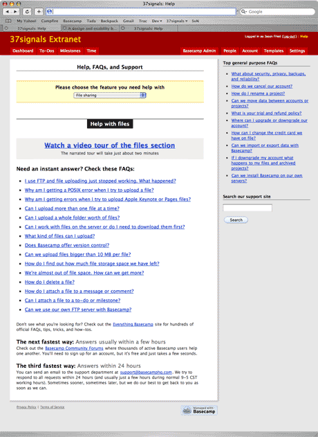
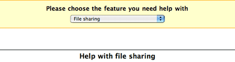
The new help section looks like this. A pulldown lets you jump to a section and the FAQs for that section load up right below. If you want to see help for file sharing, just select “File sharing” from the pulldown. We also added quick tutorial videos for key sections and increased the font size for the FAQs themselves.
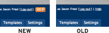
We also replaced the “Help” link in the upper right corner with a graphical button. Customers were telling us they didn’t even know a help section existed in Basecamp. The link was too small and obscure. When people need help they are already frustrated — making the help section hard to find just piles on the frustration. The button solved that problem.
But what I wanted to focus on for this particular post was a smaller part of the new help section. A little detail. A design decision.
When you select a section from the pulldown, the name of the section appears below with the relevant FAQs. The change is instant. Watch this movie to see how it works.
Speed is good, but speed can also be deceiving. Sometimes things can happen too fast. Sometimes it doesn’t look like anything changed. That was the original impetus for the yellow-fade technique introduced in Basecamp.
But the yellow fade just didn’t seem to make as much sense in this case. We wanted to be a bit more subtle. Flashing a huge 500 sq/px section yellow was too much.
When I was originally designing this the section headers looked like this:
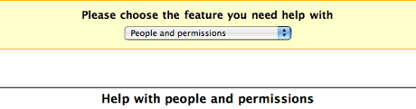
The problem was that when we started using it we realized that the headline change wasn’t enough of a visual cue to let you know something changed. Just changing some black text on a white background didn’t cut it.
So I tried this instead:
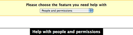
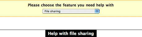
Now we’re talking. Now when you make the switch the shape of the header also changes (watch the movie again). The black bar changes length. That’s a lot more obvious than just black text on a white background.
This plays off Tufte’s “smallest effective difference” theory which basically says you should make all visual distinctions as subtle as possible, but still clear and effective.
Changing black text was too subtle and not clear enough. But changing the background to black allowed the section change to be clear and effective yet subtle enough not to startle you like a huge yellow fade might have done.
We really enjoy these details. We hope you do too.
Richard D. Bartlett
on 29 Nov 06These Design Decision posts are excellent; filed immediately in my long-term memory under ‘Useful’.
Cheers.
JF
on 29 Nov 06Thanks Richard. We enjoy writing them.
Josh
on 29 Nov 06I’m going to have to agree with Richard—these are my favorite posts on SVN. Even the times I don’t agree with the actual design decision, I always learn something. I’m not a designer, but these posts are certainly helping me figure out how to better articulate design ideas to my business partner, who is one, and to better understand the UI design process.
Thanks!
Steve T
on 29 Nov 06Great justifications, but I think a less than satisfactory result. The flawless XHTML/CSS design of the Basecamp workspace gets an odd orange button tacked on, almost like a curious RSS icon. The FAQ selection list and labels, stacked with 5 layers of labels vertically is some of the least efficient use of screen space and (un)clear language on the site. Basecamp is a test case for collaborative software. But this isn’t a test case for customer support self service. Until the FAQ system is changed from a blog style format to an integrated help area, it will always seem a bit of a jumble by non-technical users.
Thijs van der Vossen
on 29 Nov 06Ok, the help section is easier to find now, but couldn’t you guys have come up with something a little less ugly? ;-)
Seriously, the button doesn’t work well on a light background because of the dark horizontal lines at the top and bottom.
Tony
on 29 Nov 06What do you guys use as your help system? Something custom built?
JF
on 29 Nov 06Steve: We’re planning on building a full blown help system with integrated tickets next year. For now we just wanted to improve what we had and the results so far have justified the changes. As far as the space/design goes, we have some changes queued up for the next time we push an update.
Thijs: We’ll be tweaking the button slightly soon.
Tony: Moveable Type. Each help entry is just a blog post.
Jim
on 29 Nov 06Great App.
I felt lilke a fool, however, when I began pointing my clients to the “Help” section if they had any questions. I found out a few days later that they didn’t even have the link.
The red color used on all private items is incredibly intuitive. Why not do this for Help?
Hal!
on 29 Nov 06Great post! :) Thanks for the insight.
Mike Sax
on 29 Nov 06Jason, the orange makes me associate the icon with RSS… did you consider choosing a different color?
Also, the help is not a popup window… that may have some advantages, but it also makes me reluctant to click help because I might get lost or loose the changes I made in a form.
Dave
on 29 Nov 06How about matching the Help button background color with the theme text color for the Basecamp site name? It would sort of balance the top of the page.
d
on 30 Nov 06Great arcticle and a great blog!
Best Regards, http://www.kandisskvaller.com
Jason Moore
on 30 Nov 06Great utilization of your blog.
I, too, initially felt that the orange help button was related to an RSS feed.
Nathan
on 30 Nov 06Wanted to say I agree with what others said. Taking the time to explain what changes to the design you make and why is invaluable. In fact, as a student in love with business and technology, I have been finding design stuff much more interesting largely due to some of the posts here that show just what kind of depth goes into it. I hope to learn more on the topic :)
Thanks for taking the time to write these posts!
I also agree about the red color being more intuitive
Mike
on 30 Nov 06You guys have my utmost respect for all the effort into the tiniest details. Casual users wouldn’t even notice the amount of experimentation, learning and time that goes into building the small stuff – but when all these small things are added up, they make all the difference between a great app and a good one.
Jacob
on 30 Nov 06I’m with Richard and Josh: the Design Decisions are my favorite posts here on SVN—more please!
When I saw the new little “help” button on my Basecamp dashboard, I checked on the support pages and liked what I saw. Although I never visited the help pages before (didn’t need to—how’s that for an endorsement!), I liked what I saw. I just love the trick of using a changed-shape as a visual cue. Nice work.
Rob Smith
on 30 Nov 06Superb post – I really like the fact that you think about these things down to the smallest detail – great stuff.
Rimantas
on 30 Nov 06Interesting, that you’ve decided to use pulldown for this. Have you considered other ways, and what was the deciding factor? Pulldowns don’t get much love from some usability experts…
aaa
on 30 Nov 06hi this is gud
rafael apocalypse
on 30 Nov 06Hi Jason, as many others here, I’m a rss SVN reader, and just came to comment this post, because the new help button looks much more like a RSS button than a help Button!
I would try to use red only, or an red with a icon, blue with icon… the ’?’ it’s the commom icon for help.
Try to put the ’?’ before word help, and even with a orange background your button will sound much more like a really help button!
by the way, SVN rocks!
Moises Ribeiro
on 30 Nov 06Hi, great post.
These alterations had been made on the basis of tests of usability with users?
Nathan
on 30 Nov 06I am curious, with something a change this small (though still impactive) how do you go about testing or evaluating its effectivity? Are you just going to see if there has been a drop in the number of support emails over the next few months, or are you going to simply ask users, or…?
Thanks :)
JF
on 30 Nov 06Moises and Nathan: We don’t usability test. We design things based on our experience and intuition. Then we launch them. If there are problems we definitely hear about them and we consider further changes.
As far as knowing if the changes work, it’s a combination of feedback we receive (when we make any change we hear lots of feedback) and the number/complexity of support emails we receive before and after the change.
Jean-Francois
on 30 Nov 06I really enjoy these posts. However, I would like to know how you evaluate the effectiveness of these redesigns. There are always things that make sense when you design them, but when they get in front of actual customers, well they don’t quite work as well as you would have thought.
Maybe you could post a follow up in 2 months and tell us if it helped cut down support requests?
Thanks.
Jean-Francois
on 30 Nov 06Ok. I see my question answered just after posting it. ;)
Nate
on 30 Nov 06Love the “Design Decisions” posts.
Why did you decide to say “Help with Chat” (or any other topic) instead of “Chat Help”?
I would think to use “Chat Help” since it has less words and when I select “Chat” from the drop-down, I am looking for a visual cue that something related to “Chat” is displayed. If the title is “Help with Chat”, I have to scan through the “Help with” before I realize, “Yes, this is content related to Chat”.
But maybe my intuition is off. Will you give us some insight into this design decision?
Jake
on 30 Nov 06When clients start to ask me to make things bigger or turn text links into buttons it is almost always because the element is placed in the wrong context.
Maybe your help link just needs to be placed in a new context and we can stop nit picking button colors on this thread.
Massimo Sgrelli
on 30 Nov 06I think taking care of details like this is fundamental to increase users loyalty and make them happy to use your application everyday. In my opinion, many small decisions like yours can make the difference in a market in which a new product release means many new – and often unused – features.
Waiting for the next post about “design decision”. Detail matters.
Joshua Porter
on 30 Nov 06Launch is the new test. The benefits are clear: real users who give a damn. One of the problems with “traditional” usability testing is that you have to work really hard (i.e. it’s very expensive) to simulate the “give a damn” part.
So while this might not be a usability test in the “set it up to make sure it works ahead of time” sense, it certainly parallels usability testing in the way you’re evaluating your design, based on real observation and feedback.
I think the usability industry as a whole might be slow to move to live evaluation, but they will. Eventually.
JF
on 30 Nov 06Joshua, the “give a damn” is the key. You are spot on there. We’re not fans of simulation—we’re fans of real. And the only way to get real feedback is to launch.
We spend a lot of time before launch getting it as right as we think we can get it. So this isn’t about tossing out crap work to get feedback. It’s about tossing out what we think is great work to get feedback. Our high standards mean we’re always going to be our toughest customers.
Trusting yourself and your intuition is an important part of the launch-test idea.
Nathan
on 01 Dec 06I guess I should rephrase my question.
When I said evaluating or testing its effectivity, I wasn’t speaking to simulated usability testing so much as, I suppose, ensuring you get feedback. Perhaps creating that type of environment. I agree that launching is the best way to get real life feedback, as various aspects of ones product may not actually be used in the flow the creators anticipated (among other things).
I guess a better question would be how did (or do) you ensure you got lots of appropriate feedback? You say when you make any change you get lots. Is that due to this blog, to announcements being made of the changes, etc?
JF
on 01 Dec 06I guess a better question would be how did (or do) you ensure you got lots of appropriate feedback?
Because we have thousands and thousands of critical people using our products. There’s never a lack of feedback. ;)
pwb
on 01 Dec 06We’re planning on building a full blown help system with integrated tickets next year.
Is that going to be a product offering or only for 37s customer support?
JF
on 01 Dec 06Is that going to be a product offering or only for 37s customer support?
It depends. We’ll have to wait and see.
PetrEX
on 04 Dec 06Thanks for sharing. I like the approach because it is different. But couldn’t you have just used a <a href=”http://www.petrexonline.com/workshops/2-technical/1-trouble-free-drilling” >verticaly tabbed menu? It would allow for scanning the topics with the added “you-are-here” visual bonus.
chrisb
on 05 Dec 06I was really surprised to find that I really don’t like the design of this particular section:
- really? dropdown navigation? I am rather surprised. But I would take your word for it being authentic web 2.0 :)
- I have a real hard time with the hierarchy of the page, as there is the cream-colored banner, the white on black header, and the very prominent video link. They all compete, and I focus on none of them.
- I love videos for apps I have never used, but never use them for things I have already learned the basics of. This makes the prominence of the video link seem excessive.
- most importantly to me, all of the links take me to a page with a completely different layout, and I lose my orientation. It seems to me that these help pages (which are really just pages of links) should be built into the help documentation (the blog), not the app.
Personally, I would rather see that orange button just take my clients to everything.basecamphq.com if they have a question.
respectfully – cb
JF
on 05 Dec 06The pulldown menu is there for quickswitching. You don’t need to use it. If you are in the Files section when you click the HELP button then you are automatically shown help for the file section. If you are in to-dos then you see help for to-dos, etc.
This discussion is closed.