
The Opposite of Fitts’ Law [via Berserk’s comment at the spiky button post] asks:
“What should we do with UI elements we don’t want users to click on? Like, say, the ‘delete all my work’ button?”
The possible answers given: Make the button hard to click, offer an undo, and/or show a confirmation alert dialog before proceeding.
The piece also highlights Alan Cooper’s interesting “ejector seat lever” analogy:
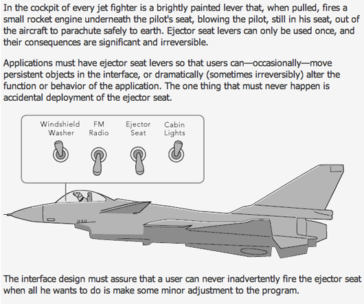
Certainly gets the point across.
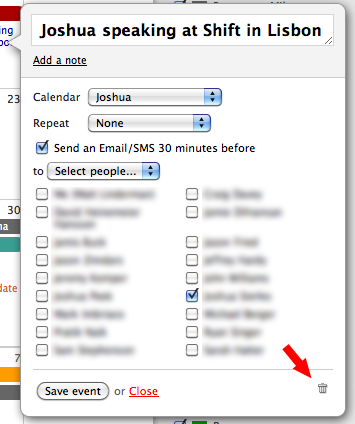
Here’s an example of separating a dangerous element from a harmless one in Backpack: The recently added add/edit an event box that pops up in your features a trash can icon that deletes a post. It’s located far away from the Save/Close actions.
In Basecamp, the Delete/Edit message links are close to each other. But if you do click on Delete accidentally, you have to confirm it:
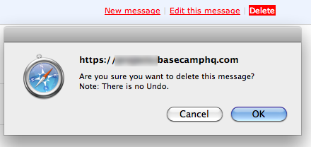
We go the dialog route when the action does irreversible damage to something you might care about a lot. Loss of a calendar event is unfortunate but easily reparable. But loss of a message with comments can cause significant pain.
(Btw, one thing about the examples used in the Fitts’ Law post: There’s actually a setting in Gmail that lets you undo email sends up to 5 seconds after a message is sent.)
Nithin Bekal
on 07 Apr 10Despite the confirm dialog, I prefer seeing some separation between the delete button and the others, either by keeping it further off or by using a different color, like in campfire delete transcript button. where it is away from other links/content AND is in a less prominent gray color.
Anonymous Coward
on 07 Apr 10@37signals
I starred at the Backpack example for nearly 2 minutes to find what you were referring too (trash can).
I actually NEVER noticed this icon until now. It looks like a design element. When both the “Save event” and “close” event are text … seems to make a lot more sense to simply have this be a “Delete” link instead of using an icon.
Again, I never noticed the trashcan-delete icon until now … which is not a good thing.
Anonymous Coward
on 07 Apr 10Whaoo … 37signals now has 18 employees per the screenshot
Deltaplan
on 07 Apr 10The analogy with the ejector seat command is a bit biased…
Because for the ejector seat command, when you need it, you must be able to be trigger it as fast as possible.
Therefore, there are some strategies (asking for confirmation) that don’t always apply to every “irreversible” actions, because there are situations where there can’t be any compromise on the speed of action.
A proper analogy could be the safety lock on guns. If you are in a situation when you may need to shoot, you release the safety. Then, after that, the trigger is activated, because it’s something for which you can’t ask for confirmation, or provide an “undo”.
I wish sometimes software (and especially slow software like web sites) use less confirmation dialogs, and opt for “safety locks” for commands that are intrinsically irreversible AND for which the speed matters above all. Bidding on an auction on ebay for example.
Doug
on 07 Apr 10One common UI pattern we use is that when a user wants to delete something, we show them a dialog box which then requires them to type in the word “DELETE” before we enable a secondary confirm button that allows them to finish the action. It basically makes it impossible to delete something by accident.
To tie into the fighter pilot analogy, whenever a pilot gives the order to eject (at least in the movies, anyway), they have to give the order three times…”EJECT! EJECT! EJECT!”, and then hit the button, so there’s no mistaking. It’s sort of the same principle.
ML
on 07 Apr 10I starred at the Backpack example for nearly 2 minutes to find what you were referring too (trash can).
Added an arrow to the image to make it easy to spot.
Anonymous Coward
on 07 Apr 10@Deltaplan
I’m not sure I understand your analogy. You are still saying there should be two steps required to perform a single action.
Gun comparisons don’t really apply. A gun is designed to perform a single action. A standard practice in gun safety is that you keep your finger off the trigger until you are ready to fire. Glocks (a brand of handgun) are praised for their simplicity, part of which means they have no external safeties.
Matt Henderson
on 07 Apr 10Following is a perfect real-world example of the ejector seat analogy.
I use OpenSRS for management of the domains we register on behalf of our customers. You have to occasionally make a credit card transaction to fund your company account, from which individual domain purchases and renewals are later debited.
Their “Make Credit Card Payment” screen begins with an “amount” field, followed by a “Select stored credit card…” drop-down menu. Off to the right of that menu, is a button labeled “Delete”. Below that, is a set of fields for entering a new credit card.
Once you choose an existing credit card from the drop-down menu, the “Delete” button immediately activates, and the new credit card fields below become locked and grayed-out.
On instinct, I’ve twice clicked the activated “Delete” button. I guess my brain thinks, “I’ve chosen a credit card. The new credit card fields have logically dimmed. And a formerly dimmed button has activated. That must mean ‘Use this credit card, and proceed.’”
What’s worse, there is no confirmation screen after clicking “Delete”; your stored credit card details are gone.
Here’s a screenshot of what this looks like:
http://www.makalumedia.com/skitch/OpenSRS-20100407-103749.png
I twittered about this this morning, and OpenSRS replied that they’re going to try to fix it.
Brittany
on 07 Apr 10I agree completely, I cannot tell you how many times I wish I could take back a click! Also, the trash can image would be better as an actual “delete link”.
Also, unrelated, but interesting, I just stumbled upon a website that said Jason Fried, Co-founder & President of 37signals, will be on the radio program ‘Ron Morris’ The American Entrepreneur’ on Saturday, April 10th at 11AM EST. Given the nature of the radio program, I am sure he will be telling his entrepreneurial story, which will be a treat.
You can LISTEN LIVE at www.TAEradio.com, and I think you can download the podcast after the show airs.
Googler
on 07 Apr 10Why not use the approach GMail uses? When you delete a message, there is no confirmation dialog. Instead, a status message appears at the top: “This message has been deleted”—with an “Undo” button.
This goes along with the UI mantra that actions should be reversible.
kasakka
on 07 Apr 10The trashcan in the second pic is certainly safe – it’s so tiny it’s hard to see on my screen. Seems like it would make more sense as a Delete link.
I’ve tried using the drag-n-drop trashcan metaphor familiar from desktop operating systems in a webapp, but I’m still not quite sure if people are ready to drag their unwanted stuff into a trashcan in their browser. Still, at least it makes it safe (how often do you drag-n-drop something by accident?), provides an undo and a confirmation to remove things. Plus it works for multiple items at once.
James
on 07 Apr 10The button choices for your confirmation should be “Yes” or “No” since you’re asking a Yes/No question.
“Cancel” or “OK” doesn’t make sense.
Weixi Yen
on 07 Apr 10Undo > all.
Anson
on 07 Apr 10Your solution is to essentially hide the delete action - you have to really look for it - and then present an awful browser confirmation dialog.
Those confirmation dialogs are particularly evil with their hard-coded OK/Cancel options, which often add even more confusion. Imagine I want to cancel my Netflix account so I click a cancel account link and then see those two options…
There is plenty of evidence to suggest that confirmation dialogs don’t even work—people automatically just click OK or hit return.
Instead, many UX designers have been arguing for having an undo option on an action like deleting or moving.
Let’s face it, we’re not talking about an ejector seat here. There’s no reason we should be so bound by real-world metaphors in software. Undo is more work to implement, but quickly becoming industry best practice.
Brian Pan
on 08 Apr 10Gmail undo is a good feature precisely because it’s too easy to send accidentally. Of course, one of the main actions is to send, so it should be easy to get to. But I agree with Atwood that the buttons could be better placed- then one of the reasons you need to undo could be eliminated.
Ed
on 08 Apr 10I agree about gmails approach.
USAF Pilot
on 08 Apr 10Geez, now they have dogs trained to do my job. I think i should look at becoming a web designer… the way this conversation is going it seems like web design would be more challenging than what I do.
Deltaplan
on 08 Apr 10@Anonymous Coward : no, there is not two steps in what I’m saying, not in the very moment where the sudden “urgent” action has to occur.
If I reuse the ebay auction bidding example, the safety would be that it’s impossible to bid on an auction unless you’ve put the auction in “bidding mode”. But you don’t have to put it in such a mode just before you’re about to bid, you can do so a few instants before, when you know that the auction is about to end in a few seconds for example, and you need to be able to bid but you don’t know when, or how much until the very moment you’ll bid.
Therefore, the two steps are completely different to the two steps that are commonly used : make the action first, then confirm the action. In what I’m talking about, you deactivate the safety when you still have enough time to do so, then you’re able to trigger your action without the need of a confirmation, which is much better in a situation when the time it takes to confirm your action can be enough to make it fail. Hence the gun analogy : you don’t want to need to confirm after pressing the trigger, you don’t have time for that when you’re firing (not to mention the fact that after you deactivate the safety, you’re able to press the trigger several times)
In a way, you can think of the “1-click” activation on Amazon or iTunes, except that in such cases it is precisely of no use : on those sites, you’re not in a situation where you may fail at buying what you’re about to buy because the few seconds to load the confirmation page would be too long.
Michael S
on 08 Apr 10I agree with the Gmail approach. A prominent confirmation stating what was done/deleted, and an easy way to undo it. It doesn’t have to persist after that page view, but I think it’s important to have it at that moment. Combined with a delete link that’s hard to click accidentally in the first place and that’s a winner :)
Slightly off topic: Amazon 1-click is dangerous with children in the house. I was once surprised to be the brief owner of a $1300 defibrillator some days after apparently my young son had access to the computer.
Jeff
on 08 Apr 10I too prefer the undo method. In the past year I’ve been integrating trashcan spaces in all my apps. These are basically pages that list all items that have been tagged for deletion. Next to each item are UNDO and DELETE buttons. A trashcan icon is always prominently displayed in the header or footer of the app with the current number of items in the trashcan – all linked to the trashcan page. I don’t use any confirm dialogs and so far, clients like the efficiency and the knowledge that they can’t permanently screw anything up just by clicking buttons. Oh, and trashcan access can be restricted to admins only if another level of scrutiny is required before permanently removing something.
@Michael S: I love the defibrillator story. Thanks for the chuckle!
Anonymous Coward
on 08 Apr 10looking at the Leader Board at http://www.masters.com, you can click on each player name to put any player to your favorite list which make it easier for you to follow their score. But if you click that player name again in the favorite list, it will remove him from the list. Well yes there is a tooltip text saying “Make Favorite” or “Remove Favorite”, but I really get use to click the name to get more info, in this case collapsing the hole-to-hole score. I think for remove they should provide something else than clicking the name.
wahyu
on 08 Apr 10I’m not coward. The one above me is … me. I thought it will say… “hey you need to put your name or you are coward.” before anyone leave it blank.
Chad
on 09 Apr 101) Make it separate from often used buttons 2) Make it clearly visible (lots of white space around it) 3) Make confirmation a two step process
I don’t necessarily agree with the “undo” feature. That can lead to “sloppy” sort of behavior. (However, I must admit ctrl+z is one of my most used shortcuts…)
Emmanuel Turpin
on 12 Apr 10Also the “Cancel” button should be the default button. Preveting the user’s reflex of pressing the enter key when a dialog shows of deleting all of his messages. Greate post !
Alexandre Roche
on 12 Apr 10Wait a second…. Dogs can’t fly planes!
This discussion is closed.