Today we announced the new Basecamp mobile, a special version of Basecamp fine-tuned for speed, easy reading and easy tapping on mobile phones and tablets. It works automatically in your mobile device’s web browser – no app needed.
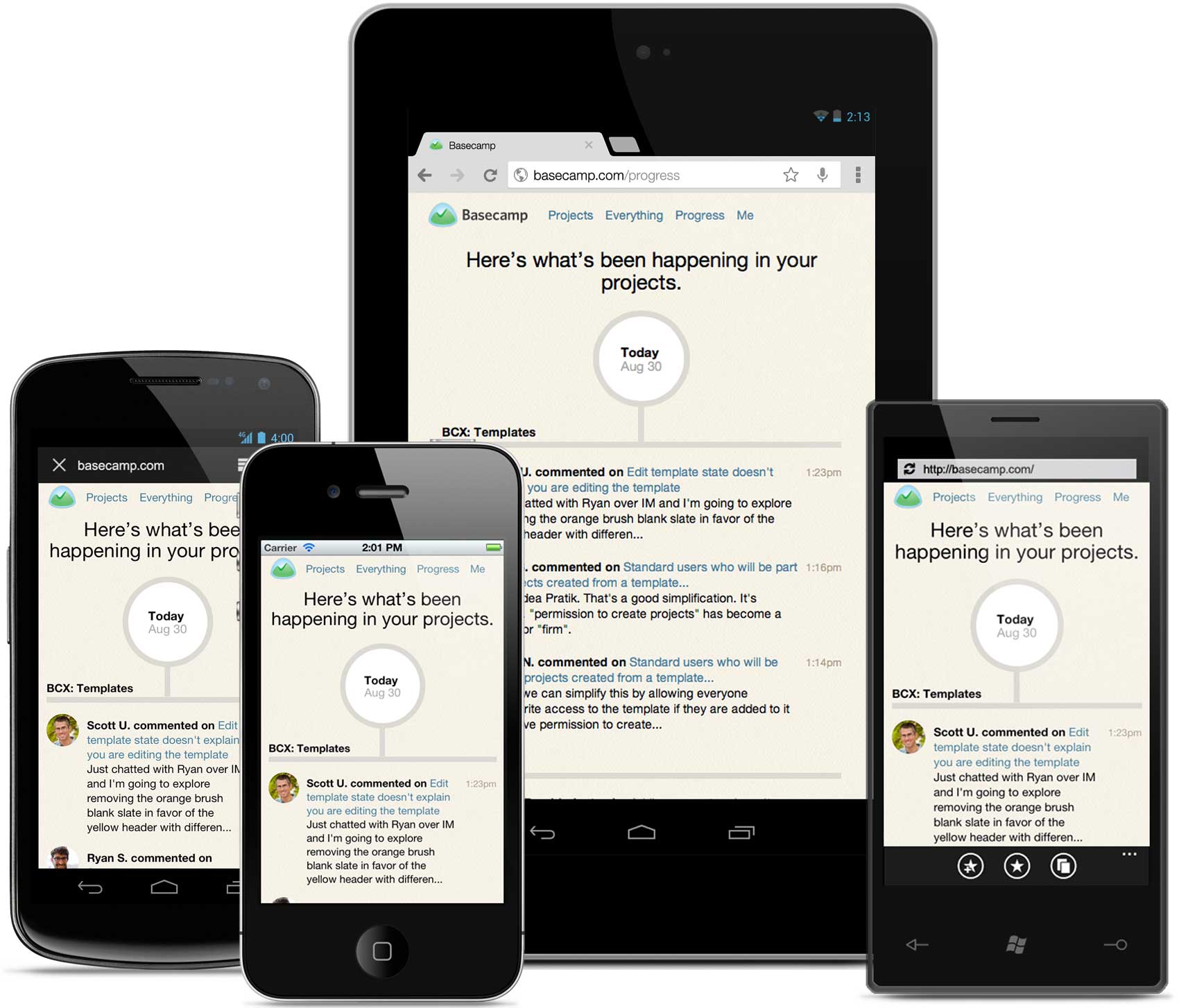
This has been a top request in the new Basecamp since launch and we’re really thrilled to finally deliver. It’s live for every Basecamp account today.
How it all came together
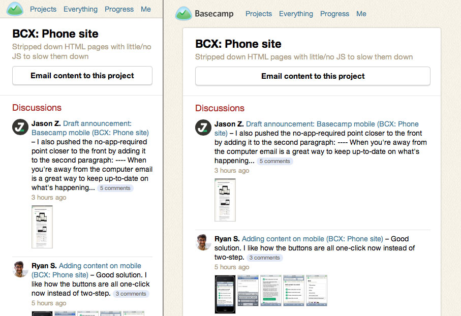
The project started from a simple need. Up until now the mobile experience on Basecamp has really meant one thing: email. Email notifications from Basecamp work great on the phone – you can even reply to them and your comment will show up in your project. But clicking a link to Basecamp on your phone was miserable. Tiny, slow and really tough to read. So we thought, What if you clicked to read a discussion on mobile and we served a nicely formatted mobile-optimized view? No navigation, no interaction, just a clean, readable page. So we set off to prove the concept. The result was an instant hit (read the discussion in our Basecamp project). The new mobile pages were even nicer to read than the email itself and, because they were plain HTML and CSS, they were wicked-fast.
So we kept proving and kept asking questions. If you’re reading the comments about a to-do you might want to see the entire to-do list, let’s see what that looks like. What if you want to see the all the Text Documents in a project – or even the project, itself? Can we try that? So we started to connect the dots, linking pages and optimizing views every time we missed something else. Pretty soon we had a fairly complete mobile version of Basecamp. It doesn’t do everything but it does a lot of what you want to do most on-the-go, without a bunch of stuff you don’t need.
Designed for the job to be done
We didn’t set out to build a feature-for-feature version of Basecamp that magically fits on a mobile phone screen. We built it for the job to be done on mobile. What you hire Basecamp to do when you’re using your computer at your desk isn’t is the same when you’re on your phone at the airport. In the evenings, I use Basecamp on my phone to see what I’ve missed. Checking the Progress timeline, adding my comments, searching for and viewing attachments – Basecamp for mobile is ideal for these tasks. By having the focus of a clear job to be done it was easy to make decisions about what to include in this mobile experience and what could be left out.
Be responsible with responsive
Instead of slimming down the full version, or using responsive design techniques, we started over. The mobile version has its own Rails templates, CSS, and JS assets. So we didn’t leave things out of the full version, we started at zero and only added what made sense in the mobile context. Even where we could have re-used a desktop template for mobile we chose not to. That keeps the mobile experience separate in code and ensures that there is absolutely no extra mark-up, styles, or code that isn’t being rendered on the screen.
That doesn’t mean we didn’t take advantage of CSS @media queries to adapt our design where it makes sense. Our designs were made for phones, but for larger devices with more pixels we can give things more room to breathe:
Less javascript, no frameworks
Basecamp is all about speed. But what constitutes speed is different depending on the context. On the desktop it’s about real-time and interacting without page loads. On mobile it’s about fast page loads on slow data connections. The powerful javascript and leading tech that makes Basecamp so snappy on the desktop is crippling on mobile. Mobile browsers just can’t keep up when in comes to rendering javascript.
By sticking with plain HTML, CSS, and almost no javascript the mobile views are insanely fast. And it turns out the trade-off is worth it. On the desktop you might leave your browser open all day long as new stuff appears instantly in your projects. But on mobile you’re more likely to take a quick dip into Basecamp here and there. You take a 2 minute peek at the Progress timeline while in line at the bank. Or perhaps catch-up on a discussion thread while riding the train. Real-time doesn’t matter. Getting in fast and getting the info you need is far more important on mobile.
HTML5? But uh… Zuckerberg! Native! What are you thinking?
There has been a ton of reaction this week to Mark Zuckerberg’s statement that, “the biggest mistake that we made, as a company, is betting too much on HTML5 as opposed to native.”, but the more interesting part of that quote was left out in most of the tech press:
And it’s not that HTML5 is bad. I’m actually, on long-term, really excited about it. One of the things that’s interesting is we actually have more people on a daily basis using mobile Web Facebook than we have using our iOS or Android apps combined. So mobile Web is a big thing for us.
—Mark Zuckerberg, Disrupt SF, September 2012.
Today we’re announcing mobile web because it’s the right thing to do. Devices and platforms will come and go, but the web browser is here to stay. Does this mean there will never be native apps? Of course not, this isn’t our final word on mobile.
See the entire project
If you’re interested in reading more about how we designed Basecamp for mobile, we’ve made the whole project public. You’ll see how we used Basecamp to bring this to life from start to finish. It’s yours to enjoy.
Greg
on 13 Sep 12Will it be available on BC Classic?
Roma
on 13 Sep 12Finally!
But job can’t be done if I can’t assign/reassign todo and add somebody to the discussion while commenting. :( Why not to do this? It will give me power to rule the worldcompany with my iPhone. :)
Anyway, nice feature to look through the attached pictures, missed it. Will be even better, if click on the picture in the email will bring right to the picture, not to the discussion (‘coz I always can click on the discussion title if I want to go there).
Michael Dick
on 13 Sep 12On the topic of Facebook going Native:
I’ll always bet on Web when compared to Native — no matter how much better of an experience the later “can deliver.”
I’m betting that their push to go Native was corporate propaganda to fool investors that they’re finally on the right track for mobile.
Michael Dick
on 13 Sep 12PS: Awesome work @jz :-D
gcsapo
on 13 Sep 12I have seen the ” ~ ” marks on some todos. What are they?
CB
on 13 Sep 12For myself and my friends going from HTML5 to Native for Facebook was night and day. People using 4’s or god forbid 3Gs I saw open facebook app and taken 5-9 seconds to load pages. Fortunately on the 4S while it was so it wasn’t as bad as everyone using iPhones that were one or two version old. Now viewing them on the native app it’s night and day speed wise.
Ultimately it’s a better experience for the user with the native app and I 100% believe a native app would be a better experience for the user for Basecamp. That said it wouldn’t necessarily be a better experience for the developer which is why they are going HTML5. Native Apps require developers to deal with Apple approval, create a special version for iPhone and Android and then HTML5 for everyone else requiring a lot more time.
In the long run like Facebook, BC will go native but will be a long time.
Don Schenck
on 13 Sep 12I agree with Zuckerberg. We develop for iOS and Android, and we use a cross-platform system (Rhomobile, which uses Ruby!) and I’m switching us to native—Objective C and Java.
But congratulations, 37 Signals. Glad I could help.
JZ
on 13 Sep 12@gcsapo We use the tilde to indicate to-dos that we are unsure about. Many times they need more investigation, are out of scope (unless time permits), or we just aren’t sure yet. That’s why those are the only ones left on the completed project :)
JZ
on 13 Sep 12The distinction between HTML5 and native is really about hybrid apps that are native wrappers around HTML content. I don’t think anyone would argue that fully native is the better experience in that case. But even if/when we offer native apps, we will still want this mobile web version. Apps aren’t a replacement for the mobile web.
Josh
on 14 Sep 12How did you go about implementing the structure in your rails app? I have done something similar in the past with namespaces but wondering if there is a different way to achieve it? Would you mind sharing the thoughts behind that?
Mark
on 14 Sep 12That’s precisely how I would have built it too, well done.
It makes perfect sense to release a product for the largest audience possible i.e. in the browser.
You can build it out iteratively, deploy at any time, link directly from email, and you can do it all much faster and cheaper. So many benefits. Nice one.
JZ
on 14 Sep 12@Josh the phone views live right alongside the other templates: /app/views/phone. We’re also separately compiling assets for mobile in phone.js and phone.css.
So every template with a phone format has a corresponding show.phone.erb template. The rails app sets the phone format for certain matched user agents.
It’s working great. It’s nice to have the mobile views right in the main rails app so we can use all the normal controllers and helpers, but it’s separate enough that the mobile templates can be whatever we need and aren’t required to be or remain feature-complete clones.
I’m happy to share more specifics if you need.
Graham Peel
on 14 Sep 12“One of the things that’s interesting is we actually have more people on a daily basis using mobile Web Facebook than we have using our iOS or Android apps combined” – Interesting? Its been a few months since I checked, but the last time I looked at using the Native iOS Facebook app, the reviews were shockingly negative. 1 start out of 5 I believe. I’m not crazy about using the Facebook site on mobile, but at least it works (even if its slow).
Chad Jaggers
on 14 Sep 12This is good stuff. Good job @jz. It’s always interesting to see how others get to the point they are both in code, and in architecture decisions.
The native vs. web app discussion will continue on forever, but thanks for sharing your thoughts and code.
Richard Newton
on 15 Sep 12Nice job! I wonder, however, if highrise is the app that gets the most mobile use? Hope you will follow up with the Highrise mobile version!
Scott Arthur
on 16 Sep 12Given that you’re using user agent matching, how specific are you with your device support? Is it limited to specific hardware or OS versions you’ve tested, or is it more general?
Nader Mah
on 17 Sep 12It is really surprising for me that ppl still are using basecamp! Why? Can you create an invoice? Can you manage your projects and add timesheet for your internships? You are paying money to only have project collaboration? The other competitors are doing very cheap+ you will have invoice+ you will have project management+ you will have timesheet management.
Michael
on 17 Sep 12Nader, when measured by projects completed, time saved, client satisfaction, etc., Basecamp compares very well for us.
Simon Lee
on 17 Sep 12Great job! Totally looking forward to using this version.
JZ
on 17 Sep 12@Scott
We’re doing the simplest matching possible:
/(iPhone|iPod|iPad|Android|Windows Phone)/
No fussing with device or OS versions. The HTML and CSS is so simple that it works nearly everywhere.
Justin Lewis
on 17 Sep 12This is definitely a huge upgrade. I’m really enjoying the new look and it feels so much better than the old “zooming” style that I had to work with.
Productivity is already up :) Keep it simple and to the point, that’s what you’re doing and I love it.
Brian G
on 17 Sep 12@nader Basecamp is about Project Management. I don’t need client management, time tracking, or invoicing.
I need an easy place to keep all of my project assets, my to do’s and one place to let my stakeholders check in on my projects.
This is what Basecamp does.
J-F Maion
on 18 Sep 12Thanks for the post Jason—wow, a phone-specific version for every view…
The funny thing is that we posted a very similar post on HTML vs Native, to announce our mobile photography websites.
We couldn’t keep it all simple since we need to display e.g. full-screen images with swipe and all, so now we hate mobile Safari’s quirks even more than we use to hate IE ;)
Martin Ward
on 19 Sep 12This looks fantastic -new to it but will now investigate fully – have a project that has been killing us from a TPA perspective but will look to use this to get them in the tracks
Kevin
on 19 Sep 12Did you end up sharing any models between desktop and mobile? If so, how? If not, how different - and what was different - are the two?
JZ
on 20 Sep 12@Kevin – The models and controllers are all the same for mobile and desktop. All we’ve changed are the view templates (and CSS/JS assets) by serving a different format for mobile when we detect the request matches or mobile definition.
Dwight Z
on 20 Sep 12Ahhhhhhh….what a nice upgrade!!!! Much appreciated!
This discussion is closed.