Speed is a core value for 37signals and it’s easily Basecamp’s most important feature. When you have the luxury of that kind of focus, decisions about the product are easier to make because you have something to measure against. Will this feature make Basecamp slower? Is it worth that trade-off? So when we designed the mobile web version of Basecamp we knew that speed would be just as important as it was in the full desktop version. What was different was how we got there.
On the desktop, Basecamp’s speed is the result of some nifty tech that minimizes network requests, reduces page rendering and aggressively caches content. Moving through a Basecamp project is nearly instant as new content appears in real-time without re-loading the page. It’s great! I typically keep Basecamp open in my browser all day long as my co-workers’ activity streams in on the Progress screen.
When it came to the mobile version the goal that Basecamp should be super-fast was the same, but there were new forces at work: low cellular bandwidth, small touch-enabled screens, slow JavaScript performance, and context considerations (what’s useful and functional on mobile). It was tempting to turn to responsive design techniques on this project. Basecamp was already functioning fine on mobile browsers, but it required a lot of pinching, swiping, and zooming. CSS media queries would have let us craft a mobile layout for all kinds of devices with a limitless array of screen configurations. We’d be on the exact same codebase with all the same features – and new features would automatically be available on mobile when they launch as long as we remembered to test and optimize them.
Only using responsive design for Basecamp mobile would have been like fitting a Prius body to a Hummer… under-the-hood it would have been all wrong.
On the surface it sounded great, but there were some big problems. The JavaScript that powers the real-time feel of Basecamp is heavy both in terms of file size and resource usage. This is no problem on the desktop where bandwidth is abundant and CPUs are excessively fast, but mobile browsers aren’t nearly as capable of processing JavaScript and the initial download would have been oppressive.
Not only would the browser have to download and process all that code, but much of it would have gone unused. Making a design responsive generally means taking things away. You hide features, menu items, sidebars – anything that isn’t needed in the mobile context. They’re still present in the document and the mobile browser still has to download and load into memory all the CSS and JavaScript that defines them. Not to mention the additional CSS overrides that you added to the stack in order to define the responsive layout in the first place. Only using responsive design for Basecamp mobile would have been like fitting a Prius body to a Hummer. It might have looked like a mobile web app, but under-the-hood it would have been all wrong.
Basecamp mobile web views
As I covered in the announcement post we took a different approach. Basecamp mobile sits right alongside the full version in our codebase. It has access to all the same models, controllers and helpers but each view template has been re-thought for the mobile context and redesigned with its own mark-up, styles and behaviors.
Making it fast required us to rebuild every view to include precisely what was relevant to the mobile experience and nothing else – not only in terms of design and features, but resources. There’s no extra mark-up, no unused styles, and we kept JavaScript usage to a minimum. That means no jQuery – in fact, no framework at all. We distilled the most common operations to a handful of helpers (about 70 lines of CoffeeScript) and the rest we wrote using the plain old DOM API. (What was most surprising to me is how much you can do without a framework when you don’t have to support Firefox and multiple versions of Internet Explorer!)
And to give the mobile version an extra speed boost we dropped in Turbolinks, a tiny JavaScript library that converts regular page loads into Ajax requests using HTML5 pushState. With Turbolinks, all the heavy lifting – JavaScript and CSS downloading, parsing, execution, and behavior installation – happens once, the first time you load the app, instead of on every page load. It’s a huge win for performance.
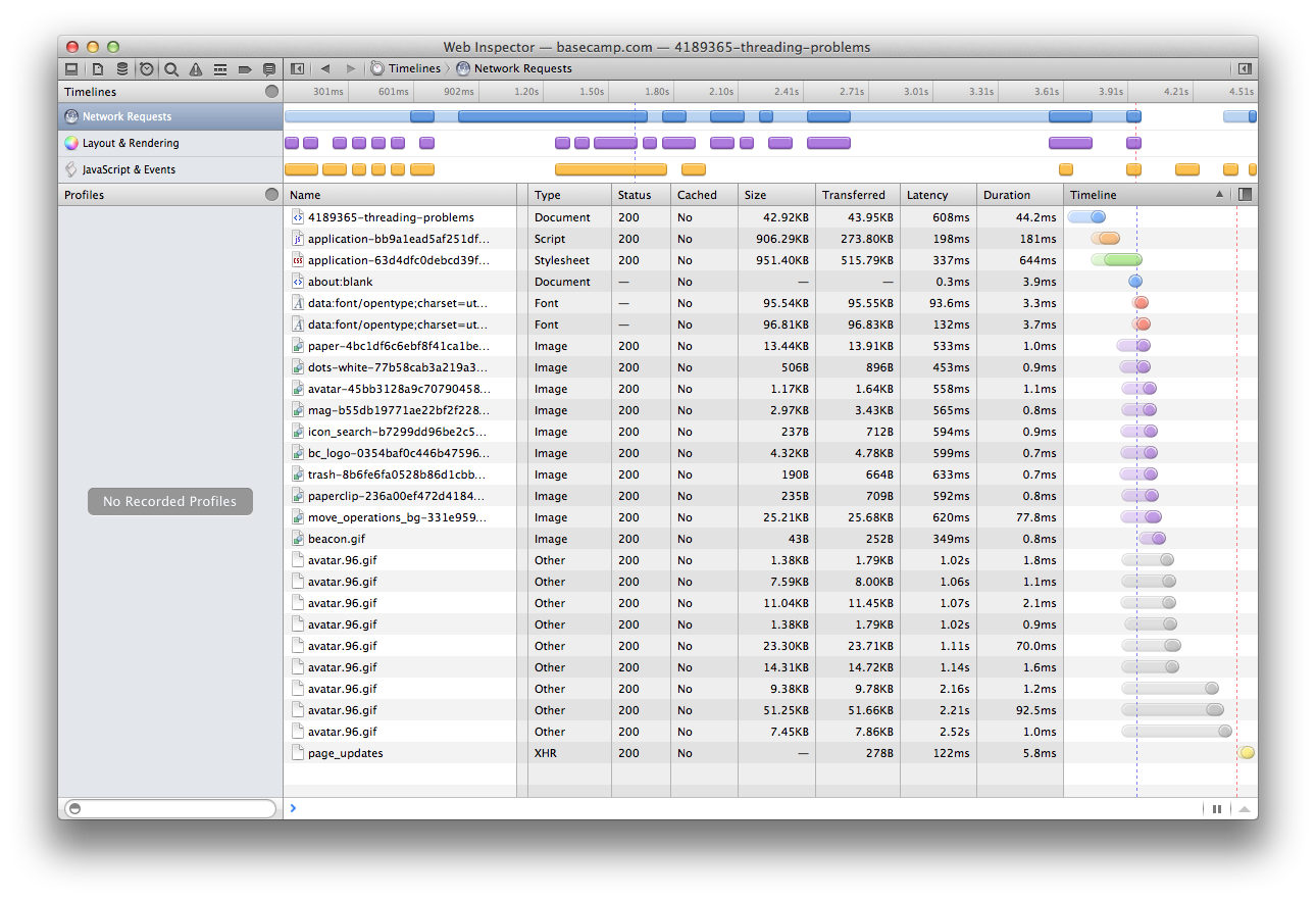
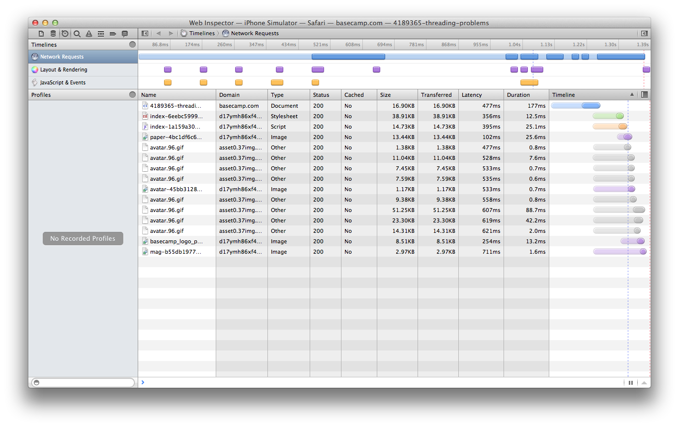
So what does this all mean? Let’s get to some numbers. I took a typical discussion from our Basecamp account and used Safari’s web inspector to compare the desktop and mobile versions.
Here’s the how they compare:
| Desktop | Mobile | |
|---|---|---|
| Load time: | 3.84s | 1.39s |
| HTML: | 42.92KB | 16.90KB |
| CSS: | 515.79KB | 38.91KB |
| JS: | 273.80KB | 14.73KB |
| Fonts: | 192.35KB | – |
Web inspector screenshots: Desktop | Mobile
That’s just about 1MB of bandwidth on the desktop. When you factor in the images on the page (mostly user avatars), it’s more like 1.2MB. No sweat on a laptop, but a serious burden on a 3g connection. So how did our mobile version stack up? The mobile version not only renders faster but offers a huge savings in bandwidth usage. The HTML, CSS, and JavaScript weigh-in at about 70K. Images increase the total cold-cache download for this screen about 222KB (125KB of that is avatars). All said, it loads more than 2 seconds faster in real time (both on wifi) and is about 1MB lighter.
Another screen in the app had actually been using responsive design techniques to deliver a mobile-friendly layout. Converting it to a dedicated mobile web view showed similar results slimming from 1000.3KB to 123.49KB. That screen looks and functions identically in both versions of Basecamp.
More than just download speed
Of course it’s difficult to quantify but these lightweight pages offer more than just bandwidth savings on mobile. The leaner mark-up, JavaScript and styles give the mobile browser less to process and use less memory. That means scrolling is smooth, taps are crisp, and the next page loads even faster because the assets are cached. We’ve already observed that many customers using iPad favor the mobile version over the desktop (which works quite well on iPad) because it’s just so much faster.
The purpose of this post is not to suggest that responsive design isn’t useful. Not only is it useful, but we’ve employed a fair amount of CSS media queries to adjust our mobile design up into tablet layouts. What responsive design isn’t is a magic bullet. A layout that looks great on mobile, may not perform well. And while it’s compelling to think that by layering some CSS on top of a web app intended for the desktop we can turn it into a great experience on mobile, that’s probably not the case for all but the most simple of apps. As designers it’s easy to forget that fast > beautiful. Applying the same care and craft to what users can’t see might be the difference between a great design and a great experience.
Michael
on 08 Oct 12It would be great to hear how you handle mobile detection. You probably have more resources than a solo-publisher, but I’d like to hear that side of the story.
Mobile detection is what has kept me from implementing a separate template for mobile.
Pete
on 08 Oct 12Great write-up. I would also be interested in learning how you handled mobile detection.
Paul Lloyd
on 08 Oct 12Thanks for writing about how you built the mobile version of Basecamp in such detail. These insights are really useful.
However, I think you’ve misunderstood what responsive web design is, or at least, what it should be (particularly when coupled with the ‘mobile-first’ approach). Rather than starting with a desktop site, with its JS dependancies and convoluted layouts, and then hiding elements and striping things away, you could have started with simpler pages-similar to those you’ve designed for the mobile version-and then added layouts and smart interactions.
This progressively enhanced approach would not only allow you to support a greater range of browsers and devices, but the desktop version of the site may be faster as a result, too. Obviously, having built and designed the original application with a desktop mindset makes this approach more difficult. But I do wonder if the path you’ve taken is sustainable over the long term. You may be sharing some code, but you still need to maintain two templates for each page.
The mobile/desktop distinction is becoming increasing blurred; I’m curious as to how you decide which devices see which version of the site.
In many respects, in reading this post I’m reminded of Tim Kadlec’s recent (and excellent) post, ‘Blame the implementation, not the technique’: http://timkadlec.com/2012/10/blame-the-implementation-not-the-technique/
It’s a good read, and worth your time.
JZ
on 08 Oct 12Here’s a simplified example of our mobile detection:
We start by matching user agents in the request something like this:
Because our mobile views are relatively plain HTML with very little JavaScript we don’t have to worry about precise feature detection or specific devices and versions. If you need something more granular there are plenty of options (like useragent for Ruby).
Our controllers then use
respond_toto serve different templates when a mobile request is detected like this:Each view template like
index.html.erbhas a correspondingindex.phone.erb.There are a few other moving parts (like compiling a specific set of assets for mobile) but that’s the basics.
Gabor
on 08 Oct 12If the mobile version is so much faster and uses much less bandwidth then why not use it on the desktop as well? Maybe some things could be progressively enhanced on the desktop but generally the mobile version sounds like a much better starting point in your description.
David Estes
on 08 Oct 12I’m really curious how turbolinks affected server load ad throughput on a large scale project like this. Did capacity increase as a result?
Dan
on 08 Oct 12I tried Basecamp mobile for the first time this weekend. It was certainly fast. However I couldn’t find a way to add a new to do. Might be me, I could’ve simply missed it, but the closest I could see was how to email new to do lists to the app. Which felt like too much hassle as I was already there, in the app and ready to go.
So, did I just miss something obvious, or is it partly so fast because it doesn’t do all that I need it to?
Thanks
JZ
on 08 Oct 12@Gabor – I’d say the speed is on par between desktop on mobile. But there are trade-offs. On the desktop you get real-time and super fast application-like UI. Real time isn’t as important on mobile. On-the-go you’re more likely to dip in an out of the app than to sit for hours watching updates roll in on a single screen. And feature-wise mobile is far behind since it was designed for a particular use case rather than being a 1:1 clone.
@Dan – It doesn’t do everything the desktop version does, which might not be everything you need. This is version one. It’s optimized for a specific use case: catching up when you’re away from your computer… reading, commenting, browsing. For now if you need to do more, the full version is a tap away.
@Paul Lloyd -
It’s not a misunderstanding. I’m clear on the philosophies and techniques behind the responsive/adaptive design and mobile first approaches. While I agree that, in theory, what responsive design “should be” is a compelling strategy my goal here is to represent the actual decisions we made. We didn’t have the luxury of going back in time more than a year to design the new Basecamp with a mobile-first approach :) We had to come up with solution that complemented what we already have.
Responsive design has been embraced by designers and that’s great. But (maybe because of those designers) it’s often too focused on visuals and the superficial. I’d argue that “hiding elements and striping things away” is exactly how it’s being applied most of the time. And that may be fine for websites but it turned out to be inadequate for Basecamp.
We’re actually quite excited about this approach. A completely separate code base is easily forgotten and harder to keep up-to-date. This hybrid approach gives us all the benefits of a single app, but without the burden of requiring every feature release to be designed, tested, and implemented for desktop and mobile. That slows development. The mobile version isn’t likely to be broken by updates on the desktop side and can progress at an independent pace. It’s completely different experience so that separation is welcome.
Thanks for the push-back :)
Paul Robert Lloyd
on 08 Oct 12Thanks for replying JZ. I’m playing devils advocate here a little, and as I’ve acknowledged in the past, there is a lot of pragmatism in what you’re describing here, and that’s no bad thing :-)
Sadly, I have to agree with you on this point. However, that’s one of the reasons why I wanted to comment on this post. There is a growing misunderstanding about responsive design—especially regarding its impact on performance—but it’s one judged on the basis of bad implementations. I’d just urge caution in trying to justify your approach by giving a misleading impression about the other options on the table.
Tyrone Avnit
on 09 Oct 12One big point that was missed, was that you end up with a merged desktop and mobile codebase. Therefore any features added to the desktop version will directly affect the mobile version. It becomes a nightmare to manage. I agree wholeheartedly, desktop and mobile applications need to be separated. By all means use the same API, but client side there needs to be a clear separation.
DHH
on 09 Oct 12Tyrone, new desktop features will not directly affect the mobile version, no. We just recently launched templates. Templates are not exposed in the mobile version. It had zero impact on the mobile version in fact.
The beauty of the hybrid model is that you get to pick and choose. Don’t want to expose, say, templates? Don’t like to those controllers and don’t design mobile screens for it. Simple as that.
Granting the mobile views their own template is just enough bubble for them to control their own destiny, yet enough integration that they’ll stay in sync with the features they have chosen to implement. Perfect harmony, development bliss.
Mike
on 09 Oct 12@JZ would you consider going into more depth on mobile detection, perhaps even publishing a little demo on github? I see your reply above but I’d love to know where you’re defining `mobile_request?`, how it’s getting converted to `format` and how you’re laying out your routes and folder structures. Thanks!
Wolf
on 09 Oct 12Thanks for the outline, good view on front-end and absolutely a good reference point for people who think a separate mobile version of their app is not needed.
“Images increase the total cold-cache download for this screen about 222KB (125KB of that is avatars)”
What I’m wondering now, why keep the avatars in altogether? Or are they lazy-loaded?
Emil
on 09 Oct 12Benjamin Aker
on 10 Oct 12I feel that you’re saying that you’re not doing responsive design at all, and essentially postulating that responsive design is about making something that scales all the way from desktop to mobile. It isn’t, necessarily.
Since there are so many different mobile platforms, I assume that you’ll still have to use a responsive design approach (fluid layouts, media queries etc) to make sure your solution works well and looks good on all the different smartphones and tablets out there.
And that is responsive design.
Uzo Olisemeka
on 10 Oct 12Comment threads (like this) on tech blogs are classic examples of “the devil’s in the details”. Such a detailed write-up and a breakdown of the problem, their thought process, the solution and the aftermath is completely overshadowed by the politicking about “Responsive Design” and what whomever thinks it really means.
At the end of the day, all our postulating must come back to the point that we are servants; we serve end-users for a living. What we call a particular method of service or what it entails is secondary to the point that our end-users enjoy the fruits of our labor and there is a marked improvement.
We’ve come to think of Responsive Design as one ultra-smart code base that adapts to all screen sizes, but the bulk of it has been focused on the cosmetic layer, not the core of the application.
This approach shows a radically different way of tailoring our response to unique client conditions. Must responsive design be from the exact same code base? Does it make it any less responsive if the optimization is server-side, not client-side?
This is a clear case of Jobs To Be Done, not How The Job Is Done. Arguably all client cases fall in the former, not the latter. Lets focus on learning new techniques and stop the pointless arguing about what to call them.
Thanks 37s for this write-up; its very useful intel.
Kelly Sutton
on 10 Oct 12You could probably knock some of the weight off of the mobile requests by storing the avatars up front using localStorage. We use the trick a few time on LayerVault to cut down on requests and/or page weight.
JZ
on 11 Oct 12Definitely, Kelly. We’re planning to do a round of improvements using localStorage soon.
Matthew
on 15 Oct 12I don’t understand why there’s 500KB of CSS. That’s an enormous amount, and having used Basecamp for a few years I can’t understand what it can actually be doing.
This discussion is closed.