
Last year I shared some extra drawings I made for the Basecamp marketing site that for a variety of reasons never went live or were seen by anyone outside of Basecamp. There have also been many drawings for The Distance that have never seen the light of day until now.
For just over a year, The Distance was dedicated to longform articles about long standing businesses. Under the editorship of Wailin and the art direction of Mig, I made a header illustration for each article and a building drawing that served as the footer. In recent months, The Distance has morphed into a podcast. I still illustrate the cover for each issue, but the header illustration is no longer needed. I like to tell people that I illustrate a podcast, and then I wait to see their reaction. There were a few issues that were both a podcast and a longform article. Here are some of the extra drawings made for those articles and then a link to each corresponding podcast. I’m also hoping to show some of the collaborative process and how we use Basecamp together as a team.
World’s Largest Laundromat
The finished header looked like this.
 I got a creative brief from Mig with some of the concepts of the story that he wanted to see in the header, and he also shared some visual inspiration, including some anthropomorphic washers and an animated gif of spiraling bubbles. The theme that I latched onto was that this is the world’s largest laundromat, so I knew I wanted to draw a big washing machine. The first image I drew was of a washer amidst a field of bubbles, but that didn’t read well and it didn’t really say anything.

I tried another one with a washing machine looming large on a street with residential buildings. Drawing buildings is my jam so I was playing to my strengths here, and I thought it worked conceptually. I shared it on Basecamp and…

I was ecstatic that they liked the drawing, and that the header came together so quickly. As you will see, it doesn’t always happen that way. I colored in the drawing and that became the final image. I had some time and I was still thinking about washing machine people, so I made the additional drawing of a washer with a top hat!

Ideal Box Company
The final header looks like this.

This article is about a box company that makes a lot of point of purchase displays. I kicked off the to-do with a drawing.

Wailin shared a copy of the story then and she broke down some of the key points and themes. She also shared a few ideas for me to try. I did this drawing but I knew that it didn’t hit on many of the themes (even though I initially tried to champion it).

Mig then chipped in with a winning idea followed by some other points, but I latched on to his origami concept.

Even though I’m relatively inexperienced in editorial illustration, that doesn’t always stop me from being overly opinionated about their purpose. I ranted about that on the thread a little bit. Artists are the worst. In the end Mig is usually right.
Victory Auto Wreckers
The final header looks like this.

I got a copy of the story and some thematic ideas from Wailin: the afterlife of a car; use every part of the animal; from junkyard to recycling center; and new commercial. That gave me enough to sketch out some ideas.


Mig liked that idea but he wanted to see it more dense with car parts.

Mig wasn’t sure about the car in 3D space, so he wanted me to try one flat but with more parts.
I drew up this, and it evolved into the final image.

Richard Bennett Custom Tailors
The final image looks like this.

Once again, we kicked it off with a copy of the story and a creative brief from Wailin. She pointed out the theme of pieces making up a whole, and of heritage, legacy, and preservation.
At the start I didn’t really have an idea, so I just started out by drawing the tailor and his tools.


I wasn’t crazy about any of these ideas and I was researching what men’s suit patterns looked like, but I hadn’t found a direction. Mig sensed that I was stuck and he came up with an idea: “Let’s try this instead. Imagine Iron Man’s suit coming together in midair, but instead it’s a bespoke suit, shirt, and tie combination piecing itself together on one of the headless mannequins.” He provided me with a sketch as well.
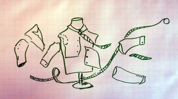
I ran with that idea and…
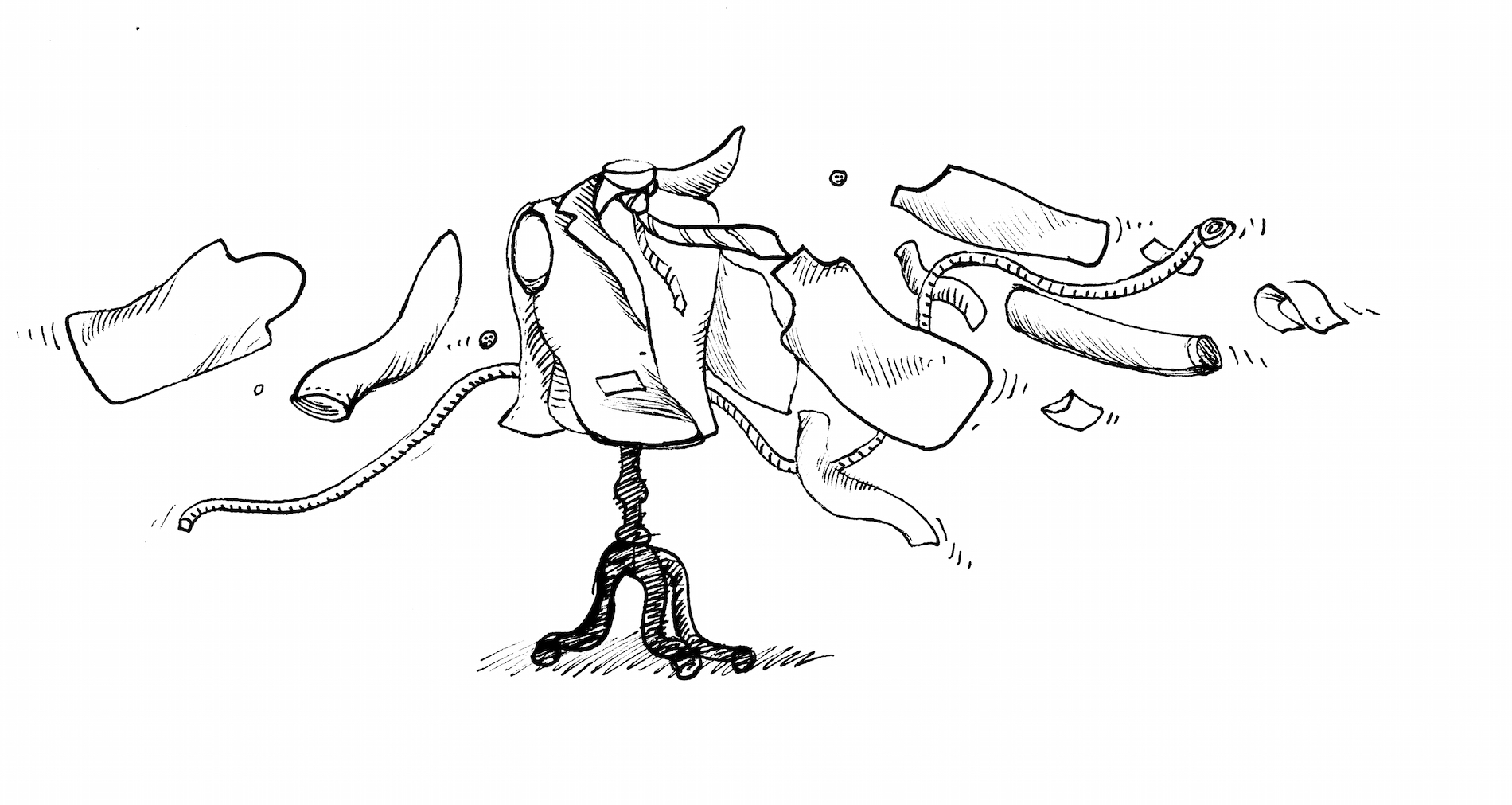
I colored it in and we had a winner. Jason Fried even chimed in on the thread, “Love how this graphic turned out!” Boom.
Grado Labs
The final image looks like this.

This was the last written story for The Distance and I really wanted to get this header right. I got a brief from Wailin with some key points about the company and a few illustration ideas.
I first came up with this.

Wailin thought that this image was too coldly clinical. I came up with something completely different.

Mig pointed out that the guy is rather scary looking and that we usually don’t have the headline re-written in the header.
One of Wailin’s ideas was to riff on the iconic “blown away guy” from the Maxell ads. I didn’t really want to go there because I thought that image was one that that is so heavily associated with another brand, but I started thinking about how I could show a listener totally immersed in sound while focusing on Grado’s two products: headphones and turntable cartridges.
I sketched out some ideas of a guy floating in a sound pool.


Mig liked the idea and asked for a more refined version. Wailin liked the direction as well and asked that the headphones look like the Grado headphones with mahogany ear cups. I took a picture of my own turntable for reference and drew a new image on the same idea. I came up with this heavily shaded idea, before we landed on the more minimally shaded drawing that we used for the final image.

The Distance is exclusively a podcast now, so there is no longer a need for these types of header images, but doing these was a great learning process for me, and collaborating on these images in Basecamp shows how it can be such an effective tool for teams. Go listen to more stories about long standing businesses!
Jordan
on 27 Aug 15I loved this – thanks for taking the time to pull back the curtain. I love the philosophic reason(s) for making The Distance a podcast – but I do miss the old medium; and this is a stellar example of why. I’ve never once downloaded an audiobook or used iTunes – so take my opinion with a grain of celtic sea salt.
This discussion is closed.