Before we launched the new Backpack a few weeks ago, we used to present new accounts with a Primer attached to the top of their Backpack home page.
The Primer was a cross between quick tips, a brief explanation of some of the stuff you can do with Backpack, and links to key features. Here’s what it looked like:
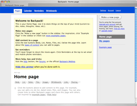
This worked well enough, but there were a few problems…
- It took up a lot of space and pushed the key Backpack feature buttons (notes, lists, files, etc) on the home page down below the fold.
- It could be hidden, but once it was hidden it was gone forever. The position of the primer encouraged people to hide it instead of keep it around for reference.
- It made a weird first impression. The simple, clean, white page metaphor was marred by a big yellow box at the top. The name of the page (“Home page”) was no longer at the top of the page.
Welcome the Welcome Tab
We introduced the Welcome Tab when we launched Highrise earlier this year. It’s worked out really well so we decided to reuse the concept in Backpack.
The Welcome Tab in Backpack provides even more information than the old Primer, but it doesn’t get in your way. You can keep the tab around for reference as long as you’d like without it cluttering up your pages or pushing down your content. And when you’re ready you can hide the tab permanently if you’d like.
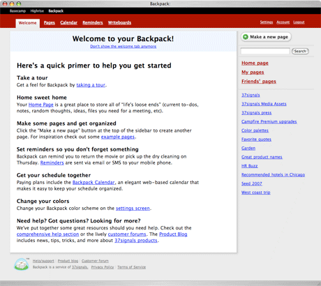
The tab is the first option in the nav bar. You can revisit it anytime if you need a quick refresher course in the basics of Backpack. It also serves as a crude site map of some of key administrative features, links to the help section, links to change your color scheme, change reminder settings, and more.
We think this is a great solution to a common scenario—getting people started but keeping the “getting started” info around for later.
Rick
on 16 Aug 07I think the name ‘Welcome’ is not appropriate when it won’t be the startpage. Why not call it ‘primer’ or ‘quick help’?
Mike
on 16 Aug 07I don’t have a Welcome tab on my pages. I don’t see an option on Settings or Account to add it. Is this for paid accounts only?
JF
on 16 Aug 07Mike, there’s a welcome tab on all accounts unless you’ve clicked the “Don’t show this anymore” on the welcome tab itself.
Brian
on 16 Aug 07I agree with Rick. You have basically just renamed the start page to the online help, and moved it from the right side of the screen to the left side of the screen.
This “welcome” tab adds confusion because people think that “welcome” and “home” pages are supposed to be the same thing. In fact, user home pages often have the word “Welcome” at the top. See Amazon.com for the prototypical example.
The Welcome tab is in the location where a website would normally have the home tab, and your main navigation link to the user’s home page is on the right sidebar, where people expect to find ancillary information, especially online help (see Microsoft Office). This makes the problem worse. The fact that you made a link to the home page the first link in the online help is a good indication that the home page isn’t prominent enough.
The application would be better off without this separate screen. I suggest removing it and better integrating online help and documentation into the user interface. For example, why not have the descriptions of “Pages,” “Calendar,” and “Reminders” show up under their respective headings when the user hovers the mouse over them?
Also, if you keep this design, then you should at least use a consistent ordering of the elements: the help text is “pages, reminders, calendar” but the tabs are “pages, calendar, reminders.” And, why isn’t Writeboards explained?
John Lein
on 16 Aug 07Great idea! Solves multiple problems in one step, and cleans the interface up while keeping it easy to find things.
One thought (related to Mike’s question) is it would be nice to give a preference to bring the tab back later on – it’s useful information and it’s easy to turn off and then want it back. I don’t see anything in my settings/account panels to reactivate it?
Jay
on 16 Aug 07I would like to 100% disagree with what Brian said.
Jon Plante
on 16 Aug 07I would like to 100% agree with what Brian said.
Dan Boland
on 16 Aug 07I disagree with Rick and Brian here—“Welcome” is the appropriate title for this tab.
Besides the fact that it actually is a welcome page (even if it’s only once), the name “Welcome” implies that there will be some explanation for how the service works on that page. And nothing is more, um, welcoming than “Welcome.”
Calling it “Help,” on the other hand, implies that the service is complicated enough that you would need help using it. I don’t think that’s the impression 37signals wants to make. And any other title, like “Primer,” doesn’t have the same positive vibe that “Welcome” does.
Andrew
on 16 Aug 07For my designs I try to avoid using the word “Welcome.” I guess it’s for two reasons:
1.) In the real world, you would say “Welcome” the first time someone visits you. If someone came back, once a day, five times a week, you wouldn’t necessarily say “Welcome to my home!” every time. It gets old. It’s great for the first time, but annoying on the 10th, 50th or 100th visit.
2.) It’s way too overused. I think designers who use it are trying to make their application ‘user-friendly’, but surfing the internet ends up sounding like you’re walking through a market of exuberant and overly-flattering merchants: “Welcome to my store! Would you like to buy…”, “Welcome, sir! We have the finest wares from the four corners of the world!”. It’s a bit much.
Brian
on 16 Aug 07Dan,
Backpack already has a big help section that is linked from the backpack home page as Help/FAQ>
http://www.backpackit.com/help/
The welcome page is an abridged version of the Help/FAQ page.
Did 37signals conduct a usability test on this change? Here’s a simple usability test: find 10 people, take them to your computer, and ask them to go to your Backpack home page. My bet is that at least seven of them click on “Welcome.”
Now, ask them “How do you get to the help section?”
(For added fun, log out, go to http://www.backpackit.com/, and ask them to point the mouse cursor at the New York Times logo, the sign up link, and the log in link, in any order. I bet that that most people will find the log in link last, and it will take them significantly longer to find it than it will take them to find the NYT logo.)
Arlen
on 16 Aug 07Hmm. I’d like to weigh in:
1. I was never confused by what the welcome tab was or what “welcome” meant. Backpack is already really targeted at web savvy people. I caught on almost instantly (and I think most people in the target market would)
2. I like it being on a separate tab, right where it is. It’s handy, and when I’m ready, I can remove it and get it out of the way, but it ISN’T my default page now, even though I haven’t removed it. It provides warmth in the top left all the time.
3. Making it a tab does make it more likely that someone will leave it there as long as they needed, since it in no way gets in the way and doesn’t slow me down. On the other hand, it isn’t really a “help” page at all, so naming it something like that would be misleading. It is, in fact, a welcome page, and serves its purpose beautifully.
There are some 37S decisions I don’t like, but this isn’t one of them.
Paul Nichols
on 16 Aug 07Overall, I do like the welcome tab idea. Keeping that content around and in a consistent place is a good thing and it beats having to “give in” and go to the Help section if you’re looking for something simple.
I’ve wrestled with the “Welcome” label on designs too though, and I’m also not a huge fan. Have you guys played with calling it “Get Started” instead? It’s a clear label (and also used in the first sentence on the page, “Here’s a quick primer to help you get started”), but also makes sense once you’ve been using Backpack for a while. If you need a reminder on how to do something, get started works just as well as “Welcome”. Just a thought.
CCXXII
on 16 Aug 07I had a discussion with a co-worker the other day about Usability and I am starting to believe the only people who worry about it are the people who are paid to do it.
I think it is important to use but my employer, a fortune 50 company, doesn’t. They want the site to work and work well for their customers but as long as people are still making purchases off our e-comm site then they are happy. The pages are terribly coded and the site search is barely a search feature, but it works and users and making purchases every day.
I get the feeling that the web is starting to do what the movie industry did that ruined it, thinking their audience is stupid.
There might be a few people in Iowa who have accidentally turned off JavaScript or who get confused by how a page is worded or laid out, but for the most page people have an amazing ability to understand how a website works.
I am getting tired of spending the majority of my time programming, designing, and testing for the 1 person out of 100 who isn’t going to purchase anything anyway. I think rather than worrying about all of that we should start working toward creating useful tips to educate the user how to properly use the site…which is exactly what this has done. It may take 5 seconds to figure out what they did, but at the end of the day the application works, and works well. If my mom can’t understand it then that is okay because my mom doesn’t need it and wouldn’t use it anyway.
Matt M
on 16 Aug 07I too find the Welcome screen somewhat misplaced. The location the tab is currently in is too prominent for information that is pretty common knowledge after using Backpack a few times. I think it could be moved the right and renamed something like “Startup Tips”.
Or, maybe on the Welcome screen itself you can have a checkbox to deactivate it completely. Regardless, it’s in too prime of real estate after you’ve used the application a few times.
Ryan
on 16 Aug 07CCXXII—Very good point(s). This entire comment thread has basically been about that “one user” who doesn’t get it. The one who came here by a random link, and has no intention of continual use of Backpack. I get tired of that, too. But in the end, I still design for that “one user”.
Personally, I don’t have a problem with the Welcome tab whatsoever. I don’t mind the idea of a “Get Started” tab, though. They both imply introductory level information, to me.
I thought about what it’d be like for the “don’t show the welcome tab anymore” link to become more known (attach an icon or something?), and if that would better self-document what the page was for. I also considered what it would be like to change the “Welcome” to “Quick Ref” or something after the first time, but that may impose too much on the user. “Is this a new page???” could potentially run through their mind, and I’m sure there would be a slew of commenter’s letting it be known that they DO NOT appreciate the confusion, as if it’s life or death.
The true talent comes in when you are able to think like that user who gets confused by the most insignificant things, when you yourself sees it plain as day.
John
on 16 Aug 07Here’s a challenge for all the back-seat designers out there:
Can you suggest a simpler solution than the Welcome tab that is at least as effective?
Mimo
on 17 Aug 07Just name it: How Backpackit works.
That’s fine.
Mimo
on 17 Aug 07Just name it: How Backpackit works.
That’s fine.
erin
on 17 Aug 07We’d love to have you join the conversations about design at the PSFK Conference in Los Angeles on Sept. 18!
Check out this link for ticket info. http://www.psfk.com/psfk-conference-los-angeles
Hope to see you there!
Sam O
on 17 Aug 07Wow, great design decision, i mean its amazing. This is tottally going to change the app. Amazing.
................. tards!!!
Seth
on 17 Aug 07Design decisions will never please everyone, just like these comments illustrate. It’s tough taking a stand, sitting back and dealing with the comments that follow – but it’s necessary to make progress.
I think there are a variety of ways to present this type of information. This is a good solution, as displaying relevant help/welcome information on each screen.
Keep up these kind of posts Jason, I always enjoy them. I’ve even thought of making similar ones on my blog, but I don’t want to bite your style too much :)
jan korbel
on 17 Aug 07I think the “Welcome” tab is a great idea. What brian seems to forget is that the Welcome tab is the first the user sees, with a clear subheading (link) “Don’t show this welcome tab anymore” – I had no problem grasping the concept as a user when I saw it for the first time and I do not think anyone should have a problem with it.
Maybe try out how it would work if the tab had different graphic representation from the “normal” tabs – make it stand out less maybe.
Neil Wilson
on 17 Aug 07I would have thought that you label it ‘Welcome’ and stick it at the beginning of the list until the user reads it, and then you move it to the end of the list and name it something like ‘Primer’, or ‘Quick Help’.
Gordon Bennett
on 17 Aug 07Here in Britain, there is a phrase “being up your own arse” , meaning being so self-obsessed that you cannot see beyond your own buttocks.
A blog entry about a tab, with 23 comments mostly bleating “Great!” is a pretty good example of being up your own arse.
Either that , or somebody has a lot of time on their hands to blog about nothing.
Ian Sharp
on 17 Aug 07Sure, this is alll great. Even greater, when somebody over at 37signals would notice when they have screwed up. Backpack is disfunctional since hours and 37 doesn’t seem to care. Check out this thread: http://forum.37signals.com/backpack/forums/21/topics/2907
The Nail
on 17 Aug 07Gordon hit the nail on the head :).
Simon
on 17 Aug 07I think the introduction of the Welcome tab is a bad idea as it removes the helpful information from the context that it can be applied within.
In the new design, if a new user wants to get started, he has to (a) nav to the Welcome tab to learn how to add a new page, and then (b) nav to the Pages tab to actually add the new page. In the old design, he had all of the info and functionality in one place.
Eric J. Gruber
on 17 Aug 07To me, “Welcome to …” is so 1990s, I just can’t use it.
Seth
on 17 Aug 07I think what a lot of you are missing is this…
Tons of people sign up for these type of web services without ever reading your feature list, or checking out your tour. Having something like this is actually a nice alternative to putting it on your information site. A lot of people simply skip over your information and want to jump right into using the application.
I answer support questions all day for my invoicing software that are plainly answered on the information site. The info site is available by a very prominent global “help” button inside the application.
This is in addition to screen-specific introduction messages outlining what you can do in that particular area of the application.
Have any of you detractors considered this might be as much of a support move, as it is one of usability?
John
on 21 Aug 07I’m surprised you guys missed the mark and didn’t do it like this from the start… a no-brainer IMO. For those who say that “Welcome” isn’t the right word, it is for those who are there for the first time (and that’s who it’s intended for). Don’t like it? Hide it.
... and Gordon is a jack-arse.
This discussion is closed.