![]() Our book:
Our book:
Defensive Design for the Web: How To Improve Error Messages, Help, Forms, and Other Crisis Points
Available Now ($16.99)

Most Popular (last 15 days)
Looking for old posts?
37signals Mailing List
37signals Services
Syndicate

Cell Phone Switchers: A Missing Tool
24 Nov 2003 by Jason Fried
Wouldn’t it be nice if there was a single map with overlays for each major U.S. cell phone company’s coverage area? This way I could directly compare coverage instead of having to go from map (Sprint PCS) to map (T-Mobile) to map (AT&T). At least Amazon has maps that are roughly the same size, but it would be even better if I could overlay the Sprint and AT&T map and see the places where AT&T offers service and SprintPCS doesn’t (and vice versa).
UPDATED WITH MAP…
I put together a map. If you visit this page on the SprintPCS site, they show a map of their coverage vs. AT&T’s coverage that looks like this:
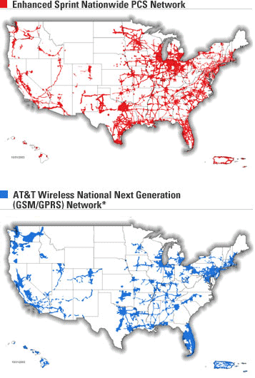
Now, that’s sort of useful, but wouldn’t the map below be more useful?
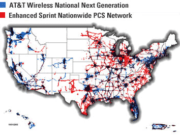
Whenever you see red, you’re seeing Sprint’s coverage. Blue is AT&T. Black (or dark purple-blue) is dual coverage. Ideally there would be a feature to toggle each map so you could turn one off or turn both on. But, you get the idea. This took me 3 minutes. It’s the little things like this that really make the difference.
27 comments so far (Post a Comment)
 24 Nov 2003 | David B said...
You can:
http://www.cellular-news.com/coverage/uk.shtml
http://www.cellular-news.com/coverage/usa.shtml
Requires IE5.5 +
24 Nov 2003 | Joshua Kaufman said...
It would be very helpful, but I would never expect that map to come from any one of the companies you mentioned. That's kind of like them saying, "We don't offer service in this location, but our competitor does!"
It's nice to see that Cellular News has taken the step and created a map that does that. Now if they could just get it to work on a Mac OS browser.
24 Nov 2003 | pb said...
That map doesn't work in IE either.
I don't see this as being much of a deciding factor. Most people don't care much outside their local area.
24 Nov 2003 | One of several Steves said...
Not to mention, the map's very wrong or very out of date. Otherwise, AT&T bafflingly decided to skip Los Angeles altogether for their GSM network. Which I don't think is true, considering how that's the carrier and network I use.
24 Nov 2003 | Jon Gales said...
That'd be a great map, but it would still be useless. Check out the map from Cingular -- it's amazingly wrong. There is no way they have that much coverage.
(Link is not on Cingular.com as their search engine for maps is currently down... It's the same graphic though, I looked at the one on Cingular 3 days ago.)
I've had AT&T / T-Mobile resellers complain about this more than once. When a customer sees teh Cingular map (Sprint PCS does something similar), a more realistic map like what AT&T provides looks skimpy. But in a few months with Cingular, they realize that the map is a pretty picture, but not reality.
I challenge a Cingular rep to take his phone to the boonies of Montana and make a call. I've had LA residents complain that their Cingular coverage is bad--and that's the #2 city in America!.
So here's what I'd like to see: accurate maps made by actual users (like war driving?) that reflect what carriers are where. Since there is no big voice to say "your maps are wrong" it's no surprise that some companies have a "fat marker" when outlining their coverage areas.
24 Nov 2003 | Ed said...
I think you're on to something. Now that subscribers in major cities can keep their number if they switch providers I believe a service like this would be vary valuable.
Distributing an .eps file of the United States (the more details the better) to various people in strategic locations in the States could create a uniform and useful HTML/Flash piece. If you have a map let me know - I'll start on the Midwest.
24 Nov 2003 | monkeyinabox said...
cell phone portability doesn't mean jack if you live anywhere besides a major metropolitan area. :)
I was hoping to score a better deal, but when i went hunting for coverage at the sites my area is barely serviced by anyone but Sprint, Celularone & Voicestream... blah!
One nice map to show that would have saved me some time.
25 Nov 2003 | pb said...
Jon, talk about amazingly wrong, you might want to look at the right map
Accessible easily enough from Cingular > Rate Plans > Maps > National.
25 Nov 2003 | Darrel said...
(The maps screw up the layout of this page).
Maps from cell carriers are useless. Sprint appears to cover a large area, but they fail to mention that the areas that they do cover are done in swiss-cheese fashion. 1 block service, 2 blocks no service, 1 block service, 4 blocks no service, etc.
25 Nov 2003 | JF said...
(The maps screw up the layout of this page).
Huh? How so?
25 Nov 2003 | dayvin said...
JF, I think Darrel could be talking about the raw URLs in Jon Gales's and pb's posts. Since they don't have spaces, they're not wrapping and thus breaking through the right side of the CommentsBox div.
25 Nov 2003 | dayvin said...
And on the subject of design, what's up with the for post titles changing to 18px Georgia? (And Comic Sans is the third font option?)
25 Nov 2003 | JF said...
Dell Cell Zones [via Gizmodo]
25 Nov 2003 | rog said...
Regarding the broken page:
Maybe it's only we IE users, but I see the page broken as well. The div labeled "TwoColClosedText" shows up vertically lower than the div in the class "syndicate", leaving a big block of white space (with no border) at the top of the page.
The sidebar stuff shows up where it ought to be; it's just the stuff starting with "View Comments"..."Post Comments" which is shifted down.
I can post a screenshot if you want.
25 Nov 2003 | pb said...
Opps, sorry 'bout that. Forum software should handle URLs automatically, imo.
That's "Dead" Cell Zones, btw. I would question its accuracy as well since I suspect it rarely/never reflects improved coverage.
The new moas you posted are much nicer but I still wonder how much of a deciding factor they would be.
I like the new headline font.
25 Nov 2003 | Darrel said...
No, I don't think it's the URLS...the images are wider than the URLs. I think the images are too wide for your DIV in IE6, so it's pushing the comments DIV below the right-navigation DIV in IE6.
25 Nov 2003 | Don Schenck said...
So, no mobile phones in Montana?
25 Nov 2003 | Mark Fusco said...
the images are too wide for your DIV in IE6...
Actually the content of this page was shifted down below the syndicate button before the images were added. Jason, I guess ya'll haven't yet read the email I sent informing you about it last night.
25 Nov 2003 | rog said...
I suspect it's the urls in the comments which are making the "comments" div too wide and pushing the whole thing down.
25 Nov 2003 | Mark Fusco said...
I suspect it's the urls in the comments
I suspect you and Dayvin are correct. I hadn't noticed the URLS previously.
25 Nov 2003 | JF said...
Fixed. Hopefully.
25 Nov 2003 | Elaine said...
So, no mobile phones in Montana?
I took a half-cross-country (WA to WI) driving trip this past summer, and for most of it, my phone was about useless.
but we did get pretty good coverage in...I think it was Butte, where we also had some mediocre coffee.
it'd be lovely to have a good resource for cell coverage, but I doubt we'll see it anytime soon....
25 Nov 2003 | Jon Gales said...
PB:
Not sure why it's like this, but here's another map on Cingular's site.
As you can see, that's what I was talking about (their search engine came back online).
25 Nov 2003 | One of several Steves said...
Read the fine print, and that Cingular map is not desceptive. It's where your digital/analogue phone will work. In a lot of cases, they have roaming agreements to give you coverage in areas they aren't located. And in places like Wyoming, you're going to be on analogue.
01 Dec 2003 | Hopper said...
The problem is that in overlaying the maps, you're not comparing the true coverage options for AT&T. As the 800 MHz carrier in numerous markets, the ATTWS coverage using their TDMA network is magnitudes larger than that which is available using their GSM network.
Sprint's map shows only the GSM coverage for AT&T. Further, the SPCS map only shows the places where their Vision 1xRTT service is availble. In South Dakota, for example, the SPCS coverage shown is just a few little dots. The true extent of their coverage is much larger.
Large areas of the SPCS network, particularly in the Upper Midwest, do not have Vision service save for the populated places. Much of this coverage is provided by Sprint PCS affiliates, not the SPCS corporation itself. The affiliates always offer the same features with respect to the vanilla SPCS offerings like basic mobile web, SMS, voice mail indications, and digital service, but not all have added 1xRTT coverage to their networks.
If you plop T-Mobile's coverage map down, you're also going destroy an objective representation of cellular coverage. Much of T-Mobile's network in the less populated areas is provided by affiliates who permit T-Mobile customers to roam on their networks.
Hence, the true extent of T-Mobile's coverage (if you wanted their native network shown) will not be viewable as they include a number of other networks.
T-Mobile makes this clear on their maps by providing a disclaimer at the bottom. But Sprint PCS does not, unless you look at the zipcode based coverage. Most of what you see as "non-vision" coverage, or however they currently phrase it, is actually non-SPCS owned networks.
The point is that using SPCS provided maps to see the offerings of AT&T isn't necessarily the best way to go about it. But neither are the other links posted at the top of the comments thread. The maps on cellular-news.com are incomplete and rather antiquated.
Cellular carriers make life difficult for those hoping to create overlays like you've done above by using wildly differing map projections than the competitors. Without rather complicated manipulations, the maps are not easily dropped onto one another.
In regards to the honesty of the maps, most carriers have recently (in the past six months or so) put a higher value on showing a fairly accurate reflection of their coverage.
Verizon Wireless used to show, for their National Single Rate Plan (zero roaming anywhere) an entire nation colored red, indicating coverage. But this wasn't a coverage map. It was simply a rate-area map. They've since gone through nearly all of their maps and been more honest in showing areas of no coverage, analog coverage, and digital coverage.
If you really want to get down to the nuts and bolts, you can search the FCC filings for Sprint PCS and get the official submissions of their coverage as provided by RF Engineering firms. They're really shitty looking -- resembling a poor fax, but do show very precisely the coverage in -dB.
03 Dec 2003 | Jay said...
I can assure you that NO cellular phone on this planet works in a large number of areas of northern Michigan. There's a 35-mile stretch of M-55 (a rather heavily traveled two-lane road between Houghton Lake and Cadillac, west of US-127), where absolutely NOTHING works - not Nextel, not Sprint, and not AT&T (to list three phones I've personally carried in that area). No roaming, no digital, no analog - nada.
But we've come to accept that fact.
(ahem)
16 Jan 2004 | George said...
If an application is designed well, the reward for users is that they will learn it faster, accomplish their daily tasks more easily, and have fewer questions for the help desk. As a developer of a well-designed application, your returns on that investment are more upgrade revenue, reduced tech support, better reviews, less documentation, and higher customer satisfaction. The rewards of building a good-looking Aqua application are worth taking the extra time.