Follow-up: Designing a web app's "Blank Slate" state
04 Mar 2004 by Jason Fried
Back in September of last year, I posted about The Challenge of Designing the “Blank Slate” which discussed the paradox of the customer deciding if they understand and enjoy the application before the app gets a chance to put its best foot forward. The problem is that most web apps shine when they are flush with data, but the customer’s first impression is when the app is empty (the “blank slate”).
Well, the web app I was talking about back in September was the still secret Basecamp web-based project management and client extranet tool. Now that Basecamp has launched, I wanted to share a couple of the blank slate screens with you (screenshots below).
When we designed the blank slates in Basecamp, we wanted to make sure that we provided examples — both visually and textually — of what will eventually occupy a page. We also made sure that we always provided suggestions of how to get started (since we knew that the reason someone was seeing a blank slate was because they hadn’t done something yet) and never presented anyone with a dead-end. Dead-ends are UI evils.
Below you’ll find two examples of Basecamp blank slate screens.
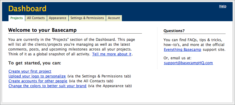
The first one is the first screen (the Projects Dashboard) someone sees after they’ve logged in. You’ll see that it welcomes them aboard, explains what this page will eventually contain (once they start adding projects), provides an example link to a tour of the page they are on, gives them some options to “get started,” provides a link to the Everything Basecamp support site, and finally provides a tech support email address should they have any questions. Here’s the screen (click it to see it full size):
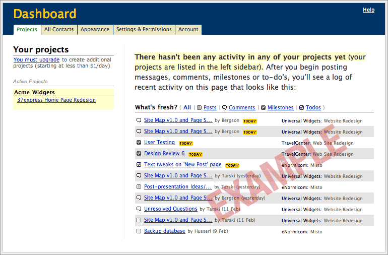
The second screen is the same Projects Dashboard after they’ve created a project. You’ll see that the page now lists their first project on the left side (highlighted in yellow), explains that there hasn’t been any activity in the project yet, details what they can expect to see once they start working with that project, and provides a visual example of a flushed out “what’s fresh log” (with a big red “EXAMPLE” cutting through it so they don’t wonder where all that data came from). Here’s the screen (click it to see it full size):
If you’re curious, this is what the Projects Dashboard looks like when it’s full of data.
Folks who use Basecamp will also see explanatory blank slate states in the to-do, milestones, and weblog/messages sections if they haven’t used those sections yet.
When building your own web app, or web apps for your clients, we hope you’ll take the time to think about and design effective blank slates. They are one of the most often ignored screens, but often make or break the experience for the first time customer. If you spend all that time and money trying to gain customers you might as well make the best possible first impression. They’ll appreciate it more than you realize.
5 comments so far (Post a Comment)
 04 Mar 2004 | Carl said...
Nice examples. I agree that "blank slates" are often neglected. Apps that pay attention really shine.
 04 Mar 2004 | Ben Scofield said...
A related issue is the prevalence of apps that ship with a default admin account, opening up all kinds of security holes down the road for naive or lazy users. A better model would have the user create the first account upon installation - which leads to an alternative method of designing for the blank slate:
When the system is devoid of data, change the interaction model so that the user is 'encouraged' to provide that data (perhaps through a wizard).
 05 Mar 2004 | clappstar said...
Thanks, I needed that.
 06 Mar 2004 | pb said...
I had a very difficult time the first time I logged in to Basecamp. I couldn't figure out what to do and was hoping that I could get started with a sample project or something.
 06 Mar 2004 | jharr said...
In all of the collaborative apps I've beena prt of designing I've only seen minimal sucess with "sample" items or projects. I think the Basecamp folks have done very well in this area.
Tutorials and, more likely, screenshots seem to be a better solution rather then inserting a sample projects that may further confuse user. If you were asked to create a project for an architecture firm it could be quite confusing to see a sample project with web design examples.
I would say that the general layout of Basecamp makes it difficult to "fill" the screen unless you do have a lot of content in the project pages. I'm sure as the product matures and more features are included that will be less of an issue. Maybe more portal-like presentation in some areas will keep from giving the felling of emptiness.


