![]() Our book:
Our book:
Defensive Design for the Web: How To Improve Error Messages, Help, Forms, and Other Crisis Points
Available Now ($16.99)

Most Popular (last 15 days)
Looking for old posts?
37signals Mailing List
37signals Services
Syndicate

The Kinja that wasn't
16 Apr 2004 by Jason Fried
Nick was kind enough to give us permission to share one of our rejected Kinja designs with the SvN audience.
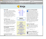 This was our favorite layout, but the question was practicality. Was a 3 column layout with the nav centered in the middle and the stories on the side effective? How would the stories flow? Was this too much of a departure from the “traditional” blog-friendly reverse chronology and top/side navigation scheme we’ve all come to take for granted? Does flow really matter or is “scattered” approach easier to scan? Was this too newspaper like? All these questions came up. We had answers for some and are still looking for others. In the end, it was decided the quirks of this design weren’t appropriate for
Kinja.
This was our favorite layout, but the question was practicality. Was a 3 column layout with the nav centered in the middle and the stories on the side effective? How would the stories flow? Was this too much of a departure from the “traditional” blog-friendly reverse chronology and top/side navigation scheme we’ve all come to take for granted? Does flow really matter or is “scattered” approach easier to scan? Was this too newspaper like? All these questions came up. We had answers for some and are still looking for others. In the end, it was decided the quirks of this design weren’t appropriate for
Kinja.
We still think it’s an interesting concept and we may revisit it once again with the upcoming SvN redesign. What do you think?
32 comments so far (Post a Comment)
 16 Apr 2004 | JF said...
Quick note... There's some stuff missing from this page (such as an option to see older posts, text ads, and some other functionality), but this was just an early proof-of-concept prototype.
We also hope it renders well in all browsers, but complete validation and testing wasn't part of the process at this point. Should be fine in Safari, Firefox, and IE 6 PC though.
16 Apr 2004 | Nick Chapman said...
Looks sweet. Nice flow.
16 Apr 2004 | Don Schenck said...
I like it. Once again, I'm reminded why I hate you guys; you're so good!
16 Apr 2004 | JP said...
So do you guys go straight to XHTML/CSS for your mockups, or do you use Photoshop first?
(Btw., great design.)
16 Apr 2004 | jarv75 said...
An interesting idea, but I don't know where to go first. My eyes go a bit mad.
"So do you guys go straight to XHTML/CSS for your mockups, or do you use Photoshop first?"
Yes, I would be interested to know that also.
16 Apr 2004 | Rob said...
I actually like the prototype a lot. It is very easy to read and scan the headlines very quickly. A much better approach than the traditional top down blog format.
16 Apr 2004 | JF said...
95% of the time we prototype in CSS/HTML. Faster (especially from a content/text perspective) and more realistic.
16 Apr 2004 | Darrel said...
I did a center-nav design once. I think it can work and it's certainly still a 'new' look as it's not been done a whole lot.
16 Apr 2004 | Brian Sweeting said...
I've gone back and forth with doing comps in PhotoShop/Fireworks vs. XHTML/CSS. There is no doubt that utilizing CSS for the presentation layer makes it so much easier than the old days of slicing up images and using tables. I think it is also an advantage to be able to demonstrate functionality to a client. Another advantage of using XHTML/CSS for comps is that the time it takes to get to code from design is basically eliminated.
I remember Doug Bowman remarking on this and he felt like creating comps in CSS hampered creativity by making you keep within the confines of what you can do (or what you think is possible) in CSS.
16 Apr 2004 | Kristoffer Bohmann said...
upcoming SvN redesign
I go to the SvN homepage mainly to read new blog entries and reader comments. If the Kinja homepage prototype was used on SvN I would find it hard to spot new entries. Are the new entries located in the left, or right column? Also, monitoring new reader comments for each entry is no longer possible as the number of comments for each entry (e.g., "View Comments (49)") has been removed.
Figuring out where to start has also become harder. Should I start by clicking the navlinks? Should I first register? Or, should I simply start reading the featured stories?
PS: You may be able to use the two/three-column format if each column is presenting different story types or story cateogies. For instance, the left column might present recent blog entries, while the right column could display recent comments.
16 Apr 2004 | Graham said...
Wow, don't you people believe in leaving margins for text? That left column is practically unreadable, crashing into the left of the screen.
16 Apr 2004 | Noah said...
Too bad that you didn't go with that one -- the three-column layout is underrated! Newspaper design has been an evolution of content and readability vs. limited space... why put it in such a negative context?
16 Apr 2004 | Tin Man said...
I like it, but on my 800x600 screen at work, I have to horizontal scroll to see everything,
16 Apr 2004 | Grant said...
I would think that people used to the traditional blog layouts (myself being one of them) would be condused at first. After looking at it for a bit I kind of like it. I can scan the entries faster since more of them can fit in one page view (no need to scroll as much). I guess it's basically a case of knowing who you target audience is and going with what is more familiar to them.
16 Apr 2004 | Noah said...
Grant, you kind of nail the problem I have with the current Kinja metaphor -- if they're targeting blog non-users, why did they choose the blog layout? Why not something more familiar, like a newspaper?
16 Apr 2004 | Bryan said...
Big fan of this 3 column design. New, different, and easily scannable. I'm not sure if exact order is important as long as I knew everything on this page was "fairly new."
17 Apr 2004 | ak said...
i like the center nav, only because it's outside the box
kudos for not constraining your thought
17 Apr 2004 | Gordon said...
I'm... er... no I'm not sure. I like the fact that it is 'different' but is the reason it's not been seen much is because it doesn't work too well?
It does make scanning the page much harder - working from the presumption that not everyone will use Kinja to start their surfing all the time, and may check certain sites throughout the day - so it's difficult to easily see the new digests that I've not already read.
Can you tell us why it was rejected? What was the main reason it 'wasn't appropriate for Kinja'?
17 Apr 2004 | megnut said...
We all liked it a lot from a conceptual standpoint, but didn't think it worked well from a usability perspective. It was hard to know where to begin reading, and I found the design made me feel tense -- my eyes never knew where to focus, I found that I wanted to look everywhere and read everything all at once. It's not clear which way the news would flow, is the newest in the top left? If so, do I read down that column, and when I'm at the bottom, have to scroll back up to begin the second column?
As far as Kinja was concerned, it took the "scan" concept a bit too literally. Fundamentally Kinja is about reading, and we felt that would be best accomplished by starting at the top and having a single column to read. It's clear and it's familiar, and those were our goals.
Still, it looked so cool, and all of our gut responses on first seeing it were that it was totally cool and different.
17 Apr 2004 | Eby said...
I like the design, though I'm not sure how well it would work on a site like kinja for reasons others have stated, especially something constantly updated. Yet for an issue based site that has many stories in each issue, I don't think this layout can be beat. I'm not sure how many of those sites still exist though. Really gives me the feeling that I'm looking at a magazine's table of contents.
17 Apr 2004 | Brad Pineau said...
It seemed weird having the main menu in the middle.. I dont think I liked it..
17 Apr 2004 | Grimcoin said...
The three column design is definately, for me, a winner. From a purely informational standpoint, I can see seven articles summaries with the three column design plus summary information down the central column. With the chosen Kinja implementation, I can see three, and after scrolling I hit the forth and then adverts intrude and irritate.
The (rejected) design allows quick scanning of the range of hetrogenus data that blogs inevitably create. Updatability would be a non-issue, new articles could be placed on the top level, with the upper left taking chronologic preference, most of us (westerners) are used to reading left to right, top to bottom.
Having the menu in the centre creates a nice seperation zone between the information columns, stopping the prospect of the information from one article intruding on another.
If Kinja had taken this design, or a sibling of it, I would definately find the service more useful, with the present design I do too much scrolling, for not enough information.. (do I sound lazy..?)
18 Apr 2004 | Lance Osborne said...
But what problems is this design solving that a more "traditional" design wasn't?
19 Apr 2004 | Lars said...
It would have been interesting to see a usable emulation of a newspaper-style multicolumn layout, but this isn't it.
My attention is drawn to the center, which is the least important part of the layout (for the reader).
So it's not "newspaper-like" at all, and it's definitely not "blog-like" either.
If there is a more enlightening post on your reason to break with all existing conventions, I'd like to see it.
19 Apr 2004 | Ed said...
Nice idea, seems a bit cramped though. Needs some more white space at the margins and possibly between items instead of the rules?
Also on reflection there is excessive use of italics in the centre 'table of contents'.
I'd definitely tweak this 'cos it has the potential to be a very effective and noticeable design.
Full of envy :-(
20 Apr 2004 | Mondo Dynamo said...
I've never understood the point of kinja. Does anyone really "use" it?
20 Apr 2004 | Hugo said...
For some reason it reminds me of reading Time magazine. Good or bad? You decide.
I like the design. I like the way the menu is split up down the centre of the page. It has balance and it seems that my eyes are drawn around and about the page thanks to this central menu and colour. A new experience for this kind of content. I guess usability nutters would say that this is inefficient, but hey, you're not reading this content to be quick and clever about it, are you?
I guess it could be read as some kind of statement to the user - "Read the little sections. Let your eyes catch on strange areas of the page. If you don't like it, go back to useit."
But then again, Australia is a pretty weird place isn't it. :)
20 Apr 2004 | Trevor said...
Upon further reflection, what I really like is how my eye jumps from headline to headline like it does in a newspaper. I don't read top down, I scan and I really like that. It helps me focus in on things I think would be interesting to me. A+!
20 Apr 2004 | Silus Grok said...
I'll have to go with Jarv75 on this... I like the idea, I even like the execution (mostly)... but my eyes were all over the place and couldn't comfortably rest on the content. Of course, this may be something as simple to change as palette.
As for it being "different" or "new"... there's value in that, of course... but not much. The real question is whether it is useful (beauty and differentiation are certainly useful... but only inasmuch as they support other core objectives), and has a short learning curve.
Thanks for sharing!
21 Apr 2004 | Carson said...
I don't like it :)
I'd rather scroll than dart my eyes back and forth like a ping-pong match to take it all in, or worse, have to scroll up and down twice to get it all.
I much prefer what they have now. Much easier to just scroll down the content, taking it all in in a way that I'm already used to.
27 Apr 2004 | miss representation said...
My CSS knowledge is limited, so this will be phrased poorly. However, unless I find that I am missing a preference setting in Firefox, I find myself staying away from any sites that are organized around a centered layout, reason being that instead of dynamically resizing the page so that all three columns fit proportionately into my browser window (768x1024), it truncates the left and right column, as I typically have the bookmark sidebar open (the issue stemming, I assume from the assumption that I have a "full screen" available, but in fact it is reduced by X, X being whatever value the sidebar consumes). Though most people who do this put the primary content in the center column, it is still very distracting visually. So is this failure an issue of the CSS, or a limitation of Firefox interpreting strict code? Or something else altogether?
In the instance shown, it would be entirely unreadable to me, as the content is on the wings. From a design standpoint, I disagree with center justifying the nav links. Your eye ends up tracking an absolutely centered axis that provides almost no useful information (granted, I'm a bit of a type Luddite; I happen to think party invites are the only time center-justified type is appropriate, and even then I find it does not succeed so well)
02 May 2004 | Lars said...
This layout concept works better for Textbased.
Is this where the inspiration came from?