Amazon’s new clothes 06 Apr 2005
31 comments Latest by Vitaly Friedman
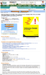 It looks like Amazon is trying a new book detail page. The new page sports a huge 400px tall book cover, a cleaned up and stacked page layout (each section takes the full width of the page and is bordered by dashed lines, revised typography with bigger type for headlines, more consistent treatment of section headers, a revised buy box, and more. They even lost the sidebar. This new design definitely puts the focus on the book first and the rest of the site second. Interesting direction. Here’s a screenshot if they change it or if you can’t see it.
31 comments so far (Jump to latest)
Zelnox 06 Apr 05
Strange, I followed the link, but still see the old version. From the image, the new look seems interesting. I wonder where the side information went.
Dave Marks 06 Apr 05
Its a shame though that the top, and bottom are fluid, yet the main bit is not… makes it a tad weird… Whats the point in removing the sidebar, to then leave me with a big white space on the right hand side???
Great for small screens though i suppose
Brady Joslin 06 Apr 05
I’m still seeing the “old” look at Amazon, as well.
The new one looks intriguing. The only thing I usually refer to on the left sidebar is the Recently Viewed list. Everything else is just noise to me. I also like the enhanced focus on the product.
Dan Boland 06 Apr 05
Hm, I’m seeing the new version on Safari. I think it’s just okay, because I’m seeing a ton of white space (per Dave Marks’ comment). It’s too bad the image they’re using for the book cover is such low quality.
Adam Michela 06 Apr 05
I see it. Don’t quite understand the logic. I’m all for the bigger things trend (which Amazon embraced quite awhile back)… but this seems a bit silly.
It would work if the rest of their design was bigger. It doesn’t help facilitate the buying/understanding process in anyway.
Simon Jessey 06 Apr 05
Could it be that the new version is Safari-specific? I’ve not been able to see it on any of my Windows browsers.
Adam Michela 06 Apr 05
Simon, I’m at work on Firefox+PC.
Jon Gales 06 Apr 05
I saw this design several months ago and it went away in a few days (must have been a cookie). I also was seeing a big change with the tabs.
Ryan Schroeder 06 Apr 05
I’m on safari and *don’t* see the new design
David Nestor 06 Apr 05
I saw the old book detail on IE, and the new one on Firefox. I suspect, based on other comments, that it’s being shown randomly to half the audience. Or perhaps randomly to half the non-IE audience?
Rex Hammock 06 Apr 05
In January I blogged a similar sighting. (Here’s , a screen shot of that version.) A panelist at SXSW (sorry, I can’t recall who) said that Amazon is continuously serving up alternative designs to a small number of users to test response rates.
Rex Hammock 06 Apr 05
Sorry, here’s the screen shot:
http://idisk.mac.com/rexhammock/Public/amazonpage.jpg
Adam Michela 06 Apr 05
Rex: That SS looks a little bit better than what I’m seeing now.
Johann 06 Apr 05
I see the old design on Firefox and the new design on Safari. And it looks like the new design relies heavily on CSS.
Anonymous 06 Apr 05
Low quality image for the bookcover.
Ramit 06 Apr 05
Amazon uses experimental pages to test if particular designs raise pageviews/sales/referrals, etc. In fact, you’re often seeing an experimental page when you view Amazon.com—you just don’t know it. So this may not simply be a design issue, but rather a combination of seeing how design may affect sales, etc.
If you notice in the screenshot, the Add to Cart button is on the left. It’s possible that Amazon designers believe that may produce more sales.
Jim 06 Apr 05
I see the new version. I don’t know - when I visit Amazon I tend to drift immediately toward the ratings, and now these are buried at least a page down. It would be nice if at the top they simply had a quick summary:
title
cost
avg rating
buy now
And then all the other stuff. If I’m already looking for a book - I simply check the rating, if it’s 4 or more stars I’ll buy it - less and I’ll read comments, then decide. The cover image seems like a waste of valuable real estate.
Greg 06 Apr 05
On PC, I see the old one in FF and the new one in IE.
I second the comment about low picture quality. It looks like they just blew up the thumbnail they had and then applied a slight blur (or just resampled) to hide the jaggies.
Jamie 06 Apr 05
It is interesting that this template only applies to Books. I wonder if they’re going to use it for other products. Seems like a lot of space for a book cover and they totally buried the customer ratings. I’m not too crazy about this design.
Gary LaPointe 06 Apr 05
I like the larger book size. Most of the time the thumbnail is SO small it’s useless. We’ll see how it takes off.
I see it in both Safari and IE on OS X 10.3.8
Adam Michela 06 Apr 05
It’s back to normal for me.
As an FYI, you can change a book image to any size by altering the URL:
http://images.amazon.com/images/P/073571410X.01._AA400_SCLZZZZZZZ_.jpg
Change the 400 to whatever pixel size you wish.
Rob 06 Apr 05
I saw the new layout last night, and I did a double take. It’s different than what I was used to seeing.
The cover of the book I was looking at was not very clear a little blurry.. Viewed on a Mac with FireFox.
Adam Michela 06 Apr 05
Yeah it is a bit weird how shitty looking the images are considering I once read that most of Amazon’s source images are stored at 720px
Sage 06 Apr 05
Someone (an Amazon employee, I think) posted more about it here:
http://www.kokogiak.com/gedankengang/2005/04/misc-thoughts-links-horn-tooting.html
alan taylor 06 Apr 05
Hi - the screenshot is mine, and I’m a Former Amazon employee - been at another job for over a year now. I still find the overall experiment interesting, and one of my first thoughts was 37Signals’ “Big and bold” design statements lately - although they rarely involve giant images.
Adam Michela 06 Apr 05
I think Amazon took to the big thing awhile before 37 though… remember the 300x50 pixel One Click Buy button?
alan taylor 06 Apr 05
Oh yeah - that mega button, forgot all about that thing.
Matt Harris 06 Apr 05
Maybe these images are only being served to ‘Prime’ customers. Does it still appear if you sign-in as a non-Prime user?
Adam Michela 07 Apr 05
Adam Michela 07 Apr 05
Ok… not sure what happened there.
I am not prime I said.
Vitaly Friedman 13 Apr 05
For my part, I prefered the old layout… Why does everybody have to re-design their pages? If something is usable, readable, accessible and easy to use there is no need to change it for a fresh look…. Just a thought, though.