Dieter Rams: “Less, but better.” 21 Sep 2006
14 comments Latest by KH
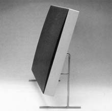
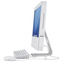
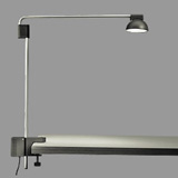
Could the lines of this speaker Dieter Rams designed in 1960 (left) have influenced the iMac?
Rams was a key figure in German design and worked as head of Braun’s design staff in the 60s. His clean and simple style has been cited as an influence by many designers, including Apple’s Jonathan Ive.
In this Icon magazine profile or Rams, he discusses how design has to be a priority that comes from the top.
At Braun they were always willing to take a risk - nobody could tell you if a product would become successful. We as designers cannot work in a vacuum. The entrepreneur has to want it; the people at the top of the company have to want it…What’s missing today is that these kind of entrepreneurs are no longer there. Today there is only Apple and to a lesser extent Sony, but not to the same degree as was the case with Olivetti and Braun, or Peter Behrens at AEG, or Herman Miller and Charles Eames, Florence Knoll with Saarinen and so on. These kinds of connections are missing today.
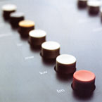
He also talks about the importance of eliminating the unnecessary:
As designers we have a great responsibility. I believe designers should eliminate the unnecessary. That means eliminating everything that is modish because this kind of thing is only short-lived.

Design Museum’s profile of Rams includes his ten principles that define “good design”:
Good design is innovative.
Good design makes a product useful.
Good design is aesthetic.
Good design helps us to understand a product.
Good design is unobtrusive.
Good design is honest.
Good design is durable.
Good design is consequent to the last detail.
Good design is concerned with the environment.
Good design is as little design as possible.
Back to purity, back to simplicity.
14 comments so far (Jump to latest)
woejilli 21 Sep 06
That good design mantra is now my desktop wallpaper. Such a solid framework for design.
Lau Taarnskov 21 Sep 06
I’ve heard the CEO of Fritz Hansen (http://fritzhansen.com/), a Danish furniture company, talk about how they work with the designers to go from the designers drawing board to the final product. The producer will suggest changes and a lot of aspects have to be considered to get a physical product that is ready for the market. As far as I remember, the point was that the designer/architecht doesn’t just make a drawing and then the producer (Fritz Hansen) “just” makes a production ready 3D version, which is ready for the market.
So the final physical product, for instance the “7 chair” is not a product of just Arne Jacobsen, but a collaboration between him and Fritz Hansen.
I was reminded of that, when reading the article mentioned here a few days ago, about how mr. Ive worked with details of the actual production.
brad 21 Sep 06
I think the similarities between the Dieter Rams speaker and the Apple iMac are an example of what biologists call “convergent evolution” or “evolutionary relay” (the latter defined as “independent species acquiring similar characteristics as a result of their evolution in similar ecosystems, but not at the same time”).
Faced with similar constraints and aesthetic goals, two designers working independently and at different times could easily come up with a nearly identical solution.
With the iMac, of course, the evolution toward a display that includes the computer was pretty much inevitable, since the original CRT iMac did that…the current design is just the same concept applied to a flat panel display.
Dave Rau 21 Sep 06
It’s interesting to consider the timelessness of good design in the context of computer hardware; timelessness and technology don’t exactly mix. Does the original iMac seem timeless? It’s hard for me to separate the design from the antiquated technology. Surely the design is still great, but does anyone else feel it’s lost something purely due to the technology inside?
Does anyone have examples of good industrial design that transcends the antiquated technology it houses?
Chris 21 Sep 06
I think the ten principles that define �good design� is a great list.
qwerty 21 Sep 06
Bauhaus and Rams advocated “form follows function”. While many people here see beauty in simplicity it seems that not all people agree. Historically, modernist design was heavily criticized for being too blant and overly functionalistic. Post-Modernism emerged and the new slogan was “form follows fun”. Witness the (horrible) Memphis phase in industrial design and the proliferation of post-modern architecture. How could that happen when simplicity is the ultimate design? Or is it just a fashion?
Risotto 21 Sep 06
The list is a nice compilation about some really important principles. But in my oppinion it fails to stress the importance, that design should be intuitive! Yes, of course the principles say that design should make us understand a product, but does this make the product usefull? A product has a great desing if nobody needs to ask about how to handle it. For instance, whenever you see a doorhandle on a car’s door you simply “know” how to open the door. That’s because the desing is usually very “intuitive” on car’s doorhandles.
Justin French 21 Sep 06
I’m really enjoying these articles guys, keep up the great work
Jack Yan 22 Sep 06
To Dave Rau above: Raymond Loewy�s Studebaker Avanti might qualify.
Jack Yan 22 Sep 06
To Dave Rau above: Raymond Loewy�s Studebaker Avanti might qualify.
Breanne Johnson 25 Sep 06
I agree with you all on what a good design should be, I prefer simple yet elegant design’s in my house and office as well. I’ve found a perfect example to demonstrate all the 10 qualities of a good design…the Reuge Music Boxes. Have a look for yourself and let me know what you think…
http://www.reuge.com/index.php?cPath=44_23&option=com_oscommerce&osMod=index&osCsid=76563fe87da110ad4328a51df64d58a
Philip Beesley 28 Sep 06
My nagging doubt, directed to Rams and Ives but especially to their influence on students, is that their work is reductive. In wise hands, that distillation can effectively integrate complex qualities and ‘solve’ them, rendering an agile, versatile, simple product. In inexperienced hands, the imperative to reduce can have a pernicious effect of dodging complex problems, because they are too messy to fit into the simple forms that might seem required to qualify. Do you think that Platonism is a viable design ethic answering today’s situations? I don’t- at least, not as a total approach. I think, ironically, that the pure products produced by Rams and Ives in fact ‘read’, ‘act’ effectively because they depend on organic, turbulent activity all around them to complete equations of desire, function, flexibility. In other words, they could be seen to be irresponsible.
KH 05 Oct 06
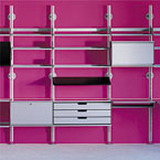
Note to Breanne Johnson: this article is entitled “Less, but better”; your music boxes (and the singing birds), seem to have missed the point. If anyone is interested by the furniture on the pink wall, it is the 606 Universal Shelving System that was designed by Dieter Rams for Vits� in 1960. Discover timeless design at www.vitsoe.com, without singing birds.