Double cover & Approval Matrix at New York Magazine 31 Aug 2006
11 comments Latest by Grant Hutchins
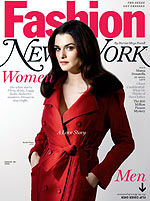
 New York magazine did something clever with its recent fashion issue. It has two covers. One side says “Women” and features actress Rachel Weisz. When you flip it over, there is a second cover on the back: “Men” with actor-director Justin Theroux. You can read the magazine either way (stories appropriate to each gender are located on each side) and the two cover models “meet” in the middle of the magazine for a joint photo shoot. Makes sense from a biz standpoint too since front of book advertising is the most coveted space for advertisers. Two “fronts” probably means increased ad revenue.
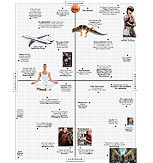
 And in case you’ve never seen it, the magazine’s regular Approval Matrix feature is worth a look. What’s hot/not lists are most definitely not hot but the interesting presentation of the Approval Matrix (X/Y axis charts an item’s highbrow/lowbrow/despicable/brilliant-ness) separates it from the pack.
11 comments so far (Jump to latest)
J 31 Aug 06
Complex magazine is designed this way monthly. Music/Entertainment on one cover and Fashion stuff on the other…though they don’t necessarily meet up in the middle with a common feature.
And one of the lad mags, Im thinking maybe Stuff does a monthly hot/not matrix exactly like that… I wonder who came first.
Brendan 31 Aug 06
Someone gave me a french magazine last year which did the same; there was a woman cover and man cover on each side. At the middle of the magazine where the woman side and man side meet, there was a flipped “creation of adam” type image with a man and woman touching fingers.
Scott Smith 31 Aug 06
Hey, my friend is the writer that sent his book to Le Guin and later discovered it up for auction. I like that the magazine editors completely missed the irony in his post. There are a couple of posts on his blog (http://americasreportcard.blogspot.com/) about this whole deal, which is pretty funny.
I like the matrix look rather than an excel looking table. Now, can they spot irony and do a pivot table…
Scott 31 Aug 06
The other week, EW did a clever cover variation. The main cover was on the new James Bond, and behind it were covers for all the other past Bonds, as if they were published at the time they were new.
David 31 Aug 06
The New York Times did a flip-over of its Metro and Sports sections in 2001-02 when it was devoting a full printed section to 9/11 coverage. It’s certainly not a new concept—I recall seeing it in other magazines in the 1990s.
The Approval Matrix, on the other hand, is a terrific grid, and a weekly must-read for me.
Greg 31 Aug 06
I like the approval matrix because it has “New Planets!” on it (top center). I like seeing publishers caught out on bad predictions and long lead times.
Kris Tuttle 02 Sep 06
Going beyond 2… I have found that you can do even better by using a different color ink and printing perpendicular to the other text. You get one story from each direction and two more by turning the paper 90 degrees and focusing on the other color. You’d be surprised how well this works.
Grant Hutchins 04 Sep 06
I saw a Stuff Magazine in London that did the same thing, but with blondes vs. brunettes. I think this qualifies as the least high-brow usage of the form.
Grant Hutchins 04 Sep 06
I saw a Stuff Magazine in London that did the same thing, but with blondes vs. brunettes. I think this qualifies as the least high-brow usage of the form.