Gamma Flickr 22 May 2006
17 comments Latest by George
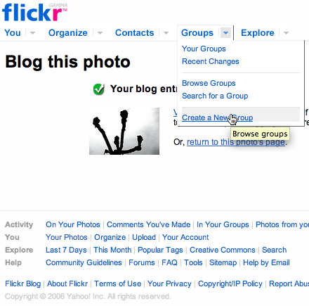
Last week Flickr went, er, Gamma. There’s a new nav scheme and some other changes too. The new Organize area (described here) is a lot snappier than the previous one. But how about we just call it, say, Flickr? Less Greek!

17 comments so far (Jump to latest)
:P 22 May 06
Gamma got run over by a reindeer.
Joshua Blankenship 22 May 06
I LOVE LOVE LOVE the new navigation… everything’s easier to get to (finally) while still being quite simple.
I’m still shocked that they launched such a javascript-heavy redesign… bold move for a site with a huge user-base. (Not that I’m complaining… I dig all of the new functionality.)
Dave Simon 22 May 06
I’ve really been enjoying the Gamma Flickr. Except that the new Organizr doesn’t work in Safari (yet.)
Rabbit 22 May 06
Flickr was always JavaScript heavy.
Eric 22 May 06
Why aren’t they using the Yahoo Javascript API?
Bryan C 22 May 06
I like it a lot. There are a few weird omissions, like having to go through two screens to do a search of your own tags, and removing clusters from the main search results. Both of those may be related to teething problems with their improved full-text search function, though, so I’m hoping they’ll be back soon.
AJ 22 May 06
@Dave Simon: The Organizr works fine for me in Safari, as far as I can tell.
dave rau 22 May 06
Yah it’s great, but what’s up with “beta/gamma”? Nobody cares! And including that is kinda nerdy eh?
Wyatt 22 May 06
What is your problem with Flickr, Matt? Maybe you should be taking advice from them, not the other way around, considering the makers of Flickr have made much more money then you ever will.
Marzec 23 May 06
It’s ok but I can’t find the ‘HTML badge’ link… Where did it go ? ;-(
Jon 23 May 06
LOL. Love that troll hat Matt. ;-)
Tony 23 May 06
I think it is really cool that flickr improves their UI, but I honestly hate the 2 column (first page) / 3 column (second page) photostream setup.
Before it was possible to upload photos in pairs, so they looked good on the first page of the photostream (1 column) and all the following pages (2 columns). Now you would need to uploaded in sixes, to get a “unified” look. If you don’t know what I’m talking about, look at a couple of photostreams.
Jo�o Craveiro 23 May 06
Something as simple as the top pull-down menus don’t work on Opera (and I’m not talking to least outdated version, I’m talking of a Beta of Opera 9) —- I’ll let the “Your browser is not supported, bear with an older version” bit of Organizr out.
Here’s a good reason why it shouldn’t, yet, be Flickr Omega. ;)
Kim Siever 23 May 06
I love the new Flickr. The one thing I wish they would implement is the ability to add to groups through the organiser; especially bulk additions.
Patrick Crowley 23 May 06
‘Gamma’ is a marketing failure.
It’s not a particular clever joke, even if you’re nerdy enough to know what it means.
And, if you’re unclear about the meaning, it’s confusing and/or off-putting.
Bryce 23 May 06
Guys, the ‘Gamma’ is a joke. A wee small, prankish opportunity to giggle. if it doesn’t make you laugh, then the world is still a better place because someone at Flickr cared enough to try to make you nattering nabobs of negativity crawl out of your half-empty cups long enough to smile.
Lighten up.
George 23 May 06
Flickr does so many things well. It has a simple interface that allows the average web user to do complex things easily. It is a community site that gets better with usage. It has a well thought out architecture that will facilitate future growth. And for $25 it is cheaper than an external hard drive.
I would be interest to see how accessible the site is with all that javascript too.
The Gamma release has I fear more of the influence of Yahoo creeping in. I bet they didn’t hear ‘Cross-selling’, ‘Brand Consistency’ and ‘Revenue per customer’ before the takeover.