Jitterbug and the Cellphone Simplicity Derby 28 Sep 2006
31 comments Latest by David
“The movement for simpler electronics is still alive and well; after all, life is complex enough already,” according to David Pogue’s Simplicity Derby for cellphones.
Software Simplicity Score
To judge each phone’s UI, he created a Software Simplicity Score which counts the number of taps needed to 1) turn off the ringer 2) open the phone book 3) open the recent calls list and 4) see your own phone number.
(Is this is the best way to test a phone’s simplicity and/or usability? As Steve Krug explains, it’s not necessarily the number of clicks that matters, it’s how much thought each click requires that matters. Still, it’s nice to have some metric for comparing relative simplicity.)
The winner of the tap test was the LG Electronics VX3400 (Verizon). Ringer off: 1 step. Phone book: 1. Recent Calls: 1. See your own number: 4. Speakerphone: 1. The Motorola C139 (Cingular), on the other hand, requires 7 (!) steps to turn off the ringer.
Interesting phone features
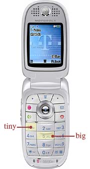 Other noteworthy items: The Motorola V195 (T-Mobile, pictured at right) has a neat button layout…if you only dial numbers with 2s, 5s, and 8s — those keys are almost twice as big as the other keys. Wtf? On the bright side for T-Mobilers, Pogue points out the coverage maps at the company’s site shows the reception at individual street addresses, not just vague blobs of the country like you get at competitor sites.
The Samsung A420 (Sprint) turns on with a quick tap, instead of a long press, of the Power button. (Pogue asks: “What’s the point of the press-and-hold requirement on a flip phone, anyway? It can’t get turned on accidentally in your pocket.”)
The Jitterbug
Most interesting though is the Jitterbug phone (pictured below), available from greatcall.com. It’s billed as “a totally new cellphone experience.” (I refuse to include the exclamation point. I’m opposed to exclamation point inflation.) “Jitterbug is designed to be the best telephone a cell phone can be. Nothing more. Nothing less.”
Interesting backstory at the company too: Its first product was an SOS phone for seniors. It was an oversized, three-button phone powered by a AAA battery that could connect a customer with 911, a towing service, or an SOS operator who would place calls for customers. “We gained 25,000 wonderful and loyal customers and we learned a lot about what they liked and didn’t like about wireless service,” says Arlene Harris, now CEO of GreatCall. (Btw, don’t miss this adorable photo of the company founders. Wilford Brimley has gotta be just off camera cooking up some soup.)
The Jitterbug is also made for an older crowd. Or, as they put it, “the ever-growing baby boomer/mature market, those who want a simplified cellphone experience.” Old people aren’t the only ones who want a simple phone but, hey, gotta start somewhere.
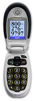 What’s different about it? It’s big — “so big that when you’re on a call, the earpiece and mouthpiece are right next to the proper orifices of your head.”
The phone also has huge illuminated buttons, gigantic type on the screen, a dedicated on/off key, Yes/No buttons, the number printed on a sticker underneath the screen, and, when you open it, you hear — get this — a dial tone. Remember those?
As for the UI, there’s no branching menu system. When you open the phone, the screen says: “Voice Dial?” If you press the Yes key, you can say “Call Jeff” to place the call. If you press No, you can scroll through the phone book and hit Yes to dial.
The phone does not have a calculator, games, text messaging, Internet, headset jack, speakerphone, on-screen status icons, or a carrier logo.
Obviously this phone is not for everyone (no text messaging ain’t gonna fly for most people I know and a headset jack is something I could never live without). But kudos to Jitterbug for going in a different, less direction. I’m sure there is a huge market of people who are dying — er, maybe that’s not the best way to put it — people who are excited for a phone that lets them make calls easily and then gets out of the way.
31 comments so far (Jump to latest)
alex 28 Sep 06
cellphones and cars (previous post)? what are you guys, gizmodo now? ;)
Anonymous Coward 28 Sep 06
…no, but it’s a good place to start. You’re certainly correct, but I’d like to think the limited UI of a phone, and the general “state of cell phone feature naming conventions” (which is not great, but not completely ambiguous) will allow us to focus on the “activity centered” nature of usabilty testing which is what is most lacking in phones these days.
My biggest complaint with most cell phones is that the UIs don’t support the activities I want to perform. You have to shortcuts and custom menus to get anything near a UI that allows you quick access to the activities you want to perform. I think since Prague grabbed a couple of common activities and counted the clicks, that’s more than acceptable. Once I settle into daily use of my phone and the names and thoughts are gone, all that’s that left for me is the number of clicks it takes me to send an SMS message.
Eric Allam 28 Sep 06
I’m curious. Which cell phones does the 37signals crew have? Which service do you use? In just a quick comparison of different carriers websites T-mobile seems the simplest. Any opinions?
Shaun Gummere 28 Sep 06
The Jitterbug phone’s design origins remind me of OXO’s Good Grips, which (if memory serves) was designed for people with disabilities, who otherwise would have trouble holding tools like a knife or peeler. Designed for people who *needed* these tools to be easy, many of us have found that that kind of ease-of-use is something we *want*, and OXO has been extremely successful in the general marketplace.
I’m intrigued by the Jitterbug phone because, although I am not part of its target audience, the stringent design requirements placed on it by the older audience it was designed for, means it has to perform its core functions simply and easily. This is definitely something I seek in the tools I use, and I wonder, if like OXO, this has appeal beyond the older audience its currently aimed at.
Jason Santa Maria 28 Sep 06
I would be curious if the Motorola phone designer considers the outer right and left edges as part of the outer buttons. Bascially, any area around the button that isn’t another button, gets assumed by the closest button. Though, it’s not actually press-able, when going for the 6, you can hit and press the outer area and 6 button at the same time to make it happen (given the average size of a thumb to a button). Could be.
Eamon 28 Sep 06
Heh. I love the tap test:
Ringer off: 0 taps (dedicated slider).
Phone book: 1 tap.
Recent Calls: 1 tap.
See your own number: 2 taps.
Speakerphone: 1 tap.
OMG! Treo 600 FTW!!~!
Gayle 28 Sep 06
That Jitterbug phone makes me want to actually buy a cellphone. Awesome.
Andy Kant 28 Sep 06
Luckily for Moto V195 users, my phone number is composed solely of 2s, 5s, and 8s (not counting the area code).
Rick Turoczy 28 Sep 06
I still think that the Firefly Mobile phone (designed for young kids) is a great example of phone simplicity. I’m willing to bet I could survive with that thing and ditch my current phone.
Alberto 28 Sep 06
The SonyEricsson V600i:
Ringer off: 1 press (hold the #-key)
Phone book: 1 press (move joystick down)
Recent Calls: 1 press
Own Number: 1 press
Speakerphone: 1 press right after you dial a number or when you are in a call
And I think this is pretty much standard for all current SonyEricsson phones and has been for a while now.
Phil 28 Sep 06
I would love to see a really simple phone. I’m not a power cell phone user, i just make phone calls. I’d like something very small, very clear, that has few touches to make a call and silence. No games, no internet, no camera.
Thijs van der Vossen 28 Sep 06
I’ll probably get flamed to death for saying this here, but I really like my new Nokia N73. Somehow they managed to make the 3rd edition of Series 60 — dare I say it? — simple and really easy to use.
Nick 28 Sep 06
OFFTOPIC
While reading this post, I needed to doublecheck if the feed was of Peter Saint-Andre and not SvN.
http://www.saint-andre.com/blog/2006-09.html#2006-09-26T13:41
Looks like Linus Torvalds has gotten real long time ago. :)
Glen Barnes 28 Sep 06
The Vodafone Simply treads a nice line between features and simplicity. My mum is on to her third phone and this is the only one she has actually been able to use - It passed the ‘Mom Test(tm)’.
It has 3 main features:
- Voice Calls
- SMS/TXT Messaging (yes it is important in NZ for older people as well)
- Voicemail
The screen is well laid out and even has your own number on the screen at all times.
Vodafone Simply
beto 28 Sep 06
The Jitterbug looks like a phone my mother would actually use. Bought her a “basic” Motorola a while ago just to discover it is useless to teach people of her age to do the SMS thing, let alone the rest of “features” (more like “useless distractions”) everyone under 40 seems to take for granted on a cell phone nowadays.
Any words on Motorola’s forthcoming Motofone? It shares the “less is more” principle as the Jitterbug but in a definitely much more fashionable and less fugly enclosure.
Richard D. Bartlett 28 Sep 06
My Nokia N70 has three customisable buttons and five customisable icons so could theoretically ace any ‘tap-test’.
Within one tap:
Phone book, call log, SMS, email inbox, camera, and calendar.
…and nearly every other feature is available within three.
The irony is that this advanced simplicity is only really available to those with the techie mindset that would actually go to the trouble of customising their UI in the first place.
Anonymous Coward 28 Sep 06
@37signals
Any idea when you will be riding on your own blog engine?
https://37signals.com/svn/archives2/and_then_there_were_8.php?41#comments
Jay 28 Sep 06
Why is the number of taps needed to see your own phone number relevant? Am I missing something?
Andrew Dupont 28 Sep 06
The allure fewer button-presses leads me to prefer clamshell phones over candybar phones, since I know I spend at least 30% of all my keypresses trying to turn my damned keyguard off.
I wonder how these usability scores would change if keyguard were taken into account.
ML 28 Sep 06
Follow up blog post from David Pogue on the Simplicity Derby.
Thijs van der Vossen 29 Sep 06
Hm. The designers were probably stark, raving mad to begin with.
elv 29 Sep 06
The Motorola V195 has a neat button layout�if you only dial numbers with 2s, 5s, and 8s � those keys are almost twice as big as the other keys. Wtf?
This is a great feature : sometimes the center keys are so small you often hit another one also. So why keep tiny keys on left and right ? Because it doesn’t matter if you press on the phone’s body.
I guess that’s why the numbers are printed near the border of the left and right keys : press on the numbers, not on the center of the keys.
Jeff 29 Sep 06
“The Motorola V195 (T-Mobile, pictured at right) has a neat button layout�if you only dial numbers with 2s, 5s, and 8s � those keys are almost twice as big as the other keys. Wtf?”
I don’t see this as an inherent problem to have differently sized buttons. Certainly makes them easier to tell apart without looking I bet. As long as they are big enough to press.
The best example of this is the Nintendo GameCube controller (http://media.arstechnica.com/staff/fatbits.media/gc-controller.jpg). No mystery about which is the primary button on that guy. Plus two of the secondary buttons (X and Y) are have unique shapes corresponding to their locations relative to the primary button (A).
In real usage, this allows on screen indicators of which buttons to press to be read by the shape alone, as opposed to an on screen indicator for Xbox or Playstation which would show a circle with either a blue b or green triangle or something. Only works if you already memorized where those buttons are relative to the other identical three right next to them.
Thyb 29 Sep 06
Hello,
This company is doing phone WITHOUT screen:
http://www.owasys.com/
I’m not sure if it works but a phone without screen, that might be the future for a truly a usable UI: as soon as you add a screen, you’re mostly adding unecessarry complexity: a navigation and its related path.
And it worth to note that’s for every consumer products (VCRs, HiFi systems, oven, fridge, etc…), not many companies succeeded to add a screen to their product and make them simpler to use.
Beside I agree with elv about the size of the keys on the V195: the key near the border are virtually infinte (like the menu bar on a mac). You cannot miss them.
The ones in the center has to be bigger.
I don’t really see anything wrong here (though I don’t like Motorola UIs but that’s nother story).
However the buttons on the side on many phones tend to be wrong because you mostly press them when you don’t want to. There is too many functions attached to them too (take a picture, say a command, choose a ring, etc.). I don’t think even the volume side buttons are necessary.
Have a good day.
Darrel 29 Sep 06
“I wonder, if like OXO, this has appeal beyond the older audience its currently aimed at.”
I’d say “yes. Absolutely!”
OXO is a great comparison. It’s also a great example of what accessible/usable design truly is. All too often it’s thought of as way to appeal to a niche target demographic that needs some ‘extra help’. Usually, they then realize that “hey, EVERYONE likes having an easier to use, more accessible product”. Surprise, surprise! ;o)
(Off topic, but what’s with the huge rash of double-posts on here lately?)
So, I bet a lot of folks not falling into the ‘older’ demographic are going to like having a cell phone that (*gasp*) excels at being a phone and nothing more. I know the Jitterbug will be at the top of my list of purchase options when the time comes for an ‘upgrade’.
The simple ‘yes/no’ buttons are (sadly) a stroke of genious. Every time I use my cell phone or borrow someone elses or use my digi-camera I’m stumped whenever I need to confirm or deny a command…rarely—if ever—are there actual dedicated y/n buttons. Instead I need to figure out which keys have been mapped for this either via cryptic and miniscule icons on the keys or some sort of disjointed labeling of the keys up on the LCD panel.
Justin Reese 29 Sep 06
I’m not surprised an LG won. I’m a very Luddite cell phone user, and so have always chosen one of the freebies that came with my plan. I recently chose a Nokia 6800, and took it back within days for its poor body quality, and traded it for an LG flip (1500, I think). I was incredibly impressed with the interface and usability; it wasn’t noticeably simpler at first glance, but everything felt organic. More recently, I added a line to my plan and chose another LG over the Motorola SLVR L2. As tempting as Bluetooth and iSync hacks were, the convenience of the tiny, sleek, elegant flip were too much for me.
I recommend LG exclusively to friends now. Motorola gets all the talk for their style, but considering I’ll spend far more time using my phone than showing it off, I’ll take usability any day.
Elaine 29 Sep 06
“menu commands are numbered” — my old sony-ericsson had that feature. sometimes (rarely) I miss that thing.
my husband has the V195, and I don’t know that either of us ever noticed the difference in button sizes. he seems to like it reasonably well, and he’s pretty picky about tech and wanted something simple.
me? I have the MDA, which is loaded down with every damn thing, but that’s what I wanted. although…I will say that it’s pretty easy to use. (1/1/2/2 on Pogue’s test)
the Jitterbug reminds me of every (landline) phone my mother’s bought for the last 20 years. she always gets the one with the biggest possible numbers, once she got reading glasses. we tease her about it sometimes, but she’s very loyal to that style for a good reason. I should send her a link.
David 01 Oct 06
Informative and humourous post. Thanks!