Many iPods, one design 07 Apr 2006
29 comments Latest by ron

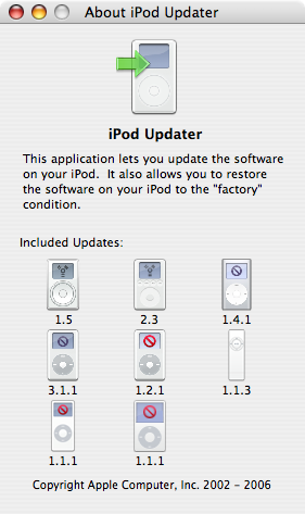
4 years, 8 models/variations, same design language (and even a trend back towards simplicity after the early 4 round-button version). Quite an accomplishment.

4 years, 8 models/variations, same design language (and even a trend back towards simplicity after the early 4 round-button version). Quite an accomplishment.
29 comments so far (Jump to latest)
Jeff Croft 07 Apr 06
It is pretty impressive, no doubt. I think when something lasts for years without a major design revision in the tech world, you can pat yourselves on the back for a damn good design.
freecia 07 Apr 06
Yes, but ask me if I like to download that huge comprehensive update and uninstalling the behemoth after I’ve updated my ipod shuffle.
Luckily, I don’t need to update very often, which is good design.
Adam 07 Apr 06
I like how the switch to color is shown by displaying the red “Do Not Disconnect” sign.
ron 08 Apr 06
i love how you PC people are like kids in a candy store….
i am willing to bet that nobody from 37signals was using a Macintosh a few years ago…welcome to our planet:)
JF 08 Apr 06
i am willing to bet that nobody from 37signals was using a Macintosh a few years ago
I’ve been using a Mac since 1995. I’ll let the others speak for themselves.
RS 08 Apr 06
I switched to Mac in the beginning of 2000.
John C 08 Apr 06
Macintosh is a state of mind. Most people have always used Macs, they just never knew. Every time a person has thought, said or screamed, “There’s got to be a better way to do this on a computer,” they were letting out their inner Mac-user.
:-)
Simplicity in functionality, power in leverage.
Vinny 08 Apr 06
Eight different designs and almost no way to tell them apart because Apple is to cool for model numbers. Again, hype and misplaced design takes a back seat to functionality. Don’t even get me started on a round control surface being used to control up/down motion on the menu.
Sneering fanboy hype. I stopped using their crap in 1998.
Stellar 08 Apr 06
Vinny, you left the mac when they sucked the most. Bad timing, my man.
Randal "sw0rdfish Santia 08 Apr 06
i love how you PC people are like kids in a candy store�.
i am willing to bet that nobody from 37signals was using a Macintosh a few years ago�welcome to our planet:)
I love how you MAC people are so snooty and self-pretensious. It’s a computer!! Ever heard of using the best tools for the job? When a Mac helps me do my job better, I’ll switch.
Same goes for hte everyday business user. Why spend millions to switch a corporate environment over to Mac? It makes no sense… and I’ll even argue that until they went Intel, Mac hasn’t been able to hold a flame to a PC outside of the Multi-media and design world.
Dan Boland 08 Apr 06
Eight different designs and almost no way to tell them apart because Apple is to cool for model numbers. Again, hype and misplaced design takes a back seat to functionality. Don�t even get me started on a round control surface being used to control up/down motion on the menu.
And the Asshat Award goes to…
Yeah, I guess “misplaced design” is why the iPod is far and away the #1 digital music player on the market and has become a global icon. And yes, there’s “almost no way to tell them apart,” too. Because it isn’t obvious to anyone right away when someone has an older model iPod. Sheesh.
DHH 08 Apr 06
I switched to the Mac in 2002. I had no interest in the pre-OS X machines.
Ryon 08 Apr 06
Impressive, no doubt, but I hate that 5G icon with its disproportionate scroll wheel (why did they do that?), and I have to stare at it on my desktop whenever my iPod is plugged in. Grr.
George 09 Apr 06
Don�t even get me started on a round control surface being used to control up/down motion on the menu.
I’d much rather be going round and round when scrolling through hundreds and hundreds of items in a list. And given its sales numbers (including repeat customers), I think there’s a lot of hard factual evidence there for it being perfectly intuitive.
I hate that 5G icon with its disproportionate scroll wheel (why did they do that?)
I always assumed it was done to make the screen look sub-consciously bigger. It took side by side pictures to persuade me the 5G was the same size as previous models after its announcement, because my instinct was to use the wheel as a scale reference.
RS 09 Apr 06
I’ve found the smaller scroll wheel is easier to because you can move your thumb around it faster. It’s easier to draw a small circle than a large one.
Wesley Walser 09 Apr 06
It is nice that the updater is a single piece of software for every version. However iTunes is starting to bother me with no auto updater. They pop off new versions like there freakin iPods or something.
Autoupdation we need you!
Don Schenck 09 Apr 06
Mac 512 back in 1989, so there.
Greg 10 Apr 06
It’s nice that they’re so similar, and I love that interface with the drawn iPods, but my take on this is that I only own one iPod, so why is Apple forcing me to download 8 updates?
John Topley 10 Apr 06
I’d imagine it’s because it’s easier for them because they don’t have to build the infrastructure to support separate updates for the myriad iPod variants and it’s also easier for the end user because they don’t have to figure out which update to download.
Kyle Posey 10 Apr 06
Who let the haters out?
Randal “sw0rdfish Santia: When a Mac helps me do my job better, I�ll switch.
That was the reason I switched, and that is the reason I encourage non-Mac users to give Mac’s a chance…some people switch, some people don’t. And I agree with the reasons by those who don’t switch…it just wasn’t right for them.
Randal “sw0rdfish Santia: Why spend millions to switch a corporate environment over to Mac?
The same reason you would spend millions to switch a corporate environment to any other platform… If another platform (whether it be windows, mac, linux, etc) can get the job done better, faster, more efficiently, or whatever, and it can either save the company money or help the company make more money, then they should switch.
Vinny: …a round control surface being used to control up/down motion…
This convention has been used for many many years in the volume control industry. I’d say that it is quite usable and very familiar.
Dan Boland: I guess �misplaced design� is why the iPod is far and away the #1 digital music player on the market and has become a global icon.
Design effectiveness, product usability, and quality features have no direct correlation to market share. I don’t consider Windows to have an effective design of anything, and yet they are the #1 operating system on the market.
Sebhelyesfarku 10 Apr 06
Hmm, 4 years, too bad it can’t still play tracks gaplessly and has crap preset “EQ”. A “music player”…
Kyle Posey 10 Apr 06
Dan, I liked the article, but wasn’t it more about the success of the iPod going beyond any single aspect of it, whether it be design, price, hardware, or features? Hence, the iPod being a juggernaut because no one can compete with them on all of those aspects.
Sunder Iyer 10 Apr 06
This comment is not related to the post. But does anybody else get the feeling that this website (www.chalksite.com) looks and feels exactly like a basecamp template? Even the screenshots look very similar.
Dan Boland 10 Apr 06
Kyle Posey: Let me repeat myself — iPod competitors have not and cannot compete in part because there�s no way for them to out-design the iPod.
Dan Boland 10 Apr 06
Oh my God… Chalksite sure as hell looks like a direct ripoff of Basecamp… I haven’t used it yet, but Sunder is right, you guys might want to check it out.
ron 12 Apr 06
not bad…but you all came from a PC backround. a mac user is one that used, use and will allways use a mac elusively.