On a grand scale: information design and science 29 Aug 2006
24 comments Latest by Sarah Black
It’s one thing to show the scale of a phone or a camera on a web page. It’s another to take a shot at displaying the scale of a hydrogen atom.
A hydrogen atom is only about a ten millionth of a millimeter in diameter, but the proton in the middle is a hundred thousand times smaller, and the electron whizzing around the outside is a thousand times smaller than THAT. The rest of the atom is empty. I tried to picture it, and I couldn’t. So I put together this page — and I still can’t picture it.
Science presents some of the most interesting challenges for information designers. How do you help people grasp sizes, distances, and ratios that are nearly unimaginable?
Some more examples:
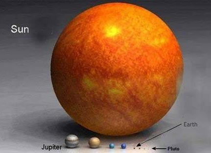
Rense.com offers up images of the relative size of planets. This one does a good job of showing the sun is really damn big:
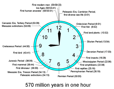
It’s About Time: Make a Timeline [registration required but the top Google link here seems to work] uses a clock metaphor to show 570 million years in one hour (man shows up just in the nick of time). Click for larger version.
The football field (or stadium) is a common metaphor here in the US…
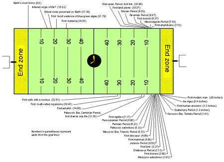
Eternity in the rocks: “If we equate the time lapsed since the Earth formed to a 100-yard football field — that is, if we place the present at our goal line and 4.556 billion years ago at our opponent’s goal line — 2.1 million years ago is only 1.5 inches from our chalk line.”
Atoms, Elements, and Isotopes: “A greatly enlarged atom might look like a marble (the nucleus) inside an empty football stadium (the electron probability cloud).”
Super-size sperm: “If you delicately unwound the whip-like flagellum of a sperm from the fruit fly Drosophila bifurca, it would stretch out 6 centimeters — 20 times as long as the fly-guy that made it. ‘To put that into perspective, if humans made sperm that long and you took a six-foot man and stood him on the goal line of a football field, his sperm would stretch out to the 40-yard line.’”
The “It’s About Time” page mentioned above also features Fields of Time, a history of time laid out like a football field. Click for larger version.
[Note: Stephen Greb, the author of the “It’s About Time” page, seems like a fun professor. He advises taking students to a real field to illustrate the scale: “The concept of the expanse of time between events can sometimes be better shown on a football field, just because it is so much larger than a length of paper. Of course, its also more fun to be outside than in the classroom. Rather than drawing objects or moments of time on a piece of paper, the students can be active members of the time lines themselves.”]


24 comments so far (Jump to latest)
Jamie Stephens 29 Aug 06
Although not science related, the timeline reminded me of John Miles Foley’s history of media imposed on a calendar year (where Jan. 1 is homo sapiens arrival on earth and December 31 is today):
Melisa Dettbarn 29 Aug 06
WOW! How awesome. I am actually an Earth Science teacher and my husband does his work in information architecture and usability so I hear a lot about this stuff at home. THANK YOU for posting on what science teachers consistently stuggle with themselves not being expert information designers. In fact, I have been working on considering and figuring out ways teachers can visually show information to students for more holistic and deep understandings of concepts that even academics have a hard time grasping. I have been using the idea of a virtual field trip with local pictures of earth science processes (google earth and images are both emmense resources) and student concept mapping (Inspiration Software). The software programs Starry Nights and ArcExplorer are also wonderful new innovations on this front.
I completely agree that real learning takes place when what is to be learned is placed in a novel or relevant context- hence getting outside. I have also used similar models of the planets and solar system as well as the geologic timeline model using the calendar year, but will definitely use the graphics you have included here.
THANKS!
Gayle 29 Aug 06
The comparisons to football fields are always lost on me because I’ve never seen a football field or watched a game, so I have no concept of how big it actually is. The rest are kind of neat, though :)
Chris Mear 29 Aug 06
I always liked this analogy for the relative sizes of human and geological timescales:
Hold your arm out to the side, and imagine that the distance from your nose to your fingertips represents the age of the earth. If you get a nail file and take one swipe across the tip of your farthest nail, then you’ve just scraped off the entirety of human history.
jenn.suz.hoy 29 Aug 06
I enjoy the clock as a timeline. It’s actually a metaphor I have some experience with, as an assignment in an information design class was just that. My clock based around the evolution of animation - something I felt lent itself very well to a clock metaphor!
Drew Bell 29 Aug 06
That clock timeline shows again how ill-equipped my brain is to handle these scales. I’ve seen variations on that timeline my whole life; we made one in grade school, and again in high school. But my first thought upon seeing it here was, “man, that was cooler in back first grade when humankind’s line was REALLY tiny.”
My dumb head can’t understand that the intervening twenty-odd years haven’t changed the measurement AT ALL. Consciousness doesn’t scale well.
Anonymous Coward 29 Aug 06
http://www.tenthdimension.com
great explanation of string theory’s 10 dimensions (found via infosthetics.com)
Daniel 29 Aug 06
I always thought these two analogies concerning the thickness of Earth’s atmosphere were quite striking:
The atmosphere’s thickness relative to Earth’s size is about the same as 1) a coat of varnish on a globe relative to the globe itself, or 2) the outer-most skin on an onion relative to the onion itself.
To be fair, I don’t know if it’s the whole atmosphere or just the troposphere where we live, but still…
sham 29 Aug 06
Scale is so important. Anything that can help people understand that a million is not a billion is not a trillion is good. Many people that are not interested in science or engineering clump all those big numbers into “infinity” and even then they don’t really understand what that means.
Chris 29 Aug 06
Wow. Did you guys skip third grade? Those pics of the sun, timelines, are nothing new… I remember those from 30 years ago, and my kids remember those from a few years ago.
James 30 Aug 06
Good on you, Chris. You’re better than everyone for seeing it first. If you have nothing to contribute, don’t.
Joe Ruby 30 Aug 06
That stuff is cool. Back when I was doing AutoCAD work, I modeled the solar system (using not much more than basic spheres and circles for orbits) and some nearby stars and some not-so-nearby stars. Pretty discouraging to see just how far away they are considering our current maximum velocities. And that doesn’t even consider the great many other stars in our galaxy, or the great many other galaxies much much farther away.
Deepak Shenoy 30 Aug 06
Bill Bryson’s “A Short History of Nearly everything” makes some awesome comparisons. A quote on the distance between planets:
“…none of the maps you have ever seen of the solar system were remotely drawn to scale. Most schoolroom charts show the planets coming one after the other at neighborly intervals�the outer giants actually cast shadows over each other in many illustrations�but this is a necessary deceit to get them all on the same piece of paper. Neptune in reality isn�t just a little bit beyond Jupiter, it�s way beyond Jupiter�five times farther from Jupiter than Jupiter is from us, so far out that it receives only 3 percent as much sunlight as Jupiter.
Such are the distances, in fact, that it isn�t possible, in any practical terms, to draw the solar system to scale. Even if you added lots of fold-out pages to your textbooks or used a really long sheet of poster paper, you wouldn�t come close. On a diagram of the solar system to scale, with Earth reduced to about the diameter of a pea, Jupiter would be over a thousand feet away and Pluto would be a mile and a half distant (and about the size of a bacterium, so you wouldn�t be able to see it anyway). On the same scale, Proxima Centauri, our nearest star, would be almost ten thousand miles away. Even if you shrank down everything so that Jupiter was as small as the period at the end of this sentence, and Pluto was no bigger than a molecule, Pluto would still be over thirty-five feet away.”
There’s another one I liked where he talked about the size of an atom. The width of an atom is to that of a hyphen on a typewriter, as the height of a flat piece of paper is to the Empire State Building.
Igor A 30 Aug 06
The problem with timelines is that they represent a a series of points. But history is a process, rather than a series of points in time.
For instance, the Battle of Kosovo Polje is believed to have determined the history of the Balkans for many centuries. It was heavily used in Serb propaganda during the Balkan wars in the 1990-ties.
(see: http://en.wikipedia.org/wiki/Battle_of_Kosovo)
In most timelines the 1389 Battle of Kosovo Polje is a major point in time in Balkan history.
But was 1389 really an important point in time? Did the process of history take another course. No it didn’t.
How would I know? Because out of curiousity, and based on data from the Times Atlas of World History I put together a animation, visualising the course of political influence on the Balkans from the year 0 to 2000. The animation makes it very clear that nothing really changed in 1389.
It was an interesting experiment. I don’t think anyone ever did a thing like that. After all, the technology I used has only be around for a decade or so….
I will try to extract the animation from the ancient (I produced it in 1999) Director file and put it onto Google Video.
Gatzby 01 Sep 06
There was a guy in my chemistry class in highschool who, after an hourlong explanation of the properties of atoms, subatomic particles and the relative distance between atomic nuclei and their orbiting electrons asked: “So what exactly fills the space between the atom and the electrons? Is it air?”… The teacher just sighed.
Igor A 02 Sep 06
In case anyone is interested in the Balkan video mentioned previously…
http://video.google.nl/videoplay?docid=3021376660382005074
humblefrog 14 Sep 06
On the theme of showing cameras and phones in context. This website does a really good job of contextualizing item sizes just by entering some dimensions and comparing them to everyday items of your choice… www.sizeasy.com.
Sarah Black 14 Sep 06
As a chemistry teacher, I have been looking for a better way to help students grasp how small atoms are.
I have been looking for a series of pictures I remember from a TV program that showed what would fit in a 1 meter cube, 1 km cube, etc, and a 1 mm cube, 1 micrometer cube, 1 nm cube, etc. Has anyone seen such a thing?