Pretty Propaganda: USSR in Construction 11 Jul 2006
8 comments Latest by testa
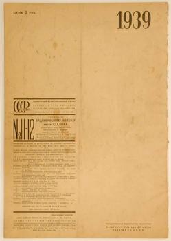
In the 1930’s, the Soviet government wanted the world to believe it was living the dream: rapid modernization, economic miracles, etc. To support this cause, it created the magazine USSR in Construction, home to some of the most innovative graphic design of the past century (see layouts at this Backpack page).
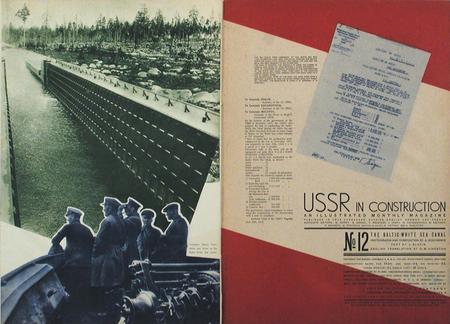
The magazine was published in Russian, English, French, German, and Spanish editions and exported to the West in order to send a message about Soviet economic success (with no mention of the unsavory truth of Stalinism: persecution, state terror, famine, etc.). Each one was devoted to a specific topic, like aviation, the army, coal mining, etc.
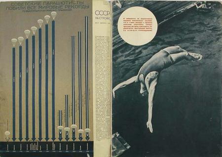
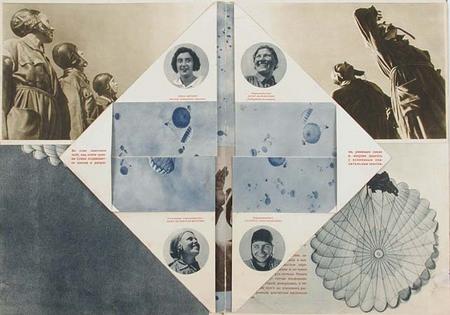
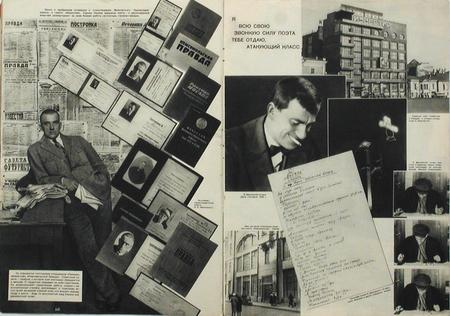
The issues became aesthetic adventures in the hands of designers like El Lissitzky (images @ Getty Research Institute, images @ Howard Schickler) and Aleksandr Rodchenko (images @ Luminous-Lint, images @ Howard Schickler). They created a new breed of publication — an avant-garde amalgam of minimal text, larger-than-life photography, photomontages, complex gatefolds, pop-ups, and more.
A review of “U.S.S.R. in Construction, 1930-1940,” offered this summary:
The magazine was beautifully printed in rotogravure on heavy stock, the photographs reproduced in green, blue, purple, sepia or black and white, sometimes in different colors on the same or facing pages. Text was minimal, pictures strong, design in the best issues audacious and inventive, with four-page panoramic fold-outs and triangular fold-out flaps. How effective it was in selling Communist doctrine abroad is unknown, but even today it is thoroughly convincing propaganda for the revolution in design that Soviet artists helped foment and spread across the world.
To really get the vibe, it’s best to check out the large format (dimensions = 16.5” x 11.5”) and fold-outs in person. If you’re in London, the Tate Modern Museum is currently displaying a bunch of spreads from the magazine.
Some more images:
8 comments so far (Jump to latest)
Stephen 11 Jul 06
Lissitzky was a huge influence on Tschichold and is used in Assymetric Typography, The New Typography and many other books as a quintessential example of imaginative typography. A favourite artist of mine I’m most glad to see him here.
qwerty 12 Jul 06
I have to raise a meta topic: We saw recently “Designed: ..”, “The Filter”, “Screens Around Town”, and “Sunspots” posted here. All articles cover a collection of topics rather than covering one (well). I find it increasingly hard to find these interesting. Given the number of comments posted there, others seem to have the same problem (or because it’s summer). Let’s apply some 37-signals sense here: less is more, focus, and exercise disciplin - please. This particular topic (Pretty Propaganda) is a welcome exception.
Spike 12 Jul 06
Yeah, c’mon guys, we’ll be the ones to tell you how to write your blog, thanks very much.
:-)
Iuri 12 Jul 06
They made some amazing photomontages!!
(btw, nice post!!!)
Jason 12 Jul 06
I’d LOVE to get some of those pages in full size reprints, or find larger art prints inspired by this type of composition. At least I have a few good names to search with now!
Claire 13 Jul 06
There’s also a display on this journal (and lots of other related work) in the “V&A’s exhibit on modernism”:http://www.vam.ac.uk/vastatic/microsites/1331_modernism/, which runs ‘til July 23.
ybakos 13 Jul 06
Thanks for sharing what seems a rare treasure of a backpack.
Russian style!
testa 14 Jul 06
work!