Reactions to new iPod, iTunes, Jobs, etc. 18 Sep 2006
43 comments Latest by Omar
Reactions from various 37signals team members on last week’s Apple announcements:
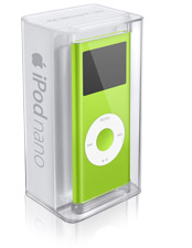
The new Nano packaging looks hot. Plus Apple can use just one package for the different colors. The see-through display shows the color via the product, not text on the box.

Smart way to increase effiency and prevent inventory problems.
The nice, simple refactoring of the iTunes sidebar helps organization.

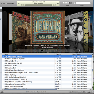
But overall, the new iTMS is too blinged out. There are gradients and shadows everywhere. And custom scrollbars are ugh. (Jakob says: “With custom-designed scrollbars, you run a significant risk of creating usability problems.”)

And there’s lots of wasted vertical space on the album pages now. They make you scroll so they can show reflections. Boo.

Moving on, the new Shuffle is like a paperclip that plays music. Crazy. Can the iPod Invisa be far behind?
According to a Saturday Night Live “special report” with “Steve Jobs” of the mighty black turtleneck, we did miss two entire product lines that are both already obsolete. The iPod Micro was launched live and immediately displaced by the iPod Pequeno, holding one million songs in the size of your thumbnail. Before we could blink the Pequeno was trumped by the iPod Invisa, which holds 8 million songs, “every photograph ever taken,” and is completely invisible.
Jobs also mentioned Apple’s sold 10 million of the first-gen shuffles. The shuffle’s success is a GREAT example of less doing well. Less screen, scrolling, songs, etc. For some, it’s an inferior product. But for many others this “just play music” approach is just fine.
Btw Steve, where’s the Turtleneck!? What about your BRAND?

Seriously though, he’s a man who’s clearly obsessed with design and style. So what’s with this look? If you’re going to wear a shirt tucked into jeans, wear a belt! And no more Mom Jeans either. ; )
43 comments so far (Jump to latest)
Mike Swimm 18 Sep 06
While I do like the new itunes I totally agree on the reflections, they are getting out of control.
Am I the only one who thinks the new itunes logo is hideous? If I remember correctly it is much more like the original one.
I am glad that they killed that ugly colored eye search icon though.
Also, Cover Flow looks so much better in fullscreen, apple needs to add that as an option.
Anonymous Coward 18 Sep 06
Those scrollbars in iTunes are the worst of all time.
--Josh 18 Sep 06
What’s with the anonymous “37Signals” author of this post? None of you want to go on record as chiding SJ’s style? :)
Justin 18 Sep 06
Digable Planets? Bummer.
ML 18 Sep 06
Josh, the post is a compilation of views from different people so it got the 37signals byline. Fwiw, DHH was the most upset with Steve’s lack of style. You know how Europeans get when it comes to fashion. ; )
Chris 18 Sep 06
Agreed. Let’s not forget the Upper Case Everything in the Store. And, if iTunes looks gloomy grey on a Mac it must look gloomier greyer on a PC.
Can anyone explain why the Browse icon is at the _bottom_ of the iTunes window?
nursegirl 18 Sep 06
Someone put an iPod Invisa on sale at Ebay, and it got to at least $50 and 12 bids before Ebay cancelled the auction.
http://www.tuaw.com/2005/12/20/ipod-invisa-for-sale-on-ebay/
Kevo 18 Sep 06
Just an FYI: iTMS is now re-christened iTS (they dropped the ‘M’)…
Dan Boland 18 Sep 06
Here are my quick takes, for what they’re worth:
The new Nanos: Meh.
The new Shuffles: Awesome!
The new iTunes: Wha?
John Topley 18 Sep 06
I wonder what the reasoning was to going back to blue in the iTunes icon. Must have been an interesting conversation.
Also, it’s have you noticed that both Apple and Microsoft appeared to have completely given up on the idea that consistency is good for applications that run on their operating systems? Both iTunes 7 and Office 2007 have a bespoke appearance. Hey, maybe it’s something to do with the number seven…
Chris 18 Sep 06
Stevie’s style….I think he wore that shirt to make him look LESS thin. He looked unhealthy at WWDC but I guess everything is fine.
One of the biggest things I can’t wait for in Leopard is a uniform UI style. Brushed metal and the smooth milk is starting to drive me crazy!
Caleb Elston 18 Sep 06
The iPod nano case is near perfection. No photos of the product, no fluffy marketing jargon, just the product front and center. The clear case is so perfect, the packaging gets out of the way, it lets customers admire the real product, not the concept of the product or the ideal of the product, the real thing. I just love it.
Chris 18 Sep 06
BTW, did anyone know that Steve Jobs has permission from the State of California to not have a license plate? Supposedly his BMW’s or Mercedes were getting stolen so often that now he has a simple barcode on it. What a badass!
Avi 18 Sep 06
I believe it is a faux pas to wear a button-down shirt tucked into jeans with a belt. But the Mom jeans are terrible.
Mike 18 Sep 06
I wouldn’t be surpised if the new, more sedate scrollbar found it’s way in to the Mac OS interface, it’d certainly make some people I know happy!
The album view of iTunes does waste alot of space, and it’s practically unsuable on my 12” Powerbook, you have to scroll the screen horizontally just to see the complete tracklistings for an album!
Coverflow’s kind of neat though, especially on a nice big monitor!
Mrad 18 Sep 06
Personally I’m getting disturbed by the whole “sneek peek” thing. They’ve done it with both Leopard and the iTV(which by the way, I desperatly hope they come up with a different name for), and it seems kind of forced.
It just feels very un-Apple. Or, dare I say, Microsoft-ish…
shane 18 Sep 06
It appears that an ex microsoft UI designer found his way in the iTunes department :) Needless to say the icon design, scroll bars, glassed out selections in the sidebar, and the store’s all caps type treatments, gradients, and strokes are hideous. I sure hope this is not the UI they will be conforming everything else to??
Mark Samson 18 Sep 06
It was quite a week for mp3 player wars last week. The Zune annoncement, the new iPod Shuffle and the iRiver s10. I’m not sure how much the physical size of these things influence a buying decision but the manufacturers especially apple seem to really care about geting smaller and smaller. Some cool size comparisons here.
NurseGirl 18 Sep 06
@Mark Samson:
Is sizeasy your product? It’s fantastic. I’m going to be so unproductive this afternoon.
sender 18 Sep 06
Great! the new nano packaging. Must get it.
manuel 18 Sep 06
maybe those new iTunes scrollbars are the new leopard scrollbars? — lets hope not.
i 2nd that.
Zack 18 Sep 06
Agreed, the packaging is very sheek! It saves them money AND enhances product image. The no nonsense simplicity of it has already brainwashed me into believing the product inside will be of the same caliber.
As for the product itself, they went a smart direction: alluminum + color. Very nice!
Greg 18 Sep 06
As a matter of visual taste, I don’t like the new nano as much. I really prefer the old one because it looks like a tiny iPod, not a tiny iPod mini, if that makes sense. I like the new features, especially the double storage, but I think the old one looks cooler (disclaimer: I am a biased first-gen nano owner).
My other, less subjective, issue with the new nano is that they don’t bundle the iTunes CD with it anymore (or with any of the new iPods). I know why they did it - because hardcopy software gets outdated, because it’s cheaper not to ship the CDs, and they wouldn’t fit in the new package, you’re most likely going to be getting on the internet anyway, so downloading the software isn’t impossible, and this may not be your first iPod.
That said, for some reason it really, really, irritates me that they don’t package the CD anymore. You can’t use the damned iPod without installing iTunes. It’s like buying a printer but not getting the USB cable - it tells me that the company has a certain degree of contempt for its customers.
Jack Cheng 18 Sep 06
Cover Flow view is neat for the first couple of minutes, but the album grouping view is really useful. That’s my default now.
Eddie 18 Sep 06
So the new nano doesn’t come with any software/CD anymore? How do you get iTunes?
Eddie 18 Sep 06
….rhetorical… I know you can download it :)
sloanNYC 18 Sep 06
The album artwork is lame in how buggy it is. And what is weird, is that if i have it in list view, the album art is not showing up in the Now Playing box… its like the artwork is in a completely different system than the artwork added by hand.
Patagonia is one company that reduced packaging for environmental reasons and then found out how much more profitable it is. Its nice either way I suppose, but Steve was all about increasing the number of products per crate I’m sure…
garrett 18 Sep 06
Maybe the new scrollbars in iTunes are going to be the standard scrollbars in Leopard? Could just be Apple testing them out on the public.
Joe Ruby 18 Sep 06
There’s nothing wrong with the way Jobs dresses — it’s way cooler than those tools who wear pastel polo shirts or look like models for Dockers. Or those pouty pseudo-grunge emo looking hackers that seem to be drawn to Ruby/Rails. ;P
Daniel 18 Sep 06
The new nano was my first Apple product ever. When I saw the package I got my aha-experience. They really do make the customers feel they rock - even before using it!
To bad I went for the black one - now it will take longer before I can justify another trip to the Apple store …
(I’m totally satisfied with the content of the package as well.)
Mark Samson 18 Sep 06
NurseGirl: “Is sizeasy your product? It�s fantastic. I�m going to be so unproductive this afternoon.”.
Yes and I’m glad you like it. If you did get chance to have a good play please send any ideas, criticisms etc. to the address on the site.
Dan 18 Sep 06
Avi: Please tell me you’re kidding. Never, ever, EVER wear a tucked in shirt without a belt. People who do that bug the crap out of me ‘cause all I can think is “when are those pants going to fall off”
Greg Fields 18 Sep 06
While I personally like the latest offering of iTunes as a consumer, the business side of my brain questions why they’ve taken so much development time and resources to develop features like the real-time reflections. Think about many product marketing + architect + developer + tester + build hours it took to put out a feature that is “cool” at best. I think they would have been better served if they delivered an incremental feature that increase application performance … or … its usability.
Joe Ruby 18 Sep 06
re: wearing pants without a belt
Here’s a bright idea — wear pants that ACTUALLY FIT so it doesn’t matter if you wear a belt! Then tell the fashion nazis to FO!
Anonymous Coward 18 Sep 06
Jakob says: �With custom-designed scrollbars, you run a significant risk of creating usability problems.
well, it must be so then. I remember hearing about that guy in the late 90’s. Something about self promotion & usability. But mostly self promotion.
Ben 18 Sep 06
Say it with me folks: (chants) TURTLENECK! TURTLENECK! TURTLENECK!
Ryan Allen 18 Sep 06
I’ve owned a lot of Apple products and the only flop has been the Mighty Mouse (the ball stopped working 2 months after I got it).
But the new shuffle…. oh… the new shuffle! I’m already a very happy 512mb shuffle owner but I just have to get one of those new shuffles.
An interesting thing about the new iTunes is they have a backup feature built in and they encourage you to backup your purchased music as soon as it’s finished downloading.
Torley 18 Sep 06
I like Steve’s new blackshirt approach—I almost wish he’d wear an Apple sticker like an armband, the colorful rainbow one I miss from ages ago!
Tieg 18 Sep 06
The new Shuffles look awesome and I already ordered one (which won’t mail ‘til early November much to my chagrin :( ), but just for the record, I saw an mp3 player in Akihabara in 2002 that was at least as small as the new Shuffle. I don’t remember the name of it, but it was probably about 1” x 1” x 1/2” and was chrome blue (and probably around 256kb); so I’m a little skeptical that the Shuffle is the world’s smallest mp3 player.
Stephen 19 Sep 06
Not so keen on the new packaging. It looks like the sort of box you’d get a cheap Casio watch in. Also, more plastic? Does it recycle as well? Biodegrade?
Joe 19 Sep 06
I didn’t watch the keynote, but when I saw Steve’s new look in pictures, I wondered if the reason was that he needed a shirt he could clip the new iPod shuffle to. A smooth black turtleneck presumably wouldn’t make that easy…
C. Nielsen 20 Sep 06
I like being given the option of deciding how I can view my songs, so I love the artwork view option. It purpose is not for rapid categorization— instead it brings back a feeling of having a collection. It brings the art back to the music which is missed by many.
Omar 23 Sep 06
Its one of the things I never understood about the American wardrobe culture, not wearing a belt when you tuck in the shirt !