Reflections are the new drop shadows 14 Sep 2006
60 comments Latest by Adam
Apple’s gone reflection crazy. And if history is any indication, everyone will follow. It looks like the image reflection effect is the new drop shadow.
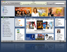
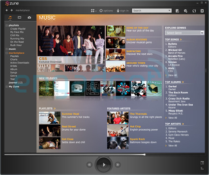
Image reflections are now found in iChat, iTunes, and iPhoto. iWeb will add reflections for you if you publish to the web. Reflections are everywhere on Apple’s marketing site too. More are coming in OS X 10.5 as well. I see even Microsoft’s Zune software has image reflections for some album covers:
We’re even seeing reflections show up on the web. Here are some icons from the Fluxiom product site:


Shopify also gets glassy with:

There’s even some Javascript to add reflections to images on your website. And if you’d rather go the Photoshop route, there are tutorials to add reflections as well. And if you have a Wordpress blog, there’s a plugin called Glassyfloor that will slip you out.
Of course there’s nothing wrong with the effect, but use it with caution. Even Apple seems to be having a hard time with moderation.
60 comments so far (Jump to latest)
Jason Santa Maria 14 Sep 06
All I can think of when I see that effect is a public bathroom with little puddles in front of all the urinals. Why do I want something I like so close to someone else’s pee. Not that my pee would improve the situation.
pwb 14 Sep 06
Interesting. Did the acquired CoverFlow have the reflections? For the Shopify and 2nd iTunes shots, are those reflections of the app in Finder real estate?
The other music clients still have a long way to go to achieve the tightness of iTunes. I think a lot of it is because Apple limited itself drastically on what sorts of widgets and markup it used on what is essentially a customized browser.
Jamie Tibbetts 14 Sep 06
Don’t forget about Front Row. Big reflections there.
Jared Christensen 14 Sep 06
The way I see it, everyone has already followed this trend. For a while.
Noah 14 Sep 06
Except reflections imply a different spatial sense than drop shadows and thus confuse the eye where as drop shadows can all be jumbled and thrown on to make layers and depth reflections only serve to distort the mind. This is an example of doing somthing because it can be done (hardware accelerated) but that probably shouldn’t be done.
JoJo 14 Sep 06
People have been doing reflections for well over a year. Where’ve you been?
JF 14 Sep 06
People have been doing reflections for well over a year. Where�ve you been?
Working really super duper hard on this post. Now I can get some sleep.
Gibbler 14 Sep 06
If your not reflectin’, you’re not designin’.
JoJo 14 Sep 06
Haha! Nice!
Reflections in logos are the new swoosh, eh?
Ben Kittrell 14 Sep 06
Does this mean those cool Java applets that made it look like your image was sitting on wavy water are coming back too?
jonezy 14 Sep 06
didn’t you hear?
the internet has been moved on to a shiny table.
Kenzie 14 Sep 06
Imagine my surprise when a screenshot of a screenshot of my design (via Shopify) showed up on 37 signals. Cool.
jenn.suz.hoy 14 Sep 06
“Everyone will follow?”
I’ve seen more reflections on more webpages than drop shadows. Apple is not a leader in the pack with this trend, for everyone wants a piece of this.
Personally, I’m not a fan of design “trends.” Use what works best in each specific situation. Don’t use it because it’s new and cool and “Apple does it.”
P.S. I know that’s not what your article was implying, it’s just my 2 cents in general. :-P
beto 14 Sep 06
Now that we are quickly nearning severe overload of all this surgically clean reflected surface madness, uberdirty-but-honest-to-goodness grungey web design circa mid-90s seems strangely appealing again.
BTW, Windows Vista is awash in reflections too. How long before we all develop a state of collective sickness?
Joe Ruby 14 Sep 06
So, are reflections Web 2.0 or 3.0?
Mark 14 Sep 06
So, are reflections Web 2.0 or 3.0?
2.5.
Mark 14 Sep 06
Whitespace is more valuable than redundancy, that’s why reflections are doomed to extintion -or at least I hope so.
Alex Ezell 14 Sep 06
When the porn sites start using reflections (T-minus 2 weeks and counting by my estimate), then we’ll know that the trend is over.
Andrew 14 Sep 06
Just want to let you know, the link to Fluxiom in the post is missing the .com part.
Joe Ruby 14 Sep 06
Ezell: Porn sites are the *trendsetters*.
Gary R Boodhoo 15 Sep 06
Whitespace is more valuable than redundancy
Wherever I look, I find advanced designs in which (biological systems, ancient writing, the emergent forms of cities & corporations, etc…), whitespace isn’t a concern at all and redundancy is at the heart of the structure.
Other than the current trendiness (coolness is conservatism dressed in black) I don’t see anything inherently wrong with reflections. In fact, in terms of UI design, Metroid Prime makes a serious virtue of reflection, allowing you to see the player character’s face (and expressions) reflected on the inside of helmet visor where the HUD is projected. That’s 3 levels of information (game engine, UI, emotional state) for the price of one!
My only beef with lame OS/web based reflections is they place emphasis on a product rather than on environment (or the context of the product I suppose one might say)
Additionally, if reflection is the hot EZ “graphic design” flavor of the moment, can refraction be far away?
S�bastien 15 Sep 06
Hey Jason where have you been ! I’ve read a long time ago Subtraction: Mirror, Mirror : “The lesson that I�ll take away from all of this is: avoid using reflections, unless it�s the year 2016 and you�re going for an unmistakably retro and kitschy 2006 look.”
Steve B 15 Sep 06
I love these reflections, tho’ I hate to admit I think I loved the drop shadows too so that means they’re doomed to be uncool sometime very soon!
Benjy Stanton 15 Sep 06
I really enjoy all the ways that web sites play around with spaces and 3d effects. Mixing all these “trendy” new effects (glassy, reflections, shadows etc.) can lead to an interactive mix of flat, relief and 3d that can’t be achieved with other media, I find it interesting rather than confusing.
Ted Lee 15 Sep 06
All your reflections are belong to us.
Mrad 15 Sep 06
I dig well done reflections that are used sparingly for smaller objects like icons and album artwork, that aren’t crazy obvious. But when you do a reflection of an entire interface, that’s just going too far. I think it’s distracting as hell.
Ann 15 Sep 06
Shiny things are cool.
Robyn Tippins 15 Sep 06
I like them too. I’d love to know how often that turnorial link in your article was clicked by all the people who are ‘so over’ reflections…
Tim 15 Sep 06
reflectotastic™ is a possible term?!
Tony 15 Sep 06
How did you get those reflections in the 2nd Itunes screenshot that look like they are on the finder real estate?
Tony 15 Sep 06
How did you get those reflections in the 2nd Itunes screenshot that look like they are on the finder real estate?
Dan Peterson 15 Sep 06
Something silly I noticed while looking at the Zune screenshot: there’s a big play button at the bottom. If you were to hit it in the context of that screenshot what would it play? If you go to the iTS area in iTunes it disables the play button until you actually select something. Again, silly…I’m surprised it even struck me that way.
Stephen 15 Sep 06
In the “Grouped” view, the album reflections render some album titles unreadable.
It’s a sad sign that Apple is beginning to trade in the functional, clean design that made them great for unnecessary, blingy whizbangery. Let’s hope it’s a shortlived trend, and not one they continue throughout OS 10.5.
Alex Ezell 15 Sep 06
Ruby: I would agree that porn typically pushed technology forward, but not so much design.
In this case, I went looking for reflections on porn sites. (Boss, it was research!) I didn’t find any. Many sites are still using huge images cut up into tables.
So, while they may be pushing the envelope with video-on-demand and other video online, as far as design they lag a bit.
bryan 15 Sep 06
I could have sworn Jason already posted this a year ago… maybe I’m thinking of starbursts? SOMEONE posted a “reflection” rant a year ago, maybe not here, but I know I saw it.
Nate 15 Sep 06
The weird weird weird Coming Zune site for the Zune has bad reflections, too. I don’t like when they’re as strong as they’ve been showing up lately — don’t cut out readability, or make it seem like it’s actually part of the object…
Marc 15 Sep 06
I started workign on a website 3 months ago and when we discussed the design I looked around what’s hot. I already had the feeling that reflections were everywhere and briefed my designer not to use them - big sites using them is a sure indication that their hype cycle has gone over its peak. Two years from now you’ll see them, laugh and say ‘how web 2.0ish….’. The people who used this look a year ago are trendsetters. Using it now is mainstream and almost boring.
Kim Siever 15 Sep 06
That’s odd; I thought we already went through the reflections phase 2�3 years ago.
PatrickQG 15 Sep 06
I’ve had reflections (relatively light. well, that’s my story anyway, and I’m sticking to it) on my personal site & blog since the beginning of the year, so either it’s not new or I was ahead of the game (rather unlikely). However I only use it once per page, and it’s mostly just a different form of a gradient that would’ve been used in the past.
jenn.suz.hoy 15 Sep 06
The reason behind reflections: apparantly we’ve all been transformed into fish and only the shiniest bait will get a bite.
Torley 17 Sep 06
Front Row is pretty gorgeous, I love how simple it looks�like my MacBook Pro suddenly got turned into one of those portable DVD players, but bigger! Really classy.
Kind of reminds me of the training stage of Deus Ex too, where you have the marble reflections.
Salvatore Savino 18 Sep 06
Everytime Apple made a new style and everyone follows! Aqua buttons, brushed metal, glossy icons… and now reflections.
I think they’re pretty to use sometimes, but better to not abuse.
Thomas Bowcut 18 Sep 06
The reflection shadow is also now an option in PowerPoint 2007 (beta) for images and text.
Manny Hernandez 18 Sep 06
Funny you guys pointed this out! I was thinking precisely the same thing last week, as I saw the new iTunes store! :)
I first saw the reflection effect in Keynote, and thought it was cool… but now it’s gone out of control.
Jolene Oldham 18 Sep 06
LOL! Funny stuff… again, I am ahead of the trend. I like that!
I’d done the glassy reflections for years with my music industry and DVD producer clients - mostly on marketing materials. How long ago? Well, I think I was using Photoshop 3.0 at the time…
Jolene Oldham 18 Sep 06
LOL! Funny stuff… again, I am ahead of the trend. I like that!
I’d done the glassy reflections for years with my music industry and DVD producer clients - mostly on marketing materials. How long ago? Well, I think I was using Photoshop 3.0 at the time…
Jolene Oldham 18 Sep 06
LOL! Funny stuff… again, I am ahead of the trend. I like that!
I’d done the glassy reflections for years with my music industry and DVD producer clients - mostly on marketing materials. How long ago? Well, I think I was using Photoshop 3.0 at the time…
Jolene Oldham 18 Sep 06
LOL! Funny stuff… again, I am ahead of the trend. I like that!
I’d done the glassy reflections for years with my music industry and DVD producer clients - mostly on marketing materials. How long ago? Well, I think I was using Photoshop 3.0 at the time…
jolene 18 Sep 06
Ooops! So so sorry! I can’t delete the multiple posts! I swear, I didn’t mean to do that!
diva 18 Sep 06
…but who did it first??
eric 19 Sep 06
no.
“utilizing that emotional power” amounts to short-term manipulation - fine for a business that is more interested in immediate money, but entirely out of line for one that cares about people.
as much as everyone is tempted to believe the myth, it is never good long-term business sense to just do the trendy thing for “the average joe” because “they don’t know any better”. as a specialist in a field, you get to help your “average joe” become better than that - you get to stretch people and help them be more creative. you also get to help your client stand out in a sea of reflections.
if you really believe that what your client thinks they want is the best thing to give them, let them do their own design in microsoft word - it even exports webpages! pretty cool!
Martin Ringlein 20 Sep 06
We are often times not trying to create great works of art, most often it isn�t even really �art� (subjective opinion).
What about the direct mail print job: a 4x6 postcard-sized marketing piece whose existence will be no more than 3 days on a kitchen countertop, at best, before it makes its way to the trash bin? If using something such as a reflection can help take you from the middle of the mail pile to the top or even keep you on the countertop for an extra couple of hours, then use it and use that influential and subconscious power. This is a creative design whose whole existence is to quickly and immediately influence the recipient to take some sort of action; whether physical or mental.
The product and the product design in this case is the long-term business. The one-time direct marketing message is short-term with specific short-term objectives. This small 4x6 piece of stock card isn�t meant to make anyone more creative � it is simply to evoke an emotion and trigger an action.
Adam 01 Oct 06
Is this one over yet?