Screens Around Town: Blogger, DropSend, etc. 20 Mar 2006
36 comments Latest by Andrew
N(nu) thanks
John Kelly Furniture is a case study in bad labeling. These are some of the navigation options: J1 series, K2 series, N(nu), etc. (No photos associated with the labels either.) These terms may mean something to JKF employees but they’re meaningless to most potential customers.
—
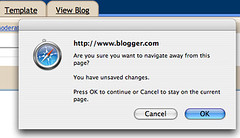
Blogger’s “Are you sure?”
Browser text areas have an unfortunate side effect: no Save button. Here, Blogger wisely minimizes the chances you’ll lose a long text entry by offering an “Are you sure…” popup when you attempt to navigate away from a post.
—
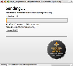
DropSend status bar
Lots of sites that allow uploading leave you in the dark re: the status of your upload. DropSend, on the other hand, offers a clear status bar which comes in handy when you’re sending big files.
—
“No, I do NOT wish to Unsubscribe”
This concert promotions company really doesn’t want to let ya go! Try to opt-out of the email list and you get this button with a triple negative: “No, I do NOT wish to Unsubscribe.” Um, what’s the point of that? And what’s next…”Yes, I do NOT wish to SUBSCRIBE to my unsubscription”?
—
Got an interesting screenshot for Signal vs. Noise? Send the image and/or URL to svn [at] 37signals [dot] com.


36 comments so far (Jump to latest)
Rabbit 20 Mar 06
OMG who is the concert promotion site?? If it’s Ticket Master, screw them! I did their “automated” (read: up to 24 hours to remove you — which is crap for numerous reasons) unsubscribe thing (I’m 99.9% sure I requested NOT to recieve e-mails from them when I bought my tickets) *3* times and still kept getting mail.
Finally I e-mailed them back and told them they sucked. They took me off after that. :)
Tracey 20 Mar 06
What’s worse than the triple negative unsubsribe button? These people with networking businesses trolling wikis, blogs and other sites to gather email addresses and adding you to the mailing list in the first place.
Steve 20 Mar 06
Re: Drop send’s progress bar….how about putting something like that in the ol’ Basecamp fellas. And perhaps we ould up the upload limit so we can share some of our powerpoints and illustrator files. Even some PDFs don’t come below 20mb.
Oh, and I am a huge fan, keep up the good work :P
Greg Palmer 20 Mar 06
I love the three pop-ups I have to have open just to see the dimensions of a bed.
brad 20 Mar 06
The John Kelly Furniture site reminds me of the site of a company called Red Flag Design, whose site aptly fits the company name. Check out the store, for example…you’re supposed to choose a product line and then choose a product, but the product line names are inscrutable. Eventually you figure out that in order to use the store you first have to go to the “product” page, and then you have to memorize (or write down) the product line, subline, and product that you’re interested in. Too bad, as they have some nice (though overpriced) products, such as bags made from discarded boat sails.
Rabbit 20 Mar 06
LOL @ Brad. NICE find. That site BLOWS.
The “shop” interface is scary as hell; looks like Jason Voorhees got a hold of our tools!
scotty brooks 20 Mar 06
The subscribe one …..
If you cant beat them baffle the hell out of them.
cheers
scott
Kathleen Fasanella 20 Mar 06
The worst site I’ve ever found is iloverawmeat.com. It’s so bad that it’s got to be worthy of some kind of prize. Indiscernable product concepts? check. You’re lucky to even find the products much less an order page.
Robert Sharl 20 Mar 06
Here’s another vote for the DropSend upload progress in our beloved 37 Signals products. Just what I was saying to my colleague the other day..
Edmundo 20 Mar 06
Oh, I hate the last one soo much. Brings back memories of trying to reduce the spam in my sister’s e-mail, and all of them had trick questions.
Who the hell writes that kind of junk? Don’t people feel ashamed of contributing such crap to the world? >:o
Wayne 20 Mar 06
@Jason
I’m curious, what are your thoughts about Newsvine.com and how they have raised VC money. I’m an avid mikeindustries.com blog reader but I still don’t see how they plan to make money based solely on advert. revenue (which they still haven’t put up yet).
I’m asking you since you run a very successful online business.
Ted 20 Mar 06
Great stuff. I never understood the logic behind making it impossible for people to unsubscribe… yeah, see, what could be better for our list than filling it with folks that don’t want to on it?
You might want to check out Christina Wodtke’s Widgetopia for more of this sort of thing.
Rachel C 20 Mar 06
Ted, on a related note, what do you think of reset/clear form buttons? Are they ever a necessary part of forms? (The number of times I’ve accidentally pressed a clear form button and been infuriated…)
ditto 20 Mar 06
Ditto to what Steve said…
Saul Weiner 20 Mar 06
Speaking of this usability stuff, when is writeboard going to function as a fully fledge module of basecamp and not as a side module?
Liam 20 Mar 06
It’s not a triple-negative. I’m not sure it’s even a double, really (“I do NOT NOT wish to unsubscribe” would be).
It’s just a little awkward.
Maura 20 Mar 06
Wordpress also prompts you if you try to navigate away from an in-progress post.
prague92 20 Mar 06
i reckon progress bars - good.
popups - bad. isn’t an autosave a better idea than a popup if you navigate away from something?
Ryan Carson 21 Mar 06
Hey Matt, Thanks for mentioning DropSend. We worked so damn hard on that progress bar! :)
Mike 21 Mar 06
Does anybody know how DropSend have made that progressbar?
I hvent been programming for some years but the last time i did that stuff it wasnt really possible to make such a progressbar when doing uploads in standard HTML forms so id really like to know how :)
dusoft 21 Mar 06
But Blogger asks me the same thing even when I had already posted the comment! So that’s not a sign of usability, but rather broken functionality!
dusoft 21 Mar 06
What’s with this broken feature:
————-
Signal vs. Noise
Thank You for Commenting
Your comment has been received. To protect against malicious comments, I have enabled a feature that allows your comments to be held for approval the first time you post a comment. I’ll approve your comment when convenient; there is no need to re-post your comment. Return to the comment page
———-
I have commented multitude of times already …
Dan Nordquist 21 Mar 06
Here’s my only problem with the Blogger “Are you sure?” prompt (and it’s kinda complicated, so follow along):
1.) They’ve put the comment POSTING form on the same page as the comment READING form.
2.) Firefox, upon seeing that there’s a Blogger username/password prompt, tries to be helpful and fills in my account details, whether or not I want to add to the comments. (I don’t: I just want to navigate away or close the window.)
3.) The Blogger javascript, having detected that I entered SOMETHING into the form (but not necessarily a comment) throws a scary-looking warning up, incorrectly assessing that I’m about to throw away valuable half-finished thoughts, and keeping me on the page.
I suppose I should probably just tell Firefox to quit trying to help me on Blogger pages, but that’s the only site where the helpfulness gets in my way.
Steve 21 Mar 06
I noticed that comments were closed on the Campfire coupon post, and now Campfire has ads in free accounts, that has gone unmentioned. Do I detect too much ire for 37S to handle?
Suthers 21 Mar 06
@Mike: I think on the Web 2.0 Show podcast Ryan Carson had said that DropSend was written in PHP for almost everything except the file upload, where they had used Perl.
JF 21 Mar 06
now Campfire has ads in free accounts, that has gone unmentioned.
It’s mentioned in the chart on the account page in your Campfire account. Free accounts have ads, pay accounts don’t. Same thing with Backpack. Nothing new, no secrets.
dusoft 21 Mar 06
Where is my comment with links to various upload progress meters?
RS 21 Mar 06
dusoft: Please try to post it again. We aren’t holding comments for approval. I don’t know why you saw that message earlier.
Tony 21 Mar 06
I had a comment never show up previously on a different post, and it seemed to be related to the number of links in the comment. Maybe you guys should check your comment spam settings?
tester 21 Mar 06
test
Mike 22 Mar 06
Dusoft -> It would be great if you would post the links again. :)
dusoft 22 Mar 06
OK, you got a bug in your commenting system - probably a spam filter against links??? couldn’t send the comment above with http:// prefixes…
Eric 22 Mar 06
I wish Gmail had that sort of Blogger popup for when you have the web chat open and go to close the main Gmail page. Instead (at least on the Mac), I get a “This is going to close your chat window, haha - [OK]”-style prompt.
Andrew 23 Mar 06
Funny thing about that Red Flag Design site, the flag in their logo is white.
I guess they give up?