Screens Around Town: CrossConnector, Dandelife, and Wufoo 17 Jul 2006
15 comments Latest by Phil Hagelberg
CrossConnector

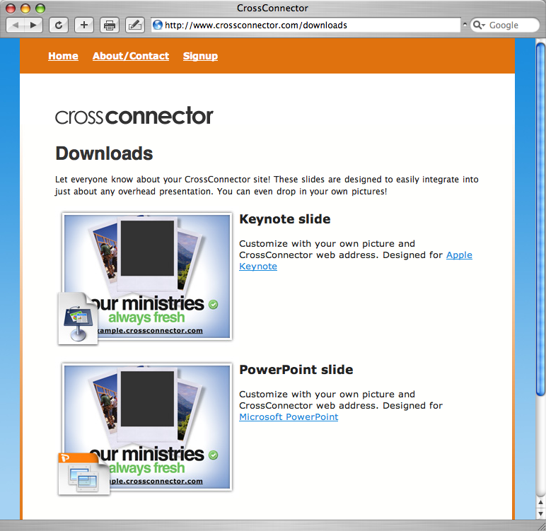
CrossConnector, a tool that helps ministries get online, has an unusual promotional offering: branded Keynote/PowerPoint slides for integrating into presentations.
Dandelife

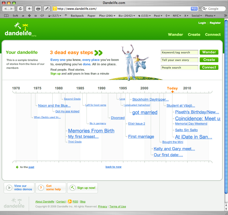
Dandelife takes a person’s stories and creates a visual timeline.
Wufoo

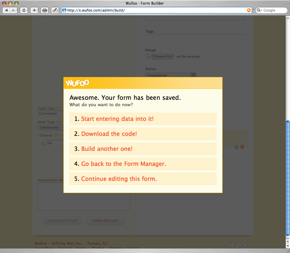
Save a form at Wufoo and the rest of the screen dims while this box appears with options for what to do next.
Got an interesting screenshot for Signal vs. Noise? Send the image and/or URL to svn [at] 37signals [dot] com.
15 comments (comments are closed)
Launch Thought 17 Jul 06
The dim background and highlighted box on the Wufoo page makes it crystal clear what’s supposed to happen next. I like it!
Robert 17 Jul 06
The dim background trick is something that Go Daddy has been doing for a while in their webmail app. It’s nice in the sense that it’s a web version of a modal dialog box, but all in all, modal dialogs are weak solutions to design problems that can be solved in far better ways.
Jeff Croft 17 Jul 06
I’m not sure how I feel about the lightbox-style dimming of everything else on the screen until you make a choice.
On one hand, it does seem like this makes thing clear for the user and gets them on the right path right away.
On the other hand, though, we all grew very tired of the modal dialog on desktop computers, which completely prevented us from multitasking (remember Macintosh System 7?). It took this long to get us (mostly) away from that static model — should we really start encouraging it on the web, or are we just setting ourselves up for the same annoyance down the road?
I’m not sure. But it’s interesting to think about.
Phil 17 Jul 06
The CrossConnector offering is not so unusual when you realize that many churches run overhead displays with words to worship music or visuals to support the sermon using PowerPoint or Keynote (or apps that build top of those formats). Many of them will loop through “promotional slides” between services. Stuff like “Bible study is Tuesday at 7pm”, “Men’s breakfast is Saturday at 7am”, “Please silence your cell phone”, etc.. Having a nicely designed slide to promo the new website saves someone in the church office having to make it :-)
Barry 17 Jul 06
Is it me or does anyone else think that Dandelife’s verbage:
is a bad choice when dealing with a timeline for your life?
Walker Hamilton 17 Jul 06
Oh….definitely. Let me set a timeline up for my grandparents right now.
….whoops, I mean, sorry grandma!
Kelly 17 Jul 06
@ Barry and Walter
Agreed. I thought it would be best to use everyday language. Had a lot of complaints about that particular usage though. We’ll be changing it just as soon as we can.
Kelly
CEO, Dandelife.com
Don Wilson 17 Jul 06
Love the look of Dandelife.
Dan Boland 17 Jul 06
Love the look of Don W.
Dan Boland 17 Jul 06
Boy, I love it when people pretend to be me to post shit. It’s real classy.
Optimus 17 Jul 06
Robert/Jeff:
I think it’s an elegant solution that is overused.
It would be better to use a design that strips away distractions and uses less dramatic visual cues to show the user what they need to focus on.
Where I could see this being better applied is when forms are incompletely filled — dimming everything but the part that needs to be revised or filled out.
Jamie 17 Jul 06
I feel the same way about CrossConnector as I do about buying a shirt that says “Diesel” or “Banana Republic” on it. I want to wear a shirt, not an advertisement. On the other hand, prominently displaying other logos, like Apple or BMW maybe, carry a certain cachet. Perhaps they feel like displaying their slides will garner the nod from some of the congregants.
AndyToo 18 Jul 06
Hmm, dimming the rest of the screen to show an important dialog - Windows Vista anyone?
It’s been in Vista for over a year, and whilst it’s useful the first/second/third time you see it, it very quickly becomes a pain in the ass when you’re trying to Get Things Done. I beleive they’re pulling it (or toning its use right down) for the final release as a result of user feedback…
Phil Hagelberg 18 Jul 06
Yeah, I’ve got to say I am not a fan of modal dialogs. They were all right before MultiFinder was introduced, but let’s move on.