Screens Around Town: G24, Tickspot, Workopolis 31 Jul 2006
12 comments Latest by Scott Meade

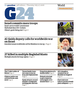
G24 brings you the latest stories from the Guardian in PDF format — updated throughout the day.

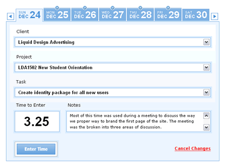
Tickspot offers days as tabs.

Aaron writes in: “I got an email from workopolis (we’ve posted jobs there in the past). I wanted to unsubscribe, and clicked the link in the email and faced this choice (remember, in my brain I want to cancel my subscription).”
Got an interesting screenshot for Signal vs. Noise? Send the image and/or URL to svn [at] 37signals [dot] com.
12 comments so far (Jump to latest)
Gianni D 31 Jul 06
Tickspot… is great! The best part is that it integrates with basecamp. Wish the agencies had this when I worked freelance, i’ll have a leg up on them now with my own clients… haha.
jetfuel 31 Jul 06
~_~
If buttons have labels, why do you need sentences to explain which button does which! Miserable!
Mo 31 Jul 06
lol.. notice the text in the tickspot Notes box.
I guess not enough time was devoted to grammar and proper spelling.
Moca 31 Jul 06
I have been using Basecamp for a couple of months now and I love it, so it makes natural sense to sign up to Tick.
The UI is so delicious that I don’t even mind filling out form fields but unfortunately I might have to wait until I switch to it from Harvest…
harvestapp.com, they have the stop watch feature that was the selling point for me.
Throughout the day I never work on a project continuously and the ability to have the clock running on the side that I can start/stop at anytime is indispensable.
Do you guys have any plans to create something like this? How about this feature + a desktop widget integrated with the app?
I have been waiting for something like this for a looooong time.
Scott Meade 31 Jul 06
TickSpot looks good and I’ve started using it. Just wondering though: what is the thought about how 37s and readers here decide when to call someone to task for looking too much like a 37s app copy vs. heap acclaim on an app for learning from 37s. TickSpot is exactly a 37s look and feel right down to the little curvy chicklets to the left of items that label each list item as “Project” or “TASK”, etc. (instead of “To-Do”, “Message”, etc.). Don’t get me wrong, I like it and I want to copy it too. :) Just wondering what your thoughts on the line between “inspired by” and “undifferentiated from”.
george 01 Aug 06
The last screenshot reminded me:
Where is designnotfound.com? I’ve read the first 37s book and it has some of the cases that were in dnf.com but not all. It was such an entertaining and useful resource.
kazesoze 01 Aug 06
I use http://www.getharvest.com and signed up with Tickspot and I wanted to compare both. One thing that I like about Harvest is the fact that not everyone can see all the projects. I am just curious as to why Tickspot made that decision. It would be the same thing as if basecamp decided to allow everyone (employees, clients, subcontractors) to see every single project, which doesn’t make any sense.
Dan Grossman 01 Aug 06
TickSpot has some pretty bad design flaws as well. There’s use of AJAX all over the place, but no indicator that anything is happening. I’m on a fairly slow proxy at work, comparable to dialup speeds. I choose an item from a dropdown but still can’t use the others for seconds until they finally populate without visual update.
I click a forward or back arrow on a date list to see nothing happen… I figured they don’t work since I have no data entered in the past or future or something. 10 seconds later my date list flips itself around reflecting those old clicks.
Ryan Heneise 02 Aug 06
Ryan Heneise 02 Aug 06
Man, my end blockquote got put in the wrong place. It was supposed to be right after “‘To-Do’, ‘Message’, etc.).” Oh well.
Scott Meade 02 Aug 06
Good points Ryan, thanks.