Screens Around Town: Last.fm, TCF Bank, Danger Graphics, Whitespace 03 May 2006
29 comments Latest by Nick
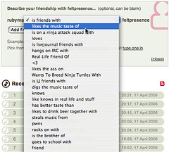
Tagging a relationship at Last.fm

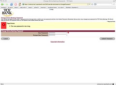
TCF Bank: 10 character password = too long?

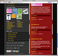
Equal Width Columns @ Danger Graphics

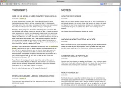
Equal Width Columns @ Whitespace

Got an interesting screenshot for Signal vs. Noise? Send the image and/or URL to svn [at] 37signals [dot] com.
29 comments so far (Jump to latest)
Dan Boland 03 May 06
I wish the Whitespace right column had a background of #ddd or something that would differentiate it from the left column.
Ryan M 03 May 06
I’m not a big fan of the 50/50 split. It’s a “new” and interesting way to design a site, I guess, but confusing to figure out what to read first.
Walker Hamilton 03 May 06
@Dan: Is the line dividing them not enough, Or wrong altogether?
Jeff Croft 03 May 06
I’m with Ryan. The 50/50 split looks kind of nice in a thumbnail view, but in actual use I think it makes it difficult to figure out what’s more significant. More common layouts tend to better indicate “this is the main content, this is secondary”…or similar, as appropriate.
dusoft 03 May 06
Line is fine, but how do you know what is the main content and what is the sidebar?
As Steve Krug said it: “Don’t make me think.”
dusoft 03 May 06
Line is fine, but how do you know what is the main content and what is the sidebar?
As Steve Krug said it: “Don’t make me think.”
edddy 03 May 06
I use 50/50 split in a site long ago, because I want it to be 50% content 50% institutional
http://www.agropuerto.com (in spanish)
Don Wilson 03 May 06
It’s amazing how useful a site may become when it uses 50/50 columns.
nursegirl 03 May 06
I find that the 50/50 split only works when the content on the left and right are of similar importance but different context. Then, it’s often clear to the reader what side they want to look at.
I do agree with Dan Boland, though, that using different coloured background or different font on a 50/50 page is necessary.
Lisa 03 May 06
I’m not a fan of the 50/50 split — not in this case at least. There is no indication of importance on the page…nothing to really draw my eye in. It just looks all gray to me.
James Weirick 03 May 06
I’m not a fan of the 50/50 split either. I’ve only seen a few sites manage to pull it off nicely. Most of the time it just confuses the reader about where to look first.
Bob Aman 03 May 06
Could someone please create a standard for passwords. I’ve had sites telling me that an 8 character long password was too long, and there are FAR too many sites that disallow special characters. NetBank has a strange policy of allowing alphanumeric, “!”, “~”, and “_”. Why only those special characters? Beats me.
One of our systems at work actually truncates passwords longer than 8 characters. All characters after the first 8 are dropped on the floor.
Tyler Smith 03 May 06
I can’t begin to underline my frustration with sites that institute their own set of peculiar password requirements, often disallowing non-alphanumeric characters.
Bank of America and Chase do this and it drives me nuts. For BofA, I’ve got to purposefully *dumb down* my preferred strong password, and for Chase, I’ve got to invent a 8 character plus password that includes caps, lowercase and numbers *without* special characters.
It makes me wonder what the rationale is behind explicitly disallowing special characters? Forcing users to comply with a non-standard password policy, if anything, *reduces* security by forcing them to record it somewhere so they can remember it.
Jeff Croft 03 May 06
I agree that it’s wholly frustrating when the password you want to use won’t work at a particular site because of their password requirements.
But, doesn’t it also force you to come up with something unique for that site? Tyler said he couldn’t use his “preferred strong password.” But should you really have a “preferred” password? It’s insane how many people use the same password from website to website. Annoying as it is, the lack of a password standard ensure that people are constantly having to come up with new, unique passwords — and that can only be a good thing from a security perspective.
John Sheehan 03 May 06
The TCF password requirement drives me CRAZY. I tried setting a really complex one that was less than 8 characters and it wouldn’t take that either. Had to be 8 characters and no numbers or symbols. No warning before hand either. It’s really ridiculous.
sham 04 May 06
When someone requires a 4-digit password or an 8-alpha password, it just tells you how to hone down your attmepts to break the security. Whew! I only have to look for four digits, my job is easier!
Arbitrary password restrictions lean in the direction of being less secure. And no, American Express, I will not use my mother’s birthday as a password.
Jason Liebe 04 May 06
Don’t get me started on TCF Bank. A couple other massively retarded things they’ve done (that hopefully have changed): When looking for a location if you enter zip code it would force you to enter a STATE! And if you checked the boxes for ATM and Branch the query joined them with and && not an ||, thus eliminating many locations.
TCF blows on many fronts except Minneapolis branches for some reason. I had a CHI based business account and after much frustrations began putting all my calls into small biz branch in MN.
Don’t you think little things like those discussed here give you a snapshot of the big picture at some of these bloated companies…
Ed Knittel 04 May 06
Last.fm has hit on something big! I think more websites should use “likes the ass on” to describe relationships between two things. Example: Ed “likes the ass on” Campfire.
But back to passwords: I see nothing wrong with having 1 or 2 strong passwords. I think it can actually be safer. Case in point: I know someone who uses a bunch of different usernames and passwords for different web sites. But do you know how does he remember what usernames go with what passwords with what sites? With an Excel spreadsheet stored on the laptop. Usernames, passwords, and web site addresses all listed in a neat and tidy order.
Scary.
Michael Wales 04 May 06
I don’t think anyone has really hit password freak-out unless they are in the Air Force. I have about 15 sites I frequent as part of my job, all requiring a password.
The Air Force has very strict rules on what your password can be, such as:
- Be at least 8 characters
- Contain at least one upper character
- Contain at least one lower character
- Contain at least one number
- Contain at least one special character
- Can not start with a special character
- Can not use the same character more than twice in a row
- Can not reuse any of your last 10 passwords
Oh yeah - we have to change them every 3 months as well - arg! I can’t begin to explain the amount of frustration I go through each and every day.
Andy Atkinson 04 May 06
TCF Bank? That’s my bank! They have some poor web dev and design. Someone else can maybe back me up on this, but I know when I went to re-set my password there, the site permits *only* 0-9 and a-z characters….no special characters like “!”…this is a *banking site*….let’s make passwords a little more robust!
David Paquet 04 May 06
Having alot of unique password isn’t more secure. In fact, one of the argument for SSO is that when you have less passwords there also less chance that you are going to write it down on a paper (which is highly unsecure).
Less is good ! :)
Sammy 04 May 06
Huh - minimal layout, down from the ever-popular three columns to two, then two equal sized columns. Pretty soon it’s going to be essentially a one-column layout.
Yup. I have seen the future of web design, and it sucks.
Darrel 05 May 06
“TCF blows on many fronts except Minneapolis branches for some reason”
Except that they seemed to get robbed weekly.