Screens Around Town: Microsoft, FontLab, & Jeteye 02 Oct 2006
28 comments Latest by SuperBot Offline Browser
Microsoft Business Solutions CRM

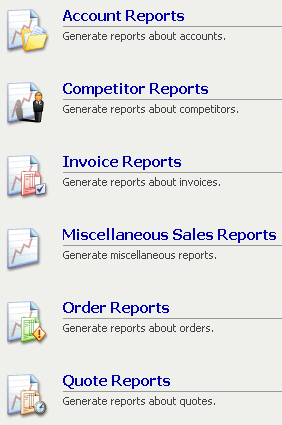
Part of a Microsoft Business Solutions CRM screen (full screen) that uses the word “report” 31 times. (tx Scott)
FontLab

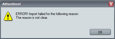
A magic 8-ball error message (experienced by Jordan while importing a font into FontLab).
Jeteye

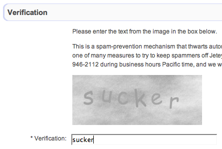
Jeteye verification screen. Hmmm…if you type it, does that mean you are one?
28 comments so far (Jump to latest)
Raineri 02 Oct 06
Hehe, the last one is pretty funny.
You see that redundancy in that Microsoft project because the employees are mostly deadline driven; they probably aren’t UI wizards and just want to get things finished.
Jeremiah 02 Oct 06
Is the microsoft picture a word hunt challenge? I count 32 instances of the word “report.” Can anybody find more? :)
cvfoss 02 Oct 06
I see variations of that second one all the time. Even telling us what didn’t go wrong would be more help.
Kevin 02 Oct 06
I count 34.
Dave Rau 02 Oct 06
The first shot is super lame; the descriptions all say “X: Generate reports about X;” well no shit! If you’re already on the reports page, then you certainly don’t need the word reports in each subheading. Hierarchy!! Hello?? How absolutely redundant and unhelpful.
And when is that OS gonna get anti-aliased type.
Microsoft has no grace!
condor 02 Oct 06
don’t mean to hijack the post, I just want to share another screen from around town I just came across:
http://mail.lycos.com/lycos/Index.lycos
please notice the pay plans with “free storage” ?
they almost had me :)
Hasan Akyol 02 Oct 06
Whats happened with the development of Sunrise? Any news?
jonezy 02 Oct 06
that ms screen is hilariously awesome… like i wonder if the point is to generate reports? reports anyone?
Geof Harries 02 Oct 06
Why wouldn’t the Microsoft UI state “Reports” at the top as a global heading and then list the individual options sans Reports? One word labels, e.g. Account, Competitor, etc.?
That would be much cleaner and simpler. Not to mention less redundant.
Scott Meinzer 02 Oct 06
Someone sends that screenshot one day in campfire SvN chat (same name and all) and I point out how many times report is listed.
Thanks for the credit on that one signals ;)
J/K - I just found it funny that this cropped up from that campfire chat over a month later
jonezy 02 Oct 06
sorry for the triple post :(
ML 02 Oct 06
@Scott
Wasn’t sure where the screen came from. Thanks for straightening it out, link added.
indi 02 Oct 06
On that MS screen shot, it makes me cringe to imagine what I would see if I hit the “Advanced View” link …
Andy Kant 02 Oct 06
Dave:
Don’t turn this into an OS flame war. ;-)
…and besides, Windows has had anti-aliasing of text atleast since XP came out. Most users just don’t know how to turn it on (there were issues with text displaying blurry on legacy CRT’s so it was disabled by default when XP came out).
Lance Shields 02 Oct 06
I feel sorry for anyone is forced to use the MS CRM app. How boring and dry can business get. I suppose the icon design is intended on friendlying it up. But I find them worse than “report” being repeat. A document image, obviously the report, gets repeated in each icon with little sub-icons acting as modifiers. “Report + a suited guy = competitor”, make sense to you. Practically meaningless crap. I wish I designing the a competing app for MS’s CRM software ;
Scott Meinzer 02 Oct 06
@ ML
No need for the link (not like there is anything there right now anyway ;) ). I just found it funny that it came up. Apparently those campfire logs really do work…
I would actually be curious on how many words are in the logs for the 37s campfire account. I would assume the getting real book has been “written” a few times over in campfire.
Jacob 02 Oct 06
I went to the Jeteye signup page and the captcha I was served said “coward”. Some twisted sense of humor at play there, I think. Way to make my feel bad, Jeteye. :(
But seriously, I think that actually hurts them. By narrowing their domain of captcha words, they’re just making it easier for a bot-writer to brute force their captcha.
Killian 02 Oct 06
I’m the poor soul who has to use MS CRM and believe me you do not know the trouble I seen.
I don’t know if it was the screw balls who implemented the system and/or MS’s own futility (probably both) but in order to write up a quote for a new client I have to type that clients name and phone number at least 6 times.
Will the 37s CRM please save our souls!
AndyToo 03 Oct 06
I’m preaching to the wrong choir here, but seriously, you can’t slate the entire MS product range UI design because of one screenshot in one product.
And excuse me, but you’ll find that the UI in 99% of apps out there (including *gasp* Apple products) absolutely stinks to high heaven. MS gets it right more than most, and is at least getting better.
AndyToo 03 Oct 06
I’m preaching to the wrong choir here, but seriously, you can’t slate the entire MS product range UI design because of one screenshot in one product.
And excuse me, but you’ll find that the UI in 95% of apps out there (including *gasp* some Apple products) absolutely stinks to high heaven. MS gets it right more than most.
Matt/slapshotw 03 Oct 06
*MS gets it right more than most* —AndyToo
If by “gets it right more that most” you mean “is worse than any other major company at designing screens that people can easily use,” then I agree completely.
-Matt
M 03 Oct 06
hahaha, nice. But did you guys made up the Jeteye one? I can’t believe it’s a coincidence.
PWills 03 Oct 06
@Dave Rau
The “Miscellaneous” report’s description does not conform to your forumula �X: Generate reports about X�.
We can therefore infer than an actual human being came up with those marvelously helpful report descriptions on his or her own. Which makes the whole situation that much more pathetic, IMHO.
Ben Darlow 03 Oct 06
The Microsoft example is one particularly interesting to me, as it highlights the habit of designing UIs on autopilot. Rather than thinking “Are these titles self-explanatory enough as they are?” somebody decided they needed expanded descriptions, without thinking that every single one of them would start with “Generate reports …” (except the misc one, but even that could have been reworded to do that). Whenever I’ve encountered repetition of that nature, my first move is to remove the repeated elements and see if the interface copes well enough without.
I'm With Stupid 03 Oct 06
So, what exactly is the user supposed to do on that page in the MS BS CRM application (‘BS CRM’, hmmm, that must be Freudian)? I assume it is for report generation of some sort, but I don’t think spells it out clearly to the typical ‘MS BS’ user what it is supposed to be used for. Perhaps they could indicate on the page somewhere that there are some sort of reports that can be generated for some sort of things.
Michael Zuschlag 04 Oct 06
Geof Harries - Heck, why use the word “Reports” at all? Do the users even know what a “report” is in the DBMS sense? Does it matter? Would “Sales History” or just “Sales” be better?
If the designers felt a need to provide more information on each menu item, they could’ve given some examples of the reports provided by each option, starting with Miscellaneous Sales Reports. BTW, “miscellaneous” should be on the blacklist of words that should never appear in a menu. And aren’t *all* these reports categorized as Sales reports?
And the icons? Yeah, go with the trendy use of rounded corners and dropped shadows. Makes the images of the forms look like ceramic tile. Do my reports come out in cuneiform? And if the designers really can’t resist going with 3-D icons, at least they should get their perspective right. Apparently this company ships products in boxes without all corners square.
Sub-icons are bad, as Lance points out, but Invoice, Order, and Quotes are discriminated by sub-*sub*-icons, plus that wonderful entirely non-arbitrary coding dimension of color. Even with 48x48 pixels to play with, icons still suck at identifying commands.
Horizontal rules. How decorative. But wouldn’t it make more sense to put them *between* the menu items?
Links on this page are colored (a) Blue, (b) Blue or black, (c) Yellow (blue and black are menu items, not links), (d) Yellow, but not everything yellow is a link, (e) Some of the above is sometimes true and sometimes not; do you feel lucky? (f) Did I ask about white-on-blue?
Are Admin Reports disabled, or just being coy?
Four places tell the users they’re on the Sales Reports page. Wouldn’t want them to miss that. Why is there a link to Sales Reports if the user location is Sales Reports?
Okay, I’m drifting off topic.
Mark Janney 05 Oct 06
Google Alerts
Alerts from Google.
Chicken McNuggets Happy Meal
A Happy Meal with Chicken McNuggets.
Total Victory
A victory that is total.
SuperBot Offline Browser 06 Oct 06
…Rather than thinking �Are these titles self-explanatory enough as they are?� somebody decided they needed expanded descriptions…
I don’t think so. This is what happens when a designer sets inflexible guidelines (“Each function shall have a title and description, separated by a rule and accompanied by an icon”), and the coder is given no discretion to adjust them, even when they are inappropriate.
Finally, the screen reaches QA, who decides not to send it back because doing so would require a mountain of paperwork.
In other words, this screen is the work of a committee.