Screens Around Town: New looks for summer 10 Jul 2006
19 comments Latest by Alex
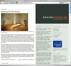
Design Observer goes under the knife and loses the light text on a dark background. “We wish to maintain a focus on our main posts, and on these being readable as longish essays. We are moving to a three-column format so that our weekly Observed column may become a daily feature. And we hope to highlight more books and items from our archive.” A group of Speak Up authors discussed the new DO and gave it mostly negative reviews in a round table discussion.
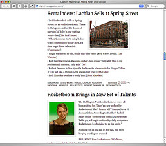
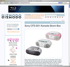
Gawker and Gizmodo shuffle and redesign. “Bigger images, a flexible design that works on browser windows from 800 pixels to 1600 wide, cool ajaxy navigation between posts, and more to come.”
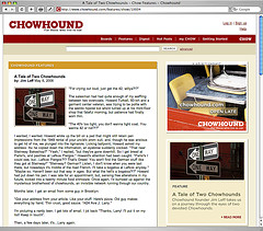
Chowhound puts on a new face for foodies.
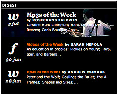
Reversed-out type lives on at The Morning News where this Digest block uses white text on black background. Those date elements on the left are neat but the right side sometimes features white text over a white image which ain’t so legible.
19 comments so far (Jump to latest)
Matt Todd 10 Jul 06
I personally like the new Design Observer, err, design. It’s clean, with an intent focus on functionality, helping the eye navigate to the most valuable content to the lesser.
M.T.
Mike Swimm 10 Jul 06
Waiting for the animated header to load EVERY time you view a new page on Gizmodo drives me absolutely nuts.
It’s called a cookie guys.
Design Observer looks great.
RS 10 Jul 06
At first I didn’t appreciate the DO redesign. It took me a few weeks. Now I drink up the subtle color and proportion on each visit. For example, the thick line below the author and the thin dotted one after each article. Or the expert spacing and soft grey greens. It’s become a favorite. My only complaint is the small type.
Paul 10 Jul 06
“Waiting for the animated header to load EVERY time you view a new page on Gizmodo drives me absolutely nuts.”
I second that.
I feel that using Flash for a one-time logo animation is pretentious and inaccessible.
Mrad 10 Jul 06
I totally agree with Mike about Gizmodo. It’s wayyyy too distratcing on every page. An animation like this just gives standards zealots more anti-flash ammunition.
You’ve got a groovy little logo anim there. Use it tastefully on the homepage only.
Dan Boland 10 Jul 06
I think a lot of designers are quick to pan a redesign because no one wants to be the one that likes something everyone else hates. I like the DO redesign, image be damned. =)
However… nothing happens when you hover over a link. That drives me absolutely crazy. Can I get a “text-decoration: underline” please?
Joel Johnson 10 Jul 06
We’re probably a bit overly enamoured with our fancy new logo, you’re right. Animating once per session is probably much more reasonable. We’ll get that cooking.
Keep it coming!
Grant Hutchins 10 Jul 06
The Daily Mail screen reminds me of Myspace. I bet most people who are interested in what it says instinctively drag over the text.
Still it’s sloppy.
Dustin Boston 10 Jul 06
Thanks for moving the images to your site. Flickr gets blocked at work…
Stephen 10 Jul 06
I’m not a big fan of Gawker’s “support” for wider resolutions. Having a left aligned heading jutting all the way across the page and throwing the odd image over to the right a bit is hardly making good use of the extra space.
Pete Lasko 10 Jul 06
Adding a background-color to the inline text in that morning news box would still give the basic effect of text over image, while preserving legibility. Alternately if they wanted to use a png they could preserve the effect even better. its no good as it is.
Christopher Fahey 10 Jul 06
The Design Observer site you see today is different from the one from only 48 hours ago. The 2-days-ago site had the DO logo (and the big blank background) taking up about three times the space it does now. Enterprising third-party design critics redesigned the site elsewhere with a smaller branding area. DO must have seen it and taken the advice. If you click to view an internal page, you can still see the huge logo area, actually.
Kitty 12 Jul 06
As clean and subtle as the Design Observer redesign is, I’m having trouble getting past the old-school coding under the hood. Tables for layout, center and font tags - I don’t think they reflect well on a design-centered site. “Design” is more than just visual design; with all of the discussion of standards and accessibility resources and expertise out there right now, not to mention all of the sites poking fun at retrograde table-based redesigns, it’s odd that they’d go ahead with this kind of structure.
J 12 Jul 06
I�m having trouble getting past the old-school coding under the hood. Tables for layout, center and font tags - I don�t think they reflect well on a design-centered site.
Sigh. Don’t go looking for problems. READ the site, not the code.
Kitty 13 Jul 06
The contents of Design Observer are great, and the layout is fine. I just feel like the redesign doesn’t encompass all aspects of design, especially for a site that highlights it. The underlying architecture is important too, not just the visual aspects. The way it is now, it doesn’t seem to be very concerned about the structure of the information or accessibility to people using assistive technologies, like a beautiful-looking car built with less-than-modern technology and that can’t really be driven by everyone, even though the resources are available to modernize and fix it.
Kate 14 Jul 06
I totally agree with Kitty — DO’s code is shameful. To their credit, the Speak Up crew discussed this a bit in their round table discussion, but (predictably) the general attitude (everywhere) seems to be that the behind the scenes code just doesn’t really matter. This is ludicrous and irresponsible, especially in view of a future that becomes more and more paperless and tech-oriented by the day. Designers, especially elite ones, need to be setting better examples in an industry that is evolving to the point where even the stodgiest of old-school print designers need to know at least a little about how the web operates. Come on.
That aside, I read their feed, and I have to say it’s annoying to be unable to access the links from the feed — you have to click and visit the actual DO Observed mini-pages for the links (the color of which is barely distinguishable from the main body text). Grouch grouch grouch.
e 15 Jul 06
Unless mandated by the government, many people will not make their sites ‘accessible’ as you would like.
Plus, they will lose customers/prospects/clients if their sites are not accessible—their loss, your gain. However that is, unless your own site is all flash http://www.katelane.com/
Kate 15 Jul 06
Heyyyyy!
Arg. Flash sites are a different issue entirely (besides, that 1) is not the only site I maintain and 2) was done for a class). And personal portfolio sites are hardly in league with a site like DO, which serves as a resource to a larger community.
Alex 16 Jul 06
nice and mature, e.