Screens around town: Skype, BusinessLogs.com, and MP3 blogs 12 Jan 2006
60 comments Latest by john beck
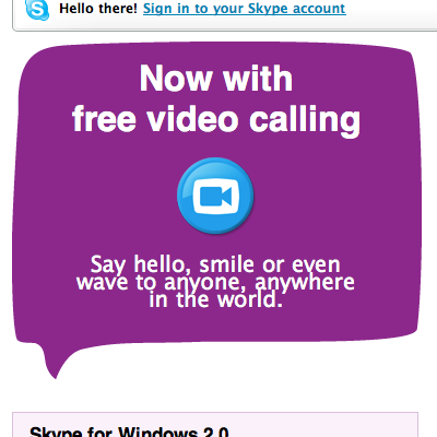
The age of CSS has led to an abundance of straight line design. Adding some rough edges can make a page seem significantly more human. Here, Skype uses organic shapes to seem more friendly.

The effect reminds me a tiny bit of old Saul Bass movie posters.
—
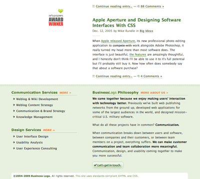
The footer at BusinessLogs.com is a great example of how to end a web page without leaving visitors wondering “Where can I go next?” The footer offers links to services, a brief About Us philosophy bit with a link to more info, and a clear contact button. This also works well as a quickie site description for those who arrive via Google or some other outside link. Click image to see the full size version.
—
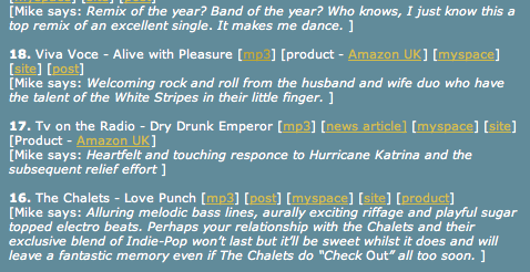
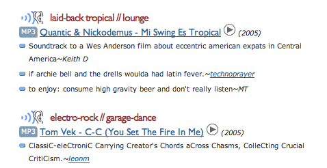
A tale of two MP3 blogs: Take Your Medicine and Aurgasm. Look how the MP3 link — the most important one — gets buried when it’s just text (Take Your Medicine, top image here) vs. Aurgasm’s clear visual callout. A good case for icons.


60 comments so far (Jump to latest)
Spike 12 Jan 06
That Skype speech bubble is hideous - looks like it has been warped out of shape. Really, really grotesque IMO. Love the business logs one though.
Mike Rundle 12 Jan 06
Thanks for the shout-out Matt, it’s cool that you noticed ;)
As for some ROI talk, we probably get 3-4x more requests for work a week after we dropped that redesign than ever before. We’re making a lot more money per project, getting cooler clients, our RSS subscription base has almost doubled, and things are really going well. Crazy what a footer can do haha.
Tony 12 Jan 06
Great post. Thanks.
Geof Harries 12 Jan 06
I think Skype’s branding is very original and good looking to boot. They don’t rock the typical Web 2.0 style too heavily - rounded corners, gradients and diagonal stripes - instead going out on a limb with distorted bubble shapes, sketchy fonts and youthful style. Their creative team should be commended, not slammed, for their approach.
Matt Todd 12 Jan 06
Mike Rundle’s comment is extremely telling just how important a fully thought-out design is. It’s quite easy to see that the footer of a website is one of the most neglected design elements, which is quite sad considering you want to keep people interacting and exploring your website. Mike Rundle and BusinessLogs got this right… really, really right. Well done.
M.T.
Joe 12 Jan 06
the businesslogs footer is rather powazekian:
http://www.powazek.com/2005/09/000540.html
Geof Harries 12 Jan 06
If I’m not mistaken - Business Logs’ giant footer preceded Derek’s re-design. Mike, can you clarify?
Geof Harries 12 Jan 06
Yep. Derek re-designed: Sept 5, Business Logs: Aug 19.
Jonathan Snook 12 Jan 06
Regarding Skype and the use of sharp lines often has more to do with the ease for creating scalable designs. The Skype site, despite its morphous thought bubble fails upon bumping up the font size a couple steps. Suddenly you find white text on a white background. (then again, other elements on the page also fall apart)
Noah Winecoff 12 Jan 06
I’m not a big fan of skype’s speech bubble. I like clean and crisp, but thats me. I really like the footer for BusinessLogs though.
Dan Boland 12 Jan 06
I’ll hop on the “BusinessLogs’ footer is awesome” dogpile. It also makes me realize how beautiful Lucida Grande is on the web.
dmr 12 Jan 06
Horray for organic shapes! It’s quirky, interesting and gives the site quite a bit of personality.
paul 12 Jan 06
You talk about the MP3 text link getting lost, but look at your own embedded links within paragraphs in this very blog. If you happen to have the link underlining option turned off in your browser the links here are completely invisible.
I brought this up once with you guys by email and received a curt reply from Jason saying basically to bugger off. If I turn link underlining back on then I wouldn’t have any problem.
I’m willing to let it go - if you guys really believe that it is incorrect for me to choose that option in my browser, and by extension incorrect for browser publishers to include the option to begin with, but it’s a little gauling when you go out of your way to nit-pick everyone else’s designs.
I literally have to mine-sweep your paragraphs to find the links — to find if there even ARE any links. Is that not silly? And the irony is you actually color the visited state so they DO become visible — after the link’s been followed. Horse. Barn door. Etc.
Ryan 12 Jan 06
Sorry, but I think the Skype bubble is hideous, and the type towards the bottom of the bubble is so crunched together (not to mention that it’s in a completely different face altogeter) that it just looks like a high school design student put it together.
Mike 12 Jan 06
Hmm… icons might work…
Dan 12 Jan 06
With regard to paul’s comment about links… It seems sort of silly what you are complaining about. You say you turn off the feature that makes links easy to find, then you have a problem when you can’t easily find links. I think maybe that’s just a sacrifice you have to make when you turn link underlining off? Also, the links are a solid black color while the body text is grey, which also helps.
ML 12 Jan 06
I literally have to mine-sweep your paragraphs to find the links � to find if there even ARE any links. Is that not silly?
Paul, that does indeed sound silly. A couple of questions for you:
Question #1: Is there a point at which the owner of a site is allowed to say, “You know what…this affects such a small percentage of visitors I’m just not going to worry about it.”
Question #2: What percentage of people do you think turn link underlining off?
Matt 12 Jan 06
I have never heard of anybody turning off all link underlining before.
You are definately the minority on this one, and as ML said, how much work does the designer have to spend on a fraction of a percent of the userbase.
daleV 12 Jan 06
no underlining for me. underlines are totally mosaic.
Paul Irish 12 Jan 06
What a pleasure to see my own site mentioned on one of my favorite blogs.
And Mike, I still enjoy your site. Content is king, but good design sure lets people enjoy that content even more.. Cheers!
Rimantas 12 Jan 06
A short plan how to lead a meaningful life:
a) turn off link underlining in browser
b) turn off colors too
c) go around the web bitching how bad sites are, cause nobody cares to put
“LINK:” in front of every and each link on the page.
Seth 12 Jan 06
I was just noticing that Skype bubble yesterday when I had to go download it for the first time.
Really nice design…thumbs up.
SC 12 Jan 06
wow, I thought I was the Duke of the Web, but I had never heard of anyone turning off link underlining. wow. I just… I….
Lance C 13 Jan 06
Hmm, turning off link underlining.. must be a Web 2.0 thing. ;)
On a more mature and serious note, the only thing I didn’t like in the post was the skype bubble. I personal think the skype site is all over the place. I’m sure it was a design choice made by the designers to be “different”. I just think with the inconsistancies on the site, what does that mean for their business practices? :)
Holy Cow 13 Jan 06
I�ll hop on the �BusinessLogs� footer is awesome� dogpile. It also makes me realize how beautiful Lucida Grande is on the web.
Unless you’re using Windows, in which case it looks unbelievably hideous! (Waitaminnit, that’s a majority of users on the Web, ain’t it?)
Darrel 13 Jan 06
If you happen to have the link underlining option turned off in your browser the links here are completely invisible.
Uh…Duh?
To be fair, 37s could also color the link. Which would probably be a good idea but yea, turning off link underlining seems like a really odd thing to do.
And the BL footer is great. I’ve been looking for more examples of footers being used in a more robust manner. Nice.
I think it’s also important to point out the differences between Powazek and BL. Powazek is using his footer as *the* means of navigating the site, while BL is using it as *ancillary* navigation. (not saying one is better/worse…just that they are different)
smeidu 13 Jan 06
hi everyone,
I’m searchin for good books about userInterface Design in special for Web Appz. of course i ordered “Defensive Design for the Web” and also “The Elements of User Interface Design”
von Theo Mandel.
Are there any other good books out there, which you can recommend?
nice greetings from austria;-)
Kim Siever 13 Jan 06
I like BusinessLogs’ footer idea as well (and all the other recent incarnations of it on other sites). We recently redesigned the footer on our subpages using these as examples.
Erik 13 Jan 06
I’ve been turning off underlining on links since the first time I used a browser on a color monitor a decade ago. The default behavior of a web browser is to color a link blue, an active link red, and followed link is purple, no hover change. That’s the way it’s been since mosaic. When I install a new browser that I intend to use regularly (not just for testing) one of my first tasks is to turn off underlining in the preferences.
I usually think 37S is good with their usability decisions, but I think they fell flat here on the blog with the links. Links should always be a different color than the basic text, whether you think you’re going to be relying on underlining or not. That’s just good usability. You don’t have to stay with that reflex-type blue that’s used by default, but you should stay with colors. Build a style and stay consistent.
Plus, underlining is ugly, on the page and on the screen. It breaks up the flow of reading. That’s why you almost never see it in books. What an author puts down as underlining in their manuscript (a relic from when authors used typewriters and not word processors) comes out as italics on the printed page. We can all agree that italics on screen suck, but monitors have something most printed pages don’t: color. Swap the italics for a different color and you’re set.
Darrel 13 Jan 06
“Plus, underlining is ugly, on the page and on the screen. It breaks up the flow of reading. That�s why you almost never see it in books.”
You never see it in books because hypertext doesn’t work on paper ;o)
Does it break up the text a bit? I dunno. Maybe. But that’s not the point. They are obvoius links, and that’s often what people are looking for.
Anyways, I’d love to see more examples of the footer-type navigation/sitemap/other info type thing. If anyone has some, post ‘em!
bobby 14 Jan 06
I�ll hop on the �BusinessLogs� footer is awesome� dogpile. It also makes me realize how beautiful Lucida Grande is on the web
Jaanus 16 Jan 06
Hi, this is Jaanus from Skype. Thanks for the kind words guys, our nice little brand is important to us and we continue to work on it day and night. The spacing of the bottom lines in the violet blurp obviously has some “issues”, men are at work fixing that as we speak.
theCreator 22 Jan 06
I’m behind bobby
Marla Erwin 01 Feb 06
OK, am I the only person who thinks the Business Logs footer is too much? Probably works well on longer pages, but when the page content is shorter than the footer it feels completely out of balance. In fact when I first saw the screenshot, I thought the footer area WAS the page content, and looked at the copyright line as the “footer.” I do think the principle is sound, but the size + density of text + strong color all combine to make it visually overwhelming. Half the height would be better.
Eduardo Bernal 13 Mar 06
Welcome to the Pharmamx.com Family!We invite you to visit us at www.pharmamx.com and find our great medicine prices. We provide serious and first class service to all our customers 24/7. If we do not carry a medicine you need just let us know and we will be more than glad to assist you!To show you our gratitude for past purchases and to offer you one more reason to continue purchasing with Pharmamx.com we are offering a limited time 30% discount included on all our medicines. We will keep on giving you the best price and service in the market. Welcome and enjoy your visit to Pharmamx.com
Eduardo Bernal 04 May 06
Welcome to the Pharmamx.com Family!We invite you to visit us at www.pharmamx.com and find our great medicine prices. We provide serious and first class service to all our customers 24/7. If we do not carry a medicine you need just let us know and we will be more than glad to assist you!To show you our gratitude for past purchases and to offer you one more reason to continue purchasing with Pharmamx.com we are offering a limited time 30% discount included on all our medicines. We will keep on giving you the best price and service in the market. Welcome and enjoy your visit to Pharmamx.com
John Beck 09 Sep 06
Easy to follow step-by-step guide to financial freedom by buying real estate
Tax Foreclosures 09 Sep 06
Easy to follow step-by-step guide to financial freedom by buying real estate for Pennies On The Dollar
John Beck's Tax Foreclosures 09 Sep 06
Guide to financial freedom by buying real estate for Pennies On The Dollar
John Beck 09 Sep 06
Everyday there are new ways to earn huge profits over the nternet with Real Estate.
Tax Foreclosures 09 Sep 06
Everyday there are new ways to earn huge profits on Real Estate
John Beck's Land 09 Sep 06
Ways to earn huge profits over the Internet with Real Estate.
John Beck 09 Sep 06
With just two deals, I’ve profited over $17,000!
Tax Foreclosures 09 Sep 06
With just two deals, I’ve profited over $17,000! In real estate
Tax Liens 09 Sep 06
I would never think of earning 5 figure income in real estate
John Beck's Success Stories 09 Sep 06
I would never think of earning 5 figure income in real estate
John Beck's Land 20 Sep 06
Ways to earn huge profits over the Internet with Real Estate.
John Beck 20 Sep 06
Easy to follow step-by-step guide to financial freedom by buying real estate
Tax Foreclosures 20 Sep 06
Easy to follow step-by-step guide to financial freedom by buying real estate for Pennies On The Dollar
John Beck's Tax Foreclosures 20 Sep 06
Guide to financial freedom by buying real estate for Pennies On The Dollar
John Beck 20 Sep 06
Everyday there are new ways to earn huge profits over the nternet with Real Estate.
Tax Foreclosures 20 Sep 06
Everyday there are new ways to earn huge profits on Real Estate
John Beck's Land 20 Sep 06
Ways to earn huge profits over the Internet with Real Estate.
John Beck 20 Sep 06
With just two deals, I’ve profited over $17,000!
John Beck 20 Sep 06
With just two deals, I’ve profited over $17,000!
Tax Foreclosures 20 Sep 06
With just two deals, I’ve profited over $17,000! In real estate
Tax Liens 20 Sep 06
I would never think of earning 5 figure income in real estate
John Beck's Success Stories 20 Sep 06
I would never think of earning 5 figure income in real estate
john beck 24 Sep 06
It seems to be a successfull business blod either a good place to discuss about technological matters.