Screens Around Town: The Morning News, Original Signal, Wize 05 Oct 2006
16 comments Latest by al
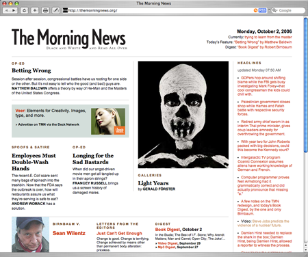
The Morning News

The Morning News redesigns.
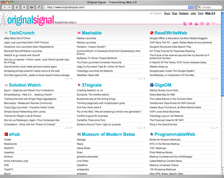
Original Signal

“Original Signal aggregates the 15 most popular Web 2.0 sites. The main purpose of the site is to provide a quick glance on what’s happening without using your desktop/web RSS reader.”
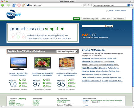
Wize

“Wize Rank takes the collective wisdom of more than 750,000 reviews of nearly 20,000 products and distills them into a single, simple number that’s easy to understand.” Nice to see a shopping comparison site with big product shots instead of itty bitty thumbnails.
Got an interesting screenshot for Signal vs. Noise? Send the image and/or URL to svn [at] 37signals [dot] com.
16 comments so far (Jump to latest)
Sam 05 Oct 06
totally digging the Morning News redesign. make things different without totally freaking out the visitor. like that.
Dan Boland 05 Oct 06
I liked the previous version of The Morning News better. Not bad though. And thanks for the tip on Wize, I’m checking it out right now.
Alex Aguilar 05 Oct 06
I prefer www.popurls.com over originalsignal
but I recommned you change to light background and larger text
John S. Rhodes 05 Oct 06
Dan wrote: “Not so sure about Wize”
Exactly what I was thinking. From a design perspective, my first impression is that this seems usable. However, because of the content (see my previous post!) I’m not so sure that I trust the site. I guess I “trust” the design but I don’t really believe in the content. It doesn’t matter if it is empirically valid; right or wrong.
Rank 100 is simply higher than Rank 97. Everything I know screams that the iPod is superior so Wize.com violates my expectations.
This might be a good thing for the market as a whole since it might wake people up to other (better?) products. But as an individual, I have trust issues with the site.
Another angle on iPod versus the ZEN is that Wize.com only takes the product into consideration. That is to say, the ZEN really might be a better product but the overall experience might be worse than with an iPod. Think about how the product intersects with iTunes, music selection online, Apple marketing and the like.
Micha 05 Oct 06
Checkout www.newssnacks.com as well.
Dan Boland 05 Oct 06
John Rhodes: My complaint isn’t with whether the ZEN Vision is better than the iPod or not, it’s with the scoring system. How can something have a perfect score when only 86% of customers gave positive reviews? How is that possible? If the ZEN Vision really does outscore the iPod, fine, but how can they hope to have any credibility when their own data contradicts itself?
Alfred Toh 05 Oct 06
www.newssnacks.com is spotback.com’s attempt at making a one page aggregator. IMO, they totally copied originalsignal and launched newssnacks way later than originalsignal.
It will be interesting to see how the orginalsignal 3 column grid layout becoming the defacto layout for one page aggregators.
Luis 05 Oct 06
This is totally different from the topic of simple websites, but Bundstone boots are a perfect example of simple design and contruction that has worked for well over a hundred years.
I just bought a pair and have to say they are amazing.
Lee 05 Oct 06
Lee from Wize.com here —
We were all surprised by the ZEN being the top ranked MP3 player on Wize. Turns out it has a higher percentage of positive reviews than the iPod. Both are consistently reviewed positively by people all over the web.
The power of Wize Rank is using the collective wisdom of user and expert reviews to identify high quality products. Customers should use Wize Rank as a starting point for product research, then dig into the detail to find the products that are right for them.
Augie De Blieck Jr. 06 Oct 06
I love that MorningNews design. There are far too many newssites that overload each story with “associated links” right next to them on the front page. There’s way too many boxy layouts that cram text next to each other with no padding (or margins). MorningNews works so well for me because of all that white space gloriously keeping the individual elements separated. That also helps make the three images on the page pop out more. (The advertiser must be happy about that.) The lead story is clearly the lead story. It’s not lost in a sea of overwhelming information.
The headlines on the right look a little too wordy, honestly, but that might also be the red text color at the small size in the screen shot. But when they mix black and red text together, it’s a little jarring to me, too. Don’t know what the solution is there…
Luke S. 07 Oct 06
I’ve always appreciated The Morning News’ design(s), but this one is all over the place. It really needs to be a heck of a lot tighter - the elements in this design just seem to float in space with no clear hierarchy and very fuzzy relationships. The story hierarchy itself is really quite confused & the whole thing needs to be whipped into shape. Its too bad because they had quite a distinct character which has been lost somewhat in this new design.