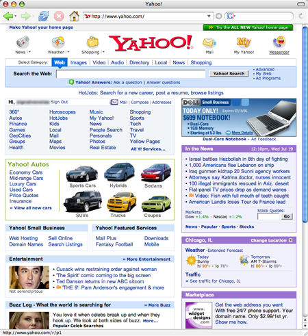
For what it’s worth, I miss the centered logo and the icons at the top.
Mark Haliday
24 Jul 06
Too busy. Still won’t use it.
Yahoo = Mess
Google = Easy, clean
Luis
24 Jul 06
Way too much info, but then again that’s what they’re about, I guess.
Stanley
24 Jul 06
Google home page = 13 clickable links
New Yahoo = 102 (by my VERY quick count)
I know where I’ll go(ogle) for info.
Stanley
24 Jul 06
Google home page = 13 clickable links
New Yahoo = 102 (by my VERY quick count)
I know where I’ll go(ogle) for info.
Phil
24 Jul 06
This whole “Yahoo is too busy, so thats why i don’t use it” complaint is tired. There is a plain Yahoo page here: http://search.yahoo.com/ .
Some people use Yahoo’s search as their home page though and find all that extra stuff useful. This is a good design for a majority of Yahoo’s users, not the geek minority. It’s an advantage for Yahoo to be able to advertise their products because of that layout. Google has got itself in a catch-22 situation where it can’t tell a majority of it’s users about Google Spreadsheets, because they don’t want to mess with the simple homepage.
Yes it has lots of links, but Yahoo is a fully featured portal, while Google is (to most people) “just” a search engine.
A lot of people prefer having all sorts of information on their home page. And in these days of high speed Internet, who really cares about minor differences in speed?
The “Fireable Offense” Flash-based video linked as the first headline on the home page is crashing Safari and Firefox on two different Mac OS X computers. (No problems with YouTube, Google Video, or other Flash movies however).
Way to go, Yahoo.
Peter
24 Jul 06
It’s perhaps more appropriate to compare www.google.com with search.yahoo.com, and news.google.com with www.yahoo.com.
8500
24 Jul 06
I really enjoy the “Marketplace” section which just seems to be a new location and label for ads. I’m sure the blurring of ads and news is a much requested user requirement.
Tsukari
24 Jul 06
I like it, its much a much better layout for the amount of content they show. To those who say googles site design is better, I say when you have to do a google search to be able to see any of its products outside of search, that counts as an equally bad design. How is anyone outside the “blogosphere” supposed to find out that stuff even exists at all?
Google.com is a great search portal, but as far as a company with a diverse set of products goes its really bad.
8500
24 Jul 06
After further review, the Marketplace section isn’t new but that doesn’t make it suck less.
I think people are focusing on how much information is on the Yahoo! home page now as opposed to how efficiently that information is arranged and presented.
Clearly the goals of Yahoo.com and Google.com differ at a fundamental level. Yahoo’s page is a heavy-information portal that attempts to present an overview of user-determined infobites, which are all fairly editable. Each monad of data is very cleanly laid out.
Google’s homepage, by comparison, is spartan, but look at how much info is made available (almost none). When you compare Google’s search results page with Yahoo’s home page, which is more pleasant and inviting?
I think for what it is the new Yahoo home page is a winner. If you need lots of web clippings in a tidy package you can’t beat the Yahoo/My Yahoo pages. Google News is ugly and poorly organised by comparision. The Google homepage simply won’t get you what you want (if you want the services that Yahoo’s home page offers).
Tsukari
24 Jul 06
I like it, its much a much better layout for the amount of content they show. To those who say googles site design is better, I say when you have to do a google search to be able to see any of its products outside of search, that counts as an equally bad design. How is anyone outside the “blogosphere” supposed to find out that stuff even exists at all?
Google.com is a great search portal, but as far as a company with a diverse set of products goes its really bad.
CC
24 Jul 06
What a mess.
Adam Sanderson
24 Jul 06
yahoo.com bounces around way too much for me. With things sliding up and down, it’s kind of frustrating to use. They’re really set on the whole highly javascripteddeal without seeming to have a good plan for how to use it.
On the other hand, if you want a fancy search with AJAX alltheweb.com is kind of neat (powered by Yahoo anyways).
I think people are focusing on how much information is on the Yahoo! home page now as opposed to how efficiently that information is arranged and presented.
Clearly the goals of Yahoo.com and Google.com differ at a fundamental level. Yahoo’s page is a heavy-information portal that attempts to present an overview of user-determined infobites, which are all fairly editable. Each monad of data is very cleanly laid out.
Google’s homepage, by comparison, is spartan, but look at how much info is made available (almost none). When you compare Google’s search results page with Yahoo’s home page, which is more pleasant and inviting?
I think for what it is the new Yahoo home page is a winner. If you need lots of web clippings in a tidy package you can’t beat the Yahoo/My Yahoo pages. Google News is ugly and poorly organised by comparision. The Google homepage simply won’t get you what you want (if you want the services that Yahoo’s home page offers).
Brandon
24 Jul 06
I’ve never been a big fan of Yahoo! I’ve been using Google for so long any portal-style site just makes me cringe. I use news aggregators to get my other info, and Googles customized desktop does a heck of a job showing me most of my favorite blog posts and news feeds and doesn’t show me a bunch of crap I don’t need or want (especially ads - not a one).
I think people are focusing on how much information is on the Yahoo! home page now as opposed to how efficiently that information is arranged and presented.
Clearly the goals of Yahoo.com and Google.com differ at a fundamental level. Yahoo’s page is a heavy-information portal that attempts to present an overview of user-determined infobites, which are all fairly editable. Each monad of data is very cleanly laid out.
Google’s homepage, by comparison, is spartan, but look at how much info is made available (almost none). When you compare Google’s search results page with Yahoo’s home page, which is more pleasant and inviting?
I think for what it is the new Yahoo home page is a winner. If you need lots of web clippings in a tidy package you can’t beat the Yahoo/My Yahoo pages. Google News is ugly and poorly organised by comparision. The Google homepage simply won’t get you what you want (if you want the services that Yahoo’s home page offers).
Swati Jain
24 Jul 06
Information overload when it comes to the Yahoo homepage. I really don’t know where to begin with all that content.
I think busy works sometimes. My Netvibes setup is very busy, but I know that every single link on the page is relevant and interesting to me.
Even when you customize My Yahoo, you’re getting choked by menu options you don’t want, content you’re not interested in reading, or advertising for shit you don’t need.
Seriously: Justin Timberlake’s new music on Launchcast Radio? Shoot me.
I will say it’s an improvement. I think it suffers mostly from icon overkill - do we really need one for each nav item? I do wish they had a more elegant solution for those poor folks stuck at 800x600…ya know, those that think Yahoo and Google ARE the internet.
Sam
24 Jul 06
I found this sweet site that has even less visual noise than Google! It’s called about:blank
Use the search box in your browser chrome if you want a perfectly uncluttered UI. I bet that’s what most of you do already. Yahoo.com is more than just search.
I never thought I would say it, but I actually prefer the old design. The dominant single colour in the new design just makes my brain shut down.
The funny thing with Yahoo! is that you are usually only one link away from an equally awful, but at least usable, 2000-era page design that has managed to persist.
ben murray
24 Jul 06
Just judging by the images … the new design looks better, but does it feel better? Not a rhetorical question, seriously asking, haven’t used yahoo in ages.
Also, I like google’s personalized portal. www.google.com/ig I set it up to have as many things as I want. No images, just textual information. Plus you can rearrange it until it feels right.
Perhaps it would be a more suitable to compare google’s personalized portal/homepage to yahoo.com.
rebekah
24 Jul 06
I’ve been using a beta of the new yahoo page at work for some time. The mail section has seldom worked for me in IE. I also ways have to go to mail.yahoo.com to access it.
I mostly use yahoo for email, buzz.yahoo.com (which I can’t find in the new IA), and My Yahoo for RSS feeds. Except for the buzz content on Yahoo, the new IA works for me. I ignore the “busy-ness” and focus on what I want. Its overkill, but it doesn’t keep me from navigating to what I want.
Google and Yahoo are 2 different beast to me. Google is my search engine of choice, but I continue to use yahoo mail.
I was hoping that the yahoo update would make it more usable, but it went the other way. Hang on to a few yahoo items for legacy reasons (plus I use Yahoo web hosting), but as time goes on, yahoo finance is about the only thing I really use from yahoo. Yahoo Mail is what I used for online signup (cause I don’t mind spam in my yahoo email account). Google for everything else.
CJF
24 Jul 06
The way they guarantee that everyone gets to see the 5% of Yahoo!’s services that they use in one place is to make sure that everyone has to wade through the 95% of the services they don’t use.
I don’t like that, It’s too much overhead at the beginning of a task. As others have pointed out, even if you are one of the few who will cusomize a portal, you are stuck with bits you can’t get rid of that you have no use for.
Google has the right idea, people start using the web by typing keywords if they don’t know exactly what they want, or going to a memorized (or bookmarked) location when they do. Despite how blatanly it violates usability heuristics, I’d say it’s harder for most people to type www.yahoo.com, and then find and click on mail in that portal, than it is to remember and type mail.yahoo.com and go straight there.
James
24 Jul 06
Ironically, I like a lot of Yahoo for it’s simplicity. weather.yahoo.com (used to be) much more simple and speedy then weather.com, sports.yahoo.com is great and clean compared to espn.com, and finance.yahoo.com is second to none. It seems like they are changing all that by Ajaxifying everything (the Yahoo Mail beta is cool, but way too slow).
Overall I’d say it’s easier to navigate, more useful, and better laid-out. Which is good. but, it’s too bad it comes at the expense of aesthetics. The new Yahoo!, in my opinion, is too shiny, too textured, too shadowed, and just too “I’m trying to be trendy, but am using last year’s trends to do it.” And, while I do think the newone is mostly better usability-wise, the old one did make really nice use of color, whereas the new is kind of all-the-same.
And, I definitely agree with Jason — I miss the centered logo and icons up top (and it’s not like I go around agreeing with Jason for the fun of it). :)
Zelnox
24 Jul 06
I’ve used Yahoo as my homepage almost ever since I started to use the Internet (almost 10 years). My first e-mail account was from Yahoo ^_^;;;;. However, I do not really read what’s on the page. I remember reading the headlines much more often back in the old page, because the “sports” link was below it. I rarely used the section with the categories, because it took too long for my eyes to settle down, but I like the new one more. Ever since Google came along, I’ve just done CTRL+L and typed google.ca in. Funny, eh? With Firefox, I don’t even need to do that.
Still, I prefer using Yahoo as my homepage. At least, there can be things I can blink at and actually click if it piqued my interest. Maybe this is why at the Museum of Modern Betas, there are a few projects for “custom homepages”.
I do agree that the new Yahoo has way too much gradient. O_o makes me think of their IM client. Meh.
Joe
24 Jul 06
I get lost in Yahoo’s new home page. I don’t see anything new that gets me excited. Shrug…
jason
25 Jul 06
I always find it deeply ironic about all the comments the “internet elite” on sites like this and slashdot have about sites that the masses use like myspace and Yahoo…these are both huge internet properties that make tens of millions of dollars. Alot more than many of the designers obsessed with usability, standards, opera browsers, etc combined. If all of those things are so important, then how is it “badlly” designed sites and portals like aol, msn, yahoo, and myspace get tens of milllions of users ?
pj
25 Jul 06
It’s just another of those “home page-come-portal” type things. We’ve seen it a million times and this is another example that it’s horrible.
Surely most people have they favourite sites for particular content e.g. BBC for news and they just vist those sites or use RSS. One site which trys to do it all just ends up doing nothing.
The new Yahoo email interface is just as bad.
Google homepage and gmail win hands down because they are fast, to the point and provide a useable service.
thomas B
25 Jul 06
“yahoo.com bounces around way too much for me. With things sliding up and down, it�s kind of frustrating to use..”
Agree 100% the “moving” thing is horrible; it’s like something Microsoft would dream up as a “Useful Feature”
I had just as hard of a time finding the “Mail” link as I do trying to find something in my fridge. It took way too long. Is it too hard to give me a little mail icon? An animated GIF would be way sweeter!
Joe
25 Jul 06
I always find it deeply ironic when somebody attempts to make an intelligent comment but then also makes the dumbest of spelling mistakes with “alot.”
The day Yahoo! and other sites make their technology available to those of us on Firefox will be the day I defend them in these Yahoo! vs. Google debates.
Design-wise, I think the points are covered above. Google is clean, Yahoo! is becoming the next CNN.com or NYTimes.com - let’s get all our information to you all at once so that people see it. What they don’t realize is - if a page is cluttered with too much, then you can’t see anything clearly.
As far as Google - the oversimplified design does have drawbacks. I’ll admit, I probably only know about 1/4 of all of Google’s services available, simply because they don’t advertise it to the average user. Yahoo! puts all the services right out front. I tend to think they did it more successfully in the past (Yahoo!), but that’s just me.
We’re at another crossroads in the design industry, where we are still fiddling to try to find the best blend between information architecture and practical design. It will get a little bumpy from time to time. I’m just happy that there are larger sites like Yahoo! willing to try something new, so the little guys like me and you can take what they did right and wrong and improve on it.
Quartazone
30 Jul 06
It’s not Yahoo vs Google. And it probably hasn’t been for a long time.
Yahoo’s home page is a newspaper. Google’s home page is a command line tool.
Yahoo’s page is for passive use- browse, nibble and graize. Google’s page is for getting something done. It gives you direct access and gets out of the way.
Yahoo may know something about putting a search engine together, but it’s pretty clear that Google has run completely past them. They just don’t measure up as a search engine company to Google. And Yahoo knows it.
Yahoo’s new home page is a clear indication of the irrelevance of comparing the two. Yahoo took a simple busy page that had become familiar to millions, like the layout of any famous newspaper, and changed it something heavier (in terms of the effort for my browser) without adding any obiviously discernable benefit.
This is the work the clueless that are seeking attention through the whims of fashion. Sad, because Yahoo could be something more than this.
50 comments so far (Jump to latest)
JF 24 Jul 06
For what it’s worth, I miss the centered logo and the icons at the top.
Mark Haliday 24 Jul 06
Too busy. Still won’t use it.
Yahoo = Mess
Google = Easy, clean
Luis 24 Jul 06
Way too much info, but then again that’s what they’re about, I guess.
Stanley 24 Jul 06
Google home page = 13 clickable links
New Yahoo = 102 (by my VERY quick count)
I know where I’ll go(ogle) for info.
Stanley 24 Jul 06
Google home page = 13 clickable links
New Yahoo = 102 (by my VERY quick count)
I know where I’ll go(ogle) for info.
Phil 24 Jul 06
This whole “Yahoo is too busy, so thats why i don’t use it” complaint is tired. There is a plain Yahoo page here: http://search.yahoo.com/ .
Some people use Yahoo’s search as their home page though and find all that extra stuff useful. This is a good design for a majority of Yahoo’s users, not the geek minority. It’s an advantage for Yahoo to be able to advertise their products because of that layout. Google has got itself in a catch-22 situation where it can’t tell a majority of it’s users about Google Spreadsheets, because they don’t want to mess with the simple homepage.
Olav 24 Jul 06
Yes it has lots of links, but Yahoo is a fully featured portal, while Google is (to most people) “just” a search engine.
A lot of people prefer having all sorts of information on their home page. And in these days of high speed Internet, who really cares about minor differences in speed?
Carlos 24 Jul 06
The “Fireable Offense” Flash-based video linked as the first headline on the home page is crashing Safari and Firefox on two different Mac OS X computers. (No problems with YouTube, Google Video, or other Flash movies however).
Way to go, Yahoo.
Peter 24 Jul 06
It’s perhaps more appropriate to compare www.google.com with search.yahoo.com, and news.google.com with www.yahoo.com.
8500 24 Jul 06
I really enjoy the “Marketplace” section which just seems to be a new location and label for ads. I’m sure the blurring of ads and news is a much requested user requirement.
Tsukari 24 Jul 06
I like it, its much a much better layout for the amount of content they show. To those who say googles site design is better, I say when you have to do a google search to be able to see any of its products outside of search, that counts as an equally bad design. How is anyone outside the “blogosphere” supposed to find out that stuff even exists at all?
Google.com is a great search portal, but as far as a company with a diverse set of products goes its really bad.
8500 24 Jul 06
After further review, the Marketplace section isn’t new but that doesn’t make it suck less.
Robert Dewey 24 Jul 06
I still prefer Google. I’m a fan of clean interfaces, and it looks like Yahoo tried to pack even more into their interface than before.
Jough Dempsey 24 Jul 06
I think people are focusing on how much information is on the Yahoo! home page now as opposed to how efficiently that information is arranged and presented.
Clearly the goals of Yahoo.com and Google.com differ at a fundamental level. Yahoo’s page is a heavy-information portal that attempts to present an overview of user-determined infobites, which are all fairly editable. Each monad of data is very cleanly laid out.
Google’s homepage, by comparison, is spartan, but look at how much info is made available (almost none). When you compare Google’s search results page with Yahoo’s home page, which is more pleasant and inviting?
I think for what it is the new Yahoo home page is a winner. If you need lots of web clippings in a tidy package you can’t beat the Yahoo/My Yahoo pages. Google News is ugly and poorly organised by comparision. The Google homepage simply won’t get you what you want (if you want the services that Yahoo’s home page offers).
Tsukari 24 Jul 06
I like it, its much a much better layout for the amount of content they show. To those who say googles site design is better, I say when you have to do a google search to be able to see any of its products outside of search, that counts as an equally bad design. How is anyone outside the “blogosphere” supposed to find out that stuff even exists at all?
Google.com is a great search portal, but as far as a company with a diverse set of products goes its really bad.
CC 24 Jul 06
What a mess.
Adam Sanderson 24 Jul 06
yahoo.com bounces around way too much for me. With things sliding up and down, it’s kind of frustrating to use. They’re really set on the whole highly javascripteddeal without seeming to have a good plan for how to use it.
On the other hand, if you want a fancy search with AJAX alltheweb.com is kind of neat (powered by Yahoo anyways).
Jough Dempsey 24 Jul 06
I think people are focusing on how much information is on the Yahoo! home page now as opposed to how efficiently that information is arranged and presented.
Clearly the goals of Yahoo.com and Google.com differ at a fundamental level. Yahoo’s page is a heavy-information portal that attempts to present an overview of user-determined infobites, which are all fairly editable. Each monad of data is very cleanly laid out.
Google’s homepage, by comparison, is spartan, but look at how much info is made available (almost none). When you compare Google’s search results page with Yahoo’s home page, which is more pleasant and inviting?
I think for what it is the new Yahoo home page is a winner. If you need lots of web clippings in a tidy package you can’t beat the Yahoo/My Yahoo pages. Google News is ugly and poorly organised by comparision. The Google homepage simply won’t get you what you want (if you want the services that Yahoo’s home page offers).
Brandon 24 Jul 06
I’ve never been a big fan of Yahoo! I’ve been using Google for so long any portal-style site just makes me cringe. I use news aggregators to get my other info, and Googles customized desktop does a heck of a job showing me most of my favorite blog posts and news feeds and doesn’t show me a bunch of crap I don’t need or want (especially ads - not a one).
Jough Dempsey 24 Jul 06
I think people are focusing on how much information is on the Yahoo! home page now as opposed to how efficiently that information is arranged and presented.
Clearly the goals of Yahoo.com and Google.com differ at a fundamental level. Yahoo’s page is a heavy-information portal that attempts to present an overview of user-determined infobites, which are all fairly editable. Each monad of data is very cleanly laid out.
Google’s homepage, by comparison, is spartan, but look at how much info is made available (almost none). When you compare Google’s search results page with Yahoo’s home page, which is more pleasant and inviting?
I think for what it is the new Yahoo home page is a winner. If you need lots of web clippings in a tidy package you can’t beat the Yahoo/My Yahoo pages. Google News is ugly and poorly organised by comparision. The Google homepage simply won’t get you what you want (if you want the services that Yahoo’s home page offers).
Swati Jain 24 Jul 06
Information overload when it comes to the Yahoo homepage. I really don’t know where to begin with all that content.
Jough Dempsey 24 Jul 06
Sigh.
beto 24 Jul 06
Um… whatever. They still keep aspiring to be all things to all people a la 1999-style portals. Meh.
I’d say Google has made us intolerants to all that visual noise.
Ken Walker 24 Jul 06
I think busy works sometimes. My Netvibes setup is very busy, but I know that every single link on the page is relevant and interesting to me.
Even when you customize My Yahoo, you’re getting choked by menu options you don’t want, content you’re not interested in reading, or advertising for shit you don’t need.
Seriously: Justin Timberlake’s new music on Launchcast Radio? Shoot me.
Mrad 24 Jul 06
I will say it’s an improvement. I think it suffers mostly from icon overkill - do we really need one for each nav item? I do wish they had a more elegant solution for those poor folks stuck at 800x600…ya know, those that think Yahoo and Google ARE the internet.
Sam 24 Jul 06
I found this sweet site that has even less visual noise than Google! It’s called about:blank
Use the search box in your browser chrome if you want a perfectly uncluttered UI. I bet that’s what most of you do already. Yahoo.com is more than just search.
Marcus 24 Jul 06
I never thought I would say it, but I actually prefer the old design. The dominant single colour in the new design just makes my brain shut down.
The funny thing with Yahoo! is that you are usually only one link away from an equally awful, but at least usable, 2000-era page design that has managed to persist.
ben murray 24 Jul 06
Just judging by the images … the new design looks better, but does it feel better? Not a rhetorical question, seriously asking, haven’t used yahoo in ages.
Also, I like google’s personalized portal. www.google.com/ig I set it up to have as many things as I want. No images, just textual information. Plus you can rearrange it until it feels right.
Perhaps it would be a more suitable to compare google’s personalized portal/homepage to yahoo.com.
rebekah 24 Jul 06
I’ve been using a beta of the new yahoo page at work for some time. The mail section has seldom worked for me in IE. I also ways have to go to mail.yahoo.com to access it.
I mostly use yahoo for email, buzz.yahoo.com (which I can’t find in the new IA), and My Yahoo for RSS feeds. Except for the buzz content on Yahoo, the new IA works for me. I ignore the “busy-ness” and focus on what I want. Its overkill, but it doesn’t keep me from navigating to what I want.
Google and Yahoo are 2 different beast to me. Google is my search engine of choice, but I continue to use yahoo mail.
The Wog 24 Jul 06
I, like Ben Murray, have been using a Google personal portal - http://www.google.com/ig.
It’s simple, clean, and uses infoboxes that I choose from a large (maybe to large) array of Google and third party boxes.
Quick and clean with no UI overload or ads (so much for Yahoo).
However, you do need a Google id and who knows what kind of personalized infogathering Google has on me.
Deepak 24 Jul 06
I was hoping that the yahoo update would make it more usable, but it went the other way. Hang on to a few yahoo items for legacy reasons (plus I use Yahoo web hosting), but as time goes on, yahoo finance is about the only thing I really use from yahoo. Yahoo Mail is what I used for online signup (cause I don’t mind spam in my yahoo email account). Google for everything else.
CJF 24 Jul 06
The way they guarantee that everyone gets to see the 5% of Yahoo!’s services that they use in one place is to make sure that everyone has to wade through the 95% of the services they don’t use.
I don’t like that, It’s too much overhead at the beginning of a task. As others have pointed out, even if you are one of the few who will cusomize a portal, you are stuck with bits you can’t get rid of that you have no use for.
Google has the right idea, people start using the web by typing keywords if they don’t know exactly what they want, or going to a memorized (or bookmarked) location when they do. Despite how blatanly it violates usability heuristics, I’d say it’s harder for most people to type www.yahoo.com, and then find and click on mail in that portal, than it is to remember and type mail.yahoo.com and go straight there.
James 24 Jul 06
Ironically, I like a lot of Yahoo for it’s simplicity. weather.yahoo.com (used to be) much more simple and speedy then weather.com, sports.yahoo.com is great and clean compared to espn.com, and finance.yahoo.com is second to none. It seems like they are changing all that by Ajaxifying everything (the Yahoo Mail beta is cool, but way too slow).
Rimantas 24 Jul 06
I use google, but I rarely see its first page: ctrl/command-k to get into the Firefox search field, type a keyword and go straight to search results…
Launch Thought 24 Jul 06
Better than it used to be, but it could still be made even more clear. The new design is a big step in the right direction.
Jeff Croft 24 Jul 06
Overall I’d say it’s easier to navigate, more useful, and better laid-out. Which is good. but, it’s too bad it comes at the expense of aesthetics. The new Yahoo!, in my opinion, is too shiny, too textured, too shadowed, and just too “I’m trying to be trendy, but am using last year’s trends to do it.” And, while I do think the newone is mostly better usability-wise, the old one did make really nice use of color, whereas the new is kind of all-the-same.
And, I definitely agree with Jason — I miss the centered logo and icons up top (and it’s not like I go around agreeing with Jason for the fun of it). :)
Zelnox 24 Jul 06
I’ve used Yahoo as my homepage almost ever since I started to use the Internet (almost 10 years). My first e-mail account was from Yahoo ^_^;;;;. However, I do not really read what’s on the page. I remember reading the headlines much more often back in the old page, because the “sports” link was below it. I rarely used the section with the categories, because it took too long for my eyes to settle down, but I like the new one more. Ever since Google came along, I’ve just done CTRL+L and typed google.ca in. Funny, eh? With Firefox, I don’t even need to do that.
Still, I prefer using Yahoo as my homepage. At least, there can be things I can blink at and actually click if it piqued my interest. Maybe this is why at the Museum of Modern Betas, there are a few projects for “custom homepages”.
I do agree that the new Yahoo has way too much gradient. O_o makes me think of their IM client. Meh.
Joe 24 Jul 06
I get lost in Yahoo’s new home page. I don’t see anything new that gets me excited. Shrug…
jason 25 Jul 06
I always find it deeply ironic about all the comments the “internet elite” on sites like this and slashdot have about sites that the masses use like myspace and Yahoo…these are both huge internet properties that make tens of millions of dollars. Alot more than many of the designers obsessed with usability, standards, opera browsers, etc combined. If all of those things are so important, then how is it “badlly” designed sites and portals like aol, msn, yahoo, and myspace get tens of milllions of users ?
pj 25 Jul 06
It’s just another of those “home page-come-portal” type things. We’ve seen it a million times and this is another example that it’s horrible.
Surely most people have they favourite sites for particular content e.g. BBC for news and they just vist those sites or use RSS. One site which trys to do it all just ends up doing nothing.
The new Yahoo email interface is just as bad.
Google homepage and gmail win hands down because they are fast, to the point and provide a useable service.
thomas B 25 Jul 06
“yahoo.com bounces around way too much for me. With things sliding up and down, it�s kind of frustrating to use..”
Agree 100% the “moving” thing is horrible; it’s like something Microsoft would dream up as a “Useful Feature”
Don Schenck 25 Jul 06
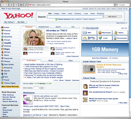
As long as they have Pamela Anderson’s picture on their page, I won’t go near it! That woman is digusting.
Matt Sidesinger 25 Jul 06
I had just as hard of a time finding the “Mail” link as I do trying to find something in my fridge. It took way too long. Is it too hard to give me a little mail icon? An animated GIF would be way sweeter!
Joe 25 Jul 06
I always find it deeply ironic when somebody attempts to make an intelligent comment but then also makes the dumbest of spelling mistakes with “alot.”
jenn.suz.hoy 26 Jul 06
I will say one thing - design-related or not.
The day Yahoo! and other sites make their technology available to those of us on Firefox will be the day I defend them in these Yahoo! vs. Google debates.
Design-wise, I think the points are covered above. Google is clean, Yahoo! is becoming the next CNN.com or NYTimes.com - let’s get all our information to you all at once so that people see it. What they don’t realize is - if a page is cluttered with too much, then you can’t see anything clearly.
As far as Google - the oversimplified design does have drawbacks. I’ll admit, I probably only know about 1/4 of all of Google’s services available, simply because they don’t advertise it to the average user. Yahoo! puts all the services right out front. I tend to think they did it more successfully in the past (Yahoo!), but that’s just me.
We’re at another crossroads in the design industry, where we are still fiddling to try to find the best blend between information architecture and practical design. It will get a little bumpy from time to time. I’m just happy that there are larger sites like Yahoo! willing to try something new, so the little guys like me and you can take what they did right and wrong and improve on it.
Quartazone 30 Jul 06
It’s not Yahoo vs Google. And it probably hasn’t been for a long time.
Yahoo’s home page is a newspaper. Google’s home page is a command line tool.
Yahoo’s page is for passive use- browse, nibble and graize. Google’s page is for getting something done. It gives you direct access and gets out of the way.
Yahoo may know something about putting a search engine together, but it’s pretty clear that Google has run completely past them. They just don’t measure up as a search engine company to Google. And Yahoo knows it.
Yahoo’s new home page is a clear indication of the irrelevance of comparing the two. Yahoo took a simple busy page that had become familiar to millions, like the layout of any famous newspaper, and changed it something heavier (in terms of the effort for my browser) without adding any obiviously discernable benefit.
This is the work the clueless that are seeking attention through the whims of fashion. Sad, because Yahoo could be something more than this.