Screens around town: three sidebars 24 Aug 2006
18 comments Latest by Annie
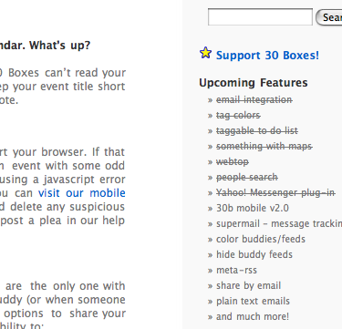
The 30boxes blog has an upcoming features sidebar that says a lot with just a little. It gets across 1) upcoming features, 2) recently added features, and 3) is a subtle way to show they’re busy improving things all the time.
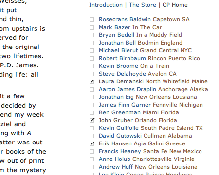
Coudal’s Field Tested Books sidebar uses checkboxes to indicate visited links.
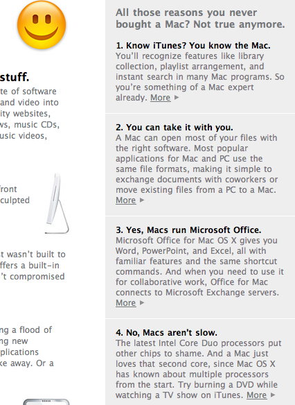
Apple’s Get A Mac sidebar does a nice job of tackling the concerns many Windows users have about switching. Overall, the copy on this page is excellent. It succintly blasts you with a ton of info — in list form for easy digesting — that makes it seem silly not to use a Mac.
18 comments so far (Jump to latest)
Kieran 24 Aug 06
Interesting. Slightly off topic but what powers your basecamp FAQ site? I was wondering weather you use backpack?
Thanks!
Andy Rutledge 24 Aug 06
Does sidebars matter a lot, well it just doen’t matter :)
Daniel 24 Aug 06
I’m not familiar with 30 boxes, but I wonder if some might feel as if those features are no longer coming soon, rather than recently added.
I don’t know how many people would do that, but it’s worth considering, since some might see it as “crossing out what’s done” and others as “crossing out what won’t be done”.
ML 24 Aug 06
Interesting point Daniel. A checkbox or small “Done!” next to the crossed-off items could make this clearer.
Rahul 24 Aug 06
Strikethrough is used by default on the “del” tag in HTML, which is supposed to be used (semantically) when content is out of date or no longer correct. Although strikethrough text can be applied using CSS, I’d presume that content authors are expected to use this sparingly and in line with the expectations shaped by the W3C’s definition of the “del” tag.
So in other words, if you use strikethrough, use it when denoting deleted or old content — not “completed” content.
If you stretch things a bit, then you could argue that making the text green or adding a tick mark in front of it as well as the strikethrough would make it clearer.
Marcelo Ruiz 24 Aug 06
I agree with Andy Rutledge, it seems a sidebar is a must in every website and we loose a precious amount of time figuring out what to put there. Sidebars are only needed if you have something to communicate there….
These are intelligent examples of how to use a sidebar!!
Narendra 24 Aug 06
@Daniel and Matt:
Thanks for the design review. We concur and to complete the feedback loop have added checks as the bullet items for the completed features on the 30Boxes blog!
Nathan Ostgard 24 Aug 06
I *love* Coudal’s use of checkboxes for visited links. What a great idea.
lisa 24 Aug 06
The Coudal checkboxes are brilliant.
Tim Jolly 24 Aug 06
I as well like the checkboxes, although they could also mean that those sites are ready and the others are coming soon :] Just messing, I hate link lists that use similar shades for visited and unvisited.
Dan H 24 Aug 06
I’m actually working a on small project where I’ve stolen been very much inspired by the check box idea from Coudal Partners. I love those thingies.
NP 24 Aug 06
30 Boxes guys read SVN :)
Updated list with checkboxes on crossed-off upcoming features.
Daniel 25 Aug 06
Rahul >
Funny thing with semantics is that it’s not easily captured in formal definitions.
The “semantic” status of a completed item depends on your viewpoint. In the context of the development of the application, it is as you say “completed”, not “deleted” or “old”. In the context of a list of upcoming features it _is_ both deleted and old. It is no longer an upcoming feature.
Though I agree it is not obvious _why_ it is deleted from that list.
Bryce 25 Aug 06
Not to be a contrarian, but I’m not so taken with Coudal’s checkboxes. It seems to up-end a (now-going on a couple-year’s) standard for ‘checkbox in a list indicates selection of that item for some later action to be enacted upon it.’ (FWIW, I think this is a lame convention, and one that will probably fade with time as DHTML click-to-select becomes the norm.)
After visiting the site and playing around with it a bit, it just feels ‘wrong’ to me somehow. As evidence, go there and click on an item whose checkbox is -not- checked (but before doing that, ask yourself.. ‘what should the result of checking this box be? I sorta-kinda expected it to just .. I dunno.. accept the click, check the box and do nothing else.. almost like a ‘I’ve read this book, so I don’t need to read the article’ feature or something.
-Instead-, the empty checkbox actually acts as navigation — it simultaneously changes to a checked box and -takes me to- the page for the link beside it.
Checkbox-as-navigation just seems wrong — it’s mostly benign in this one instance (because the Field-Tested books site is pretty straightforward) but hearing other commenters laud the idea as ‘brilliant’ makes me cringe at the thought of imitators and their escalating abuses.
Should these playful repurposings of checkboxes flourish, how will I predict, in a web application, what possible effect could result from clicking a checkbox? Will it just select an item? Will it navigate -to- that item? Will it enact an action -on- that item? He’p!
Charles 25 Aug 06
The Get a Mac text is well thought out — especially in addressing the mac myths, without talking down to the customer. By saying “All those reasons you never bought a Mac? Not true anymore.” (my emphasis) they take the message in a positive direction. Apple could have easily said “They’re not true.” or something along those lines, but that would have been perceived negatively by the customer. Instead the customer feels curious, as opposed to dumb. Just a thought, but that’s some great user-based brand writing.
Mb. 26 Aug 06
Yeah, I’m with Bryce. The first time I saw the Coudal list, I thought it was some sort of tool, i.e. I expected that I could or should *do* something with the little check boxes. Maybe just because I use Backpack lists so much.
But a bit of thought and clicking made it clear. They definitely look nice, but what they’re showing me is at first glance confusing.
As for the Get a Mac text: wouldn’t it be nice if every company in the web had texts this simple, short and well thought out?