Screens Around Town: Ugly on purpose 21 Sep 2006
16 comments Latest by Giovanni
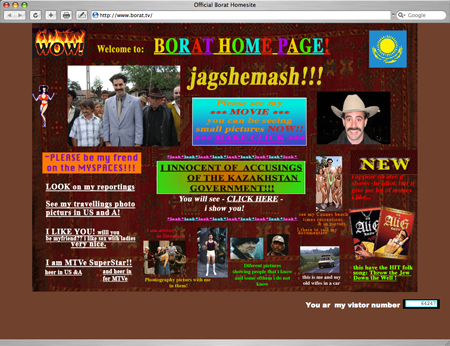
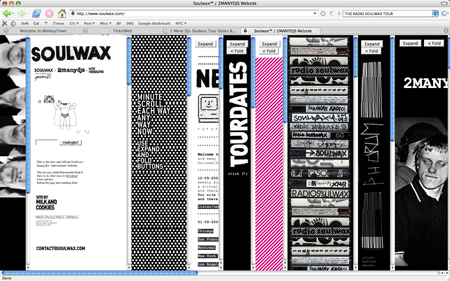
Is there a time and place for bad design? These entertainer sites definitely strive for “cool ugly.”

Jagshemash! Borat’s site is a mess but what did you expect? Reminds me of Mahir a bit. The frantic MySpace add badge is a clever touch.

Soulwax’ frameariffic layout is certainly, um, different. Good luck trying to actually get any info here though.

Comedian TJ Miller does not have a website. Links include “Nothing about TJ Miller,” “Not Home,” “Broken HyperLinks,” etc. Does not contain this video where TJ claims women are intimidated by him because he knows so much about giraffes.
16 comments so far (Jump to latest)
Sandy 21 Sep 06
Borat’s page keeps us laughing HARD at work. It hits it just right: perfectly bad web design :-)
Ryan Heneise 21 Sep 06
Whatever you do DON’T click on The Myspaces! (At least, if you do, don’t scroll down.)
Spike 22 Sep 06
Zach Braff’s website is beautiful: http://www.zachbraff.com/
James 22 Sep 06
hmmm reminds me of the classic:
http://webtekrocks.com/
I remember that site from over 4 years ago. Still makes me laugh.
Chriztian Steinmeier 22 Sep 06
Oh, and don’t forget http://www.paulgilbert.com/ - he’s as hilarious as his gutarplaying :-)
Marcin 22 Sep 06
http://www.zajobiste.pl/
promo site of polish movie (and it is written in Rails…)
Lau T. 22 Sep 06
Older spoof IKEA fan site: http://www.ikea-fans.dk/
Notice how the left frame is just narrow enough to provoke horizontal scrolling.
Ralf 22 Sep 06
Oldschool from Germany: http://ars-berlin.com/
Daniel 22 Sep 06
Soulwax site is a really clever imitation of the worst (still interesting) real life information design that I know of - unofficial ad boards for music clubs and concerts.
How do people scan these for information? How do they know which thorough encrypted and spasmically drawn poster is actually worth trying to decrypt? What are the codes for great bad design and just plain bad design that make one poster stand out before the others (except that it’s pinned on top of them)?
I’m really interested. They must work, why would the designers go on if they didn’t? And they do work - people visit those concerts. But how?
Torley 23 Sep 06
What gets Soulwax’s site down for me is the scroll bars—the Aqua just doesn’t work the rest of the thematic!
Sacha Cohen (not to be confused with Sasha Cohen, hehe) is hilarious—Borat reminds me of Mahir as much as Ali G reminds me of Armand Van Helden.
Does anyone know a detailed analysis of why frames faded from popularity? There are few sites with frames I really enjoy using, Bloglines being one of them.
Giovanni 25 Sep 06
Galaxy Quest did it in 1999: