Screens Around Town: Usability.gov, Google, Opensuse 05 Jun 2006
17 comments Latest by Grimmthething
Greg Colker writes:
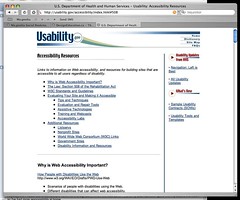
On the right side of the page, just under the navigation, they’ve got a really interesting headline: “Navigation: Left is Best” Is this a joke?
Matt Radel writes:
This was taken from the spell check widget for the Google custom homepage. Wow. The word may be spelled correctly? That’s one helluva spell check.
Jon Maddox writes:
i grabbed this from opensuse 10.1 beta download site.
This is great, this reminds me of how i read user reviews of software or hardware. I only want the negative reviews, I want to see what people are complaining about. And likewise, i want to know the most important gotchas in this beta, dont make me read through an entire bug list. Great stuff.
Got an interesting screenshot for Signal vs. Noise? Send the image and/or URL to svn [at] 37signals [dot] com.


17 comments so far (Jump to latest)
Chris 05 Jun 06
The spell check tool was created by a user named “Grimmthething” not Google.
http://www.google.com/ig/directory?num=24&url=http://www.geocities.com/grimmthething/googleSpell.xml&q=spell&start=0
So I wouldn’t really blame google for the users choice in words.
dusoft 05 Jun 06
Also, I am eager to believe the spellchecker is just weghing a probability of the word spelled correctly by comparing different word spellings in google?
John Lewis 05 Jun 06
Yeah, what happened to Slashdot? That place doesn’t look geeky at all anymore. It looks slick. I don’t like my name at the top left looking like a tab of sorts, but still… nice art.
Tumble 05 Jun 06
I also eagerly awaited some discussion in the design community about Slashdot. It’s an interesting balance of prior design constraints, maintaining familiarity and community image, and trying to embrace some new design ideas. I followed the design contest fairly closely, and was interested to see that none of the elite designers ever mentioned it at all. Some might say that the design contest was an attempt to get a new design for free, but I felt more like it was to give ownership of the site back to the users. Anyway, I’ve been disappointed that the redesign of such a popular and important site (at least to geeks) has gone unmentioned.
Swati Jain 05 Jun 06
The “opensuse 10.1 beta download site” link that you posted doesn’t work. It has an extra space after http://
Myles Braithwaite 05 Jun 06
Nice to see you are using SuSE!
Eli Sarver 05 Jun 06
Yes it’s great the Jon Maddox is using SuSE.
A friend of mine ran a study and the result was that left column nav is bad for reading speed but good for navigation. I’d rather help people on the part they do most of the time (reading).
Greg 05 Jun 06
I really can’t tell if Jon Maddox is being sarcastic or not about the SuSE thing. I think that actually IS a pretty awesome thing. I’d rather be blindsided by the good features than horribly annoying ones. Good to get it all out on the table before I download.
Jon Maddox 06 Jun 06
Thats what I meant. They got all the really bad stuff out of the way immediatly. Anyone using a beta OS should be more concerned with what is going to be broken/buggy than whats working. They obviously sold you on features, they got you this far.
They go even further by aggregating the worst bugs rather than all of them.
I wasn’t being sarcastic about how i read user reviews either. My favorite part of c|net is viewing by negative reviews. Who cares about whats good about a product? I know whats good about it, thats why i’m reading the review. I want to know what people don’t like about it. Most positive reviews are just filled with fluff anyways.
Paul Hepworth 06 Jun 06
What is the government doing spending tax dollars to “teach” us about usability? That is unbelievable. Whats next, is the government going to be contributing large numbers of highly paid programmers to open-source projects that are not getting an “equal shot” at being popular? ;)
Daniel Lakier 06 Jun 06
Paul,
Do you think that the government does not have one or two systems of its own? I believe that the guide is for systems developed with government money for the government, although others can use it, too.
-Dan
Paul Hepworth 09 Jun 06
Daniel,
Yeah your right, maybe I over reacted. :)
Regardless of who the target audience is though, I still think its funny that they have the site.
Paul
Daniel Lakier 09 Jun 06
Paul,
I agree with you - it is definately not government’s sweet spot, to put it mildly.
-Dan
Grimmthething 20 Jun 06
Correct, Google has nothing to do with the statement on the spell check module. I use google and if it doesn’t return a “did you mean” doesn’t necessarily mean that the word is spelled correctly. The wording is my own.
-Grimmthething