Screens Around Town: Windows Vista, Weather.com, Boden 30 May 2006
29 comments Latest by tdg
Andy Dietler writes:
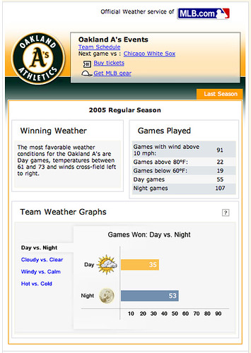
This page at weather.com gives you an overview of how your team (in this case the Oakland A’s) have faired in different weather conditions.
The only thing is that they give you the stats as a total of games won in each condition instead of a percentage of wins in each condition. So it’s pretty worthless for me to know that they’ve won 64 games on clear days and only 19 on cloudy days because they could have played 200 games on sunny days and only 20 on cloudy days.
Jamie writes:
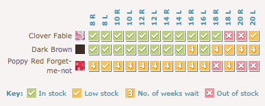
I like how Boden has handled displaying item availablity on their product detail pages here. However, it is a little difficult to figure out how to Add to Cart. But when you figure it out, it makes pretty good sense!


29 comments so far (Jump to latest)
Phil 30 May 06
Actually it tells the total day and total night games right above the weather graph, in the conveniently labeled “games played” box.
Jules 30 May 06
Tha’s true, but it would make much more sense to have a percentage bar.
John Lewis 30 May 06
Weather.com should definately be linking off that page to a sports betting website.
Marko 30 May 06
I’ve got a feeling that Vista will be one of the last versions of Windows to be released, when it finally gets released anyway. Still, if Bill is postponing Vista Launch because this kind of crap is in it, I see a man with vision!
I'm With Stupid 30 May 06
“Actually it tells the total day and total night games right above the weather graph, in the conveniently labeled �games played� box.”
What does that have to do with anything? You still don’t know how many they played on clear or cloudy days, just how many they won.
Likewise, the breakdown on Windy vs Calm gives wins in relation to 15mph winds, but the ‘conveniently labeled “games played” box’ lists games played in greater than 10 mph winds.
Finally, the Hot vs Cold gives the wins for over and under 70 degrees, but the ‘conveniently labeled “games played” box’ tells me the numbers for over 80 and under 60 degrees.
Just because the box is “conveniently labeled” doesn’t mean it is relevant or useful.
I’d give them an ‘A’ for the idea, which is cool, but a C- for the implementation, because they made it kind of useless.
Phil 30 May 06
“What does that have to do with anything? You still don�t know how many they played on clear or cloudy days, just how many they won.”
No, it gives the break down in that box, they’ve played 55 day games and 107 night games. I agree that a percentage would be more useful so you don’t have to do the math in your head (it tells in another box that the percentage of day wins is higher), but its not quite as bad as you make it out. I think they are “keeping it simple”.
DonWilson 30 May 06
There is a method to that Vista madness. I can’t WAIT to begin using that OS. So far, it looks awesome.
franky 30 May 06
Imagine 93% of the Windows users, yes the non geeks.
‘Oh what is that folder ‘system’? Don’t use it, lets delete it’.
I know it is unimaginable, but there are people who even don’t know how to install or better even deinstall software. Main little annoyances for us nerds/geeks/freaks/advanced users are protections for them.
Besides that, how many times do you delete ‘system (owned) files’?
Back to reality. Try deleting ‘explorer.exe’ (or any other actually used system file) in Windows XP, regular admin account allowed. Did it work without the use of tools or without booting in safe mode? But actually a shortcut should have the logged in user as owner. And not system. Eventually ‘admin’ would be OK as well
Also how many people just buy their computer out of the box and will hardly ever change anything, except for Windows Updates and MS Office?
Sometimes I have to think back how much Windows has evolved. True it has his problems, but actually ‘everything’ on board for the average user. Not everyone wants to work with a console (I do often) or can justify the expensive price of a Mac (MacMini changes a lot tho).
Mac works at ‘a vision’ and always managed this quite well. Soon I will also switch.
Linux works at ‘we can do this better’. KDE and Yast2 (two things I loathe) have ‘windowzed’ Suse. Finally huge steps were made towards non-geeks.
MS develops for billions of users. And will always be bashed.
Sure it is fun, but people who have genuine Windows knowledge and have worked in IT-CS know that biggest problem is still the user. MS has to think about this problem when developping. Now next time when a user confronts me with such a problem I know I can tell her/him to be less dumb and at least read what is written in the message boxes before clicking OK. One time out of 4 can’t be asked too much or. ;)
I’ll stop now and sorry for the English (it’s only my fourth language). And no I don’t defend MS, I just think it is too easy to bash MS. But still funny. ;)
Jacob Fugal 30 May 06
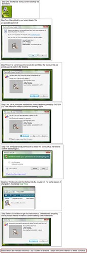
While I don’t share Don’s anticipation for Vista, he does have a point about the seven “steps”. First, four of those seven “steps”:
* Having a shortcut on the desktop
* Informing the user that they’re only deleting a shortcut
* Having the shortcut in the recycle bin
* Confirming before emptying the recycle bin
are in no way unique to Vista. Current Windows versions also have them (I won’t comment on whether I think that is “good” or not).
The other three “steps” are all due to the fact that the shortcut is owned by SYSTEM, and thus needs special privileges/verification. This isn’t going to be the case with 99% of icons (if it is, then *that’s* the problem, not this symptom).
Jon 30 May 06
That Vista thing is both hilarious and sad. Hard to believe a multi-billion dollar company made that.
Greg 30 May 06
Seven clicks to remove a Microsoft icon, how many clicks to remove a competetor’s product? Could it be zero-clicks?
“Windows desktop cleanup wizard has detected the program ‘Mozilla Firefox’ has not been used in four hours and has automatically removed it from you system.”
;)
Dan Grossman 30 May 06
Why do people still react like this to the Vista dialogs? If I took a screenshot of a Linux desktop asking me to enter the root password before deleting a file I don’t own, would you react the same?
You can give permission of files, or an entire hard drive, to a user in Windows Vista. Then you don’t have to jump through hoops to modify or delete those files. Just like Linux.
dave rau 30 May 06
If shortcuts are more visually clear then you don’t need a dialogue box explaining in sentences that ‘this is a shortcut.’
And why continue with the ‘yes/no’ boxes. Isn’t a ‘delete this’ box better than ‘yes’? It makes the box an action.
Why the ‘repeat this for …’ checkbox? It’s just one item; there aren’t any repetitions to handle in this case. Weird.
Also, if recycle bin isn’t a choice down the line why is it presented as such up front? Can’t windows check to see if the file CAN go in the bin, if it can’t make some changes to the current dialogue about a permanent delete?
Why doesn’t MS just rip the OS X flow and get on with it. There’s little to improve on the Mac side in this area. Maybe a few minor buggers, but whatever.
Jay Reding 30 May 06
I’ve been using Vista Beta 2 for a bit, and the user interface is just horrid. (Due disclosure, yes, I’m one of those preeningly arrogant Mac users.)
It’s odd that a company like Microsoft that spends more money than most companies make in a year on research can’t do better than what Vista presents now. For instance, the Aero Glass interface is quite annoying to me. Why are so many windows translucent in Vista? The only reason for translucency is when you have a need to see two windows at once - which is a very rare event. OS X has a lot of visual bells and whistles, but all of them serve a purpose. The “genie effect” lets you know where a window is going to on the Dock. Expos� is fantastically useful for finding windows. Dialogs emerge from their parent windows, makin it clear which window owns which dialog. There’s a reason for everything.
With Aero Glass, it’s like Microsoft decided translucency was cool, so they made things translucent that don’t need to be - regardless of what it does to the user experience.
Vista seems to be an OS made by programmers, programmers meshed in a culture that seems to be the very antithesis of “Getting Real”. Vista seems to go out of its way to annoy, patronize, and befuddle the user, sometimes all at once.
No company is perfect, not even Apple, but one really wonders why a company with more money than God can’t come up with a better system than that - then again, perhaps that *is* the reason why they cannot.
I'm With Stupid 30 May 06
“No, it gives the break down in that box, they�ve played 55 day games and 107 night games. I agree that a percentage would be more useful so you don�t have to do the math in your head (it tells in another box that the percentage of day wins is higher), but its not quite as bad as you make it out. I think they are �keeping it simple�.”
I make it out exactly how they break it down. I didn’t say anything about Day/Night games and neither did Andy Dietler (they guy from whom the original comments came).
Yes, they do provide the day/night breakdown. No, they don’t provide a meaningful breakdown for anything else.
If by “keeping it simple” you mean “providing incongruent statistics”, then yes, they are “keeping it simple”? If you mean “providing useful information in an easy to use way”, then no, they aren’t “keeping it simple”.
Ken Rossi : CivilNetizen.com 30 May 06
If there is a royalty crown available, I give it to Greg.
——————————————-
Greg 30 May 06
Seven clicks to remove a Microsoft icon, how many clicks to remove a competetor�s product? Could it be zero-clicks?
�Windows desktop cleanup wizard has detected the program �Mozilla Firefox� has not been used in four hours and has automatically removed it from you system.�
;)
———————————————-
German 30 May 06
Wow, a system in beta has a bug. Great find, guys.
Matt 30 May 06
German,
This isn’t a bug— this is a usability and workflow DESIGN problem.
-Matt
Daniel Lakier 30 May 06
Matt,
Actually, it is a security issue, and it will not affect most activities. In this case, one of 2 things is going on:
1) A shortcut owned by another user - probably the system is being deleted and elevated security is required to do this
AND/OR
2) A shortcut that is being shared by all users was being deleted
This is a really polite way of dealing with the situation. What other options are there?
Delete the file without prompting? Seems rude.
Deny the operation? Not so good.
Force users to log in as admin? Not so good.
What would be a better approach? I am curious as to how this could be better handled? Any ideas?
-Dan
Jeff 30 May 06
I don’t think anyone can deny that requiring some sort of verification before performing an action such as deletion on an object not owned but the current user is good practice. The problem here is: does it really take that many dialog boxes to tell the user “this is a shortcut that someone else owns”?
Actually, I think that just solved the problem in one dialog box.
Matt 31 May 06
Daniel,
I agree with Jeff. How about:
“This file is owned by somebody somebody else, and you don’t have permission to delete it. Choose (in nicer words):
1. Authenticate to delete (the OS X way?)
2. Cancel”
-Matt
Bobby 31 May 06
Thanks for sharing such informative article. I got to learn much from the discussion.
Darrel 31 May 06
“There is a method to that Vista madness.”
We’re waiting in anticipation to hear what that is. Do share!
Love how don ran to the flickr post and immediately played the ‘beta’ card.
I think that card had more value back when Vista was only in year 3 or 4 of development. The beta excuse is getting a bit tired at this point, though.
Dan Lakier 31 May 06
I suspect that one of the dialogues in Vista will be removed when it goes live - I suspect that is a bug. As far as dropping down from 2 dialogues, that might be a bit tougher, because Vista escapes out to the Secure Desktop environment when prompting for consent.
The Secure Desktop environment opens the consent window in a “special” manner which blacks out all other running apps and makes it impossible for key loggers, or scripts or what not to either capture what you type, or put up a dialogue that looks like a password prompt.
Because the Secure Desktop is pretty invasive (visually speaking), MS (perhaps unwisely, perhaps not?) decided to ask before sending the user to the secure desktop.
Conceptually speaking, the secure desktop seems good to me, but it is a bit of a pain. What do you designers out there think MS should have done?
A) Take the user straight to the Secure Desktop and prompt for confirmation - even though this is quite jarring if you did not expect to go
B) Make users click twice
C) Make the consent dialogue a regular window and eliminate the secure desktop and allow for a single dialogue?
D) Do something else that is more elegant?
-Dan
Daniel Lynch 31 May 06
Stop complaining about the neighboring dogpile, or continue to look as stupid as the next one - it’s your choice.
Men.. pfft. All idiots.
Adolfo Bernal 01 Jun 06
Dan,
Perhaps having an option to disable the Secure Desktop warning in the future would work.
After the user deletes a shortcut the first time, they’ll have a better idea of what’s going on. That would reduce the number of dialog windows in the future, which people don’t read anyways because they already know what they say.
Cheers.
Dre Skofstad 01 Jun 06
Hi folks - I was interested to see this discussion as I am the Program Manager at Microsoft for the feature in question :). First, to confirm there was in fact a bug here in Beta 2, and we have also changed it so you do not get the security elevation prompt anymore for deleting desktop shortcuts. So you will only get the standard “are you sure you want to delete this and by the way, don’t worry, we aren’t deleting the .exe” prompt.
It’s great to hear the lively discussion on the security experience here. As some folks pointed out we need to optimize for security - I strongly believe we’re doing the right thing there. That said, the trick here is finding the right balance between seecurity and usability (for a very wide range of types of end users), and we’re working hard on that and learning as we go - changing the desktop shortcut experience is just one example. Keep the feedback coming…there’s some great thinking going on here!
Shawn Oster 06 Jun 06
From the Vista screenshots I’d say there is some “Fear of Coupling” going on. As a developer you want all your layers decoupled as much as possible but this can have the negative effect of setting up a chain reaction of dialog boxes. I imagine this “one” task is going through a series of sub-systems, each one raising it’s own issue, thus making the user answer something. From the outside world it seems obvious, roll all the issues into one dialog and be done with it while from the inside you want to make sure something hasn’t slipped around your “uber-dialog” and that this isn’t the result of some virus going direct to the sub-systems.
I run into this issue all the time and am always curious how other software applications handle such issues. Seemingly related issues that from a sub-system level aren’t really all that related.
Is there something on OSX that is analogous all of these things happening at once:
- deleting a shortcut (do you guys have shortcuts? hence needing to warn the consumer user that they aren’t deleting the real app).
- deleting an item that doesn’t belong to the user initiating the action.
- deleting an item that isn’t just owned by “somebody else” but is in fact owned by the system and thus may be an Important File.
- deleting something that can’t be retrieved from the recycle bin and so you better be darn sure you really do want this puppy gone.
I’d love to see a series of screen shots from the Mac camp that handles all four of these conditions, just for a real apples to apples comparison.