Screens Around Town: Yahoo, Sproutit, NY Times, Mobber, Campfire 17 Apr 2006
10 comments Latest by Brian
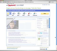
Blank Slate: My Yahoo
We’ve talked before about blank slates. Here’s a look at My Yahoo’s faded take.
—
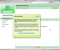
Blank Slate: Sproutit Mailroom
SproutIt Mailroom’s blank slate has an instructional box that can be dragged around the screen.


10 comments so far (Jump to latest)
Olav 17 Apr 06
Some good examples of stupid features here.
John Lewis 17 Apr 06
I like that on the Yahoo faded preview I can scroll. That way I can see the faded content I could unfade that below the fold.
Pete 17 Apr 06
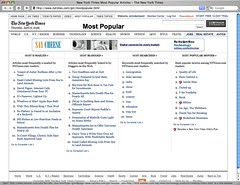
I liked the old NY Times site better - I have to scroll to the 3rd screen to get my daily news fix now… It’s a newspaper site, why would I go there for video? ;(
Dan Boland 17 Apr 06
Funny that the most obvious “most popular” list (to me, anyway) isn’t on the NYTimes page you highlighted — most read, as in the news articles most clicked on and read. Get rid of the stupid movie list, that’s a much lower priority list. And I think giving them equal weight works in this scenario.
sj 17 Apr 06
That’s funny, I thought I was the only one. New York Magazine also made a transition to a new online design, and the feedback I’ve heard from that was similar - it’s prettier, but it’s more difficult to find things. CSS designers like to think of themselves as being better as usability, but one does not automatically lead to the other.
npdoty 17 Apr 06
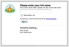
I can’t tell if the Mobber screen is supposed to be in sharp contrast to the Campfire screen or similar to it.
The Mobber screen obviously asks for a lot more information, but it seems that that extra information is pretty vital to the Mobber service, and isn’t so much to the Campfire service. (Mobber will presumably need information like this to make money, which Campfire won’t, and why not get it out of the way at the very beginning?) And I found it all very easy to fill in (and not intimidating since it was in such a small space) — except that the password field didn’t hide the characters as I typed (a disturbing experience).
dave rau 17 Apr 06
Mobber: “ZIP code” not “Zipcode” ZIP is an acronym.
Scott 18 Apr 06
USPS needs to take dave rau’s advice as well:
http://www.switchboard.com/bin/cgidir.dll?Mem=1355&PR=138&CSF=LocatorPostOffice&CID=1222