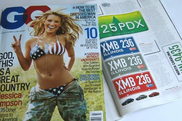
Segura license plate design 27 Jun 2005
19 comments Latest by Bill Hanley
The July 2005 issue of GQ Magazine features Carlos Segura’s concept for license plate design (page 160 in print version) .
I am of the opinion that license plates do quite a bit towards detracting from the lines and design cues of the cars they are put on. In some cases, the design on the plates are so overwhelming that the readability of the numbers themselves are jeopardized…I am a fan of simplicity and clarity, and in this case, take it a step further and suggest color matched plates, so in essence, the background color of the plate is the same color as your car, with either black or white numbers over that color (depending on contrast issues).

Other featured designers include Duffy, Chip Kidd, Paula Scher, Johm Jay, and Alexander Isley.
19 comments so far (Jump to latest)
Seth Werkheiser 27 Jun 05
Huh? Wha? This post was about license plates? I was, umm… distracted, I think… hehe
Dan Boland 27 Jun 05
I’m not the biggest fan of the Illinois license plate (how can you not love the tackiness of the old design?), but mainly because the license plate number is just that — all numbers. Somehow, it’s harder for me to remember all numbers than the traditional three letter, three number combo. I hope I never witness a crime and a getaway. =/
David 27 Jun 05
How about printing them on clear plastic so you don’t even need different plates. Then they could have a black or white print version, or just do white w/black outlines.
Dunno if plastic would be too easy to fake if that’s even an issue.
pb 27 Jun 05
I miss the old California black and yellow plates.
harlo 27 Jun 05
even better, Tennesse’s old state-shaped plates.
omit 27 Jun 05
Bring back vintage plates.
Darren James Harkness 27 Jun 05
Wasn’t the whole idea of the different license plates to allow people to quickly identify the state the plate is from? Though the ordinary driver may not care, it would be a real headache for photo-radar operators / red light cameras to identify which state an offending vehicle is from in order to charge the right driver with an offense without the unique design.
And honestly, I’ve never looked at a car and thought the license plate broke its design.
Jim Walls 27 Jun 05
Got to agree with you, Darren. This is what happens when a designer works without a creative brief.
The client mandatory on this one is that license plates make it easy for law enforcement to identify the owner of the vehicle. Therefore, each state’s design must be uniform and visually distinctive. Take that away, and you eliminate the usefulness of a license plate. Why not paint the windshield the same color as the car, or make the brake lamps white?
Perhaps he solves this issue in the article (admittedly, I haven’t read it).
Harlo 27 Jun 05
Distinctiveness of plate has gone away before this designer’s suggestion.. Where I live, in Michigan, we can choose one of 24 different plate designs.. each of them uglier than the last (except for the OG white-on-blue)
Jim Walls 27 Jun 05
But Harlo, Michigan’s plates are distinctive in that they’re different from other states’.
Design taste notwithstanding, all of Michigan’s plates can be identified by law enforcement by its white field with blue bar at the top, or the plain blue field with white lettering.
Now, if you want to talk about the clip-art loon, lighthouse, or sailboat, that’s a different story. Does the state of Michigan not have a single graphic designer who could take this job on pro bono, or is the current “designer” hoarding this project for themselves?
Dan Boland 27 Jun 05
Way to call out my home state, Steve. ;) I can’t believe there’s a license plate for friggin’ Parrotheads…
Anonymous Coward 28 Jun 05
I hate Illinois nazis.
Bill Hanley 25 Nov 05
I think the optional five dollar bridge graphic plate is one of the nicer U.S. state designs and for a mere $5 is a great deal. You should see what we have to pay in Ontario for any option to avoid having our crappy standard plate here!