The long road to simple: creating, debating, and iterating “Add an event” 23 Aug 2006
89 comments Latest by Sebhelyesfarku
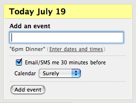
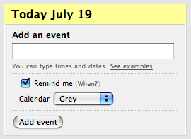
That “Add an event” box (above) at Backpack’s new calendar looks simple enough. But sometimes simple takes a lot of work. How we arrived at this screen is a good look at the process we use to solve design challenges.
First, some background: People enter events at Backpack’s calendar. Type in “6pm dinner” and it shows up. But there are also other ways to enter events…
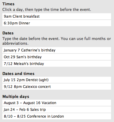
All that info is too distracting if it’s onscreen all the time. So we put it in a popup window. The trick is getting people to click on the popup. What’s the most efficient way to encourage people to click the popup link? Oodles of text would create too much noise and people probably would skip over it anyway. “Click here” would just be ignored. “(?)” would feel like a link to a help item, not an action item. We want action. So we had our challenge: Seduce customers into clicking on the popup link without distracting them from the task at hand.
After the jump: a summary of a day’s worth of creating, debating, iterating, and screenshot sharing. [Note: This process is also a great example of how we use Campfire to share ideas and work together as a group even when we’re in different locations.]
Here was the first stab:
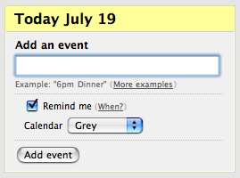
The verdict: “More examples” is too vague. Let’s be more direct with the link…
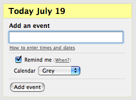
That phrasing is better but maybe this is even clearer…
The “6pm dinner” example is gone now though. It’s missed. What if we go to two lines…
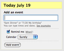
Intuitive but is all that text really necessary? Do we need to have “You can type times and dates”? And maybe the whole thing should be bigger, say 11px? Also, let’s try darkening up the examples. Small and light is tough for people to 1) notice and 2) read.
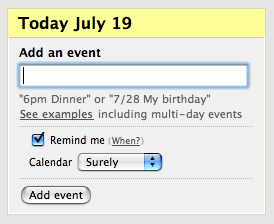
Slightly less attractive when it’s bigger but it is more clear. All this text and links is getting noisy unfortunately. “Including” is a big word that’s not really necessary. What if we took it out and went with “See more entry examples”? Yeah, saves just a few characters. But every little bit counts.
The text is still the same shade. Let’s make it a hair darker.
As for the “Remind me”, let’s get rid of “When?” and just fix the reminder time at, say, 30 minutes.
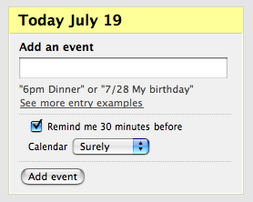
Getting better. Would “Learn how to enter events” be better? Hmm, “learn” sounds complicated. Let’s skip that. How about: “See more date & time examples”…
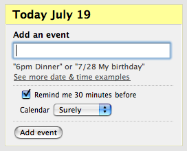
Meh, the ampersand is noisy. Back to “and”…
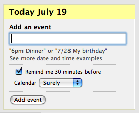
Better but not ideal.
Some more ideas are thrown out but tossed aside before even getting to the mockup stage:
Rejected: “See how to enter dates” or “See more examples” Why? 1. They’re not meaningful — nobody feels like they need more examples of a time before an event. 2. They don’t set expectations about what you can do in the event box, other than enter times.
Rejected: Right justified “Show me examples” above the field. Why? “Show examples” is the wrong text. Examples of what? And why do I care? We want to encourage the click by making it clear it does something.
So we go with one example next to “Enter dates and times”. Less noise and everything fits on one line…
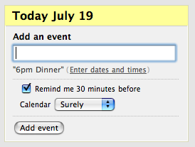
Ooh, that’s good. The first time people see the “Enter dates and times” link, they learn that they can enter dates and times. We’re setting expectations. Plus, they may think they actually have to click it to specify dates and times. It’s kind of a trick. So they click on it because it seems action-oriented when they probably would have skipped over “more” or “?” or something like that. And that’s ok because it still gives them what they need. Bravo.
Now what about the reminder feature. Let’s get more explicit with the explanation of what the reminder does. How about “Remind 30 minutes before via email” instead? Or “Email me 30 minutes before” would fit. So would “Text me…” But someone can have both email and SMS turned on as reminder options. So let’s say “Email/SMS me…” It’s short enough to work. One more idea: We could change this text according to an individual’s setup. Eh, let’s leave as is. For v1, this is fine.

Now that’s what I’m talking about. Way better all around.
Sometimes there’s a lot more to simple than meets the eye. To the customer, this is just a few obvious words in a small box. But really, that’s the point.
89 comments so far (Jump to latest)
Josh Charles 23 Aug 06
Wow, thanks so much for posting this. This is a great thing to show people when they “simple is easy.”
Brad Pauly 23 Aug 06
Great post! Interesting to see how something like this evolves.
John 23 Aug 06
That’s great! Most people approach this kind of design from the “let’s-see-how-much-functionality-we-can-cram-in-here” angle.
Jeremy 23 Aug 06
Focusing on such a specific piece of the UI and giving narrative to the team’s starts, tweaks, and resolution is a pretty cool thing to do. That short, action-oriented result just helped me seal the deal on some similar work I’m doing. Thanks!
Kind of a related question: Would you say the fact that you guys use tools like Campfire and Writeboard help you blog better? Seems like your team has a lot of *written* discussion which could help make the leap to blog that much easier. (Fumbling around for some ingredients to help our team gel in the same regard.)
Fin 23 Aug 06
I am, however, against fixing a time for the reminder.
care to change the “30” into a combobox, to enable the user to be alarmed (For example) 5 minutes before?
Jack Shedd 23 Aug 06
“A designer knows he has achieved perfection not when there is nothing left to add, but when there is nothing left to take away.”
- Antoine de Saint-Exupery
JF 23 Aug 06
Fin we’ve discussed this in previous Calendar threads. 30 minutes is what we launched with. We will allow flexibility in the future.
ML 23 Aug 06
Would you say the fact that you guys use tools like Campfire and Writeboard help you blog better?
Yes, a lot of the blog posts at SvN are sparked by discussions in Campfire. For posts like this one, it’s esp nice to have the transcripts that you can go back and refer to. Writeboard helps us more in the actual writing process as we collaborate on and refine ideas.
Bill P 23 Aug 06
Thanks Matt! Practical Practical Practical.
This is a great way to introduce people to “Getting Real” in a non-threatening way.
Too many people I work with have been burned by one or another methodology-du-jour… They run and hide when they hear of anything different.
This article just plain makes sense.
Well done.
Bill.
JF 23 Aug 06
Campfire is the most important tool we use to work together. We live in Campfire all day. It allows us to iterate, review, discuss, change, debate, share, and have a historical record of everything that happened in real time. It’s absolutely critical for us. We couldn’t work this way without Campfire.
Rick 23 Aug 06
Doesn’t the fact that you have to document the heck out of it with this post entry defeat the point of it being SIMPLE?
Please don’t misunderstand, I’m a huge 37signals fan and even moreso, a huge KISS advocator.
But when you have to spend so much time explaining HOW to use the new calendar feature … it seems by mere definition that whatever is being documented and explained in so much detail, in this case how to add an event, can no longer be simple.
JF 23 Aug 06
Rick, this isn’t documentation, this is our actual discussion in Campfire. It was edited a bit so it reads better as a post, but this is our conversation, this is how we work.
We don’t have to spend so much time explaining how to use it, we’re just taking you through the process to get that link and the words right.
These details matter no matter what’s behind the actual link.
Also, we didn’t mention time, but this probably happened over a 20-30 minute period of trial, error, and review.
RS 23 Aug 06
Rick, when you say “documentation”, I’m not sure if you refer to this post or the popup itself. Here are some comments with regard to the popup.
There is sometimes a trade-off between simple now and simple later.
A long form full of pulldowns for dates and times is simple now because it’s very easy to understand. But over time all the clicking for each event becomes a pain.
Once people learn the simple time syntax, they can create timed events very quickly. That’s simple later. It also makes the whole app more enjoyable thanks to the reduction of interface elements.
Rick 23 Aug 06
JF & RS
I really appreciate your response. I think you guys do great work.
I’m concerned though that yes, the design if SIMPLE … it’s not very INTUITIVE.
Maybe you guys could write an article about simple vs intuitive and 37signals thoughts on the similarities and differences of the two concepts.
Just my thoughts
Rick
ML 23 Aug 06
To pile on: Getting to simple isn’t always a simple process. Sometimes that’s the trick…doing the heavy lifting/thinking so customers don’t have to.
Aaron Blohowiak 23 Aug 06
Extremely high-value post.
Kudos and Thanks.
Quincy 23 Aug 06
I have a client whose company name is “4AM” (don’t ask, I have no idea why). How might I schedule a meeting with this client, for example at 2pm?
Also, are the following times treated the same?
* 2pm
* 2 PM
* 2 P.M.
* 14:00
Nathaniel 23 Aug 06
Marvelous post. I love it. Thanks for sharing!
RS 23 Aug 06
Quincy, you can type this:
2pm Meet with 4AM
Quincy 23 Aug 06
RS:
Thanks. One last question. I have a good friend and her name is April. Will this cause problems when I want to schedule an event/lunch date with her?
tron 23 Aug 06
The final iteration is probably the most confusing of the bunch. By tricking first time users into thinking an instructional link is an action you’ve set the precident that in your software some things just don’t work as suspected. It may get them to read the date and time instructions but they are going to approach the rest of the software differently as a result. There are plenty of simple and elegant solutions to this design challenge that don’t involve tricking the user.
Rick 23 Aug 06
I find it sadly ironic that in just a few minutes after my comment about how I personally don’t find the interface intuitive - people are already asking questions on how to use the Add Event screen (refer to Quincy’s comments).
ML 23 Aug 06
I have a client whose company name is �4AM�…I have a good friend and her name is April.
Quincy, let me guess: your wife is named “9/12”, right? If so, you have the makings of a great “Who’s on first?”-like routine.
RS 23 Aug 06
Rick/Quincy:
How cute. Your comments are coming from the same IP.
Quincy 23 Aug 06
RS:
Rick and I work for a small, very small (just him and I), design studio and we use a router to split our Internet connection.
ML:
Rick and I have http://www.4am.co.uk/ as a client.
And is “April” really that uncommon of a name?
—-
No flaming was intended. We simply work together and were posting similar feelings.
Jeremy 23 Aug 06
Y’know that “Enter dates and times” got me to click it right away. Yeah, there was a little something unexpected at first about the old school popup legend (as opposed to, say, some ajax widget unfolding right where I clicked), but the experience was still good because I learned information I needed in order to enter dates and times. Both my intent and the designer’s intent were fulfilled. I’ve clicked it a few times to double-check how to use it.
This is one of those interface decisions that makes sense in action more than on paper. Is it tricking me? Yeah, sorta, but it’s also teaching me *its* tricks. I can just type “9/3 - 9/19 Great time for vacation” and “Enter” and get the result I expect.
Daniel 23 Aug 06
Not being a Backpack-user, this is the first time I’ve seen the “add an event”-box.
In fact, I first saw it in NewNewsWire, and before I even read the post, I noticed the “6pm dinner” and the pop-up-link (couldn’t see the post itself before I scrolled). The first thing I thought was actually “Heh, just like TaDa; very flexible because it’s just text. But the example says 6pm so why the link for entering…. ooooh, it parses the times and dates! Nice!”
But I still wanted to click that link so bad…
Point is: I got it right away. Very nice interaction design!
Keith Morrison 23 Aug 06
I think the link to examples would be more intuitive if it said “entering dates and times” instead of “enter dates and times”. The way it is now, makes me think I can get to a more advanced form that will let me specify dates and times.
Dave 23 Aug 06
What’s the huge yellow “Today July 19” for?
I’m not only entering dates for July 19, correct?
Enter date for Today July 19, 7/28 My Birthday…not clear.
I’d like the final example if it just started with “Add An Event” instead of some big yellow date that may, or may not, apply to the event I’m adding.
Dave 23 Aug 06
Quincy…
April and June from 4AM, our programer and PM will march over to Ruby Tuesdays for a lunch meeting on Friday at 1PM to discuss Today Show branding project.
JF 23 Aug 06
Dave, the big yellow date is the day you are currently on. You can enter events for that day without spec’ing the date or you can add events for any other day by spec’ing the date. Or you can just click on another day in the calendar itself to jump to that day and then add an event that way.
STe 23 Aug 06
How about this: �6pm dinner� (Other examples)
Everyone knows that the �Other examples� text is a link and will take you somewhere or do something. The use of other suggests they are extra, additional, more examples. This suggests to most people that when they click the link they expect to be presented with other examples like the �6pm dinner� example already mentioned.
This basically says: clicking here will give you other examples
To me, your choice of �Enter dates and times� suggests that it will enter the dates and times for me. Much like a button labeled �Sign in� or �Post comment�. These buttons do what they say they will do. Your link does not enter dates and times, so, why label it so? At least �More examples� or �Other examples� are clear and easily understood.
The first time people see the �Enter dates and times� link, they learn that they can enter dates and times.
Is this not evident from the Add an event label and the text box requiring user input?
Plus, they may think they actually have to click it to specify dates and times.
First time around, they are more likely to think it will enter the date and time for them.
It�s kind of a trick. So they click on it because it seems action-oriented when they probably would have skipped over �more� or �?� or something like that
Tricking users seems to be a side effect of an application becoming more complicated. Why do you need to trick your users into doing things? I will always go with �Examples�, �More examples� or �Other examples�. Why? Users know what they will get when they click the link. They are not tricked into showing a pop-up. They clicked the link to see more examples. If they do not want to see more examples or know about more examples, they will not click the link. Examples are like the �Help� link. If I want help, I click the help link. If I do not want help, I do not click the link. I skip over text, links, buttons, etc I do not need, want or have a use for.
ML 23 Aug 06
How about this: �6pm dinner� (Other examples)
We prefer “Enter dates and times” because that educates people that they can enter dates here as well. Otherwise, they might assume that this text box is for today events only.
jonezy 23 Aug 06
I love this kind of insight into the way seemingly simple decisions are made regarding usability. It really does reaffirm for me that building websites/webapps is as much psychology as it is design and development.
STe 23 Aug 06
Otherwise, they might assume that this text box is for today events only.
As also mentioned in a previous comment, do you not think this is made worse by the fact that you have a big yellow box directly above the Add an event box? This automatically sets users to thinking they are adding events to the date that is highlighted in bright yellow. It is ok after the user gets used to the way the system works and operates, but the same can be said for any system given a big enough time scale.
If the software is simple and intuitive enough, do you not think users should assume very little? They should just know what to do.
JF 23 Aug 06
STe, nothing is made worse, actually.
People seem to get it just fine the way it is. No one has written in confused or complaining. And believe me, when people don’t like/understand something we hear it.
So all is good in calendarland.
random8r 23 Aug 06
I think the one you arrived at is awful. In the context, it explains nothing.
“Today July 19” should change to (smaller text) “Add event to” (larger text) “Today” (smaller text) “19th Aug 06”.
You should change the words “add an event” to be slightly smaller, and say “describe when and what”
You should use the one word “how?” instead of “enter dates and times”, and put it next to “describe when and what”.
You should make it so it says “in calendar:” then the pop-up.
“Add event” button should just be the word “add”.
Kieran 23 Aug 06
On using campfire all the time to collaborate, do you guys have any issues with RSI or find it difficult expressing your ideas by typing as opposed to speach face-to-face?
JF 23 Aug 06
On using campfire all the time to collaborate, do you guys have any issues with RSI or find it difficult expressing your ideas by typing as opposed to speach face-to-face?
No problems with RSI and we prefer to express our ideas by typing them. It forces us to get to the point quickly since no one wants to write a novel to explain something.
When you are face to face the conversation will likely go many directions and you’ll end up talking for 30 minutes about something you could have handled in about 5 minutes of concise typed back and forth statements.
John 23 Aug 06
It forces us to get to the point quickly since no one wants to write a novel to explain something.
Abso-freakin-lutely.
We regularly use Campfire for meetings — particularly with overseas/interstate clients — and we find that it forces our communication to be *precise* as well as *concise*. One unfortunate problem with any IM situation is that it’s very easy to misinterpret (or read too deeply) into typed messages. Campfire/IM has forced us over time to improve the language we use so we are direct and clear (something we’re still working on, but we’re at least very aware of it).
It’s greatly improved the way we communicate ideas and information, to the point where we rarely actually need to speak on the phone. The transcripts become your documentation, so noone forgets decisions or points of information.
STe 23 Aug 06
�a summary of a day�s worth of creating, debating, iterating, and screenshot sharing.
That sure is a productive day of work. Going with �More examples� or even �Examples� would have been a lot easier and would have taken five maybe six seconds to decide. Still, I guess productivity is on the up. How do you justify �Getting real� when you spend a full day deciding on a short sentence?
STe 23 Aug 06
“Examples” works just fine.
I guess this goes against your �It just doesn�t matter� philosophy.
JF 23 Aug 06
STe, we didn’t spend a full day. If you read the comment thread above you’ll see we spent about 20-30 minutes.
Sometimes we think 20-30 minutes is worth it on a single sentence. Sometimes it’s not.
People will disagree about what’s important and what’s worth spending time.
This is very much in like with our “it just doesn’t matter” philosophy. We felt this mattered so we spent time on it. Other things didn’t matter as much so we didn’t spend time on it.
That’s all.
STe 23 Aug 06
Why does the post mention a day’s worth of…?
JF 23 Aug 06
It may have happened over a full day, but it’s not a full contiguous day of work on nothing by this. It’s probably 20-30 minutes of actual work time spread across a whole day.
Moving on…
STe 23 Aug 06
Don�t get me wrong, I often appear to be an antagonist. However, I am not.
John 23 Aug 06
However, I am not.
There are ways of avoiding this misconception, STe :)
STe 23 Aug 06
There are ways of avoiding this misconception
There are indeed, John. :)
I have another question. Why did you not set the format in which users can enter dates and events to one single unified format? Choose one method and let all users enter the date in that format. Say, the abbreviations method and remove the full month method? Then, you would not need a link and a pop-up at all.
Sam Purtill 23 Aug 06
Hey 37signals, I have a burning question for anyone in your organization:
Do you guys care that everyone uses the exact same design as you? A ton of Web 2.0 companies that have built their sites using RoR seem to just copy your interfaces. Is this even legal? Let me know, thanks…
Todd Moy 23 Aug 06
I’ve got to go with STe here…the idea of tricking the user into learning more about how to use the feature is misleading at best. The text “Enter Dates and Times” implies that I will be afforded another means to “Enter Dates and Times”, not learn how to correctly format a parseable entry.
From the flipside, if I’m looking to see how to learn how to use more exotic formatting like “Jan 24 - Feb 6 Sales Trip”, would “Enter Dates and Times” convey a learning function vice an action function? I don’t think so. I’m more inclined to click “Text Formatting” on the page footer since it seems like it will fulfill that goal.
As for stab #1, I think that has the best textual merit. It provides me with a quick and dirty example and a clear path to learn more. Brief and to the point, not noisy, and IMHO, probably one of the more commonly used formatting styles. Kudos for keeping that.
In all, it seems that the technical “coolness” of the feature and 37s’ desire to show it off is driving the train here. It is cool, but I’d argue that the user’s goal should overrule the somewhat subversive intent.
The unanswered question is why do you want to encourage people to click the popup link?
Mathew Patterson 23 Aug 06
This post is excellent. For me, the real value is not in the final outcome, which we can endlessly debate, but the process. As a use I often feel that the designers and developers of some applications need to put more thought into the labelling and positioning of elements.
The lesson to take from this is: Small things matter too. Spend time thinking about these friction points, not just on getting the back end working.
JF 23 Aug 06
Do you guys care that everyone uses the exact same design as you? A ton of Web 2.0 companies that have built their sites using RoR seem to just copy your interfaces. Is this even legal? Let me know, thanks�
Yes we do care. It’s not at all cool and some of it is illegal. I’m working on a post about this which you’ll see here on SvN shortly.
J 23 Aug 06
For those calling it misleading, you’re going a little far. It’s wordsmithing to encourage a benign action. Misleading is lying, or telling something one thing and doing another.
The text that 37signals provides does what it says. It tells you how to enter dates and times.
If the text said “Get a free car!” and then the resulting page was about how you had to pay for the car, that would be misleading.
But clicking “Enter dates and times” and seeing instructions on exactly how to enter dates and times is *not* misleading. It’s accurate and in my eyes a good solution.
ML 23 Aug 06
The unanswered question is why do you want to encourage people to click the popup link?
To inform them about the various options they can use to enter dates and times. This helps set expectations and gives people options they might not know about otherwise (e.g. multi-day events).
STe 24 Aug 06
Sorry, my question must have been missed.
Why did you not set the format in which users can enter dates and events to one single unified format? Choose one method and let all users enter the date in that format. Say, the abbreviations method and remove the full month method? Then, you would not need a link and a pop-up at all.
STe 24 Aug 06
If you do that, you remove the choices users have to make and that in turn makes things easier. Only one format for dates. You obviously feel the need to decide certain things for users, but not on how they should enter information. Why give them a choice when one input format is a simpler and easier option to learn?
If there is one way to enter information, there is less of a learning curve. One option reduces code, reduces thought on design, reduces ease of use, reduces links next to examples, reduces learning curve. Does this not equal a simpler more efficient, effective user experience?
1ooo 24 Aug 06
I don’t like “Enter dates and times” link. It’s telling me I should enter only an event name in the textbox and then click the link for entering time & date if I would like to add it.
If you really want people to click it I’d go for sth extremal like “6am dinner” and “Don’t look at examples here” link.
Joe Ruby 24 Aug 06
I think the box turned out for the best, more or less, but wow that’s a lot of obsessing about one tiny box (on a site that likely has a TON of interface stuff). How long did it take?
FredS 24 Aug 06
The subtle lightgrey line inside the box outline is genius css work. Genius!
STe 24 Aug 06
How long did it take?
It was worth posting about. It was worth spending 20 � 30 minutes over a full day to get right. It was worth taking multiple screenshots to post up on the blog�
Also, sadly, my questions still go unanswered.
Joe Ruby 24 Aug 06
Looks like STe has spent far more time worrying about this than they did! Hahaha.
STe 24 Aug 06
Maybe, but that still does not hide the fact that when a difficult question came up, it was ignored.
Gautam Buddha 24 Aug 06
You might have as well integrated Google Calendar into the app…unless of course, you suffer from the NIH syndrome.
Gordon 24 Aug 06
Interesting.
I’m a technical author (us wot right tha manualls) and I frequently have discussions with our software engineers of this very nature.
There are parallels to be found in the minimalist approach to user documentation as well. Basically, never use ten words when two will do and make every word count.
Getting the balance right in a UI is twice as tricky, so well done on a pretty good job.
Jason Yip 24 Aug 06
How long did the overall exchange take?
Mark 24 Aug 06
One thing that I see as potentially being an issue for some is the lack of consistency in the examples. For example, under the field your example uses quotations and in the pop-up, they don’t. This might become an issue for those who associate quotation marks with string data.
Why not put the most relevant (according to what is the most prevelant type information input) example in the text input field without the quotes? It then becomes apparent even to the most naive user that this is an example provided them.
As for the example link below the field, I would think you’d want to highlight the most complex data one could add — multiple dates — and form your link text to give a tease to that functionality. Perhaps something like “Need to add Multiple Dates? See How Here” or something similiar spun in that general “Hey! Get your freebie surprise Here!”
When the user clicks that link they not only get the example of that particular item, but everything else, as well.
Or, simpler —
If you provide date / event as the input example, make your pop-up link read “Need to add a time to this event?” or vice versa.
RS 24 Aug 06
Some people have suggested that “6pm Dinner (More examples)” would have been fine.
We weren’t satisfied with “more examples”. The reason is that people have no good reason to click on an “examples” link. People tend to think they already know everything. :)
“More examples” also has two ambiguities: (1) More examples of what? and (2) What’s the point of more examples?
It turns out that we really want to teach people how to enter dates and times. The fact that we use examples in the explanation is incidental to this goal. So we made the text reflect that exact purpose.
“Enter dates and times” is unambiguous. The point of the link is clear, and when the popup loads, the method for entering dates and times is explained.
And why did we go to such lengths for a tiny bit of text? This text Mattered because without it, people can’t enter events that span multiple days. The syntax knowledge is really useful to people. So the link needs to be clicked.
It’s cool to see so much interest on this topic.
Scott 24 Aug 06
�Enter dates and times� is unambiguous.
True, but as far as I can tell, the new popup doesn’t let you actually enter dates and times. I’m surprised you didn’t use some kind of AJAX call to dynamically replace the one-line of examples w/ more examples.
Kieran 24 Aug 06
Yes we do care. It�s not at all cool and some of it is illegal. I�m working on a post about this which you�ll see here on SvN shortly.
What examples are we talking about here?
I originally thought that the yellow highlight/fade away were 37signals ideas but then found http://script.aculo.us/, was the yellow fade originally 37s ideas?
JF 24 Aug 06
FWIW, we have had about 5 emails from people not being sure how to enter dates/times/events (usually related to spanned events), and there have been tens of thousands of events entered so far. So the results prove the solution worked.
Could there have been other solutions? Absolutely. Could there have been better solutions? Sure, that’s possible too.
But to those calling it awful, or confusing, or misleading, the truth is it’s been very successful.
Overall we’ve had less than 30 support emails related to the calendar since we launched it. Based on our extensive experience launching features and major tweaks, this is about as low as it gets.
So we’re very happy with our execution, and our customers are as well. At the end of the day that’s what matters.
Bleh 24 Aug 06
Keiran, if you look at the source, 37sig is using scriptalicious for that effect.
Go easy on the copy cats, immitation is the sincerest form of steal^H^H^H^H^H flattery
JF 24 Aug 06
The Yellow Fade Technique was announced on Feb 19, 2004.
It has since been built into a variety of javascript libraries.
Andrew 24 Aug 06
I have to agree with another post - “Enter dates and times” is an action statement: It starts with a verb (‘enter’), and my first inclination is that it allows me to act on the associated text box. “How to enter dates and times” is perhaps less ambiguous - it’s associated action denotes learning, rather than doing, which is what you want.
As for the Email/SMS thing, does that change depending on the user’s preferences? For example, if they don’t have SMS notifications set up, does it just say “Email me?”
I like “remind me” better - it’s “method-agnostic” and, presumably, I had set up my reminder method preferences beforehand. It also leaves room to add newer notification methods later down the road - you don’t want it to say “Email/SMS/MSN/AIM me” ;)
ML 24 Aug 06
How long did the overall exchange take?
The conversation took place over a few hours. But that doesn’t mean everyone was focused solely on this screen during that period. Ryan would post a screen and ask for opinions. Others would check in, see the screen, and pipe in with thoughts. Then there might be a lull while edits were made and folks work on other things. Meanwhile, we’re all working on our own stuff at the same time. We’ve grown pretty good at multitasking in this way.
Btw, this is part of what’s great about Campfire. We don’t have to gather in a “real” room and have a “real” meeting to hash this stuff out. As Jason mentioned earlier, Campfire is really essential to this process and the way we work overall.
You should do _____ instead.
Thanks for your input. We’re not claiming this is the perfect solution for everyone. This is all subjective. We’re always open to changes down the road if they’re necessary. But, for right now, we’re pleased with the final version we came up with.
Dave 24 Aug 06
JizzleFizzle Said
the big yellow date is the day you are currently on. You can enter events for that day without spec�ing the date or you can add events for any other day by spec�ing the date.
That’s what I figured. The final example is really nice, however, I’m just not sure if that’s the best way to handle the date I’m on…espcially since it may not have anything to do with the event I’m entering.
I’m guessing that other calendars only let you enter events for the date I’ve already selected. You guys added a fairly uncommon, but worthy, feature - enter an event on any date. I just think that there may be a better way of handling the selected date.
I suspect most first-time users might be confused if they saw big yellow text “July 19” but added an event of “7/20 - My Birthday”
Will the words “My Birthday” appear July 20th, or will the words “7/20 - My Birthday” appear on July 19th as the yellow text seems to suggest? (I know the answer but is there a clearer way of conveying this)
grid 24 Aug 06
I think you had the best version at #1, when it said ‘Example: “6pm Dinner” (More Examples)’.
I would have gotten rid of the initial (redundant) “Example:”, but otherwise think that was the best presentation of the information. The rest of the time in conversation could have been spent creating another dropdown (or text box) for when to send the reminder. (A half an hour before the event is WAY too late if the event is an hour away, and WAY too early if it’s in the same room.)
All this IMHO.
Joe Ruby 24 Aug 06
Now imagine internationalizing this box!
Kevin K. 24 Aug 06
Is a bit of instruction every now and then such a bad thing? Is a bit of playful experimentation to learn how something works going to kill anyone?
andrewo 24 Aug 06
So many of the comments above seem to suggest the people complaining about the design have only read about it, but not used it.
It’s not uncommon that something that reads as nonintuitive (usually because it doesn’t simply copy something else), in fact *is* quite usable. This particular feature, as Jason’s figure of “about 5 confused people” suggests, *is* usable, even if it doesn’t look that way on paper.
It’s very very hard to overcome the tendancy to criticize something you’ve only read about, especially if you feel that you’ve got expertise in the subject, but it leads to knee-jerk judgements that can be wrong.
Gopichaithanya Gudipalli 25 Aug 06
Very useful information. Thanks.
As pointed out by many others, it would have been better if the date is not highlighted, because the window is for adding a new event, which can be at any day. So, it might be confusing to some at first appearance whether the window is to add an event only for that day or not. Of course, we expect some common sense from an user, I still feel its better to avoid such confusions. It can be slightly modified like this..
Prophetess 25 Aug 06
…and the end result is *exactly* what I want in a calendar — the ability to specify my event by typing into one text box. Good work!
Ash Haque 25 Aug 06
Maybe it’s just me but I liked the first one the best:
“Example: “6pm Dinner” (More examples)”
nick 28 Aug 06
I have to agree that “simple” doesn’t mean “not confusing”.
when I tried out the Calendar, I was initially confused when I saw the “Enter Dates and Times” link. To me, it’s a command exactly like the command to “Add an Event” — I had to use my own experience with many UIs to deduce that typing in the box was the action item, rather than clicking on the “Enter Dates and Times” link.
I don’t think I’ve ever seen a help prompt disguised as an action item like this. I have to admit I found it slightly annoying (as well as confusing), and this “trick” certainly didn’t add to my impression of the calendar as being simple!
I agree with grid that your first iteration was the best (minus the extra word “Examples”) I think you worried too much about users who wouldn’t think entering a date was allowed.
Great-looking calendar tho — the layout and most of the features are indeed beautiful and simple!
Christian Watson 31 Aug 06
This is a great example of how writing (labels, instructions, etc) is a core component of usability.
I appreciate the number of iterations you went through to come up with something that worked for you.
However, I was surprised that you did not mention any usability testing with real users (unless I missed it somewhere).
You all know the product very well and would likely interpret the text very differently to someone who was less tech-savvy.
We come across this issue a lot in our own team - we come up with something we like but can’t be sure that our users will ‘get it’.
Fortunately we are surrounded by (internal) users who we can quickly run things past to see if we’re way off base. A little usability testing goes a long way.
Sebhelyesfarku 05 Sep 06
Much ado about nothing.