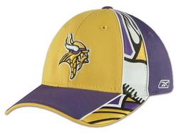
Ugly sideline caps 01 Dec 2005
16 comments Latest by frank
Ever year the NFL comes up with new official merchandise which they force players and coaches to wear on the sidelines. And each year it just keeps getting uglier and uglier.
Take these “fashionable” (according to Lids.com) Official Players Sideline Caps (please).

I’m not expecting Tom Ford or anything but two-tone madness with a sliver of a logo blown up really big and then thrown in the corner? Watching the Jets offense is already painful enough without this added cruelty.
16 comments so far (Jump to latest)
Dan Boland 01 Dec 05
It’s not just the caps… jerseys have been getting increasingly hard to look at in the past few years. What’s up with Cincinnati Bengals’ monstrosity? And the Bills, my God, what the hell is that?
Drew Pickard 01 Dec 05
It’s probably because sports jerseys are no longer spots jerseys that players wear - but are consumer products, that need a significant re-styling every year to drive sales … oh, and players wear them too.
I think the difference probably came when they realized that it was a missed ‘opportunity’ to have players wear ‘standard boring’ jerseys that didnt sell well when they could make them wear their ‘designed’ consumer products instead and get free marketing/product placement!
I am, of course, merely guessing at all of this.
Jamie Tibbetts 01 Dec 05
Hey, you gotta distract people from lookin’ at the beer and brat-juice stains on your gut somehow.
Don’t diss Lids though. They make the best fitted hats.
Dave Simon 01 Dec 05
I’d agree with Dan Boland about the Bengals and Bills jerseys.
The Bills are amazing - using at least 3 different shades of blue! And their shoulders are blue even when they are wearing road whites. Which seems to me to be a bit of a cheat - especially if they are playing a team with blue jerseys - and there are lots of them!
Yes, these caps are hideous, too. But I like nice, clean ones, and they are hard to find with NFL logos on them.
freddie falcon 01 Dec 05
I miss the old Atlanta Falcon logo and their black unis. Nice reply Christopher… well put.
Mark Priestap 01 Dec 05
Right on. I was watching the Dallas game the other day thinking “What ever happened to snazzy dressers like Tom Landry?” I’m sure it’s a money thing.
Kelly Johnston 01 Dec 05
Best part: The Denver Broncos fans are saved the ugliness
Benjy 01 Dec 05
I think the difference probably came when they realized that it was a missed �opportunity� to have players wear �standard boring� jerseys that didnt sell well when they could make them wear their �designed� consumer products instead and get free marketing/product placement!
I don’t think it was the “boring” designs that didn’t sell. I think it’s the fact that people don’t want to spend $100+ on a jersey of a player who’s as likely as not to be on a different team a year or two later.
Derek Scruggs 01 Dec 05
Remember, you’re talking about a league where there are people who wear cheeseheads.
Damien 01 Dec 05
Personally I think its less a problem with the graphic designers and more the managers who are a) forced to have everything redesigned each year, b) have to get more and more spamvertising crammed in. But sadly the people who pay the bills still believe all this crap is a good idea.
Damien
freddie falcon 01 Dec 05
For contrast, check out NFLe (europe) gear.
Seth Werkheiser 01 Dec 05
The bad design probably is fueled by the fact that people keep buying these ugly things. Ugly designs being bought up by die-hard NFL fans…. it’s a complete cycle done every year I guess…
Mike 02 Dec 05
It’s all about the bling, baby.
Sebhelyesfarku 02 Dec 05
Baseball caps look stupid anyways.
frank 03 Oct 06
vikings suck anyway