
In The Imperfectionist, interior design guru Dan Ho says, “Perfection is a cheap caricature of style.”
Style, in Mr. Ho’s view, is unstudied, capricious. Specifically, it is a rubber ducky placed on a plain wooden table, a loop of twine hanging from a bathroom sink instead of a conventional toilet paper dispenser. It is the good sense not to replace chipped heirloom china with something flawless and new, and the wisdom never to waste countless hours building a trellis when a plant displayed in an old sausage tin, or whimsically in a child’s sand pail, will do.
 Reminds me of some of the recent discussions about boring, boxed-in web design (see Blahg or Boxes or this chat).
In the quest for perfectly aligned grids, are designers missing out on the subtlety and charm that comes from things that are imperfect but human?
Reminds me of some of the recent discussions about boring, boxed-in web design (see Blahg or Boxes or this chat).
In the quest for perfectly aligned grids, are designers missing out on the subtlety and charm that comes from things that are imperfect but human?
Shabby chic web design
Of course, there’s always room for good, clean design. We’re champions of it. But perfectly aligned grids aren’t the answer to every design challenge.
It depends on what you want to communicate. Are you aiming for clean, useful, and functional (say, a project management app)? Then simple, usable elegance is a great solution. But what if your goal is to speak with a unique voice (like at a personal blog), be more human (a small company trying to emphasize intimacy), show off a distinct style, or stand out from the crowd? Then some rough edges and discord can work wonders. Consider it a shabby chic approach to web design.
There’s a great side benefit to this approach too: You get to work with what you’ve got on hand. You don’t need to wait for the ideal ingredients or set aside tons of time to pull it off. You can jigsaw together elements that wouldn’t fit in a “perfect” layout. You can use images, fonts, and copy you have instead of waiting for things you don’t have. You make it work and accept the resulting disjointedness as part of your unique vision.
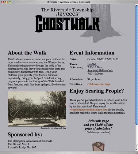
This site for a Halloween Ghostwalk won’t win any design awards. Yet the playful copy and folksy vibe conveys exactly what it should for a small, friendly, neighborhood gathering.
Visual rhythm
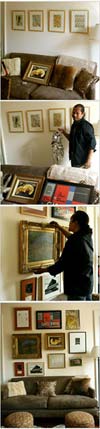
Let’s Ho it up some more. One thing he values is visual rhythm (i.e. you can place unrelated items together as long as they visually match the “beat”). A sidebar offers an apartment owner’s description of a Ho makeover (see photo above too):
Strewn around the room, up against the baseboards, were various paintings, prints and framed photographs, none of which I could bring myself to mount on a wall: I feared that they were either too big or too small for a particular space, too discordant in their various styles to display together.
But Mr. Ho thrives on discord. And he prizes sentimentality. What he cannot abide is the idea of a beautiful photograph of a Parisian stoop, a wedding present from the very person who took the picture, sitting on the floor because its recipient lacks the imagination to hang it. Mr. Ho decided that he would take over a wall above a sofa in the bedroom and group nearly every piece of art I had ever acquired.
Mr. Ho hates matching frames. To him, they symbolize the oppression of the design magazines that had filled me with the fear of hanging anything in the first place.
...His secret in grouping random images, he explained, is to place them all the same width apart so that there is a visual rhythm to the seeming madness.
Authentic simplicity
Ho’s take on simplicity is also interesting. To him, less stuff to be organized is a better solution then an organizing system. The goal is attaining authentic simplicity, not the veneer of simplicity.
What he disavows is inauthentic simplicity. From his perspective, no one should go out and buy drawer dividers to better organize their socks; they should have fewer socks and throw them in a drawer with enough room to distinguish the black ones from the navy ones.
Folksy sites
Getting back to the web realm, here are some more examples of site designs with authentic, personal style:
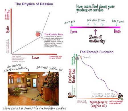
A big part of the charm of Creating Passionate Users is Kathy’s homemade charts and images. Sure, they could be more “professional” but then they’d 1) take a lot longer and 2) lose the vibe that makes Kathy’s site feel so open and inviting.
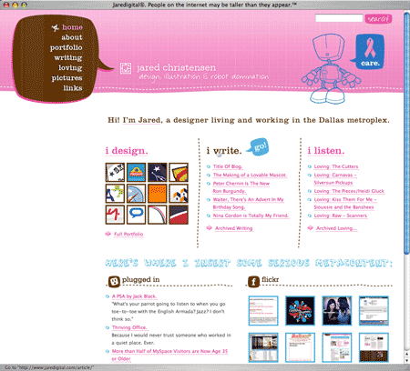
Jared Christiansen got some love during a recent designer Fireside Chat. At his personal site, organic lines, hand-drawn lettering, and cartoony hover bubbles create a warm, friendly environment. No cold “I’m a designer” minimalism here.
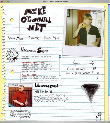
Comedian Mike O’Connell’s site layout features a ripped notebook page, doodled sketches, a tilted Polaroid, and an, um, informative “About” page (sorta NSFW). You quickly get the picture re: what Mike’s all about (i.e. hilarity!).
The value of authentic
Authenticity is underrated. People forgive a multitude of sins in exchange for it. Sure, aim for perfection and professionalism when it’s called for. But don’t overlook the power that comes from being authentic, appropriate, and human.
Baz
on 02 Nov 06Do people really have drawer dividers for their socks?
FJ
on 02 Nov 06A large part of ‘I am a designer’ minimalism comes from the very fact CSS is boxy by nature. Most ‘designer’ sites are written in CSS/XHTML because these people assume, wrongly or not, that potential customers will look at the source code and comment on its elegance. ‘Folksy’ sites heavily rely on images – in fact they are sometimes all images – which, in our DSL world, is no longer a problem but is still frowned upon in ‘designer’ circles.
The question here seems not so much to be what ‘style’ you prefer but how light one wants the page to be. Today, a light site means a whole lot of rectangles and Verdana – even if very cleverly disguised.
brad
on 02 Nov 06One thing like this that I’d love to be able to do, and I bet can be accomplished fairly easily in CSS (just haven’t seen it done anywhere), is to use uneven dark borders around content rather than straight or dotted lines. I’m thinking about the kind of borders you see on photographs like this.
On my site’s banner I put a rough underline/border under the text in the banner but that’s an image…I’d love to be able to produce a similar effect on the thin border that encloses the content of the page. Anyone know how to do that?
Scott T.
on 02 Nov 06I wondered the same thing when I saw these strange rubber rings for holding socks together at the Container Store. I decided I probably would not like to know the kind of person who buys and uses this sort of thing…
--Josh
on 02 Nov 06That kind of reminds me of one of my favorite site designs: the actor/musician/artist (who knew?) Jeff Bridges (Lebowski himself), has had a great site design for the last six or seven years: http://www.jeffbridges.com/ . He keeps it updated often too. Check out the “Latest” page and the “Stuff” page. They’re all pretty interesting, actually. I’ve always liked this too: http://www.jeffbridges.com/because.html.
Edward
on 02 Nov 06I only have black socks.
I only had black socks. Now I have black and grey socks.
John Lein
on 02 Nov 06@FJ:
I’m puzzled by your response (and similar things I’ve seen lately), which seems to indicate that CSS/XHTML/standards and images in design are mutually exclusive. CSS is just a better way of building your design, and it’s up to the designer to implement their design either with colors/divs or with images. I would say that the abundance of boxy, plain sites has more to do with designers playing with the latest design fad (not it’s necessarily a bad one) rather than limitations of techonology.
Re:boxy, I would say that using CSS makes it easier to build non-boxy sites than tables ever was. Negative margins, absolute positioning, etc are easy ways to “break the box”. Try doing that with a table.
I agree that the basics of CSS are boxy, but there’s so much more… And in my opinion, the best designs start out with a good, block-driven structure, and then branch out from there depending on the designer’s imagination/site requirements.
Sammy
on 02 Nov 06I confess. I have socks beyond white, black, grey, and brown. Some of them have little dotty patterns on them too.
I am a bad person: my socks are not sufficiently minimalist for this Web 2.0 world. I am to be shunned and pitied.
(But if you’re like me, and you want to keep your matching socks together without the need for plastic tcotchkes, try this: take the two matching socks, and roll the top of one of them inside-out so that it wraps around the top of the other one. They stay together, without additional equipment.)
Neil Straghalis
on 02 Nov 06I really like the idea of finding the authentic material of web design, and using that to it’s best advantage. Although what those are seem up for debate (boxes and grids vs. jigsawing elements together, and just making it work; but perhaps the two aren’t mutually exclusive).
Ryan
on 02 Nov 06A loop of TWINE instead of toilet paper?
Yeah, that’s definitely a “rough edge.”
Are you guys on crack or what?
Ryan
on 02 Nov 06“Organic lines?” What does that mean? Do you mean “squiggly?”
I don’t like whimsical sites that jut off and do their own thing, changing layout and design. This is posing, not designing.
A site servers a purpose, and should just work. The more different it is from every other site I’ve used, the harder it will be for me to use the site.
I mean is authenticity really “underrated?” Isn’t nearly every one age 13 and up in this country is trying to seem different and unique in every way except for the ones that matter? From hipsters to status-conscious businessmen to middle aged housewives to high school students?
I am allergic to studied unstudiousness, whether from Martha Stewart or a twee hipster.
Is there anything the least bit capricious about that torn-notebook-page layout? Unless it’s a scanned image of an actual notebook page, it’s going to take a lot more effort than just choosing a blog template or using basic HTML tags. It’s actually going to be harder than most fancy CSS sites, since a lot of the text is composed of images.
That notebook site, incidentally, looks really cool and I think it’s great. But it should be acknoledged for what it is: a very slick, cool layout that took a lot of effort, the furthest thing from an unstudied “rough edge.”
ML
on 02 Nov 06Ryan, by “organic lines” I meant the kind of lines you find in nature (i.e. not straight).
RS
on 02 Nov 06Good thoughts Ryan. Maybe the notion of “rough” in the article isn’t about being loose, careless, or quick. For me it’s more about having freedom to work outside the modern swiss-grid everything-in-its-place aesthetic, and to do so without losing style points.
sammy
on 02 Nov 06Ryan, the loop of twine doesn’t replace toilet paper. It replaces “a conventional toilet paper dispenser,” when “hanging from a bathroom sink.” You put the twine through the center of the roll.
brad
on 02 Nov 06Ryan, the loop of twine doesn’t replace toilet paper.
That’s good to know, otherwise the expression “don’t forget to floss” would take on a whole new meaning.
Anonymous Coward
on 02 Nov 06xcv
Luc
on 02 Nov 06Other great examples of authentic websites from designer Jesse Thomas:
http://www.busboysandpoets.com/
I worked with this guy in the past and he is very creative and out of the ordinary. Check out his portfolio at http://www.jess3.com
Dan Boland
on 02 Nov 06Luc: I’d say your boy Jesse took a little more than inspiration from 9 Rules when coming up with this logo.
dmr
on 02 Nov 06Cool. Nine rules invented the overlapping of a leaf. Don’t use any more leaves guys. It’s just not cool. Use a skull instead. Or drips. Or some masking tape. Did anybody already do that too?
Great examples of this exist in virtually every issue of Print. Comarts has become the catalog of the homogenized and anonymous designer. I’m far more interested in the David Carson philosophy of bringing some of you into a design. I’m sure we’ll hear from those who will cry “but designers aren’t artists!” Well, sometimes art and design converge, and sometimes I’d hang a piece of design on my wall and call it art. I’d like to see more designers put themselves into a design; make it personal, bring something unique to the table. Design isn’t just about using tools to drop things into reconfigured grids.
dmr
on 02 Nov 06And I think rough is human. Perfect is for robots.
TD
on 03 Nov 06We aim to make robots more human while trying to make ourselves more robot. At the end of the day, knowing when to control and when to let go is where we should all aim to be.
Jesstech
on 03 Nov 06Best article on SVN yet.
Charlie Triplett
on 03 Nov 06The difficult thing about this is putting that constraint on yourself that is so conducive to creativity.
One method I’ve seen for a blog that was to look kinda low-fi was this: Only use graphical elements seen in the newspaper’s automotive section. Read: Yellow stars and Brush Script.
Tom M.
on 03 Nov 06The screen caps from the original post are some nice “lo-fi” examples. They really do seem authentic.
Is it just me or is there a lot more “contrived” authenticity out there than ever before? Or maybe it’s noticeable because it’s limited to mostly one style. You know, the Hatch Show Print rip-offs, simulated silkscreen effect, with Zebrawood, Playbill, or Gill Sans Ultra type fonts with woodcut ornaments. It’s surprising because it seems to have been very trendy for such a long time, but it’s still everywhere. I’ve really noticed it on TV a lot lately.
David Woodward
on 03 Nov 06I suppose I “took a little more than inspiration” from Freshbooks too with my logo? Except I made mine back in 2002. I’m tired of people pointing at basic human archetypes like leaves in logos and attributing it to being “ripped off” of whatever the latest giant fad in blogs has used for their logo.
As to rough edges? I think they’re cool when used in the right context. And photoshop brushes make them dead-easy. But I think the core of any good design is harnessing the power of discretion.
Mark D.
on 03 Nov 06I hate to start the blame IE section (I’m lying), but it would make it a whole lot easier on us as web designers if IE fully supported using transparent PNG’s…
Ryan
on 03 Nov 06OK thanks for the replies, but if you’re fashioning a roll of twine into a TP dispenser thing, how is that more “authentic” than buying and installing a conventional TP dispenser from Target, which is likely to take less time and frankly be easier to change rolls on, if I understand this whole “hanging from the sink” setup, which frankly I’m not sure I do?
Who even uses twine anymore, except for the sheer novelty? And if you don’t have it laying around the house, you’re just being pretentious, and definitely not “authentic.”
“Look at me, I am so artistic, the Arts & Crafts movement even influences how I wipe my butt, my aesthetic sense cuts THAT DEEP.”
Here’s what’s authentic AU MOI:
“I am really lazy, especially around topics like ‘hmm, how to best dispense things very-soon-destined for the toilet’, so I just do the easiest thing that does not involve obviously heinous ethics, namely driving to the nearest cheapish store and buying a toilet paper dispenser that will be easy to install, or better yet using the toilet paper dispenser THAT COMES STANDARD WITH NEARLY EVERY HOME and apartment in the country, including in all likelihood section 8 apartments and federal housing projects in West Oakland.”
But, hey, whatever makes you authentically happy.
Ryan
on 03 Nov 06You know I think the only problems I have with the post stem from the words “authentic” (yech), “unstudied” (pshaaa, right!) and “capricious”. Without those whole lines of attack, we’re essentially left with “freedom to work outside the modern swiss-grid everything-in-its-place aesthetic, and to do so without losing style points” and squiggly lines being cool, both of which I agree with.
Michael Ward
on 03 Nov 06Mark D.: Internet Explorer does support using transparent PNG’s.
Unfortunately, versions before 7 only support 1 bit transparency natively and alpha transparency with some funny hacks. Of course, version 7 now support real alpha transparent png’s but it’s going to be a very good while before we can drop IE6 support.
Maybe it won’t be too long before we see a js hack for IE6 support as acceptable for a browser with diminishing market share.
Back on topic, I’d like to thank 37s for one of the most thought provoking articles they have posted in a while.
Dan Boland
on 03 Nov 06David Woodward: First, spell my name right, please. Thanks. Second, I admit I came down a little hard, but I had just finished reading about the Toyota plant that ripped the 9rules logo, and at first glance, thought “Jesus, another 9rules rip?”
David Woodward
on 03 Nov 06Yaniv Nord
on 03 Nov 06I recently designed a web site for my upcoming wedding. I did the design and posted it all in about an hour and consider it the best web site i ever built. It is definitely shabby-chic. check it out: www.paula-nivi.com
touche’
Blake P
on 06 Nov 06Jared’s site looks pretty good. This publicity alone should spark about 100 clones.
This discussion is closed.