Every button in your app requires a little curiosity and a leap of faith. Here’s how I discovered a new feature on my Twitter app just by being curious.
My colleague Jason Zimdars sent a goof tweet my way…

Then my other colleague Jonas Downey stepped in…

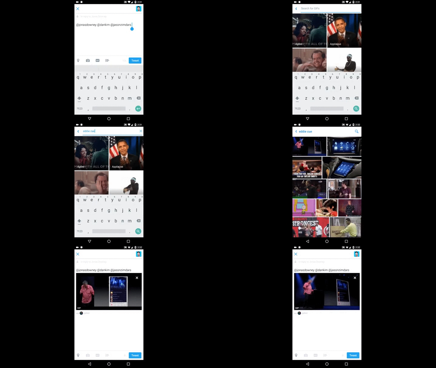
I recall seeing a GIF of Eddy Cue doing a “dad dance” at one of the Apple Events a few years ago. I wanted to reply with that GIF. Normally I’d search Google or Imgur then copy the link, paste it in the Tweet, etc. Then I saw this GIF button along the bottom of the Reply feature.

I was curious. Would it have “Eddy Cue Dad Dancing” GIFs? Was this only for mainstream GIFs? Was Eddy Cue too obscure? It turns out that it did in fact have an Eddy Cue section with the exact GIF I was looking for. I even misspelled his name and it still knew what I meant.

This, of course, is a frivolous use case. However goofy as it may be, it serves as a reminder as we add new features (and buttons) to the Basecamp 3 Android app. I was perfectly happy to do the copy and paste dance to find that perfect GIF. Had I not been curious, I wouldn’t have been delighted and surprised by that GIF button in the Twitter app.
As we add new features we can’t assume everyone will discover or use them immediately. It requires a bit of curiosity on the part of the customer—a leap of faith—to make that feature whole.
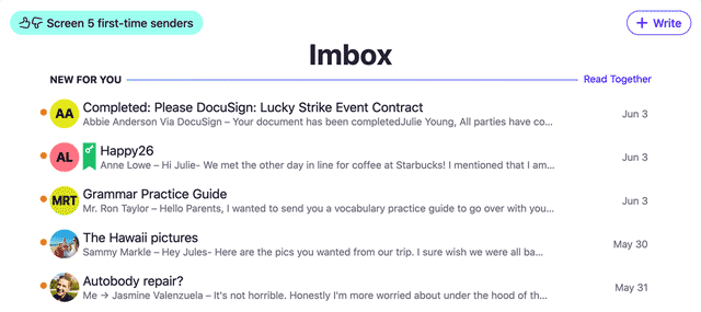
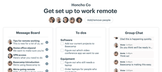
We’ve been working really hard to make the all-new Basecamp 3 and its companion Android app as great as they can be. Check ’em out!
If you have any feedback, I’d love to hear it! Email me or hit me up on Twitter and let’s chat.

