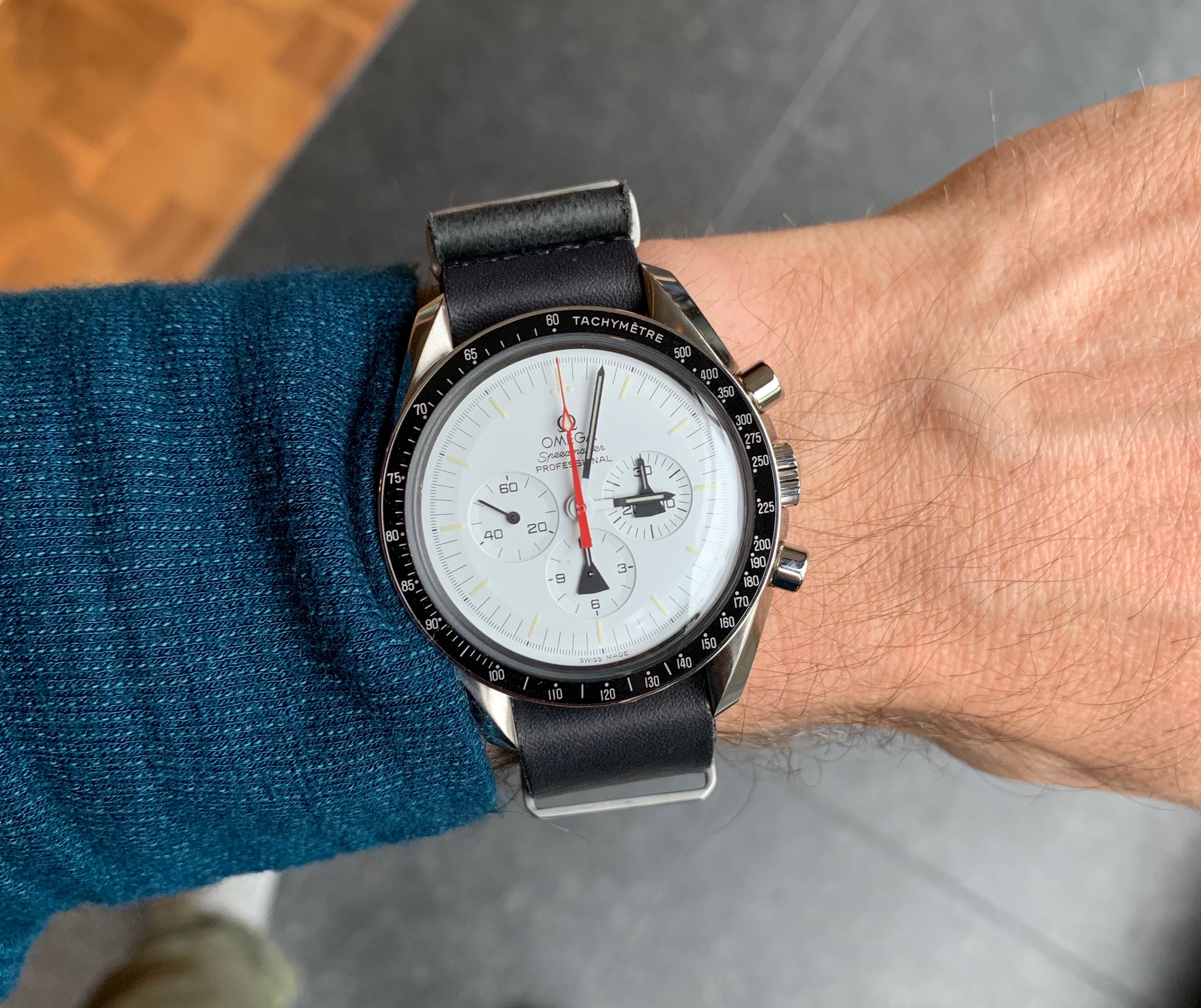
Why wear a watch when I have the time on my phone?

As a “technology person” (ugh), people ask my why I wear a mechanical watch when I already have the time on my phone?

I love mechanical watches for a number of reasons – the art, the science, the ingenuity behind the mechanisms, the continuation of a craft dating back centuries, the look, the feel, the freedom from batteries and tethers and cords.

But lately it’s really come down to this: When I look at my watch, it gives me the time. It asks nothing in return. It’s a loyal companion without demands.

In contrast, if I look at my phone for the time, it takes my time. It tempts me. The time is paired with notifications. The time is paired with a big color screen. The time is paired with a temporary cure for boredom. It seduces. It’s a rare moment that you look at your phone and you only see the time. I don’t like that trade.

I use my phone when I need what my phone does. I use my watch when I need the time. I like being on time, I like knowing where I stand in the hour, in the morning, in the afternoon, in the day. I look at my watch a lot, and I just love that it doesn’t look back.


Thanks to Krys for the insight.

A letter from a reader

Whenever we write a book, we include our email at the end so people can reach out and share their stories. With their permission, I’d like to share an email we received this morning from a reader of “It Doesn’t Have to Be Crazy at Work.” Published as written, only their name is being withheld at their request:

Hi Jason, David,

Your book ‘It Doesn’t Have To Be Crazy At Work’ prompted me to change my life. Thank you. 

When I started reading the book back in January this year, I was working 14-16 hour workdays, working weekends, and practically had no life outside of work. I was eating unhealthy food because I had no time to cook and my house (I live alone) resounded the inside of a shabby animal’s cage. I was following what was told to me as the right path to success, and I was giving away my life for a boss who somewhere deep down didn’t really care for me at all. My company offered me no benefits and it was a pathetic environment to work in. And I stayed, slogged day in and day out, because I thought I had no choice. 

However, as i read your book, things started to make sense to me. What your book said made a lot more sense to me than the life I was living. It was like a world was opened up to me, one I could not imagine. I thought success wasn’t achieved on anything less than 80 hour workdays. And I almost prided myself on being able to live through them. 

Today, I just five months later, I have been able to change my life. I moved my job to a much bigger firm that gives me a lot more job satisfaction and a lot more time for myself in life. I was able to up my salary by half in this transition and more importantly, get access to a lot more knowledge and resources at work to help enhance my development. I was able to get access to things like healthcare, and even small bits like fruit water at work which helps me stay hydrated throughout the day (whereas even water breaks were seen as bad at my previous workplace). I am able to cook meals for myself almost everyday and I am able to workout on alternate days. I come home by 5 in the evening, and most importantly, I am happy. I very so happy in life, as opposed to being a miserable little person who snarled at everyone all day long. 

I really hope more people are able to understand what it is that you are trying to put across with your book. Thanks a lot for putting the book together and all the best!

With Regards,
A tech-impact writer based out of Gurgaon, India
name withheld by request

How Amazon Prime came to be

It’s always inspiring to read about the early days of an idea. About the doubt, the pushback, the impossibilities, the models telling you it’ll be too expensive, the “but, but, but…”, the breakthroughs, the vision, and the drive when you just have a hunch. The knowing that there’s no way to know until you try. These moments are often wrapped with unusual combination of vulnerability and confidence. I find them fascinating. Here’s an oral history of how Amazon Prime came to be.

Evolving and explaining how we run our company

As we write in “It Doesn’t Have to Be Crazy at Work“, you should treat your company as a product too. To improve a product, you listen, learn, (re)consider, concept, and iterate. The same approach should be used to improve your company itself. How you work, how you manage, how you develop and communicate policies and procedures should all improve through iteration as well.

With that, we wanted to share how we’re improving through iteration on the inside. We recently updated our Employee Handbook (which anyone in the world can read) to clarify a few key points:

First, what are the different responsibilities of an executive vs. a manager vs. an individual? At some level the differences are obvious, but at the edges it’s not always clear. And where there’s murkiness, there’s often confusion and then conjecture. In the pursuit of clarity, we recently added a section to the handbook defining these responsibilities.

Second, what happens if an employee finds themselves in a situation where their performance has been called into question? Not knowing where you stand when there is a problem – or not even realizing there’s a problem at all – is an uncomfortable and unproductive place to be. You can’t do your best work when your mind is riddled with anxiety stemming from existential questions about job security. To clarify the process for helping identify and resolve such problems, we recently added a section to the handbook that details our newly formalized performance plan process.

Third, what does it look like to build a career at Basecamp? At many software companies, work is a job – and a relatively temporary one at that. The average tenure at Amazon and Google is only around 12 months. At Basecamp, our average tenure is 5 years (our team page shows how long everyone’s been here). Given that, it’s important for us to define what progress looks like at Basecamp. To help clarify those details, we recently updated our handbook page on making a career at Basecamp to include more details on progression, titles, pay and promotion, and the review process.

As you can see from the last updates times/dates on our Handbook, how we run the company, and how we explain how the company runs, is always being updated. Our Employee Handbook isn’t printed and forgotten. There’s no been there, done that. It’s not a project that ends. Rather, it’s continually updated updated and republished. And while some pages may be steady at a few years old, many have been updated within the last few hours, days or months. We’re always aiming to be clearer, fairer, and better, and we find that publishing our Handbook out in the open is an especially handy way to keep us improving – and honest about how we do it.

We believe publishing how a company works is a public good, not a private act. When customers choose to buy your product, they should know what kind of company makes it. We think that the more open we can be about our internal practices, the more comfortable the public – our customers – can feel about doing business with us. Spending money with a company is essentially voting for a company. We want our customers to feel proud when they vote for us.
A great ad

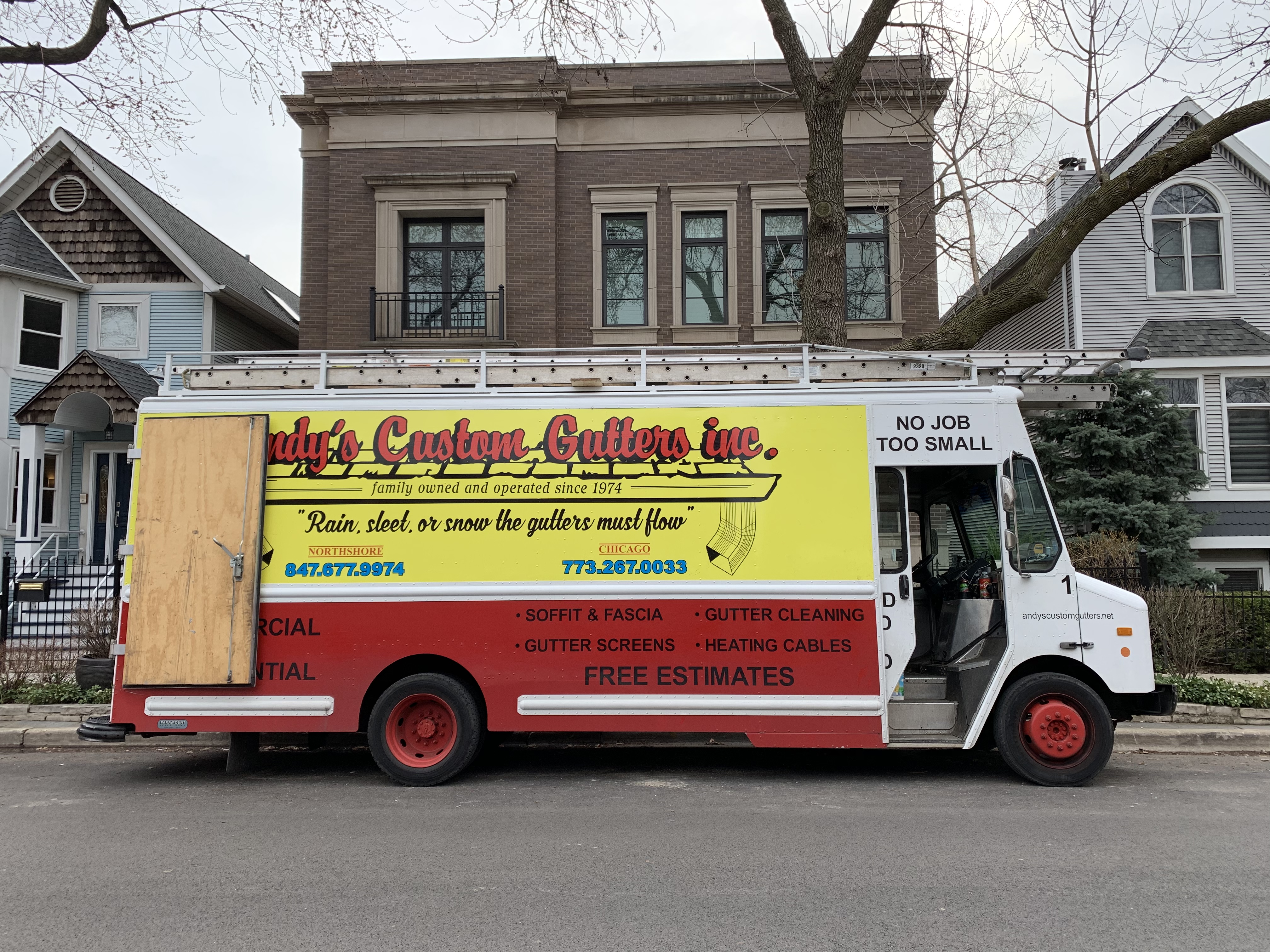
I’ve always loved this kind of design. It’s clear, it’s colorful, it’s honest, it’s approachable, it’s folksy, it’s effective. ALL CAPS works. “NO JOB IS TOO SMALL” is impossible to improve on (it also says this in huge letters on the front of the truck). “Rain, sleet, or snow the gutters must flow” rhymes (and they’re right!). You could argue that the URL is too small, you could say it’s messy because there are too many colors, fonts, styles, etc. But I’d say so what? How does any of that make this a bad advertisement on the side of a truck? It’s beautiful – and ugly – in all the right ways.

Design lesson: Consistency, confusion, and context

CONSISTENCY

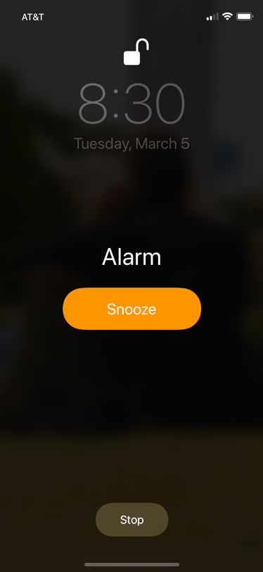
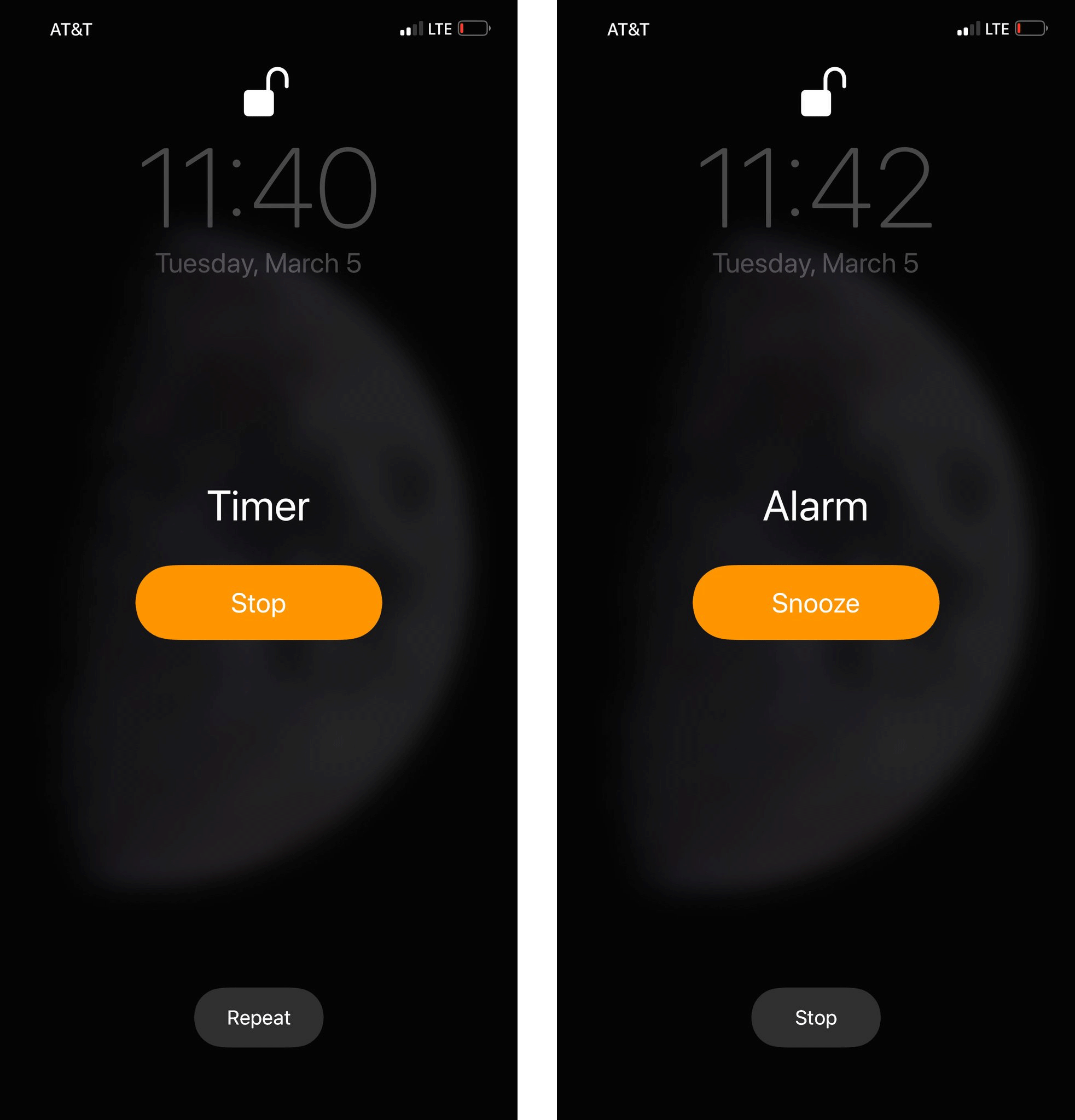
When looking at a single screen, the button shape and centering is consistent. Further, a primary button is called out using size, color, and placement – in line with interface guidelines.

CONFUSION

Stop up top on the Timer, stop down at the bottom on the Alarm. The Timer and Alarm designs look so similar that visual/muscle memory can lead you to tap the wrong button. Confusing!

CONTEXT

Ah, this is what you really want. A design steeped in context. It’s an alarm clock, and you often want to snooze one of those – especially early in the morning when you’re randomly smacking at things, hoping to hit the right thing. So make Snooze huge – no more hunting for that small button in a field of black. And make stop larger too. You could use this with your eyes closed as long as you know the shape of the phone, and which side is up/down. (Note: this is a conceptual design by Alex Cornell)


Finding a mentor

People tend to look for mentors who are too far afield. A mentor who’s 20 or 30 years on in their career. I think this is misguided.

I think most are far better off seeking mentorship from someone who’s just a little bit ahead of them. Someone who’s a year or so in front. Someone who just went through what you’re going through, not someone who went through it a decade ago.

So if you’re starting a brand new business, talk to someone who started theirs a year ago. Or if you’re about to sign your first office lease, talk to someone who just signed theirs. Or if you’re about to hire your first employee, get advice from someone with a two-person company, not 200. I think there’s a good chance the advice will be more helpful.

That’s not to say you can’t learn from an expert in their field, or that you shouldn’t trust anyone who’s been there done that years ago, but that I believe most of your advice should be relevant advice. And relevancy benefits from recency. Memories fade and myths form over time – the closer someone is to the actual events you’re asking them about, the more relevant the advice has a chance to be.

Yes, history has much to teach us, but history also has much to trick us. Last week is a better predictor of this week than last decade would be.


Basecamp turns 15

Yesterday, February 5th, was Basecamp‘s 15th birthday. As a company we’ve been around for 20 years (we used to be called 37signals), but one random Thursday back in 2004 marked the beginning of Basecamp, the product.

And we launched it right here in this post on this very blog, Signal vs. Noise. The blog looked a lot different then, but the spirit’s the same. And here’s a link to the original home page, as well.

The comments are especially interesting to read after all these years. They give you insight into what a launch is like – uncertainty, “I needs” and immediate feature requests, doubt, praise, questions, etc. Every launch is a mixed bag of emotions and opinions. Ours, potential customers, lovers, haters, etc. But that’s what makes it exciting! No one really knows what’s going to happen. Launch day is the easiest day you’ll ever have – it only gets harder from there on out.

There are so many people to thank. Our 100,000 paying customers, our incredible crew who’ve put in over a million collective hours developing the product, supporting our customers, and keeping the machine humming. It’s truly a continued honor to get to work with such bright, interesting, talented, thoughtful, and kind human beings.

But let’s also recognize that we have luck and fortuitous timing to thank. They are a large part of our success. I didn’t used to think luck played a part. I didn’t believe in timing. It’s easy for your ego to dismiss those things as something you didn’t need because you’re so fucking good. Probably not. Of course I was younger and dumber back then. I’ve since learned that luck and timing play an outsized role in anyone’s success. No need to hide from that. It doesn’t make you less of a person, or less of an entrepreneur, to admit you rode the wave of luck.

So, here’s to continued luck! Let’s make it another 15, 20, 25! Thank you everyone.

Psst: We’re hoping luck and timing come together again later this year.

I’ll pay what they’d pay

I wish ad-supported services could look at my average usage (# of pages I’ve viewed, ads I’ve seen, etc), and give me an option to directly pay them the same amount they would have charged the advertisers for my slice of views/clicks/etc. No ads for me, they get paid as if they were serving me ads.

I’ll even put my credit card on file. Just show me a running receipt of the charges I’m running up. They get paid the same amount as an advertiser would pay them, I get to support a publication I like, everything’s transparent, and anyone can opt in or out. Don’t want ads? Pay your own way. Ok with ads? Let advertisers support your usage.

Silicon Valley has become especially good at turning software, the highest margin product ever, into many of the worst performing businesses imaginable. With few exceptions, the amount of money being lost by the leaders of the new school is absolutely staggering.