Outlasting

You in business? What are you doing to last? Not to grow. Not to gain. Not to take. Not to win. But to last?

I wouldn’t advocate spending much time worrying about the competition — you really shouldn’t waste attention worrying about things you can’t control — but if it helps make the point relatable, the best way to beat the competition is to last longer than they do.

Duh? Yes, duh. Exactly. Business is duh simple as long as you don’t make it duhking complicated.

So how do you last?

Obviously you need to take in enough revenue to pay your bills. But we’ve always tried to reverse that statement: How many bills do you need to pay to limit your revenue requirements?

Rather than thinking about how much you need to make to cover your costs, think about how little you need to help you survive as long as you want.

Yes, we’re talking about costs. The rarely talked about side of the equation. I’m honestly shocked how little attention costs get in the realm of entrepreneurial literature.

Whenever a startup goes out of business, the first thing I get curious about are their costs, not their revenues. If their revenues are non-existent, or barely there, then they were fucked anyway. But beyond that, the first thing I look at is their employee count. Your startup with 38 people didn’t make it? No wonder. Your startup that was paying $52,000/month rent didn’t make it? No wonder. Your startup that spend 6 figures on your brand didn’t make it? No wonder.

Even today… Some of the biggest names in our industry are hemorrhaging money. How is that possible? Simple: Their costs are too high! You don’t lose money by making it, you lose it by spending too much of it! Duh! I know!

So keep your costs as low as possible. And it’s likely that true number is even lower than you think possible. That’s how you last through the leanest times. The leanest times are often the earliest times, when you don’t have customers yet, when you don’t have revenue yet. Why would you tank your odds of survival by spending money you don’t have on things you don’t need? Beats me, but people do it all the time. ALL THE TIME. Dreaming of all the amazing things you’ll do in year three doesn’t matter if you can’t get past year two.

2018 will be our 19th year in business. That means we’ve survived a couple of major downturns — 2001, and 2008, specifically. I’ve been asked how. It’s simple: It didn’t cost us much to stay in business. In 2001 we had 4 employees. We were competing against companies that had 40, 400, even 4000. We had 4. We made it through, many did not. In 2008 we had around 20. We had millions in revenue coming in, but we still didn’t spend money on marketing, and we still sublet a corner of someone else’s office. Business was amazing, but we continued to keep our costs low. Keeping a handle on your costs must be a habit, not an occasion. Diets don’t work, eating responsibly does.

Try it for a year. Think less about revenues and more about costs. In many cases they’re easier to control, easier to predict (seek out fixed costs that’ll stay the same as you grow, vs things that get more expensive as you grow), and easier to manage. But only if you keep them in mind as you make decisions about how you’re going to last — and outlast.


Fired up about a new idea, but can’t seem to get traction to make it happen? Chat rooms aren’t traction, they’re treadmills. Lots of talk without going anywhere. You need Basecamp 3 — discussions, to-do lists, schedules, the ability to hold people accountable. Don’t just talk about it, do it with Basecamp.
Hard first or easy first?

Accountants have FIFO (first in first out) and LIFO (last in first out). Product designers have HFEL (hard first easy later) or EFHL (easy first hard later).

No matter the project, there are things you’re more confident about and things you’re less confident about. No brainers, maybe brainers, yes brainers. Assuming you have limited time to complete a project (we spend a maximum of 6 weeks on most projects), you have to decide how to sequence the work. Do you pick off the hard stuff first? Easy stuff first? What to do?

It depends, of course. I don’t have any answers for you, but I can share some of the things we think about when deciding what to do when.

First we get our bearings.

Does this feel like a full project? Is it probably going to take all the time we have? Lots of moving parts? Does this work touch a lot of other things, or is it mostly self-contained? Do we feel like we’ve mostly got it down, or are there some material unknowns we haven’t quite nailed down yet?

If it feels big, and full, and challenging with some significant unknowns, we almost always start with the hard stuff first. The worst thing you can do in that situation is kick big challenges down the road because you’ll inevitably run out of time. You’ll either make bad big decisions that way, or you’ll push the schedule out, or you’ll work late or work weekends. All those are big no-no’s for us, so we tackle the hard stuff first.

Sometimes we start with a quick spike. We put a few days into it and see if we’re able to make any meaningful forward process. That’ll reveal if the problem is really as big as we think it is, or we’ve been overestimating the shadow of worry its been casting. But waiting until later isn’t an option. We chip away at the big rock to see if it’s sandstone that’ll break down easy, or granite that’ll require heavy machinery.

Once we have a sense of where we’re at, we think about what we need, as a team. I don’t mean what does the team need as far as tooling or technology goes, but what do we need emotionally? Do we want to slog along without any short-term visible progress, or can we grab a quick win and start to pick up some momentum? It depends — how did the last project go? Are we coming off a high or a low? If a low, maybe we should find some quicker wins to fuel the spirit. If a win, maybe we’re already feeling good enough about ourselves to go heads down without anything material to show for a few more days. The past plays a surprisingly important role in the present.

We’re currently working on some significant improvements to the way our customers work with their clients in Basecamp 3. It’s a big project, and we’ll likely be working on it over two 6-week cycles. There are unknowns — both technical and visual — but the last time we tried to tackle this problem we ended up putting a lot of work in with nothing to show in the end. We didn’t ship what we built because we 1. didn’t finish on time, and 2. didn’t feel great about what we built, and 3. didn’t want to put more time into a bad time. Therefore, this time, we ran easy and hard in parallel. The programmers worked on a hard problem first, and the designers worked on an easy one. It was a nice way pour the concrete foundation and choose the paint colors at the same time.

On the design side of things, we often try to stay away from the details early. Details can turn into quicksand. We never want to get stuck on something early on — that’s a surefire way to burn too much time on something that’s going to change later anyway. Never ever get stuck on something you just know you’re going to change later. So when we start a design project, we typically go from very big to very small. It’s a bit different from choosing hard first or easy first, but it’s still a choice. We still have to decide where to begin.

One other thing I wanted to add, but don’t know where to put: We aim to avoid feeling like we have something to prove. That’s hero language, and we don’t do hero. We do work. We have work to do. Big and small — we’re satisfied by doing good work and getting it done in the time we give ourselves up front. Heros are only satisfied by rescuing things, doing the impossible, or saving the world. We’ll leave those antics to teams that run on fumes. We’ll run on a good night’s sleep.

I wrote this essay without reading it back — a stream of consciousness burst. I’ve had a bit of writer’s block this week, so I’m trying to bust through by just writing raw thoughts and getting my fingers moving again. I hope it was helpful. Any questions?
Previewing the Basecamp 3 refresh

We’re close to finishing up a refresh of the Basecamp 3 interface on web and desktop. We’re planning on launching it in the next few weeks, so we wanted to give you a thorough preview before it shows up in a browser near you.

First, why?

A combination of reasons, really. One, we have some new ideas that we didn’t have when we launched Basecamp 3 a few years ago. Now feels like a good time to modernize. Two, we have some cleaning up to do. We’ve updated the product hundreds of times over the last few years, and we’ve introduced some inconsistencies and rough edges. Time to pause, clean it up, and set the stage for the next few years. And three, we think this new design makes Basecamp more enjoyable to use, and far more approachable for new customers. It was a heck of a lot of fun to do, too!

Further, we’ve always believed in following the same pattern car manufactures follow. Major model updates every few years, and mid-cycle refreshes about half way into a model cycle. Basecamp Classic (February 2004), Basecamp 2 (March 2012), and Basecamp 3 (November 2015) are our major model updates (entirely new code under the hood, entirely new designs, etc), and the Basecamp 3 refresh like the one we’re about to launch in early 2018 is equivalent to a mid-cycle refresh in the car world.

Lastly, we approached this as a refresh, not a redesign. We wanted to update navigation, page layout, typography, buttons, placement, and proportions, while still retaining a familiar Basecamp 3 feel. A freshening up, not a flushing out. We know our customers are in the middle of important work, and they rely on Basecamp to help them manage the load, so we wanted to tread confidently, but change carefully.

Let’s take a look at some screens

Messages

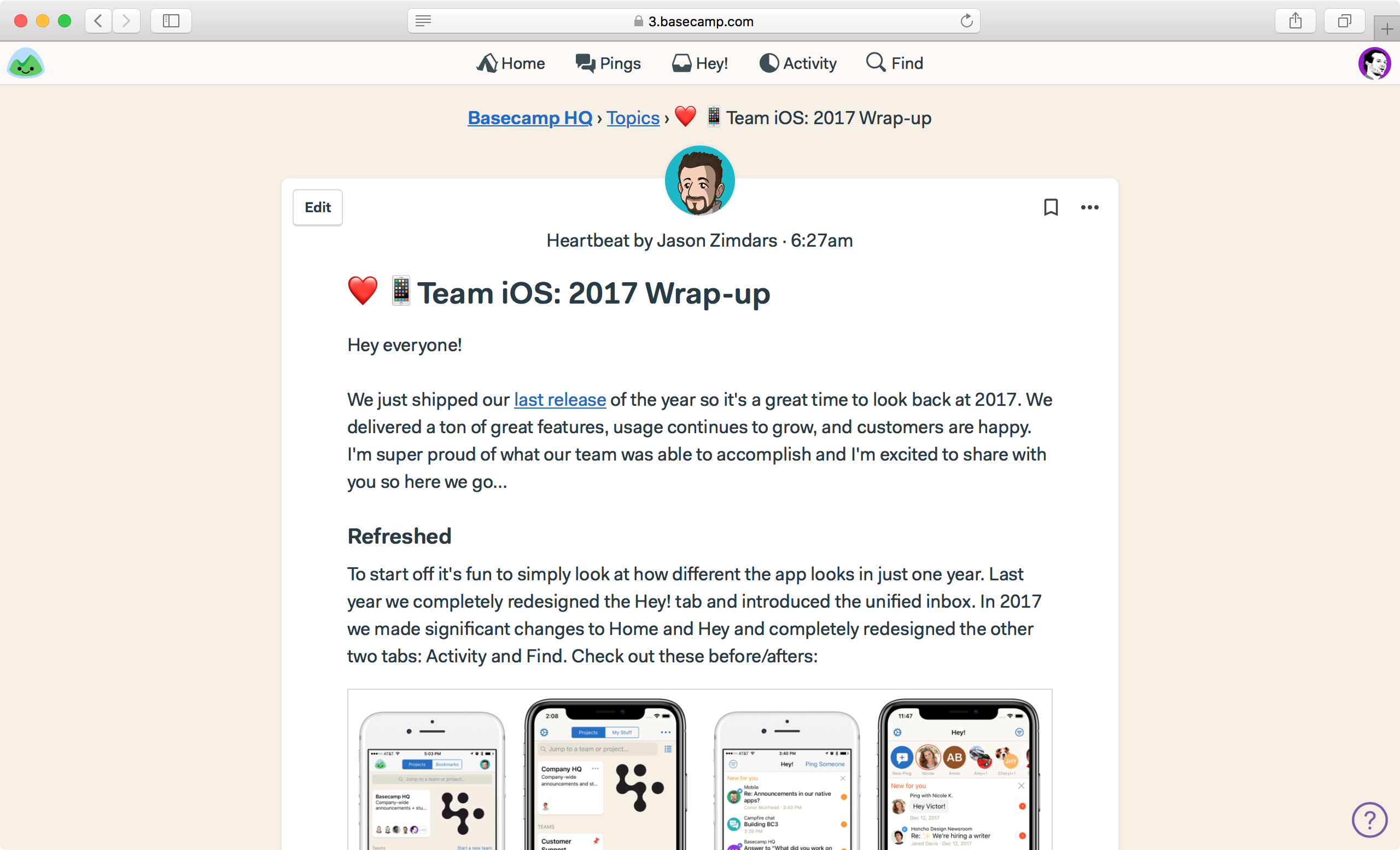
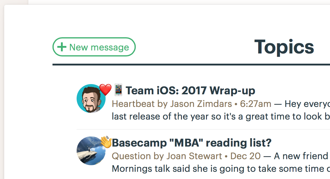
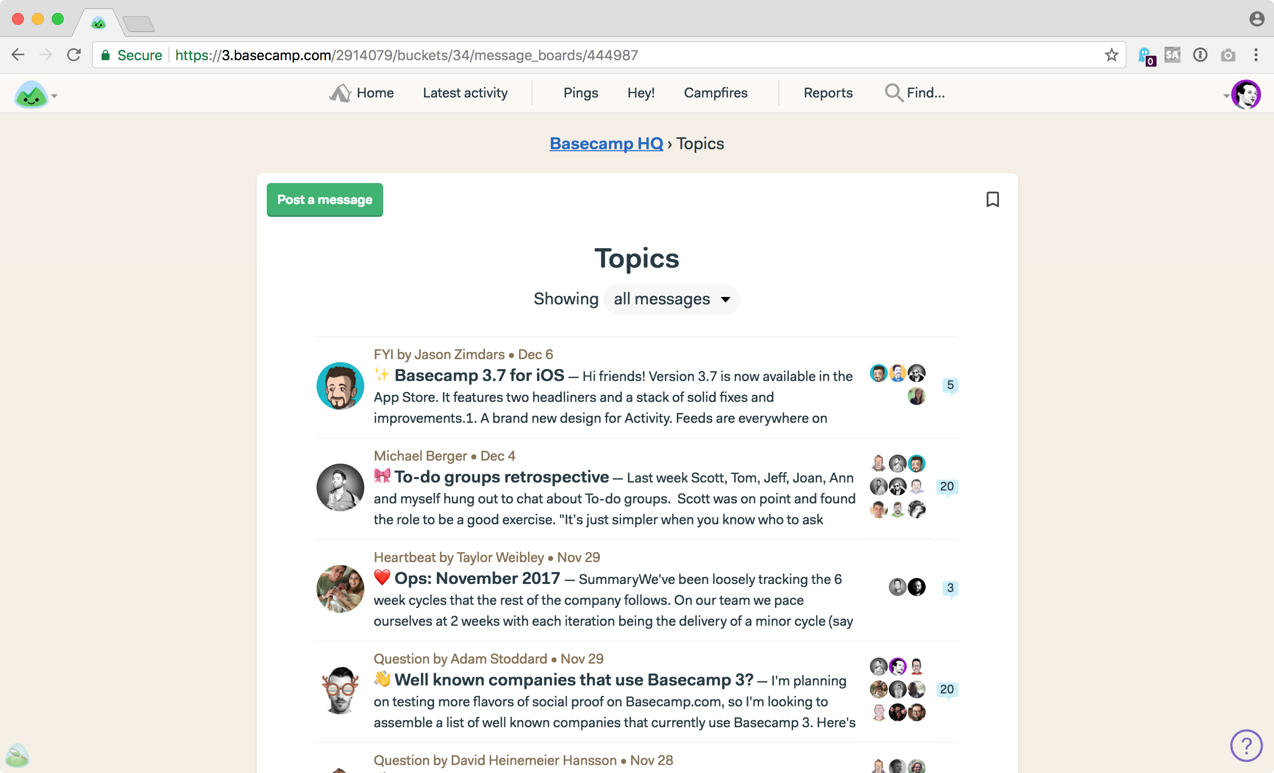
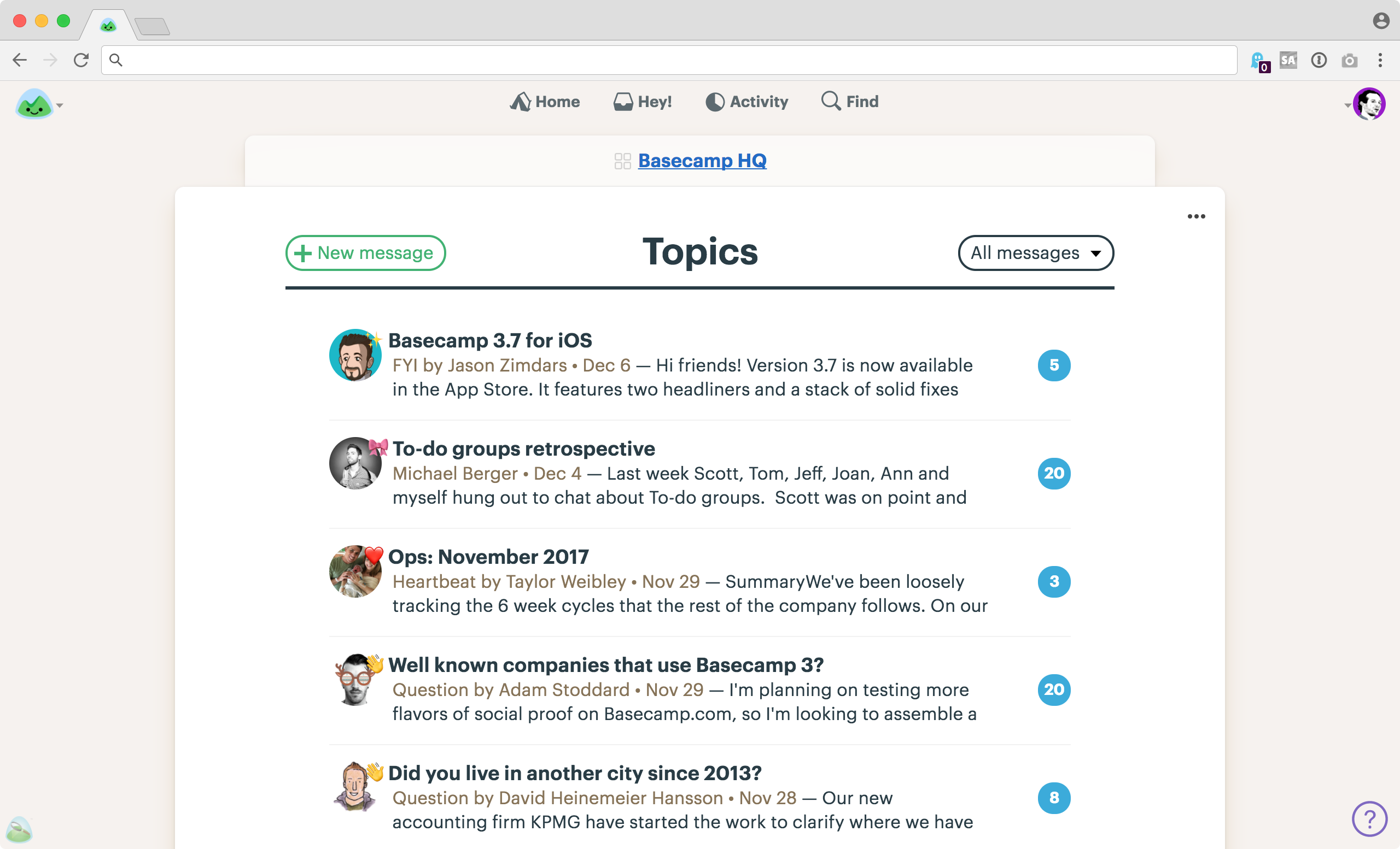
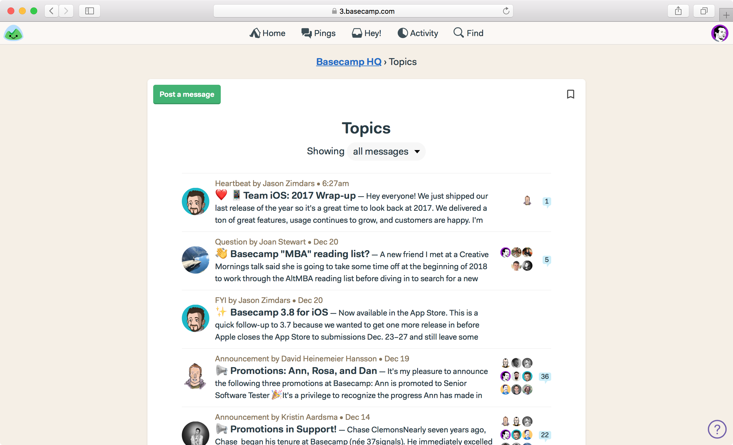
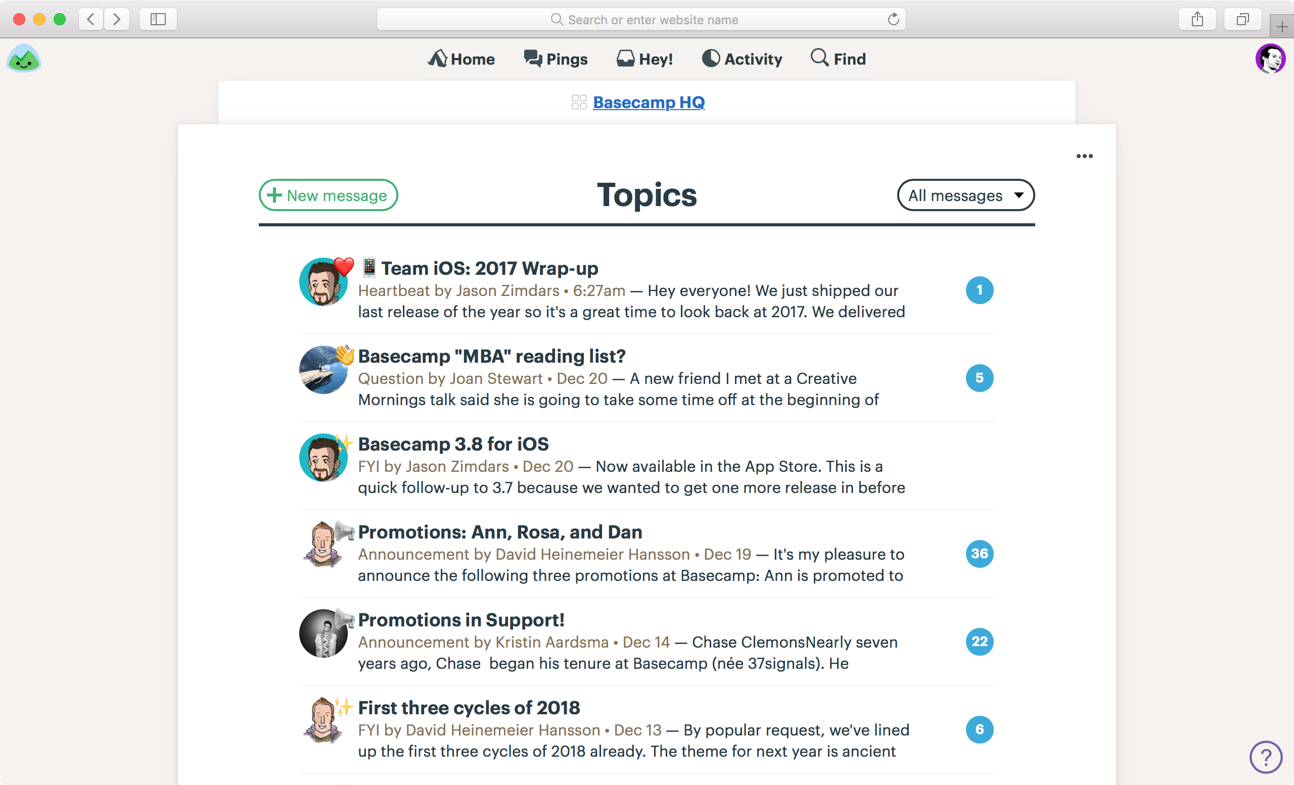
First let’s look at the screen that shows all the posts on the message board inside a specific project or team. The new design is wider, bolder, and more confident. Fewer floating objects, stronger left margin so text all starts from the same place, stronger callout of comment count in big blue circles, less dead space at the top of the screen, more messages visible without scrolling, etc. Before on the left, after on the right.


← BEFORE | AFTER →

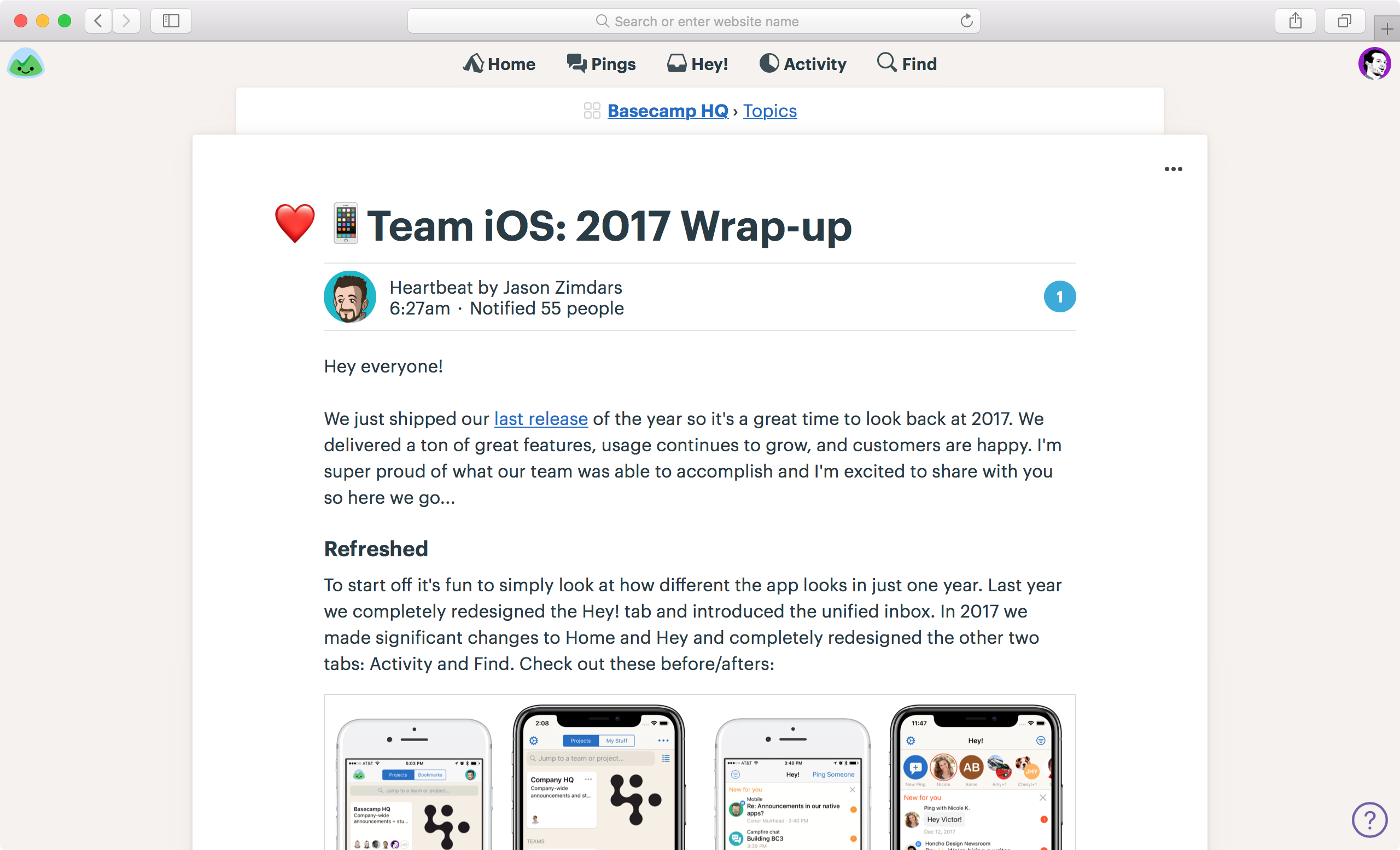
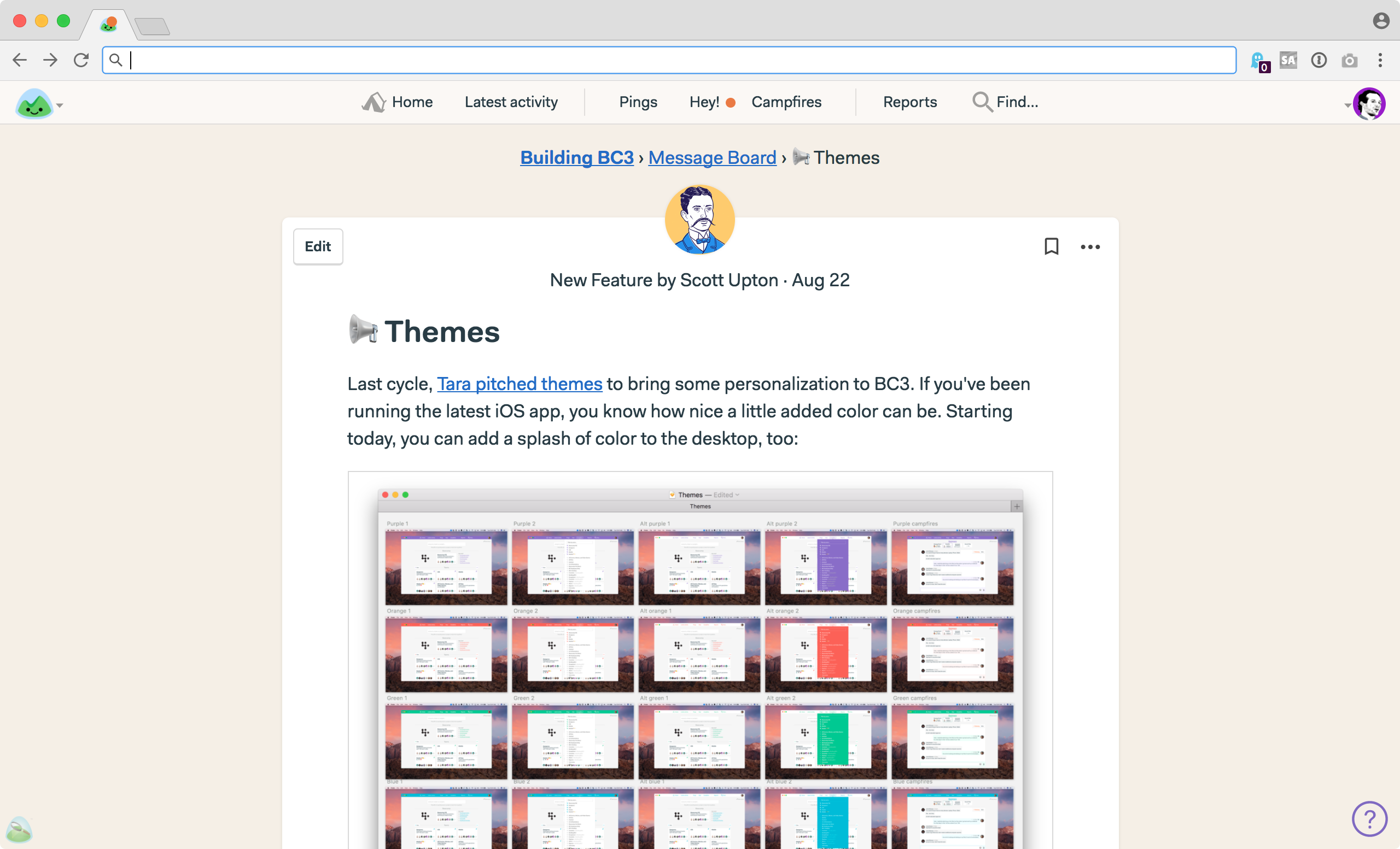
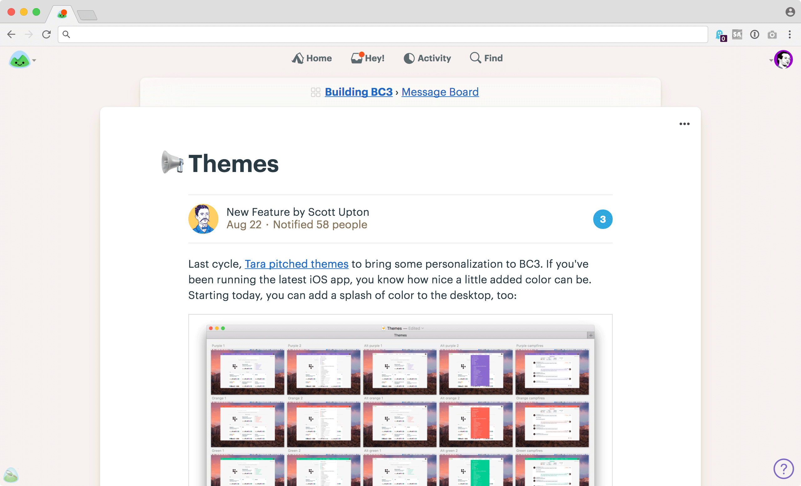
And now let’s compare what an actual message board post looks like. Here you’ll see a tighter layout, fewer intersecting and overlapping shapes, stronger masthead, better type, reorganized metadata, and overall better use of space. It just feels a whole lot more confidence inspiring, which is important when making company-wide announcements using the message board.


← BEFORE | AFTER →

Automatic Check-ins

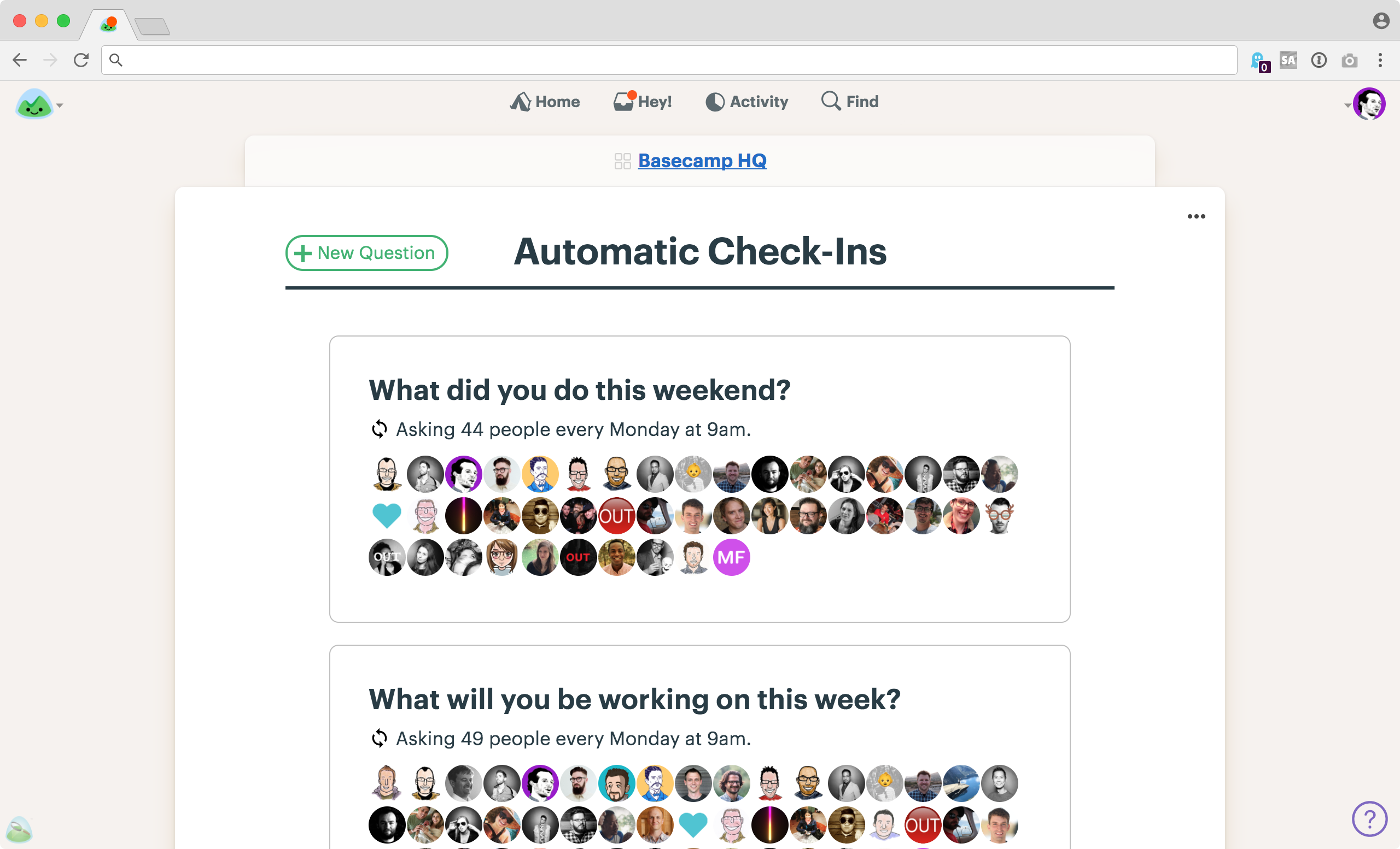
Automatic Check-ins are of the most popular features in Basecamp 3, and they’re getting a well-deserved overhaul.

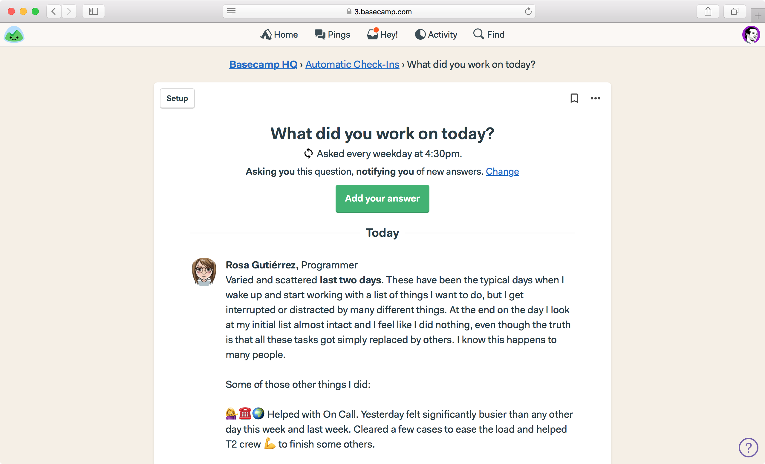
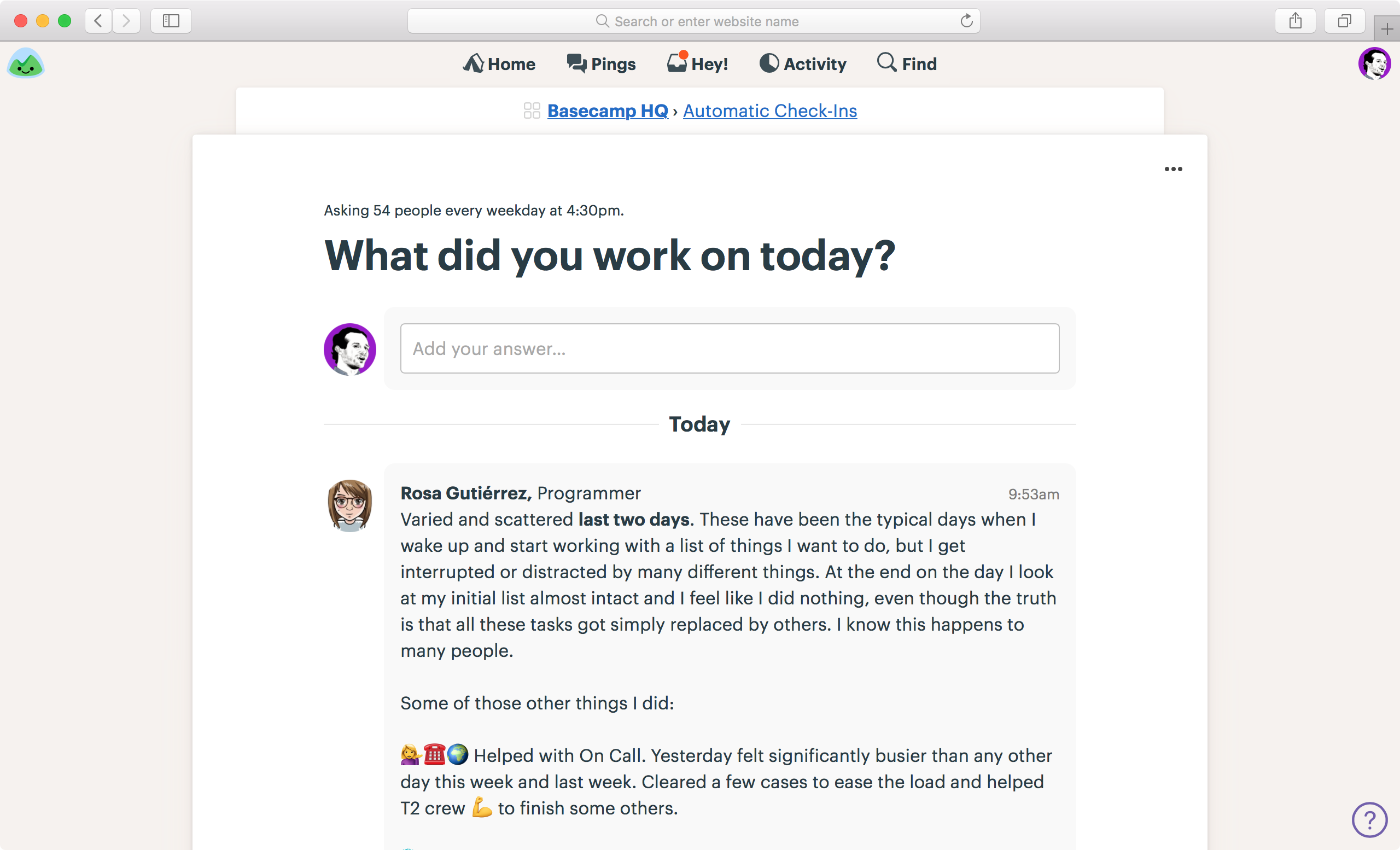
Let’s look at the check-in page itself. Here’s an example from “What did you work on yesterday?”. The previous design is on the left, the new design is on the right. We’ve cleaned up the top quite a bit, and replaced an “Add your answer” button with a field you can just type directly into. We’ve tucked some infrequently used subscription options into the ••• menu, vs. having them messily exposed. And you’ll also see a hint of the new answers/comment design — individual comments are now encased in a light grey shape to hold them together and separate them from everything else on the screen.


← BEFORE | AFTER →

Schedules

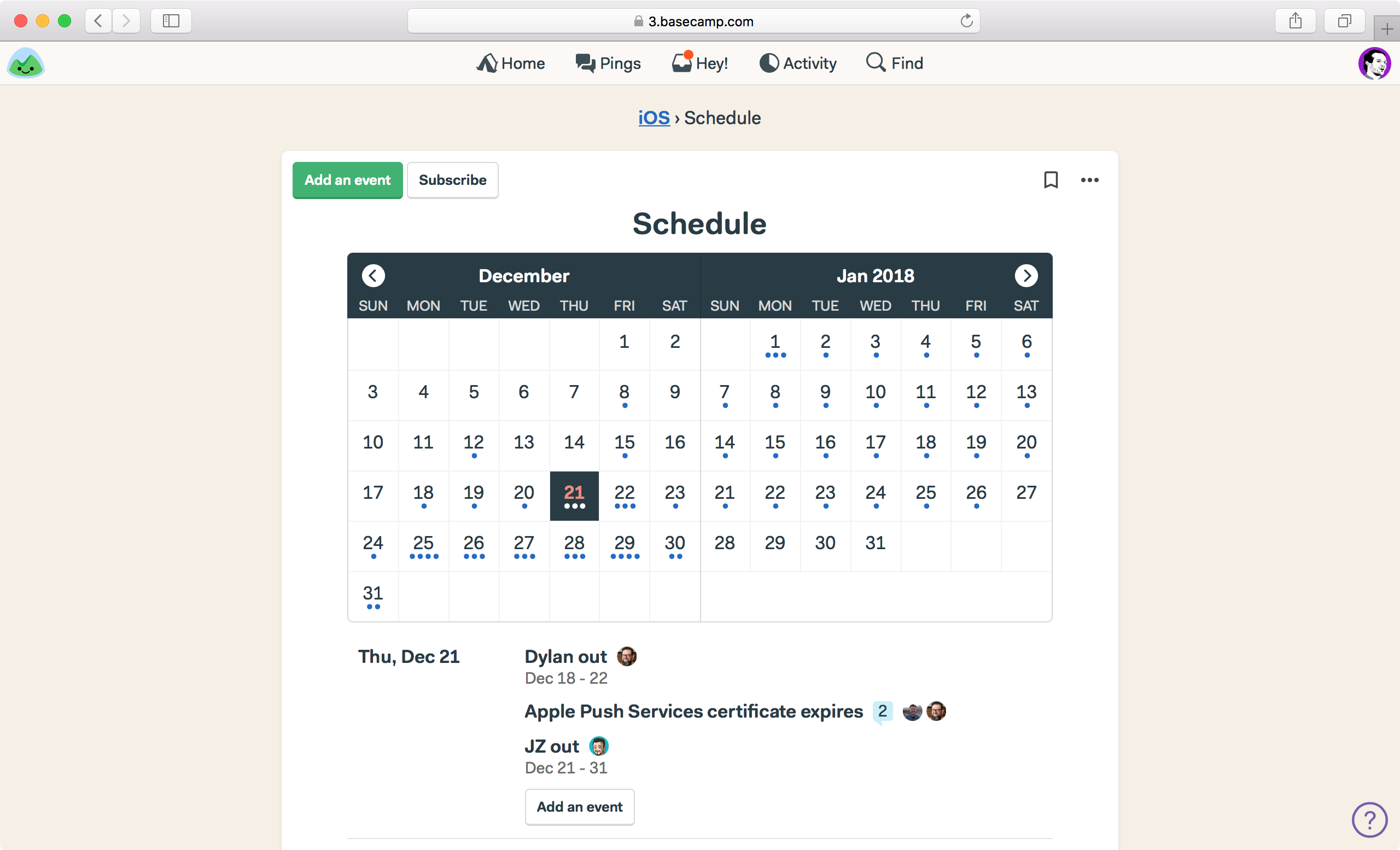
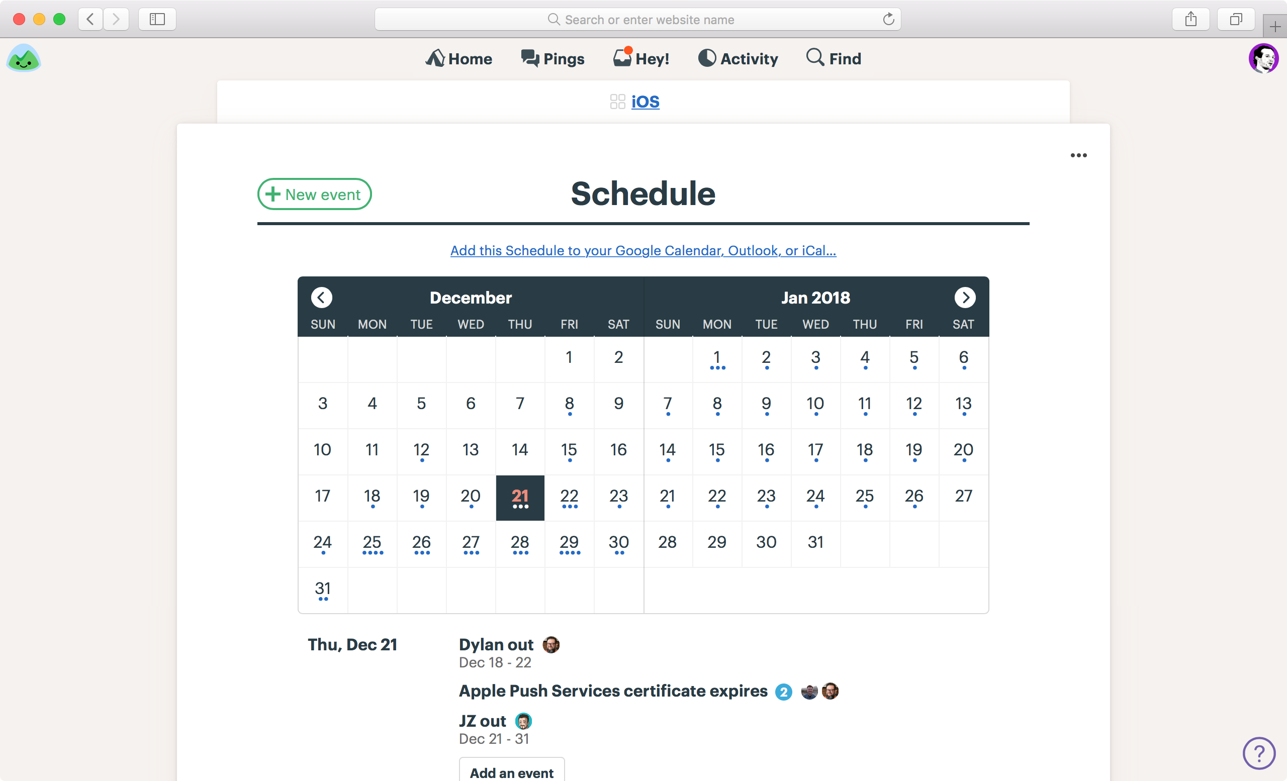
We’ve tweaked the schedules design as well. While it inherits the new header design you’ve seen elsewhere, we’ve replaced an ambiguous “Subscribe” button with a clearer, front-and-center “Add this schedule to your Google Calendar, Outlook, or iCal…” link. Further, we’ve tightened up the header, and given things a bit more room to breathe, so the screen just feels more solid, less floaty. Before’s on the left, after’s on the right.


← BEFORE | AFTER →

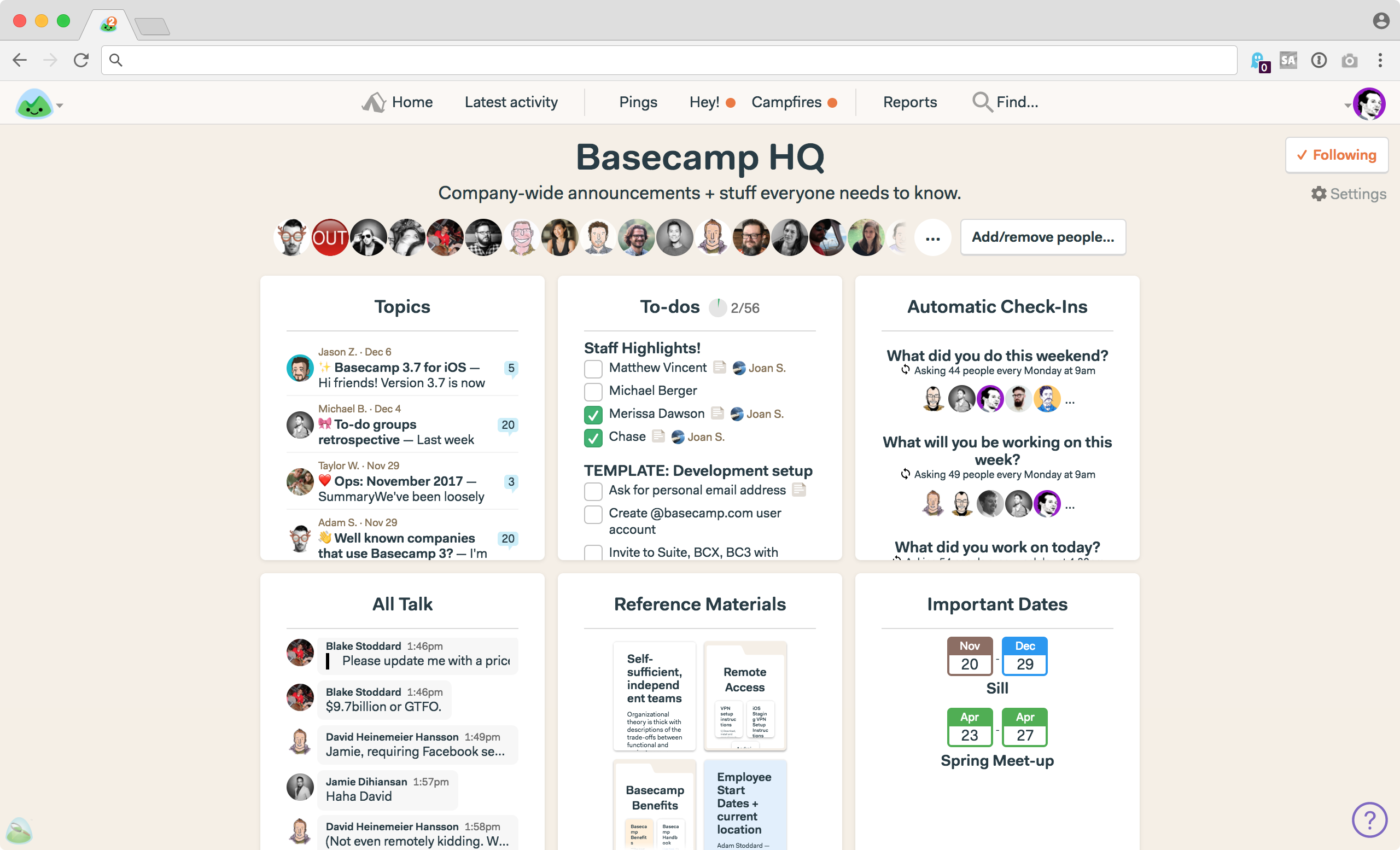
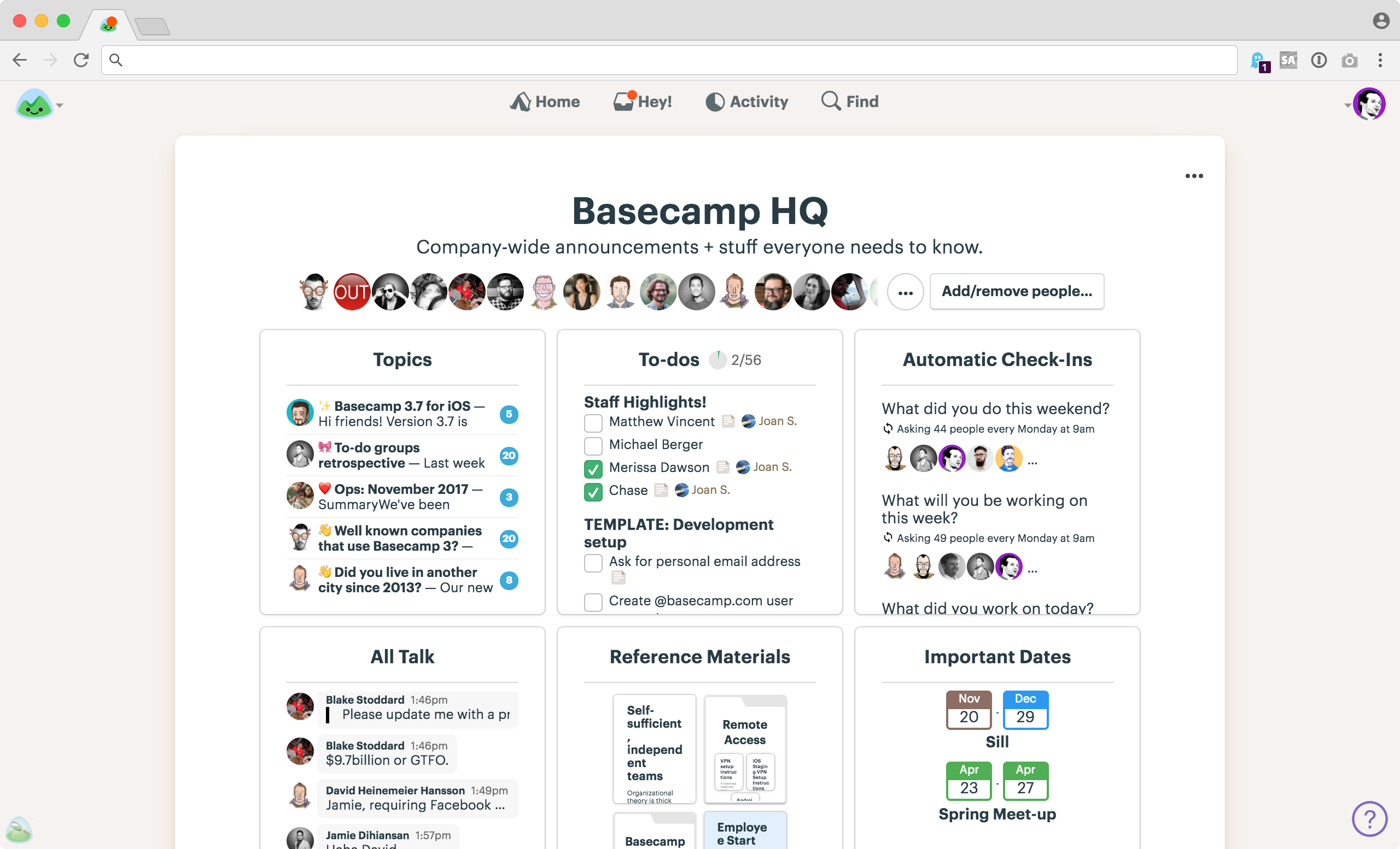
Project/Team home screens

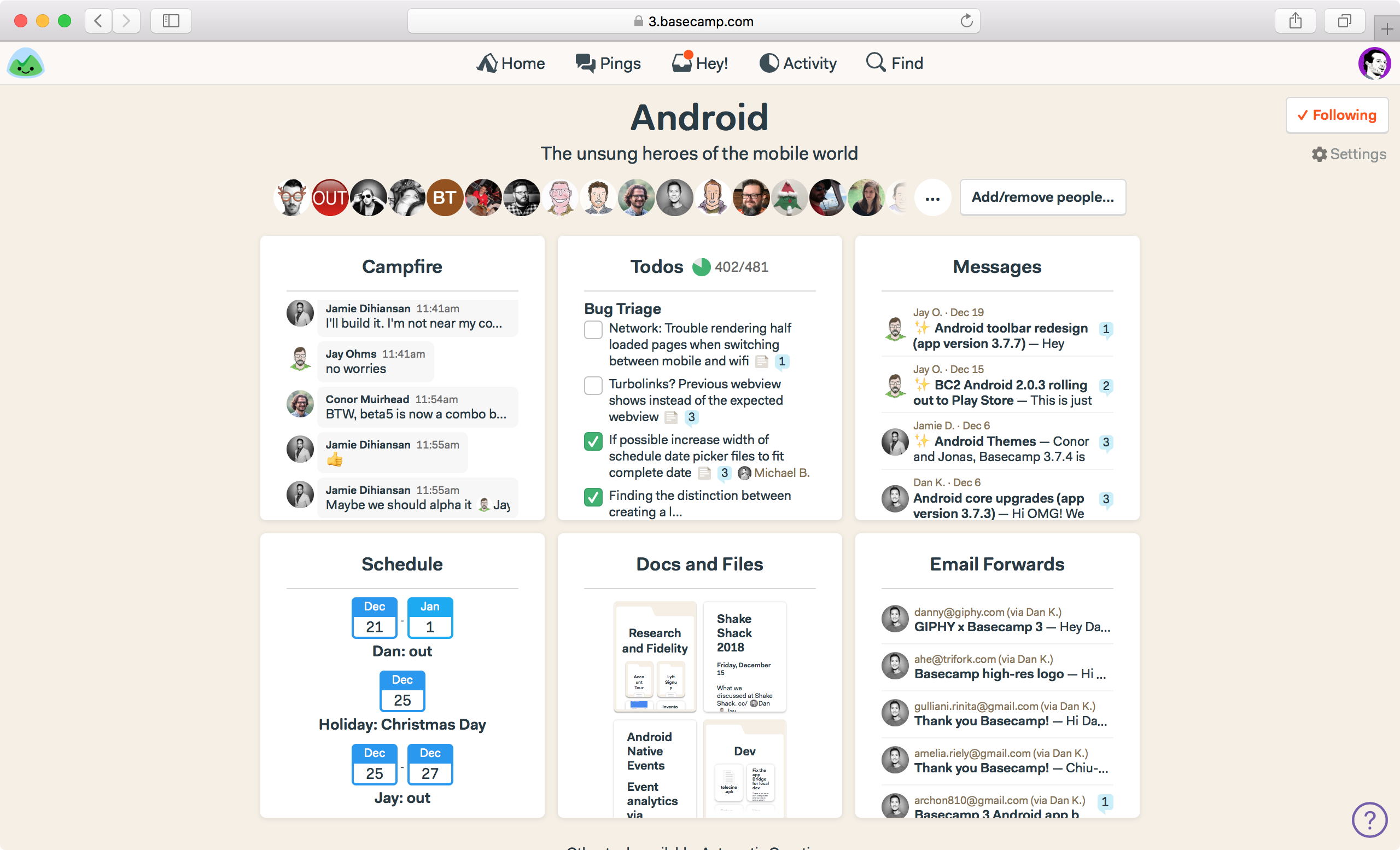
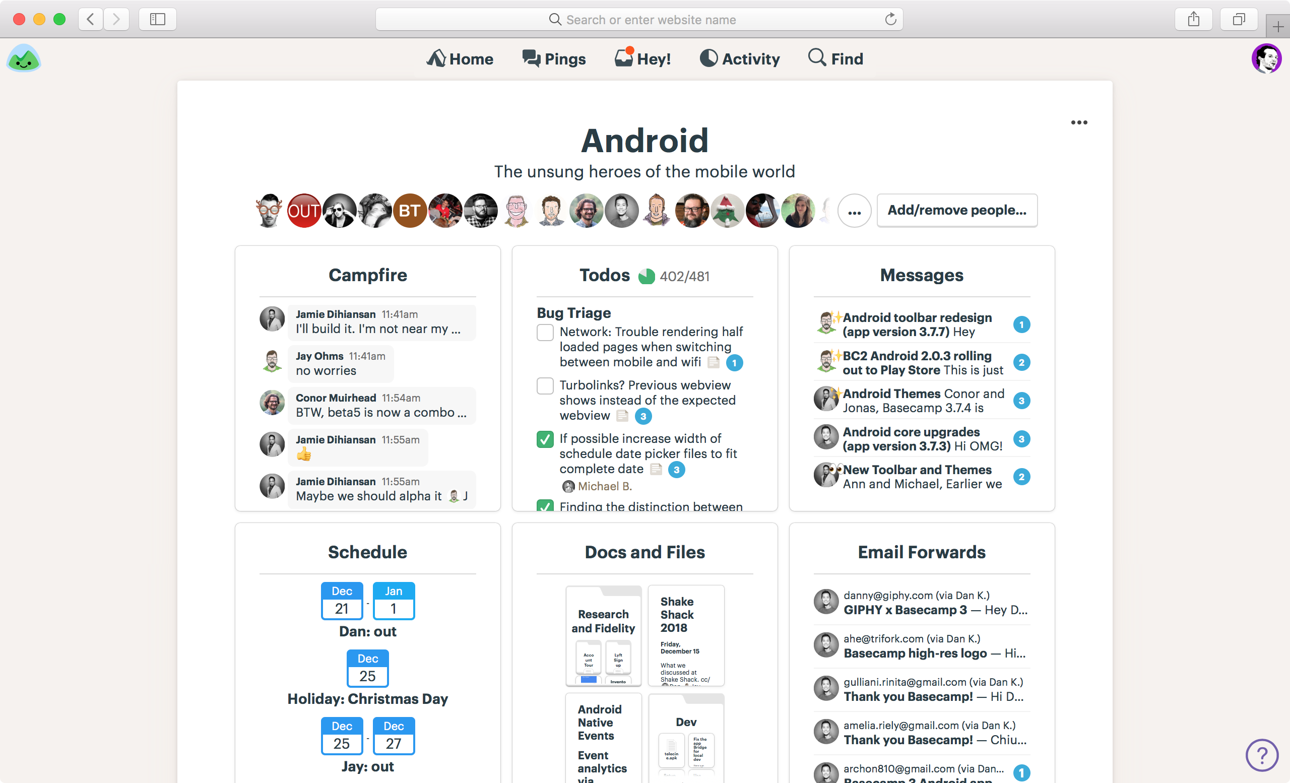
We’ve put everything on a white sheet, vs directly on the background. It helps eliminate awkward negative gaps, shapes, and alignment, and it just tidies things up considerably. The page feels more sure of itself, and better organized overall.


← BEFORE | AFTER →

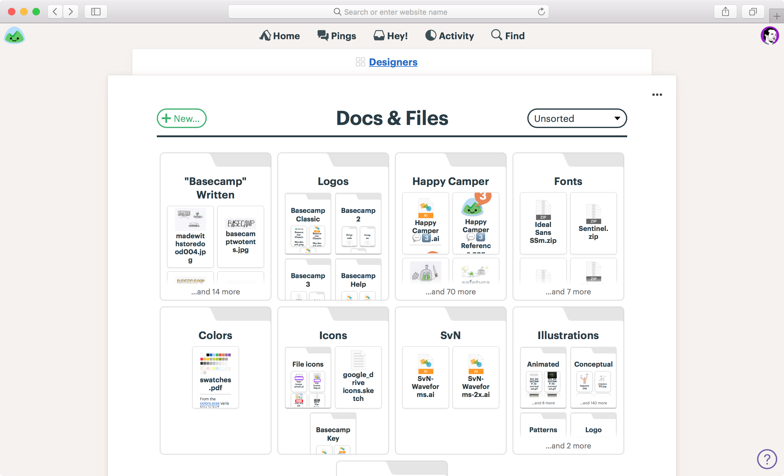
Docs & Files

Docs & Files also get a white sheet, a new masthead, a general clean up, and the new look:

Organized w/ folders

Navigation and background

You’ll see in the screenshots above, that we’ve lightened up the background. Less beige, less yellow. It’s paler, but still a trademark warm tone. We want Basecamp to feel comfortable and cozy, not cold and clinical like so much software out there.

We’ve also placed the navigation straight on the background, vs. in a strip. This cleans things up and emphases the content below rather than the navigation above. Further, we’ve added a “backsheet” behind the breadcrumb which further emphasizes hierarchy and adds some structure.

Before:


After:


“New” buttons are also all in the same place now. The current design has them centered and big in some places, while small and top left in other places. Now they’re always top left on the same line as the headline like this:


Overarching themes

While this remains a work in progress, and the final product may look a bit different from the previews you see here, the gist will be the same. We aimed to make the interface and user experience more consistent and predictable, the text more readable, and the hierarchy clearer and more intuitive. Further we tweaked the typeface, sizing, spacing, and proportions to make everything feel more comfortable, and removed a bunch of fussiness from the design. Overall, we feel great about where we’re headed here, and we’re eager to share the final version with everyone soon.

Thanks for following along, and thanks for all the feedback along the way. We’ve built plenty of it into the redesign.

All the best,

— The team at Basecamp

The presence prison

Are you chained to the green dot? Turn it off and break free.

As a general rule, nobody at Basecamp really knows where anyone else is at any given moment. Are they working? Dunno. Are they taking a break? Dunno. Are they at lunch? Dunno. Are they picking up their kid from school? Dunno. Don’t care.

The vast majority of the time, it just doesn’t matter. What matters is letting people design their own schedule around when they can do their best work.

Keep reading “The presence prison”

The Pings menu is back!

A couple days ago we launched Phase I of a Basecamp 3 refresh/redesign. One of the more significant changes was a redesigned nav bar at the top that consolidated the Pings, Hey, and Campfire menus into a single, unified Hey! inbox menu.

Sometimes when you push for a big change, you overstep. We overstepped, plain and simple. Our customers let us know loud and clear that Pings are a separate category of notification that continues to deserve its own special place in the nav bar. They’re right — when someone’s trying to get ahold of you directly, it’s important to elevate that above notifications that inform a whole group.

We’re sorry we let some of you down.

So today we’re bringing back the Pings menu as its own menu (Campfires are still consolidated into the new Hey menu). Over time we’ll continue to explore ways to improve notifications, but as of now, Pings live alone! We also may revisit Pings vs. Direct/Private Messages language, but that’s for another day. For now, Pings it is!

A nice silver lining is that we were able to improve the new Pings menu to include previews of the last line someone sent you. So hopefully this makes up a little for our snafu 😀.

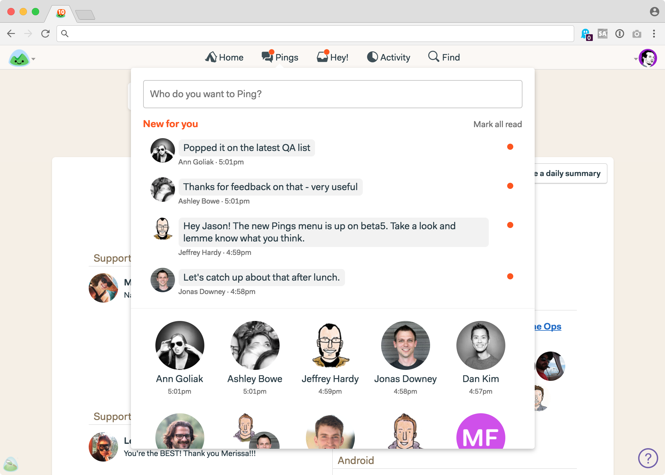
Here’s a screenshot of the new Pings menu in action:

New unread pings show up at the top, now with previews. Quickly ping someone new by typing their name in the box at the top, or select from someone you’ve recently pinged with at the bottom.

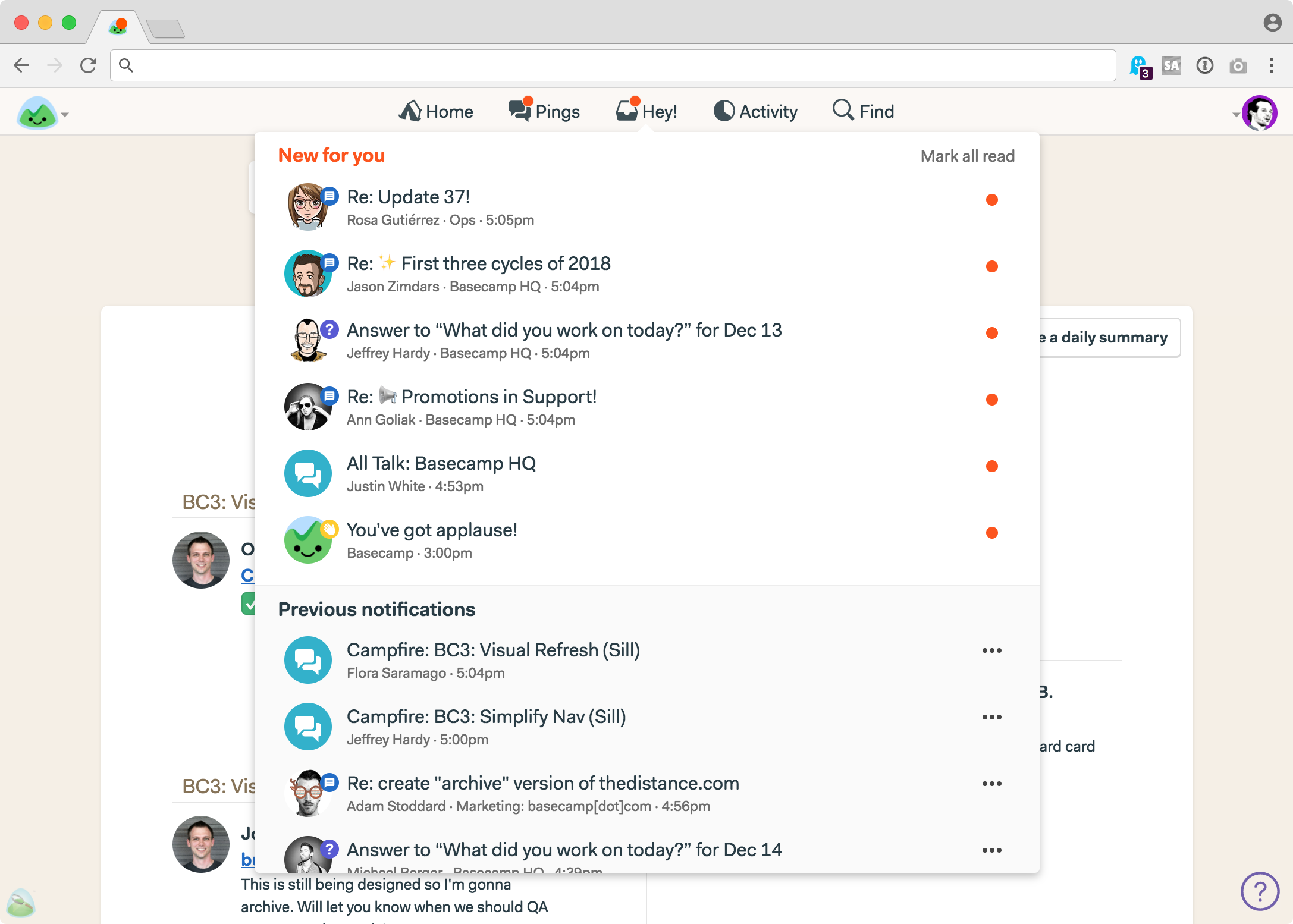
And the new Hey! menu is the same as before, just without Pings:

Removing Pings from the Hey! menu simplified this menu a bit as well. It’s faster, and clearer.

Thanks again to everyone who shared their thoughts, and for being patient and understanding while we re-evaluated our decision. Product development is a constant struggle between too much, just right, and not enough. Sometimes you get end up on the wrong side of right. While we can’t always guarantee everyone will like our decisions — it’s impossible to please millions all the time — we vow to continue to do our best to benefit our customer base as a whole. ❤️

[Basecamp 3 Redesign] Phase 1: New Nav and a unified Hey! Inbox.

Over the next few months we’ll be rolling out a visual refresh to make Basecamp 3 even easier to use — and more approachable for new users. Today we launch the first set of updates.

Most products get more complicated as they go. More stuff, more screens, more options, more ways to do things. It’s natural — evolution tends to create more complex creatures over time. Software development is no different.

That’s why it’s on us to push back on complexity and clutter as we go. If we’re smart about it, we can add power and clarity over time, while making everything feel simpler than before. With that in mind, we’re ready to share what we’ve been working on for you.

Phase 1 goes lives today

First things first. This initial refresh is centered around simplifying the global navigation at the top of the screen.

We’re going from this:

(that’s a lot of stuff which can be especially intimidating for new users)

To this:

(simpler and more approachable, ain’t it?)

Simple on the surface, but there are a variety of deep changes behind the scenes. Let’s look at them…

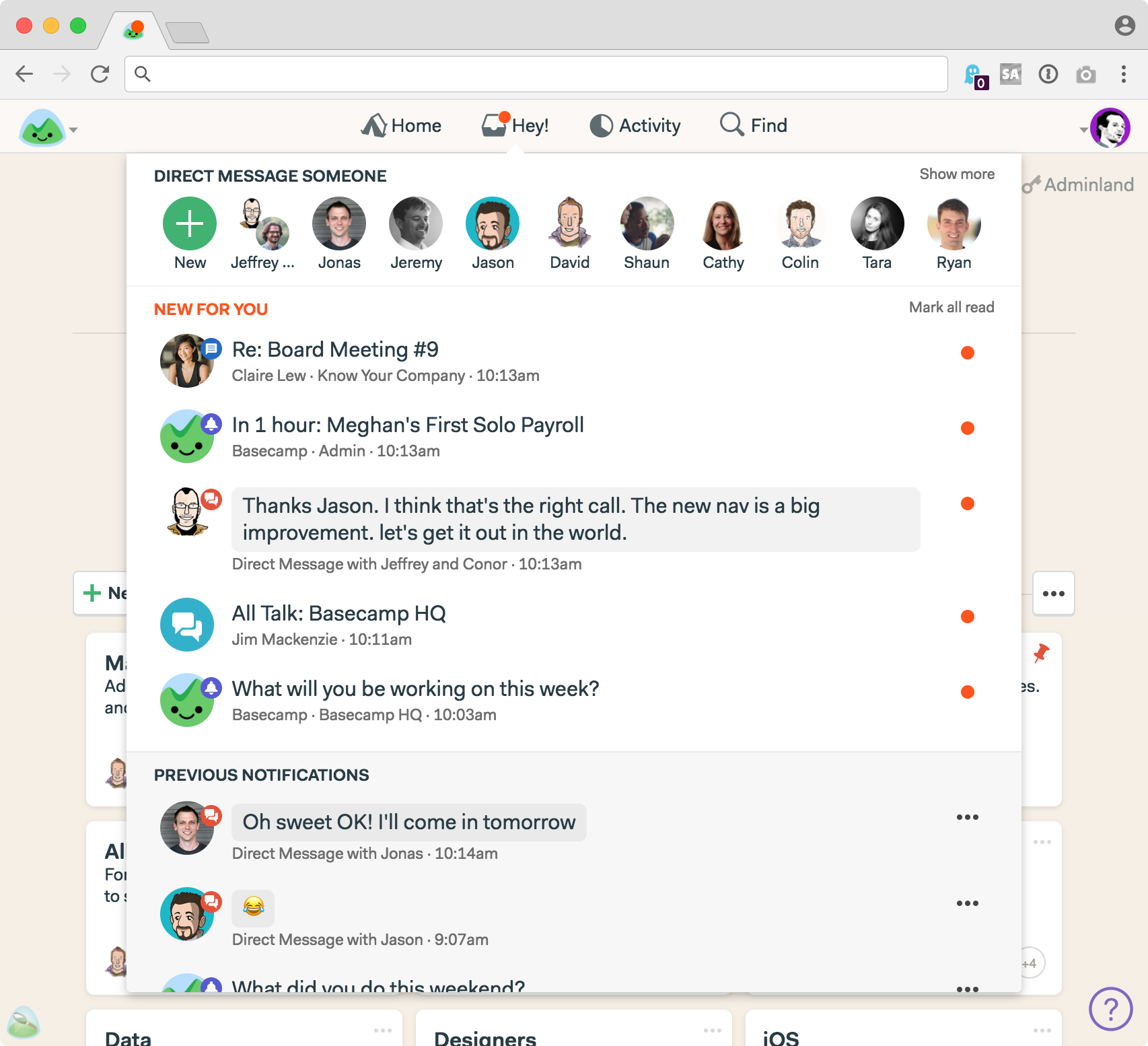
NEW: A single, unified inbox called Hey!

Previously, Basecamp 3 had three separate inboxes: Pings for direct messages, Hey! for posts, comments, to-do assignments, automatic check-ins, @mentions, and Campfires for group chat rooms. It made technical sense as these are all different things that run at different speeds, but we don’t think the mental overhead of three inboxes was worth the trouble. Don’t we have enough inboxes in our lives already?

So we’re switching to a single unified inbox. Everything goes in the Hey! menu. Now if there’s something for you to see, there’s only one place to look. And it’s been totally redesigned.

It’s all right here!

At the top you’ll see a row of faces and a plus button. Want to send someone a private, direct message? Just click their picture, or hit the plus button and type their name if you don’t see them listed. We used to call these Pings, but we’ve renamed them Direct Messages. Same feature, more familiar name.

Below Direct Messages, you’ll see a NEW FOR YOU block. All your notifications flow into here. Direct Messages, new comments, new posts, threads, Campfire chats, @mentions, new to-do assignments, etc. If you need to know about it, it’ll line up right here. Direct Messages now have previews as well, so it’s easier to see what someone wants to tell you without having to click into it. And Campfires now show who posted the last chat.

Last, you’ll see all PREVIOUS NOTIFICATIONS. Once you read something in NEW FOR YOU, it drops down to PREVIOUS NOTIFICATIONS for safe keeping and easy access. Plus there’s a link at the bottom to see all previous notifications — a screen we warmly call the Heystack.

UPDATE 14 December: Based on customer feedback, we’ve changed our mind and brought back the Pings menu. Here’s the story behind that decision.


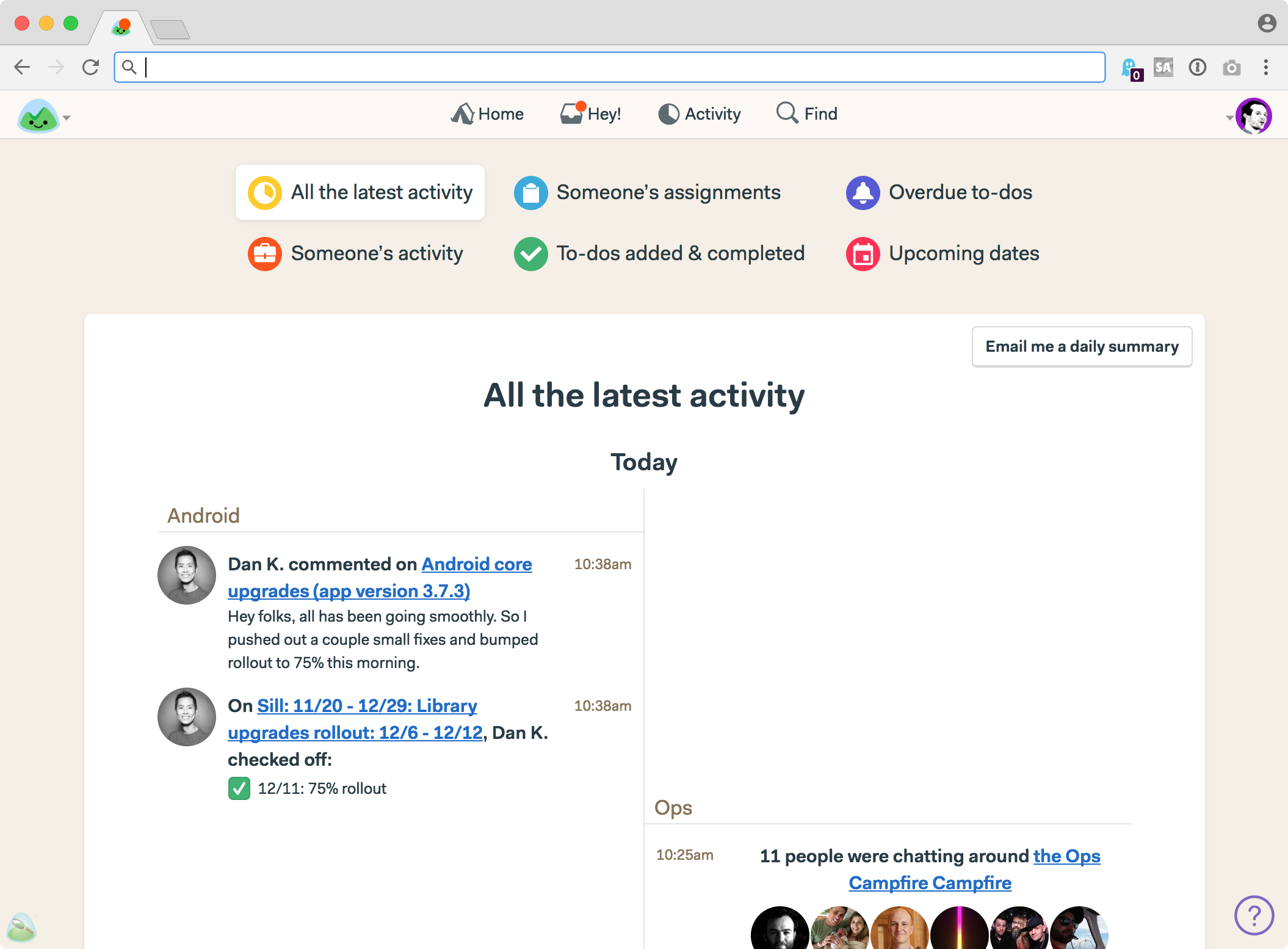
NEW: Reports roll into Activity

As part of the navigation cleanup, we’ve eliminated the Reports menu and consolidated Reports and Activity into a single screen. Now when you click on Activity, you’ll see this:


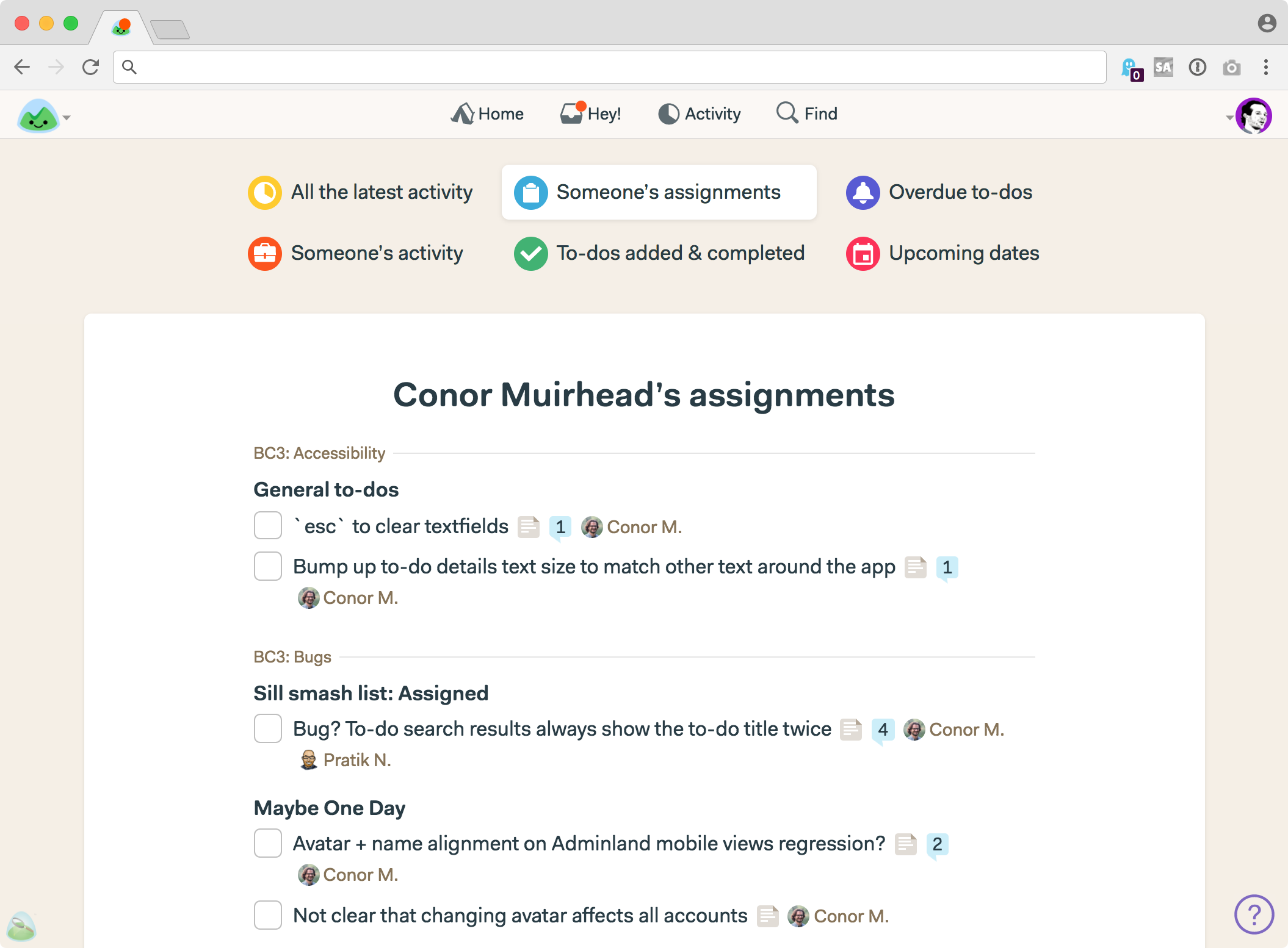
Reports that used to be in a separate menu are now front and center at the top of the Activity screen. Just click a button to switch to a different report. For example, here’s what’s on Conor’s plate:


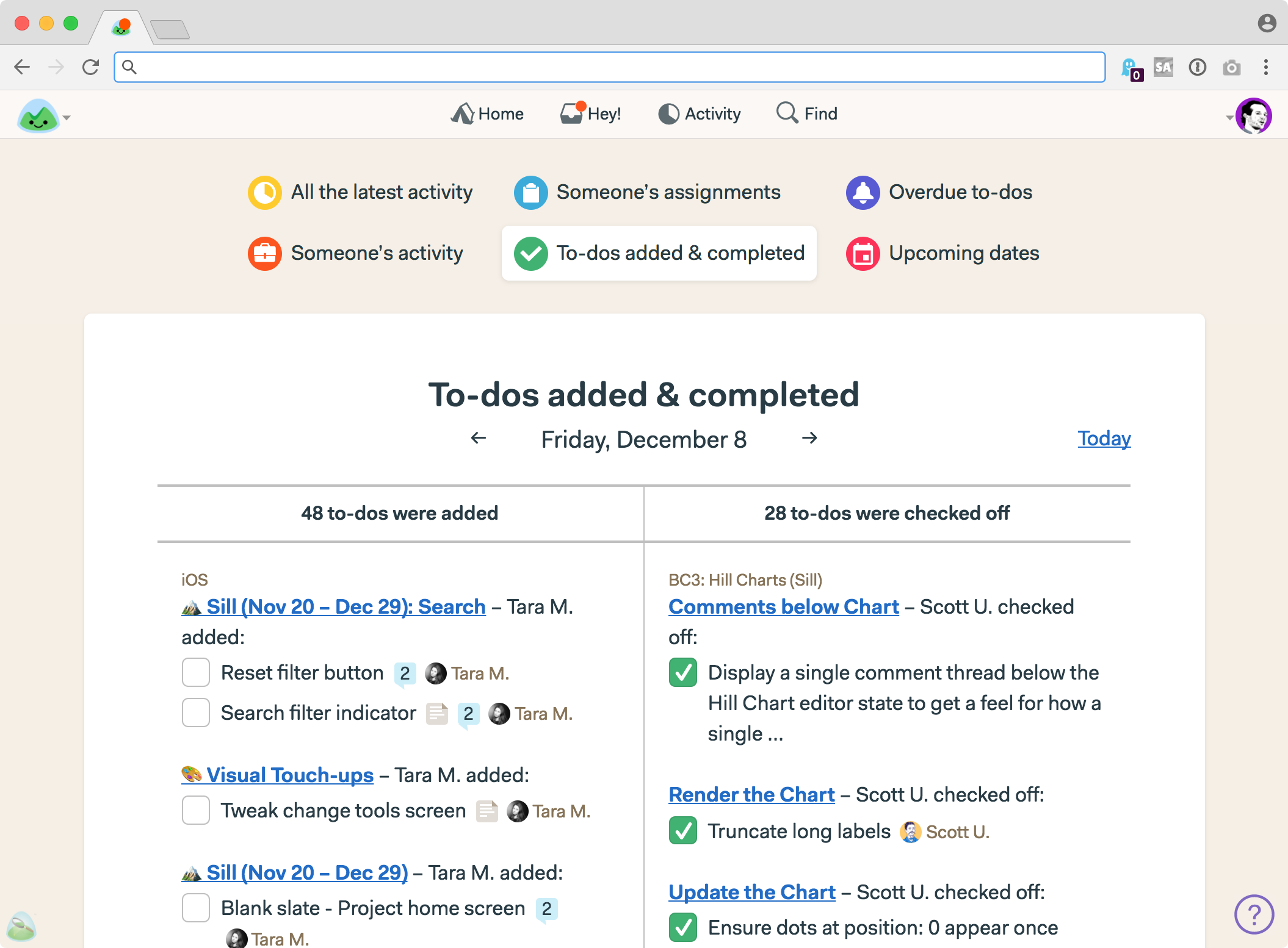
And here are all the to-dos added and completed across our account on Friday December 8th:


Simpler, clearer, and fewer places to go to get at the information you want. We’ve also improved how you select a person for a report. You’ll see that when you select “Someone’s activity” or “Someone’s assignments.”


Revamping the global navigation by consolidating and simplifying means there are fewer places you need to go to stay on top of it all. Concentrating power in a few key places, rather than spreading it out, puts more of what Basecamp can do for you front and center. And it makes it a whole heck of a lot easier for new users to learn. We’re excited for you to get your hands on it.


Preview of Phase 2

With Phase 1 now live, let’s turn our attention to a preview of what’s coming shortly in Phase 2.

Phase 2 is a broad overhaul of key screens, while still keeping things familiar enough so people aren’t disoriented. We know our customers are in the middle of important projects, so change comes carefully.

This phase of the refresh hits things like project home pages, message boards, to-do lists, automatic check-ins, etc. Plus some more tweaks to navigation. All new typography, better use of space, fewer elements on each screen to help you focus on what really matters, consistent placement of key buttons, better proportions, a toned back background, etc. Big stuff that touches nearly every screen.

Keep in mind this is work in progress, and still subject to change, but here are some highlights:


← Message Board BEFORE | Message Board AFTER →


← Message Post BEFORE | Message Post AFTER →

The new design applied to the Automatic Check-Ins index


← Project Home BEFORE | Project Home AFTER →

So there you have it! An all new navigation and Hey! inbox is available today on the web and desktop. And a few weeks from now we’ll push Phase 2 live. We think you’re going to love the overall simplification moving into 2018.

Wishing everyone the best!

And, BTW, if you haven’t tried Basecamp 3 yet, now’s the time. Since switching to Basecamp 3, 89% of customers reported having a better handle on their business, 84% report more self-sufficient teams, and early 60% have fewer weekly meetings! Want to be there too? Sign up to try Basecamp 3 for free, today.

Which version of later do you run?

One of the reasons we work in six week cycles, is that it gives us a different definition of later.

When you work on really long projects — say 3, 6, 9 month projects — or projects that don’t have any end in sight, “we can do that later” typically means you’ll get to it eventually, as part of the current project. Long time frames give you invisible space to pack away unrealistic amounts of work. Since later is so far away, there’s no harm in kicking the can down the line. In other words, later makes a pile at the end.

Gnarly problem you can’t figure out how to solve yet? Punt it into the later pile. Design not coming together quite right? Toss it in the later pile. Taking on lots of technical debt as you go? Push it into the later pile.

But then as you near the end, you run into this big pile of stuff you said you’d eventually deal with, fix, redesign, tighten up, etc. But there rarely seems to be enough time at the end, so you either end up guiltily ignoring it entirely, or hastily patching it together with duct tape. And when you hastily patch, you often end up creating another fix-it-up project later.

But, when you work in six week cycles, or relatively short time frames, later means something else entirely. There’s no time for later. It’s now or not. Later doesn’t mean we’ll get to it at the end of this cycle. It means we’ll drop it. Later means another time, not this time. Later isn’t a obligation, it’s a maybe. Later isn’t a cage, it’s freedom. It’s not a debt to pay off, it’s an asset. There’s no pile, there’s no guilt, there’s no feeling of late nights and crunch time ahead. Later simply means not now, not soon, and not for sure.

That’s the kind of later we like.

Getting to the truth

If you want to feel good, brainstorm it. If you want to appear good, test it. If you want to know if you’re any good, ship it.

The best visual description of a company I’ve ever seen

Can you describe your company this concisely?

Back in 2010, I saw Andrew Mason give a talk at Startup School that included a slide that really blew my mind. The slide wasn’t about Groupon (Andrew’s company), it was about Meetup.com.

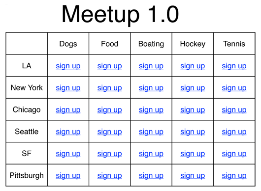
Andrew heard Scott Heiferman (CEO of Meetup.com) describe the initial version of Meetup.com as a matrix of cities and interests. He put it in spreadsheet format and here’s how it came out:


It doesn’t matter how many rows or columns — it works at all scales. It’s such a simple representation of what is ultimately a simple idea (meeting up with people in your city who share a similar interest), but it could just as easily been diagrammed in a complex way.

I’ve come back to this slide over and over for inspiration when thinking about new concepts or product ideas. It’s a great exercise in clarity. Can I boil down the idea into something as simple as a column and a row?


Today, Meetup was acquired by WeWork.

New in Basecamp 3: To-do Groups

A little thing that’s a big deal.

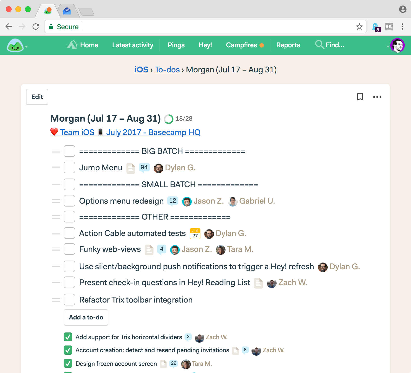
For years, we’ve been making to-do lists in Basecamp that looked like this:


See those === DIVIDERS ===? We were trying to group related to-dos together within a list. All we wanted was to bring a little structure, and an extra ounce of organization, to a single flat list.

We weren’t alone. Whenever a customer showed us how they use Basecamp, we’d inevitably run into a similar === DIVIDER === pattern. They were trying to do what we were trying to do.

We were all hacking it. As of today, the silliness is over. No hacks required!

We just launched To-do Groups in Basecamp 3!


What’s a group?

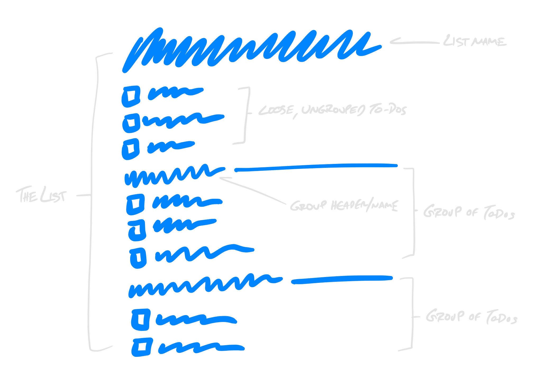
A group is like a sublist on a list. It’s organization, it’s structure, it’s an envelope, it’s a box. It has a header, and to-dos grouped below.

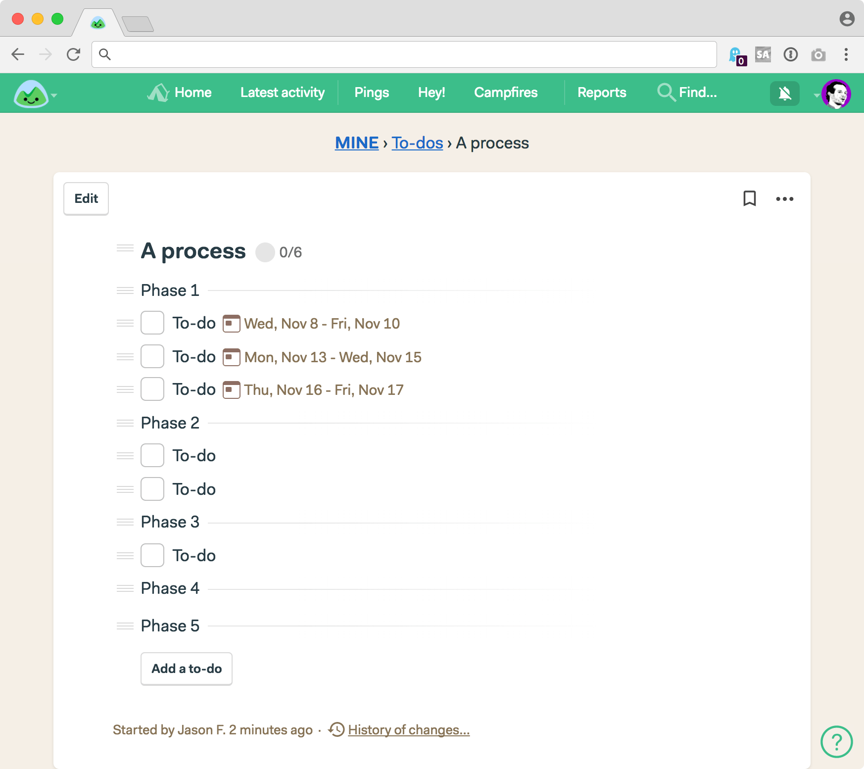
The anatomy of a Basecamp 3 to-do list with two groups

When you drag a group header, all the to-dos under that header move with it. If you click the header, you go to a separate page with just those to-dos on it. You can discuss a group, you can archive a group, you can see all the to-dos completed in a specific group, you can ungroup a group. You can make as many groups on a list as you’d like (but you can’t make a group inside a group — that would lead to an eventual, over-organized mess).

How to make a group

There are two ways to make a group of to-dos on a list.

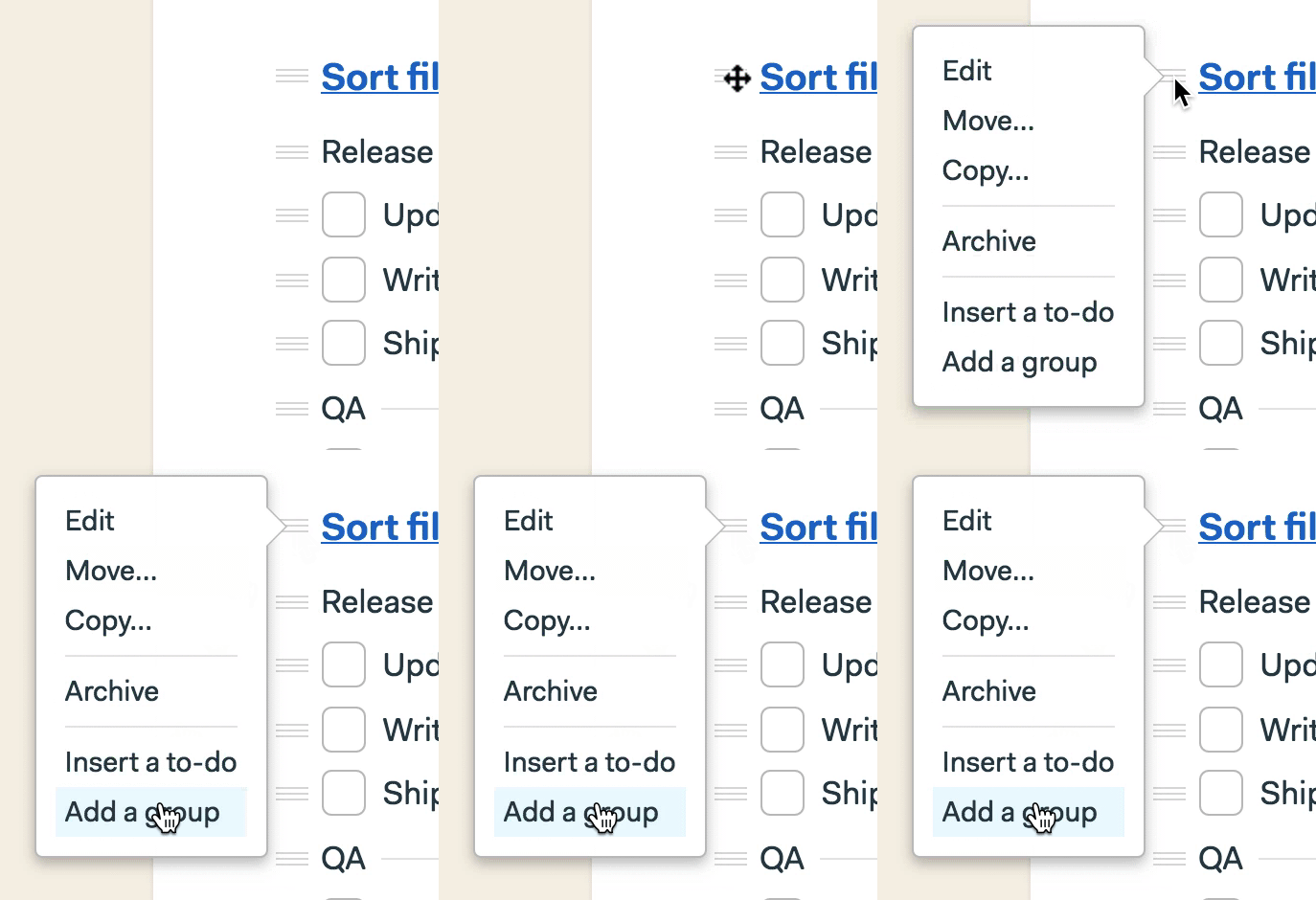
  1. To make an empty group (which you can fill later), click the hamburger menu to the left of the list name. Select “Add a group”

Make a group from the list header

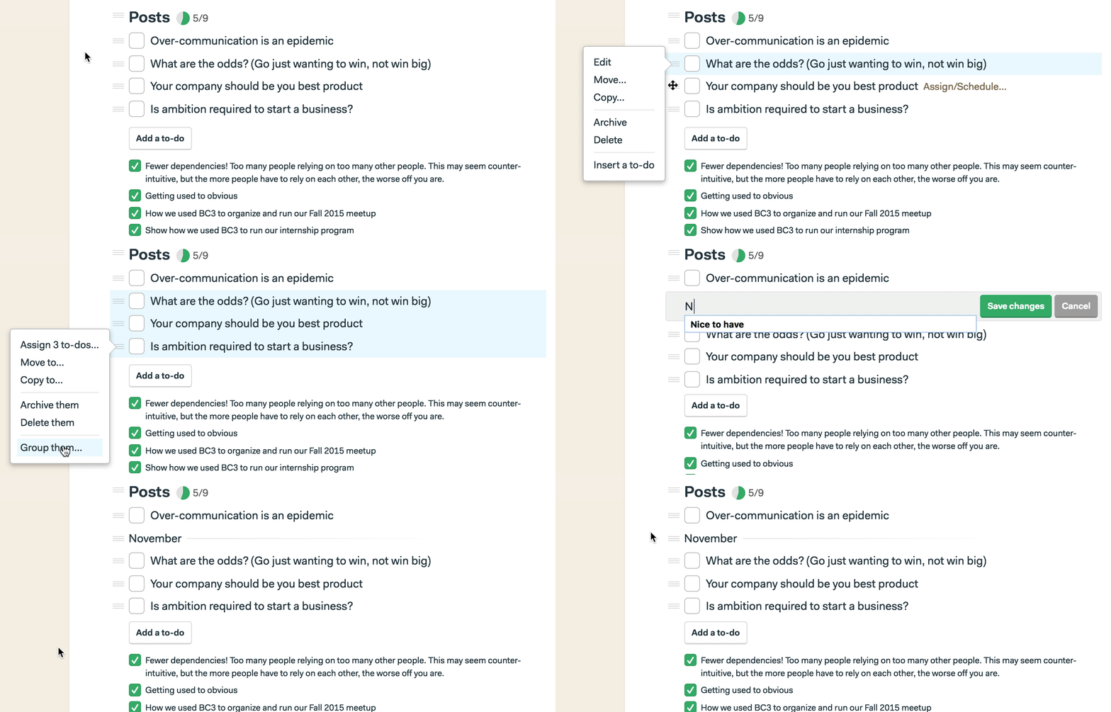
2. To group together to-dos that are already on a list, shift-select multiple to-dos (hold down shift, and click the hamburger menu to the left of each to-do you want to group), and select the “Group them” item in the menu.

Group some existing to-dos together

Adding to-dos to a group

There are a couple ways to add to-dos to a group.

  1. Simply drag an existing to-do down below a group header. It’ll snap into place and be part of that group for now on (or until you drag it back out).
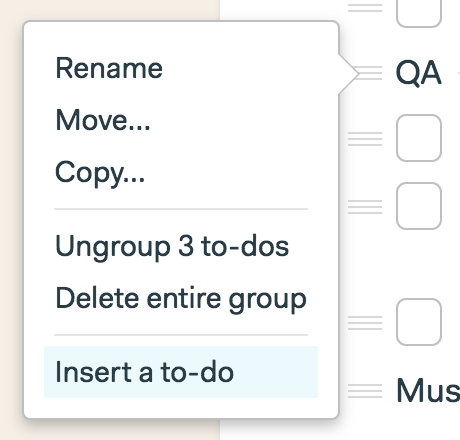
  2. Or click the hamburger menu next to the group name, and select “Insert a to-do” from the menu.

Insert a new to-do right below a group header

Moving all to-dos a group together

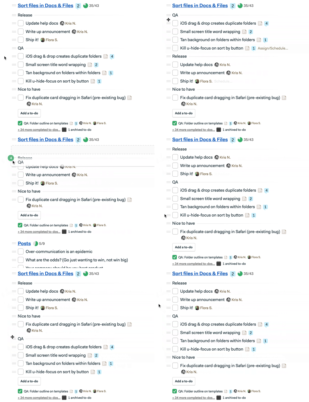
To move a group of to-dos together, just click+hold the drag handle/menu to the left of the group header. Then drag above or below any other group. To make it easier to move, the header will collapse to a single line and the number of to-dos you’re moving will show up as a little badge to remind you you’re moving multiple to-dos at once. Like this:


Isolating a group for review or discussion

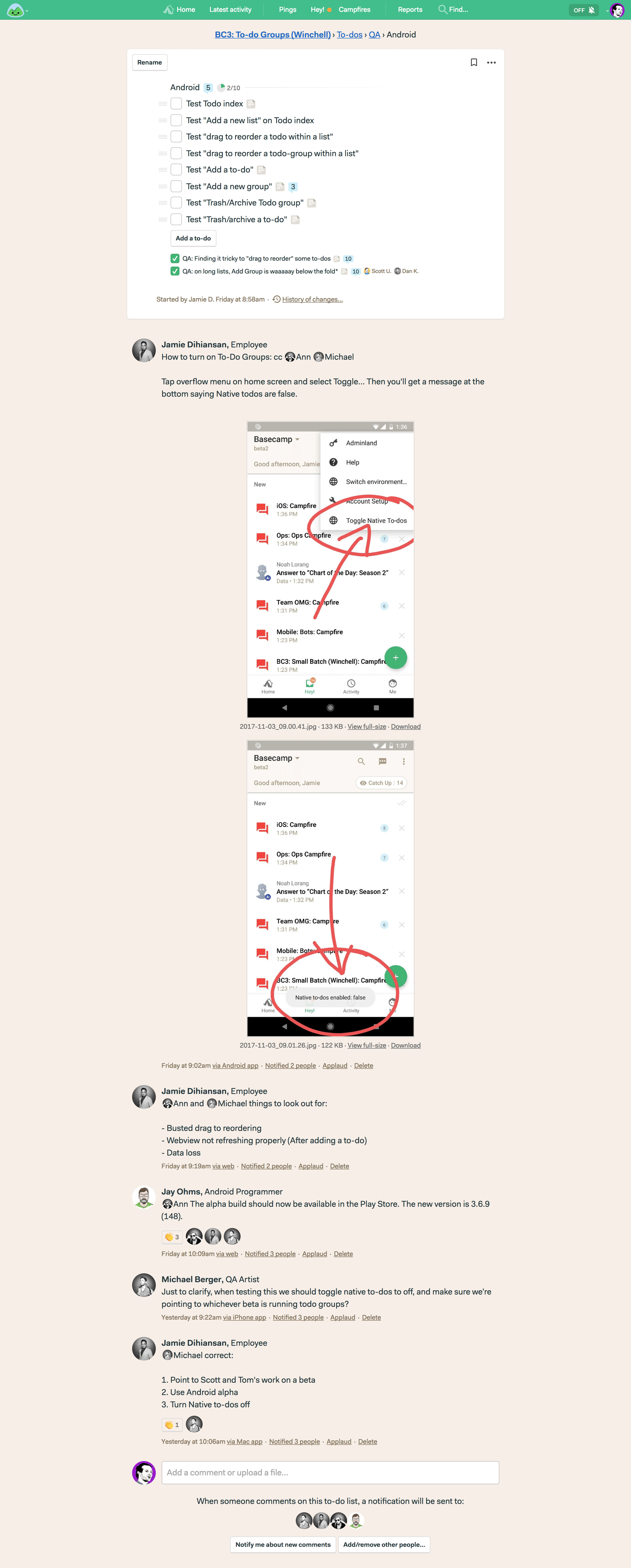
One of the great bits about groups is that clicking on the group header will take to a separate page which isolates just that group of to-dos. Now you can focus in, have a discussion about the entire group, add to-dos to that group, and see all the completed items for that group.


On the left we have a full list with a few different groups. On the right, I’ve clicked on the “Android” group header and now I just have open/completed to-dos from that group, plus a conversation about the group below.

Ungrouping to-dos

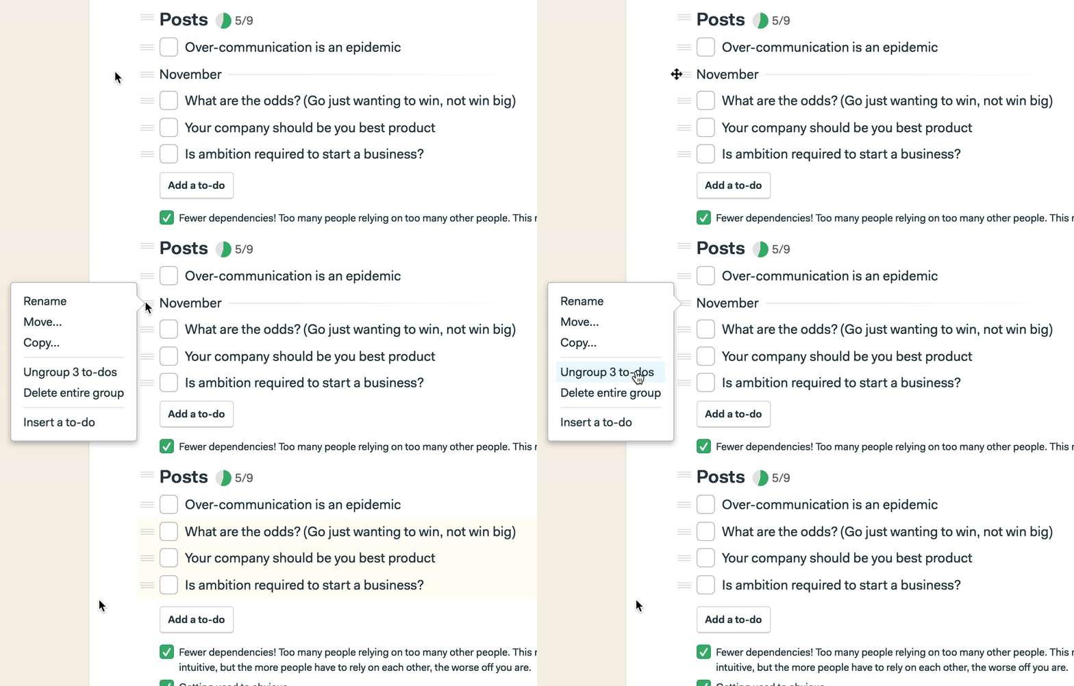
Make a group, but decide you’d rather have them “loose” again? Easy, just select the menu next to the group name, and select “Ungroup”. The group header slides out, fades away, and the to-dos jump up to the top of the list where any other loose, ungrouped to-dos are listed.

Ungroup to-dos that were grouped together

Use cases

To-do Groups are excellent for organizing work around disciplines (to build this feature designers need to do this, programmers need to do that, and when QA finds something fishy they can log things, too). Or for moving work through phases. You can drag to-dos between phases, set up work in advance, and even keep future phases empty until it’s time to slot work in.


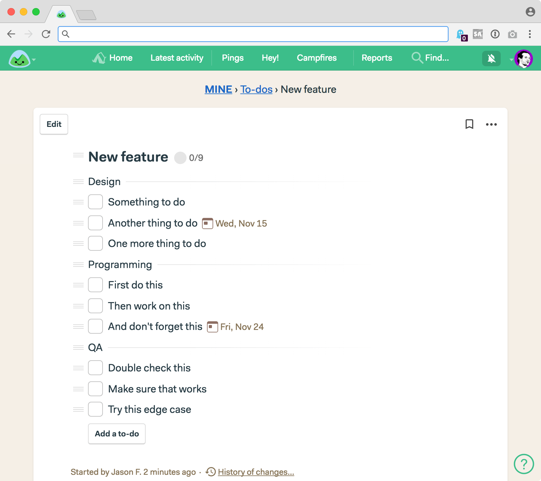
A couple of simplified examples of how groups bring structure to to-do lists

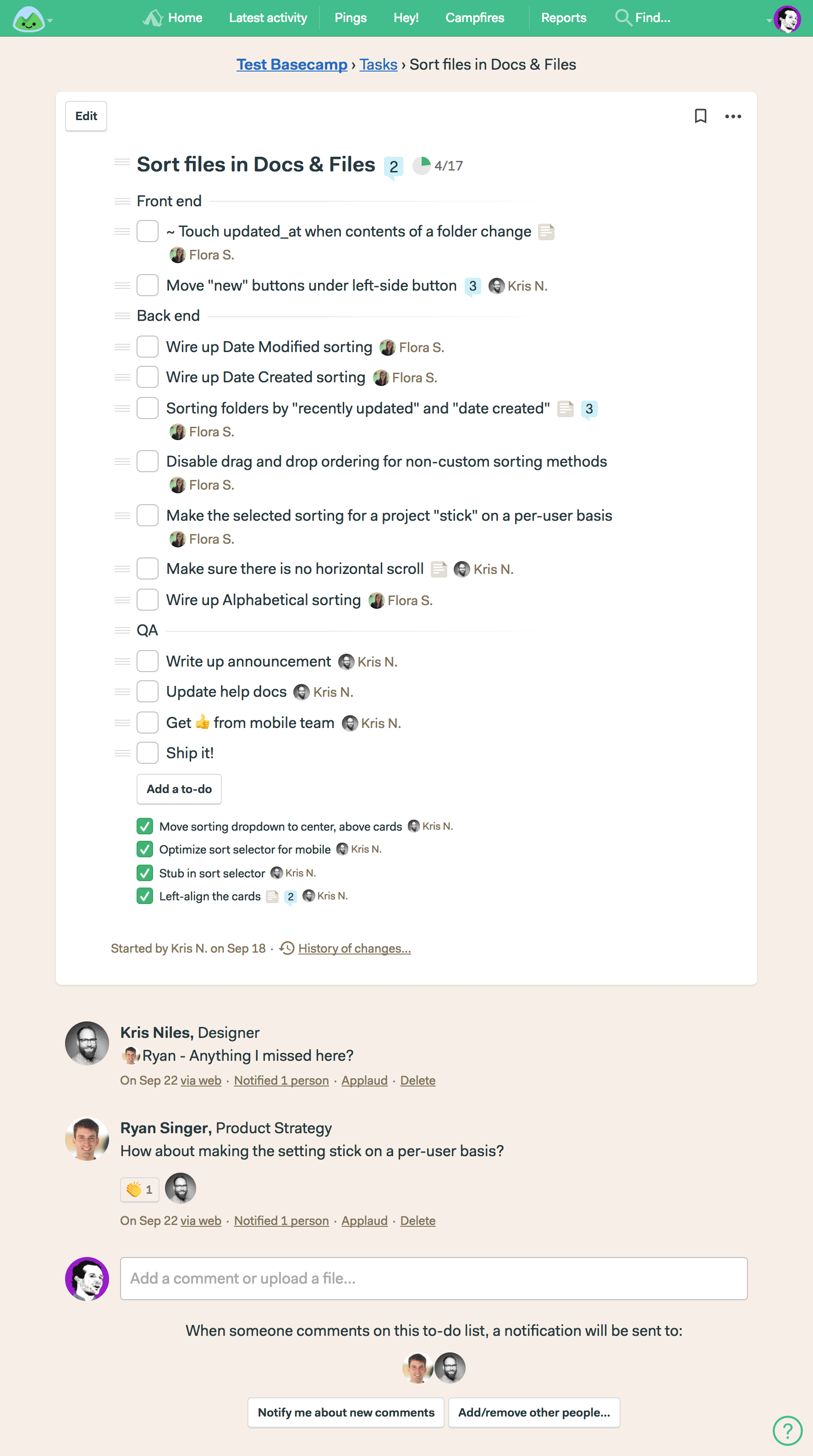
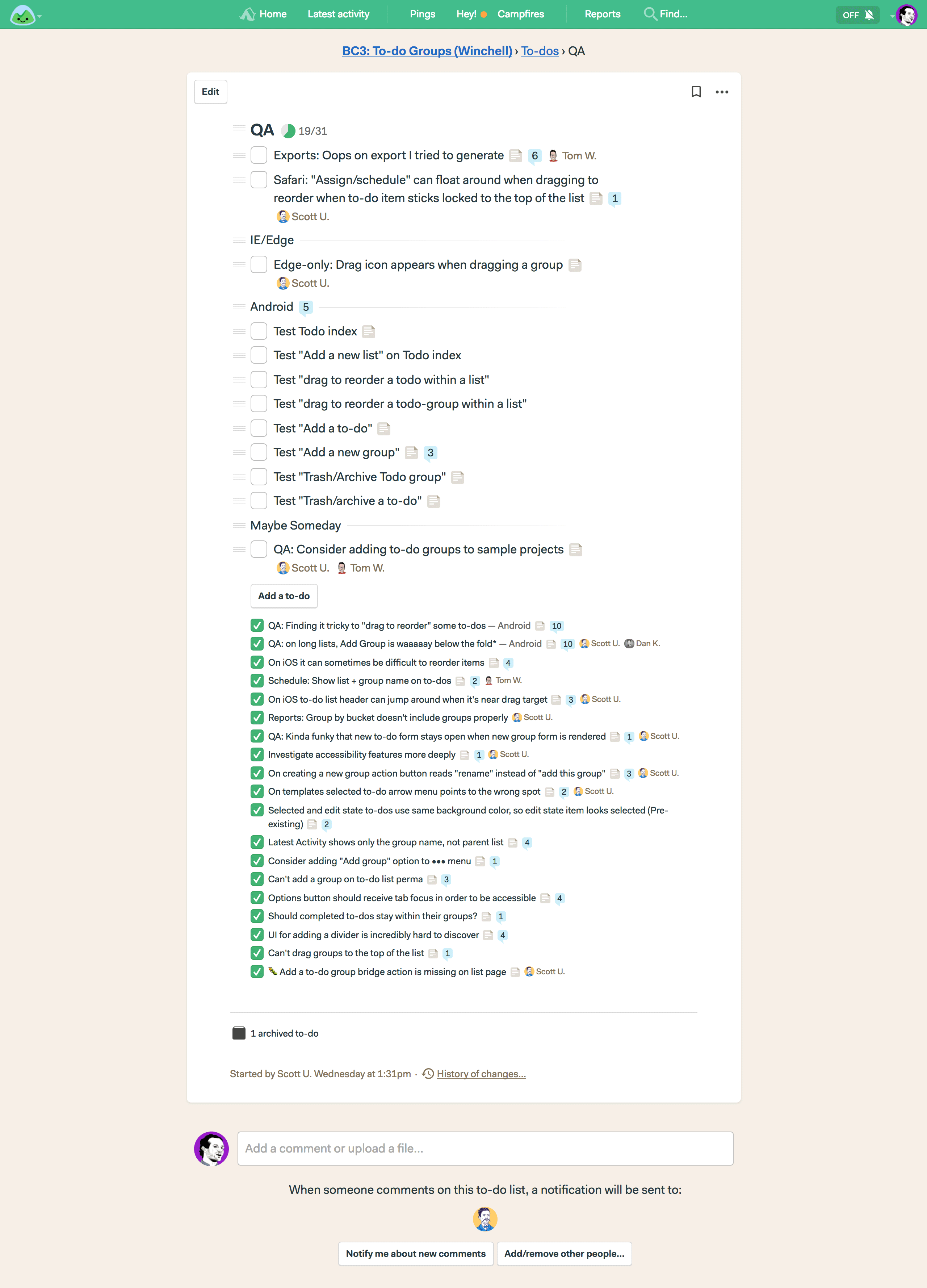
And here’s an example from an actual project we have running right now:


BONUS: Add to-dos from anywhere in a list

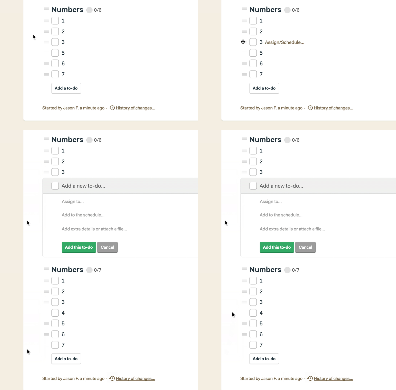
Even if you have no need for groups, we just made Basecamp 3’s to-do lists better for everyone. Before you could only add to-dos from the bottom of the list using the “Add a to-do button”.

Before today, the “Add a to-do button” was the only way to add to-dos to Basecamp lists.

If you wanted to add a to-do at the top of a list, or somewhere in the middle, you had to first add from the bottom and then drag the to-do into place.

No longer!

Now you can add to-dos anywhere in a list. Just click the hamburger menu next to any existing to-do, any existing group header, or the list title itself, and you’ll see an “Insert a to-do” menu item. Select that and you’ll be able to add a to-do right in place.


The big idea

We set out to incorporate and improve on hacked patterns we saw in the wild. We did that. We set out to make to-do lists more powerful without making them more complicated. We did that. We set out to keep to-do lists the same for those who didn’t want to use groups. We did that. We set out to prevent over-organization and sub-sub-sub-lists. We did that. We set out improve baseline to-do list interactions (like adding anywhere). We did that.

In addition to these new features being available on the web-based version of Basecamp 3, they’re also available on the desktop versions for Mac and Windows, and on iOS (iPhone and iPad) and Android.

We’re really proud of this new release, and we hope you find it especially useful. Goodbye === HACKS ===, hello GROUPS!


All growing businesses run into the same fundamental problems. Hair on fire, buried under email, overwhelmed by chat, too many tools, stuff slips through the cracks, information spread everywhere. End all that with Basecamp 3. After switching to Basecamp 3, 89% of business owners report having a better handle on their business, and 84% report more self-sufficient teams. Get it all together in one place with a single system: Basecamp 3. Try it free today.