CONSISTENCY
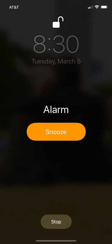
When looking at a single screen, the button shape and centering is consistent. Further, a primary button is called out using size, color, and placement – in line with interface guidelines.
CONFUSION
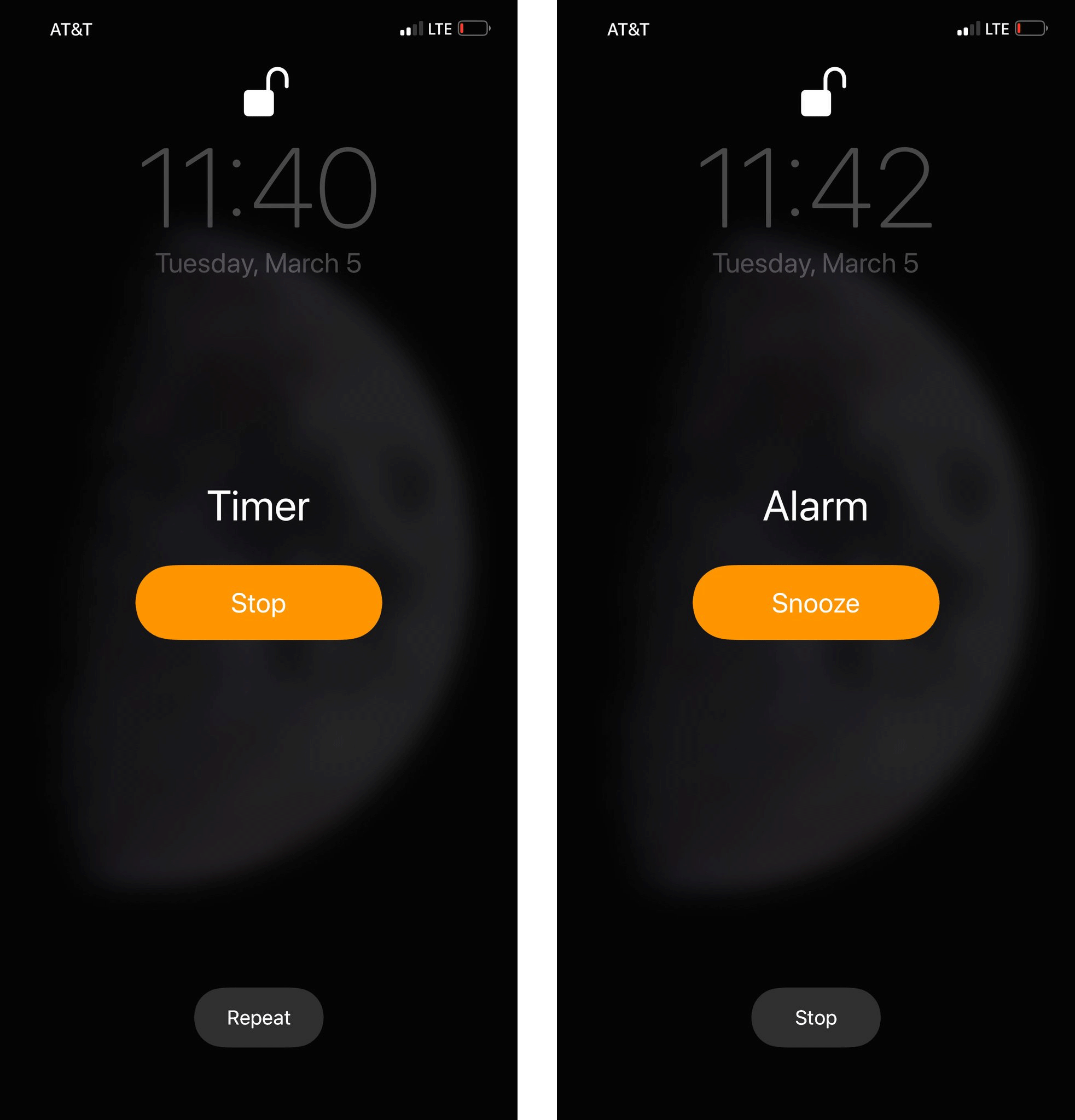
Stop up top on the Timer, stop down at the bottom on the Alarm. The Timer and Alarm designs look so similar that visual/muscle memory can lead you to tap the wrong button. Confusing!
CONTEXT
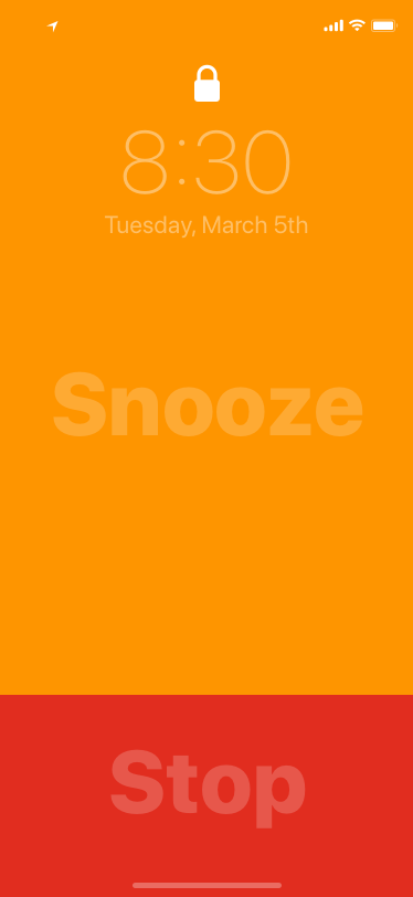
Ah, this is what you really want. A design steeped in context. It’s an alarm clock, and you often want to snooze one of those – especially early in the morning when you’re randomly smacking at things, hoping to hit the right thing. So make Snooze huge – no more hunting for that small button in a field of black. And make stop larger too. You could use this with your eyes closed as long as you know the shape of the phone, and which side is up/down. (Note: this is a conceptual design by Alex Cornell)
As an aside, one thing that has always bothered me is how big snooze is compared to everything else. I’m not a snoozer, I’d love something that allows me a big stop area and a small snooze one.
I often accidentally hit snooze when I mean to stop. Then that’s more work.
I get it, if you’re tired enough to snooze, you don’t want to hunt for something small, but perhaps our large snooze is a bigger sign of the culture at large…
Yeah, I’m not a snoozer either, but I wouldn’t be surprised to find that most alarms are intentionally snoozed before they’re stopped. What would be cool is if snooze starts out large like that, but every time you snooze it, snooze gets smaller and stop gets larger. Keep snoozing and it gets harder and harder to snooze!
There is an option to turn off Snooze in the iPhone Clock app.
Good thoughts, but counterpoints: The center button is the “most likely” action for each. So users in aggregate are more likely to stop a timer and snooze an alarm vs. the secondary action at the bottom. So while it creates inconsistency in the stop button placement (which I can empathize how that would frustrate you), it does create consistency in the screen coordinates where users are most likely to tap to respond.
Second, the challenge with edge-to-edge buttons is that you might accidentally trigger an action easily by touching the edges, such as picking up a face-down phone in the middle of the night or placing your thumb on screen to flip it. Could the buttons be larger though? Probably.
Dynamic button sizes that change size based on context (as you described in your comment) are an intriguing idea. Definitely in “nudge” behavior territory there.
Side note, that’s what I love about UX discussions like this. There are no rights or wrongs, but a spectrum based on user preferences, accessibility and needs. To think through those experiences with posts like this are always fun! Look forward to reading more.
I like this direction for sure, but I feel it could go further and add some iconography as well to both labels to help you make that quick decision in the morning. That and improve the contrast.
These changes would also help people with poor near-sight that don’t sleep with contacts and glasses and probably need more help smashing alarm buttons that others.
I agree with Nelson about the “most likely” action.
The Alarm and Timer apps have different purposes. One would set a timer to be notified in N minutes of an action that cannot/shouldn’t wait. When the timer sounds, one would stop what they were doing and see to the other task. The timer in this case becomes unimportant and stopping it should happen as quickly as possible, without even thinking, hence the use of the “most likely” action to stop it.
On the other hand, the alarm is used to (most often) wake you up. In this case, the “most likely” action becomes counterproductive and would work against your best interests. If you had to get up on time to catch a flight, for example, you wouldn’t want technology to make it easy for you to go back to sleep.
The Alarm app makes it easy for you to delay it, i.e. snooze button, but makes it harder for you to stop it. By not making the “stop” button the “most likely” action, it forces you to think, rather than rely on muscle memory to stop it.
I think the point of consistency has been missed. Consistency relates to design aesthetic, not action. So these two examples are in fact consistent, not confusing. A primary action has been afforded the same visual weight, size and position.
What is different, not inconsistent, is the users primary goal. Yet this is as expected as the use case is also different as one is an alarm, the other a timer.
I think the user should have an option to set what’s primary/secondary to them when it comes to ‘Snooze/Stop’.
I am a snoozer – Primary is ‘Snooze’ and Secondary is ‘Stop’
I am not a snoozer Primary is ‘Stop’ and Secondary is ‘Snooze’
There is an option to turn ‘Snooze’ off per alarm but I guess there is nothing that lets user decide across the board or to customize primary/secondary button options.
This alarm/timer experience is endlessly frustrating. I use my Google home in the kitchen to time the oven. When I ask, “how much time is left on my timer” I’m often told “you don’t have a timer set” and then I roll my eyes (she doesn’t mind) and say “when will my alarm go off?” And I finally get the answer. The timer and alarm functions are interchangeable and should be treated as such. Also — I like the simplicity and clarity of Alex’s concept. That said, not too sure I’d go for bright, saturated colors on a screen I’ll be looking at when bleary-eyed and mostly-asleep.
this is a super interesting solution but it has my aoda brain firing looking for contrast between the text in the foreground vs the background as well as enough of a difference between the orange/red for users.
love reading these posts – keep them coming!
What with edge to edge displays a UI like this forces you to touch your phone carefully since one button or the other will be activated if you touch the screen.
I have to look at my screen, meaning I have to pick it up. Which way is your phone turned on the nightstand? Is the part of the screen near you the Stop button?
Additionally, I find that a muted-color screen with small buttons is easier on the eyes when adjusting from darkness. The sample screen would be like opening my eyes and looking into the sun.