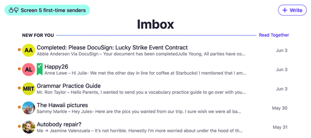
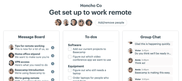
When evaluating a redesign, your first instinct is to compare the new design to the old design. But don’t do that.
The first step is to understand what you’re evaluating. If you just put the new design up against the old design, and compare the two, the old design will strongly influence your evaluation of the new design.
This is OK if nothing’s changed since the original design was launched. But it’s likely a lot has changed since then — especially if many months or years have passed.
Maybe there are new insights, maybe there’s new data, maybe there’s a new goal, maybe there’s a new hunch, or maybe there’s a whole new strategy at play. Maybe “make it readable” was important 3 years ago, while “help people see things they couldn’t see before” is more important today. Or maybe it’s both now.
But if the old design sets the tone about what’s important, then you may be losing out on an opportunity to make a significant leap forward. A design should never set the tone — ideas should set the tone. Ideas are independent of the design.
So, when evaluating a redesign you have to know what you’re looking for, not just what you’re looking at. How the new design compares to the old may be the least important thing to consider.
It’s a subtle thing, but it can make all the difference.
Speaking of reconsidering and redesigning, we just redesigned Basecamp from the ground up. Check out what’s new in the all-new Basecamp 3.

