How to ask for reviews without feeling icky about it
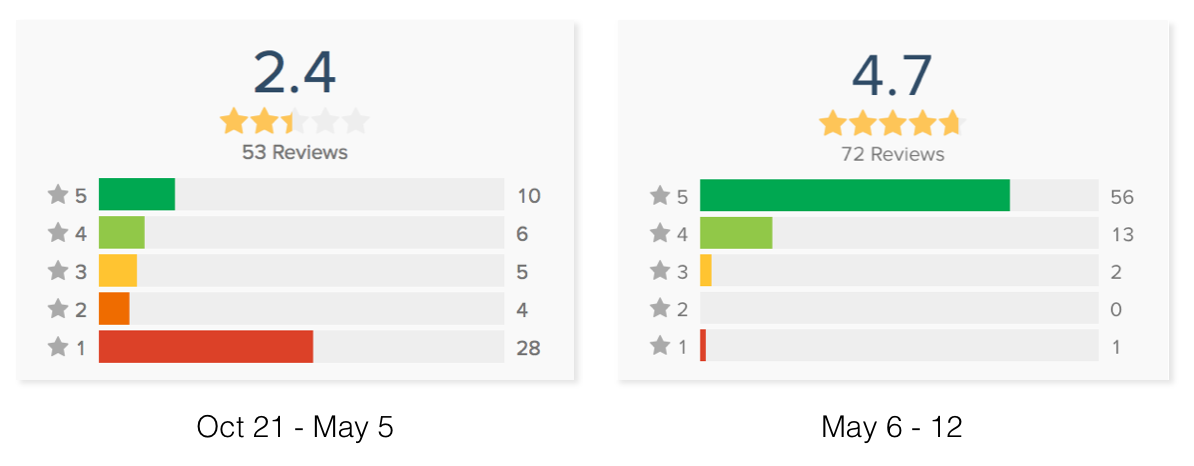
How did we go from six months of reviews on the left, to one week of reviews on the right?
Frankly, the App Store ratings for Basecamp 3 after six months were embarassing. There were too few ratings for an app with this much usage and the average was really bad. Most of our low ratings were because we did a poor job communicating that this version of the app was only for the newly launched Basecamp 3. That was definitely our fault and we deserved the scorn. (The existing Basecamp 2 app will continue to work for those valued customers until the end of the internet.)
The sign-in complaints were legitimate but we were pretty sure this was not an accurate survey of our customers’ overall enthusiasm for the app. We get positive feedback from the customers that we communicate with directly. Our internal metrics showed that usage was strong and always growing.
Basecamp’s usual approach is to make the best product possible and problems like this will work themselves out. The quality of the product speaks for itself. And we’re adamantly opposed to gaming the system.
We had to come up with a different tactic. This is a well-liked product that we’re proud of and its front page to the world didn’t reflect that.
The iOS team had chatted in Campfire about the low App Store ratings. But we didn’t come to any plan of action and, as happens with chat, it scrolled away and was forgotten. The discussion got started again when Jason Fried posted on the Message board for the iOS Basecamp.
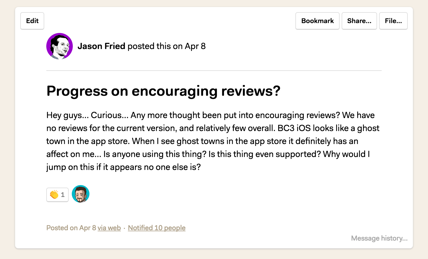
Oh boy. There were some strong opinions on the team about how gross it made us feel to nag users and beg for ratings. There were also more moderate voices saying that only persnickety developers and designers care about this. There was a good argument that older versions of the Basecamp iOS app had asked for reviews and it was effective, with no evidence that it bothered customers.
I was in Camp Persnickety. My job is to fight for the best experience for our customers. Getting in their way is not a good experience.
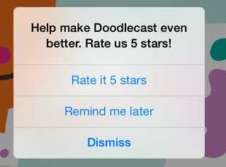
But Jason was right. The App Store listing suggested that the app was unloved and unkept. And it was upsetting to us. No one likes to have their work shit on.
After some pouting, I got over myself and took a step back from the problem. Maybe others have done a terrible job of asking for reviews, but does that means ours has to suck? Is there a way we can give you a fair trade? Sure, we’ll ask you to review the app and that benefits us. But can we do so in a way that also adds value for you?
🤔
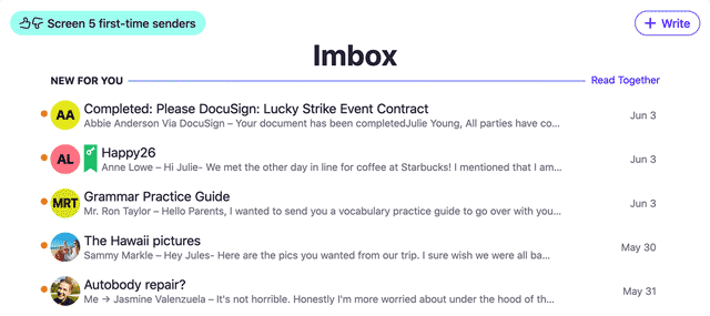
I remembered that we’d chatted in Campfire about wanting to highlight new features as they are released. We’re adding a lot of cool stuff but customers may not realize it. After all, the goal of Basecamp is not to “increase engagement”. We want to help you get your work done in less time. You shouldn’t have to go spelunking through our interface to find efficiencies. But the reality was that adding a screen to highlight new features was a low priority item that was unlikely to get our attention for some time.
Why not put these together? We’ll tell you about the new features we’ve added that make your life better. And, only at that time, do we ask if you would write a review in the App Store. We’re not interrupting you unnecessarily and we’ll make sure the screen is easy to dismiss with only two choices — “Review” and “No thanks”.
There are so many wins with this design.
- It’s a fair trade. We give a little something and ask for a little something.
- We ask only when we have new features to brag about. It’s less arbitrary and interruptive than asking after a certain number of app launches.
- It catches the customer at a good time because we just gave them something new.
- We get more opportunities to ask for ratings without being bothersome.
- We don’t feel icky.
As he always does, Jason Zimdars took the idea and transformed it into a design that was way better than what I had in my head.
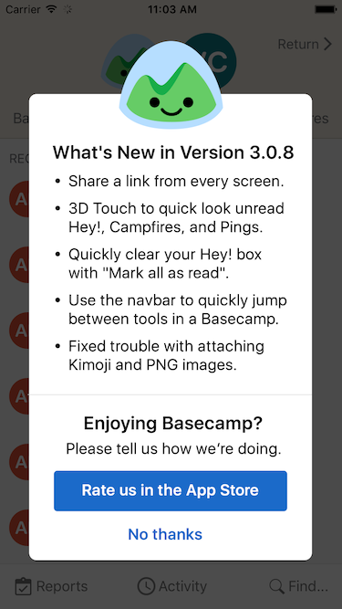
Basecamp 3 had been in the App Store for about six months before we released this version on May 6. In the first weekend we got more reviews than in the app’s entire history. And the ratings were much higher because we were asking the customers who liked the app; it wasn’t only people who were venting out of frustration.
That’s a huge success and we did it without compromising our values at Basecamp. And not only have we improved our look in the App Store, but the reviews are something we share with each other and make us feel proud.
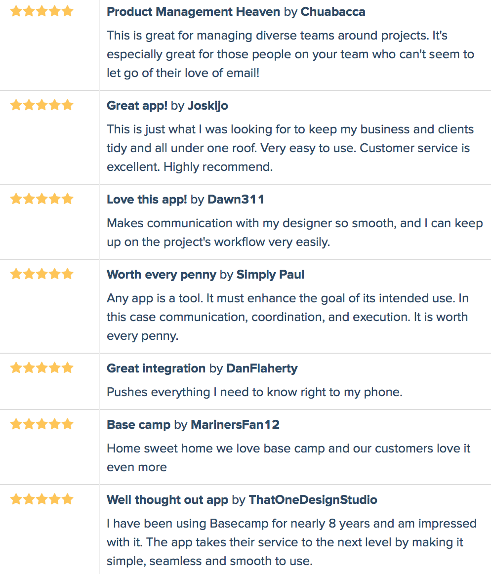
(Thank you to AppAnnie for the historical review data used in this article)
Part II of this article has been posted. It gives an inside peek at how we collaborated at Basecamp to identify and build the What’s New screen.
Do you like the Basecamp 3 app? Tell the world. Having a problem? Email support. You will get an individual response from a Basecamp employee that really cares.
Basecamp 3 works where you do on iOS, Android, Mac, and Windows — anywhere you’ve got a web browser and an internet connection. Your first Basecamp is completely free so try it today, it takes just a minute to sign-up.
