Web developers: here’s an alternative way to build UI features that rely on scroll position without actually observing scroll events. Using the Intersection Observer API we can know when an element enters or leaves the viewport and respond in a way that’s much more performant.
It’s a very, very, bad idea to attach handlers to the window scroll event.
— John Resig, Learning from Twitter
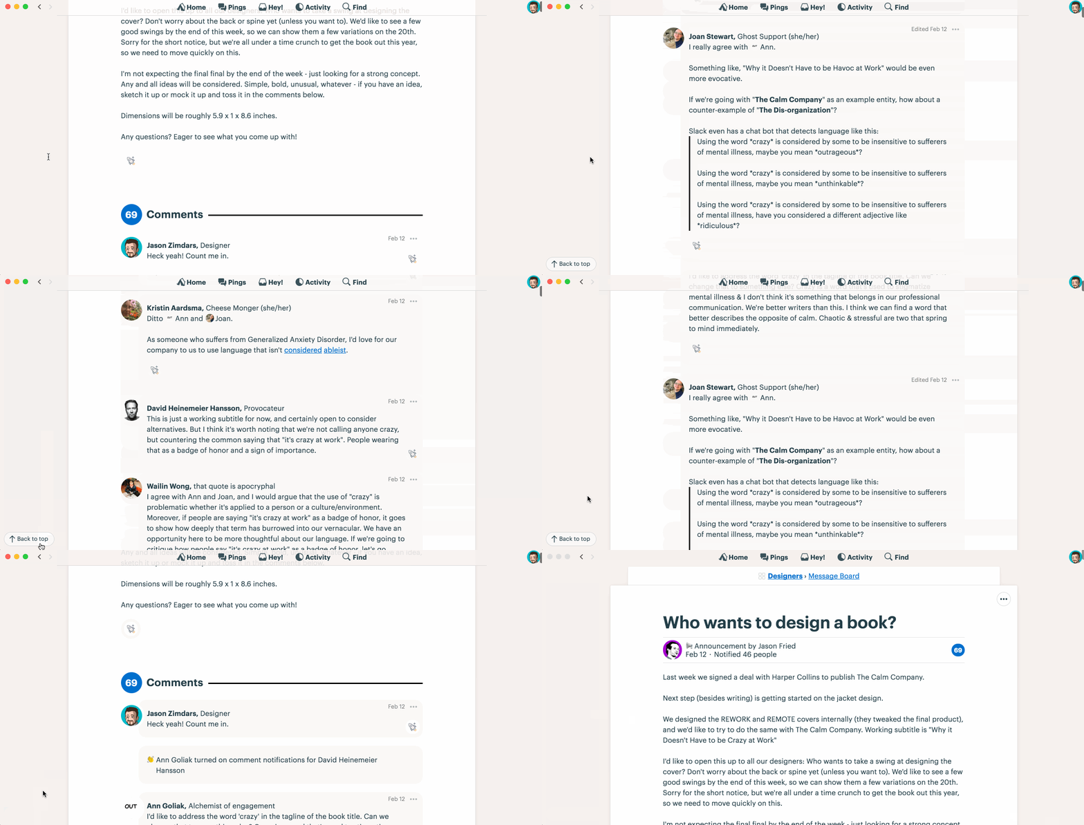
You probably don’t have to be reminded of this but there are few other options when you want an element to behave like the back-to-top button we recently added to Basecamp. Here’s how it looks:

The design dictated that the button wouldn’t always be visible but rather just when you most need it. That meant only on pages that require scrolling at all and only after you’ve scrolled a good amount — at least a couple of screens.
Enter Intersection Observer
The Intersection Observer API provides a way to asynchronously observe changes in the intersection of a target element with an ancestor element or with a top-level document’s viewport.
Perfect! Since we only want to know when the user has scrolled a couple of screens we just need an element in the DOM that’s the right height to observe. When that element leaves the viewport we’ll reveal the button.
Here’s how it works
The mark-up has two elements: the button and its container.
<div class=”back-to-top-container”>
  <button class=”back-to-top--button”>Back to top</button>
</div>
Here we position the button at the bottom of the screen and size the container element to the height of the viewport.
.back-to-top-container {
  position: absolute;
  top: 0;
  right: 0;
  height: 100vh;
  width: 1x; // MS Edge requires a nominal dimension
}

.back-to-top__button {
  position: fixed;
  bottom: 1rem;
  right: 2rem;
  opacity: 1;
  visibility: visible;
  transition: all 0.2s ease;
}
An additional class hides the button when the container is intersecting the viewport.
.back-to-top-container--intersecting .back-to-top__button {
  opacity: 0;
  visibility: hidden;
}
Note: toggling both opacity and visibility ensures the button transitions nicely to the visible state but also stays non-interactive when hidden.
Next, we toggle the CSS class when any portion of the container is in the viewport with Javascript. The intersection class is removed when the container leaves the viewport and reapplied when the user scrolls (or jumps) back up and the container re-enters the viewport.
The viewport-entrance-toggle is a general purpose Stimulus controller we can re-use the next time we need this kind of behavior.
import { Controller } from "stimulus"
export default class extends Controller {
  initialize() {
    this.intersectionObserver = new IntersectionObserver(entries => this.processIntersectionEntries(entries))
  }
  connect() {
    this.intersectionObserver.observe(this.element)
  }
  disconnect() {
    this.intersectionObserver.unobserve(this.element)
  }
// Private
  processIntersectionEntries(entries) {
    entries.forEach(entry => {
      this.element.classList.toggle(this.data.get("class"),   entry.isIntersecting)
    })
  }
}
The controller connects to the document when the element is present and disconnects when a Turbolinks page change occurs. To use the Stimulus controller we simply include the controller’s identifier in data attributes on our container element like this:
<div class="back-to-top-container back-to-top-container--intersecting" data-controller="viewport-entrance-toggle" data-viewport-entrance-toggle-class="back-to-top-container--intersecting">
  ...
</div>
Because the container is the same height as the viewport, you’ve got to scroll exactly two screen-heights before it fully leaves the viewport. We could have made it any height but this feels about right and ensures that the button always shows up at the right time even if, for example, you’re using a huge display. Even better, the same page might have a back-to-top button on your laptop but not on your 27″ iMac without any special-case code logic. Pretty elegant!
You can try a working demo and play with the code on Codepen.
Before you go…
Intersection Observer is well supported in Chrome, Firefox, and MS Edge. As of writing you’ll need a polyfill to support Safari and MS Internet Explorer. The Codepen demo above already includes an IntersectionObserverpolyfill as well as one to enablescroll-behaviorbecause window.scrollTo({top: 0,behavior: ‘smooth’})currently only smoothes in Chrome and Firefox.
That said, support is on the way which makes the polyfill only a temporaray inconvenience. This technique is a great alternative approach to consider when implementing all kinds of position-based features from collapsing navigation to lazy-loading. Good luck!
We at Basecamp believe in the web. If you’re a builder and haven’t tried Basecamp lately, if you’re tired of the presence prison, if group chat is making you sweat, if work is just crazy all the time… maybe you should take Basecamp 3 for a spin. Join the 100,000+ companies who rely on Basecamp to run their business. Why? It helps them get more done in less time without all the chaos and confusion. Start a free 30-day trial today.


The .back-top-top-container stops you from interacting with anything underneath it, which is everything in the first screenful. This is not immediately apparent on the demo, as there is no content.
Yes, but that’s only because I wanted it to be visible for demonstration purposes. If you refer to the CSS earlier in the article, you’ll see that it is only 1px wide and uncolored. That’s how it is in the production code, too.
Interesting use case for sure.
From a basics standpoint, where does the button live in the document flow?
And if I’m a tab links kind of person, or keyboard user, does the button focus after getting to the bottom of the Dom tree?
It’s the last element in BODY so yes 🙂
Awesome, Jason! I was able to follow your example and start using IntersectionObserver in production. Thanks!
Sweet!
Thanks for the article. Should update the code example classes to match.
Ooooo — I like this a lot. I sent it around the office too, and looks like I’m not alone! So, thanks for sharing!
Can this be replicated in Vue.js
Gorgeous solution! Thank you! 🙂