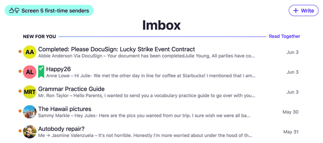
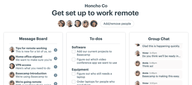
Your app store listing is a great marketing and support channel. Here’s how we approached the app page design for the Basecamp 3 Android app.
On app videos
I knew we had to have a video for our listing, but I wasn’t sure what type of video it would be. Would it be a demo of the app? Would it be a series of screenshots? If it was a demo, how long would someone even watch it?
To make matters more complicated, whatever video we’d upload would get outdated quickly. Since launch, the Android app has been updated nearly every week. We didn’t have the time or resources to keep making a new demo video.
Luckily we have a talented filmmaker named Shaun on staff at Basecamp. Shaun and I came up with an idea that would showcase the high level features of the Android app, but also be fun to watch. We wouldn’t have to keep updating the screens in the video as the app changed too.
On app descriptions
When we first put up our page, the description for the app was minimally formatted. Google just gives you a big text box to write all about your app. One day I was browsing Google Play and saw a listing for an app called Japanese Kanji Study.

I noticed the app made use of special characters in the description. I wasn’t sure how that was accomplished, so I did a Google search to find out. That brought me to this post on Stack Overflow.
Turns out that you can do a lot with the Google Play description. Strange that it isn’t really documented, but there it was. You can make things bold and italic. You can even add UTF-8 characters (★) like the Japanese Kanji Study app did.
I did an overhaul of our app description so that it talked about the high level stuff Basecamp 3 could do. I didn’t go too wild with formatting, but adding bold headers helped to highlight the tools that make Basecamp 3 great.
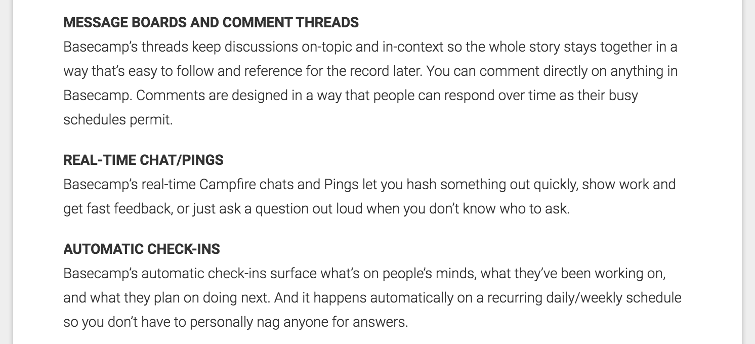
I decided to have the text description talk about Basecamp 3 the platform rather than specifically this Android app. That’s because we talk about the app specifically in the screenshots.
On app screenshots
A lot of people/companies do this with their app screenshots. I know it isn’t new territory. But I thought that by having the app description focus on Basecamp 3 the bigger thing I could focus on specifically Basecamp 3 for Android in the screenshots.
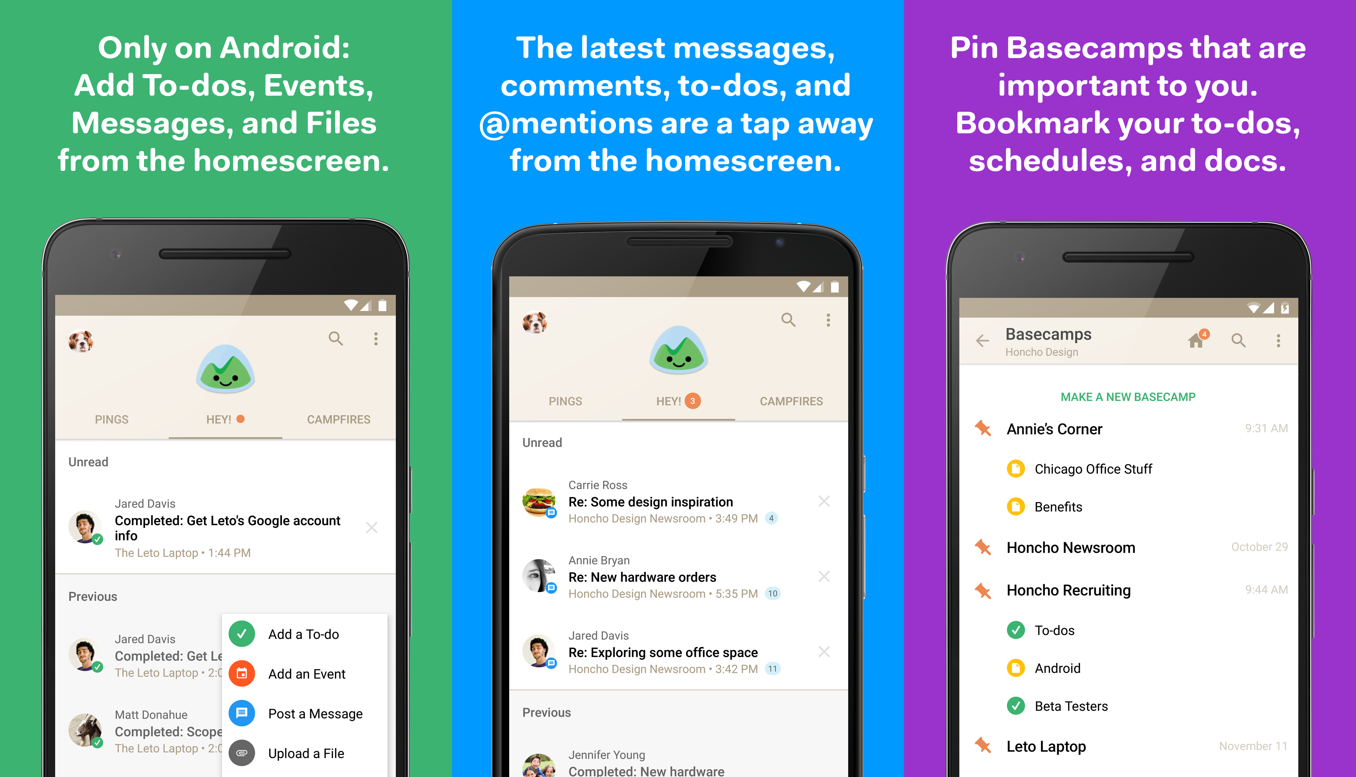
I also wanted to show a bit of variety in the devices. Shown here are a Nexus 6P, Nexus 6, and a Nexus 6P. I know it isn’t a huge variety, but I didn’t want all the phones to be exactly the same shape.
On app release notes
Dan Kim, programmer on the Android team, really likes emoji. Maybe too much in fact. During on of his emoji fits he discovered that you can have emoji in our “What’s New” release notes.
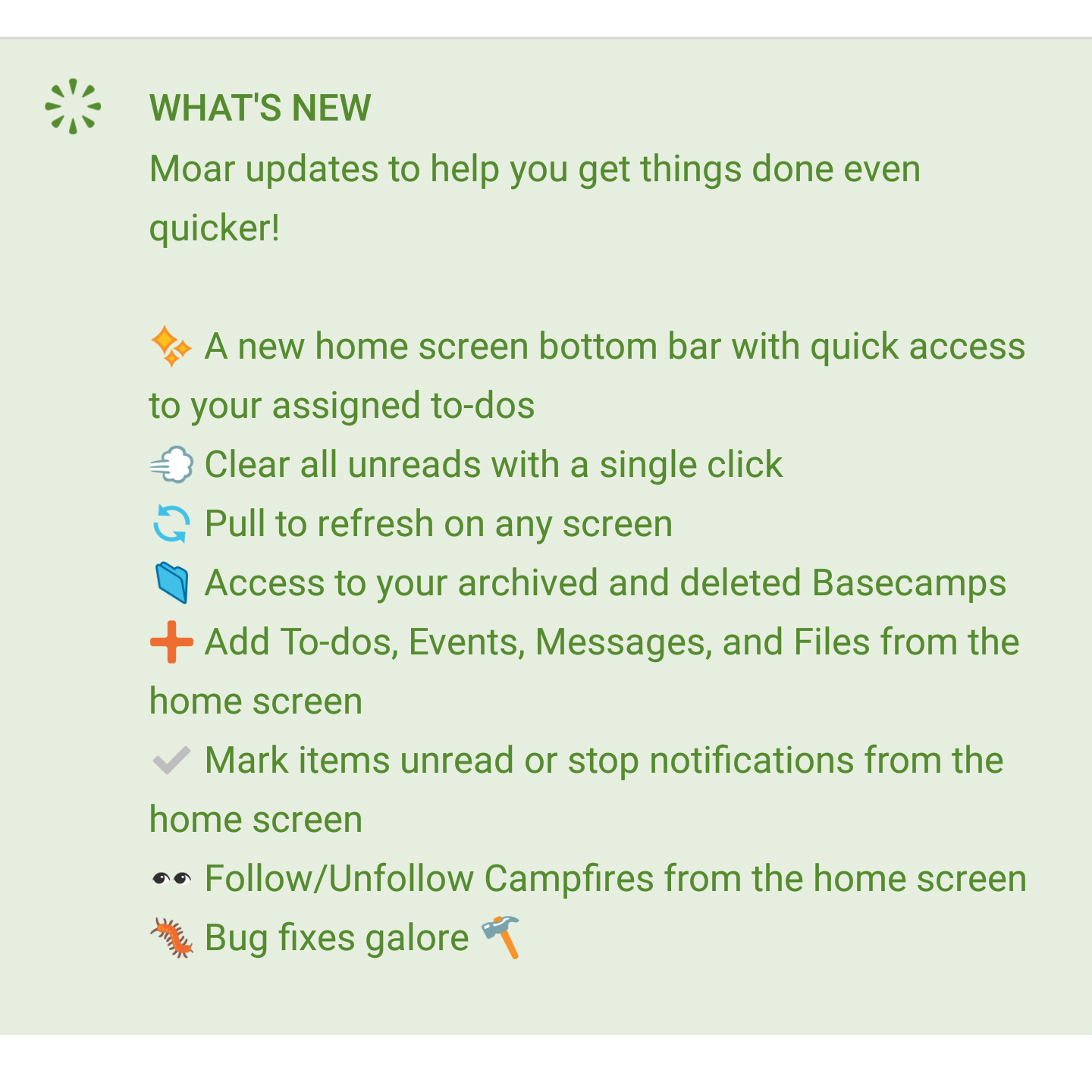
Adding emoji instead of bullets here allows us to summarize the item with an image. It also helps us to consider exactly what we should write.
On app reviews
I like to read and respond to every review. This is what makes Google Play stand out from the other app stores out there. Our customers might be having problems with the app, or they might not like some parts of the app.
Sometimes it’s hard to read a harsh review. But it helps to close the loop and respond to the customer. If they’re having problems with the app, I’ll ask them to contact support so we can help them in more detail.
You can read our reviews and my responses on our Google Play listing.
Have questions about the Basecamp 3 Android app? Let our awesome support team know by sending us an email.
Basecamp 3 works where you do on Android, iOS, Mac, and Windows — anywhere you’ve got a web browser and an internet connection. Your first Basecamp is completely free so try it today, it takes just a minute to sign-up.
