In 2017 we made web accessibility a priority at Basecamp. It was long overdue.
Over the past year, I made it a personal mission to make Basecamp 3 more accessible for people with disabilities that affect how they use the web. It’s something we’d been meaning to focus on at Basecamp for a while. But as with many unfamiliar and seemingly immense tasks it was just too easy to put off! Which is exactly what we did, for years.
In the end, it took the mix of a personal search for meaning, the reward of learning something new, and a bit too much downtime to finally make some progress.
Excuses had been easy to find. “Why spend time improving something that only a seemingly small subset of our customers would benefit from?” After all, we’ve always found it important to say no to feature requests that could bloat the product or be useful to only a slice of our customers.
Making Basecamp accessible was different, though I didn’t realize it at first. Back in early 2017, I was about to hit my eight year anniversary with Basecamp and the itch for a new challenge was real. I needed to find something I could learn and grow around, and at that, a project which possessed some inherent meaning. Not to discount the value of the quality assurance (QA) work that I’d been doing at Basecamp for the last five or so years — I know these efforts have a real impact on a tool that lots of people use to run their projects. But there’s just enough of a separation between me and them to dilute the potential energy of that truth. I needed to find something with more resonance.
I had recently experienced firsthand the compromising effects of losing one’s eyesight, and learned about some of the assistive technologies available to help. My grandmother, an avid reader throughout her life, was suffering from macular degeneration. It became impossible for her to pick up a book or newspaper as she’d done for so many years. But with the aid of a digital talking book player provided by the National Library Service and an enlarger acquired through The Chicago Lighthouse, she was able to retain her independence and connection to the outside world.
Our QA process at Basecamp could be described as a “black box” or exploratory affair. QA doesn’t generally participate until a feature has been built-out to the point where it can be used like a customer would. Only then do I storm in with my fellow QA’er Ann Goliak to hammer on what the development team has been cooking up. We search for bugs and evaluate the new feature from the perspective of a customer. Our fresh eyes can often spot things the deeply embedded development team cannot.
Then, since we work on a schedule of six-week development cycles, the feature ships, a new cycle begins, and our bug-hunting frenzy is often followed by a whole lot of downtime for team QA. It was during one such lull back in early 2017 that I finally gave in, flipped on VoiceOver (Apple’s screen reader built into macOS) and started pressing tab on my keyboard to navigate though Basecamp. And then I cringed listening to the confusing way each item on the page was being described by the screen reader 😬
As I found things that didn’t seem right during that initial run through I started making to-dos in our “Basecamp 3: Bugs” project in Basecamp, like we do for all bug reports. But back then I didn’t actually know how a given element, like a simple button, was best described to someone using a screen reader, nor which keyboard interactions were expected to go along with it. I quickly realized that if I couldn’t clearly communicate to my colleagues what specifically needed to be tweaked, the likelihood anyone would pick up these bug reports was slim. No one likes being assigned a research project!
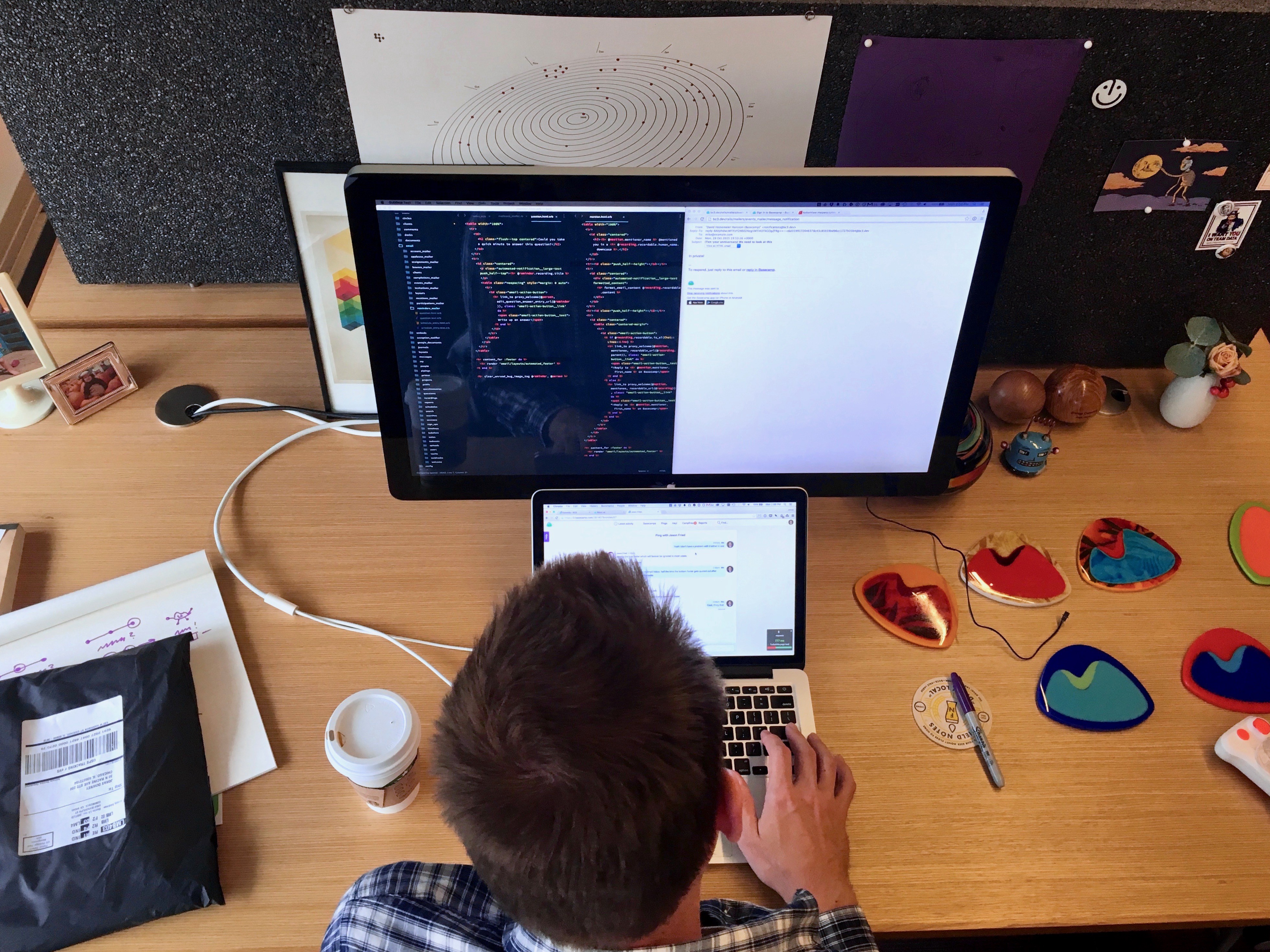
So I took on the necessary research to understand what the Web Content Accessibility Guidelines (WCAG) defined as the proper and expected way that any given thing on a web page should look and behave in order to be accessible. I opened up my code editor, made some tweaks, and tested locally to see if I was on the right track. I was actually implementing these fixes! And they actually worked! I had dabbled in a couple of Rails and other programming courses over the years, though never with much traction. Now I finally understood the satisfaction that comes from writing software code – and I was hooked.
Incorporating feedback about web accessibility into our existing QA process is in large part why we we’ve been able to build traction. During new feature development, we treat accessibility concerns just like any other type of bug. Over time, these bits of technique help to inform our designers and developers how to build with a focus on accessibility from the start.
Several years back during an all company meet-up one of our designers, Jason Zimdars, played a recording that a customer had made to demonstrate using Basecamp with a screen reader. It was both enlightening and incredibly embarrassing that this aspect of product quality had completely escaped us. A few years later, one of our interns Nathan Petts conducted a general screen reader evaluation, once again highlighting many areas where we were coming up short. Both would spark the conversation about accessibility improvements, but each time the result quickly became a huge pile of problems with no clear place to start. We would make a few tweaks, then shelve the topic for another couple of years.
In contrast, over the past year all new features we’ve shipped have been designed and tested to be accessible!
I’ve started making screen reader walkthroughs to show my colleagues the accessibility issues with our existing features and elements. I share these demos as pitches, like this one for accessible autocomplete elements.
We still have a ways to go before Basecamp 3 can be declared fully accessible. But I can say with certainty that everyone at the company agrees how important it is that we make time for these improvements.
I have gratitude for being with a company like Basecamp that values the space and autonomy for ongoing learning and growth. This made it possible for me to jump from customer support to QA back in 2011, and now it’s created the circumstances for this new undertaking in web accessibility.
In future posts, I’ll share some of the specific tweaks we’ve made to make Basecamp 3 more accessible, and the techniques we used to get there.
If you have specific questions, or want to hear about something related that I didn’t cover, add a comment and I’ll be happy to share more details down there or in a future post. Thanks for reading!

