I want to talk about one of the most basic tasks a data analyst will be asked to do on a regular basis: present some data over a period of time.
Let’s look at a chart of monthly sales from Noah’s Imaginary Widget Company. I see charts like this on a regular basis:
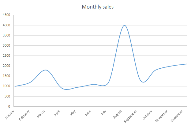
A basic line chart, right? Nothing fancy or special about it, just a couple clicks in Excel.
Not so simple: this innocent little chart is actually lying to you in a couple of significant ways.
First, you can’t actually tell where the monthly sales values fall —they fall at even points along the width of the chart, but it’s very difficult for you to mentally place the points there. Let’s fix that:

A little better — I can see actual data points now. This chart is still lying to us though. Let’s zoom in on September and October to see why:
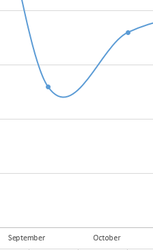
The chart makes it look like sales dipped below their September number and then increased to October. This isn’t actually true, or at least we can’t tell from the data we have — we only have monthly numbers, so we can’t possibly have enough information to say that’s what happened in between those two points.
When you use the “smoothed” lines functionality in Excel, Highcharts, D3 or any other visualization tool, you’re asking the tool to lie for you. It’ll happily fit an equation to make things look smooth, but that’s not representing the data. I wish tools didn’t make it so easy to invent data — I can’t think of a legitimate case where you should use an auto smoothing function like this.
Let’s straighten out those lines:
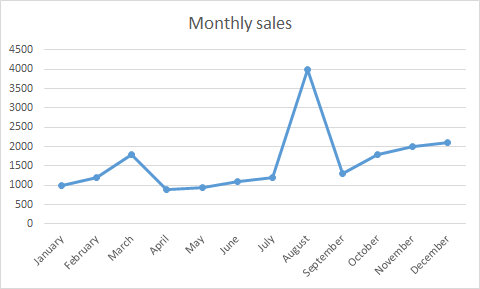
This is getting better — we no longer imply some perfect mathematical equation that doesn’t exist.
This chart still has a big problem though: by connecting the data points, we imply continuity in the underlying data that doesn’t exist. All we have is monthly data, but when you connect them together, you imply to the viewer that you know what happened in between the points.
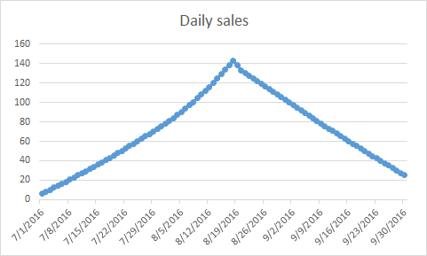
For example, zoom in on July, August, and September. At the monthly level, they look like:
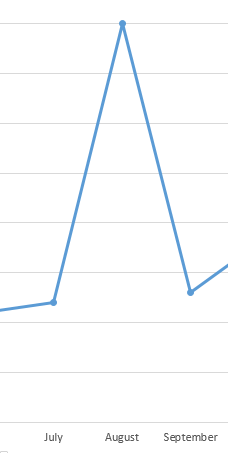
Here’s one set of daily data that could make up this monthly:
Alternately, here’s a different set of daily data that would get you the same monthly trend:
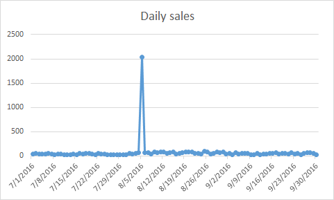
Connecting the monthly data points together sure makes it seem to the viewer more like the former than the latter, but we don’t actually have enough data to make that conclusion. It could just as easily be the latter case, but you’re unlikely to consider that possibility based on the monthly connected line chart.
The better visualization here is actually to not use a line chart at all. A bar or column chart better conveys discrete quantities like monthly sales: it’s easier to compare relative quantities visually, and it doesn’t imply continuity in the underlying data where there is none.

Much better.
But Noah, aren’t you guilty of using line charts without truly continuous underlying data?
Yep, I am. When you have high frequency data (like if you have once-per-hour data for a few weeks), even though you’re implying some continuity that doesn’t really exist, it can be much easier to comprehend when you do connect the datapoints.
For example, here’s some actual data that meets that criteria: hourly signups for Basecamp over the last two weeks. The bar chart version isn’t bad, but it’s a little hard to grok at first glance, because there’s so much visually going on at that density:
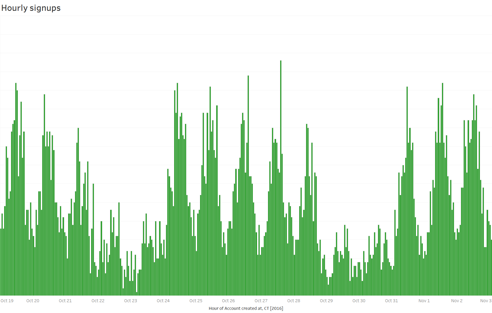
You can probably get a little better by changing the width of the bars, but he equivalent line chart is, at least to me and most people I’ve talked to, a lot easier to comprehend:
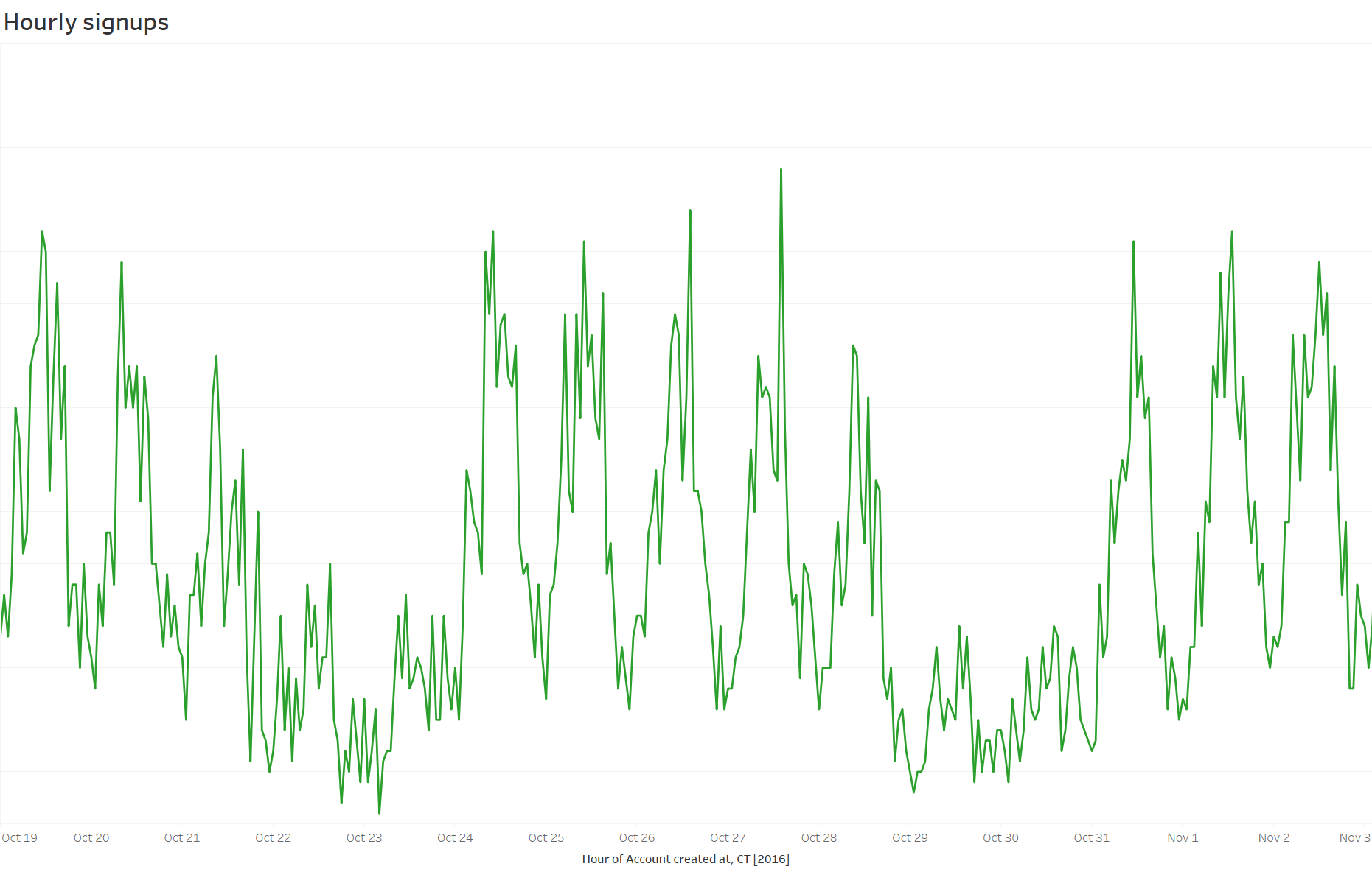
So yes, sometimes I deceive with line charts, but it’s a small lie that I can live with.
What if I really do want smoothed data?
If you want to show “smoothed” data, that’s ok, but you should explictly decide what sort of transformation you want to apply to “smooth” the data and acknowledge it. Here’s that same signup data with a five hour moving average applied:

This isn’t fancy analysis, and I don’t claim to be Edward Tufte — I put out plenty of bad visualizations myself. This might seem too basic to be worth talking about, but I see this sort of deceitful chart almost every day, both from analysts and in tons of commercial products which use smoothed line charts.
If you like charting, maybe you’d like to try out a daily chart habit — you’ll get lots of practice at making good (and some bad) charts.


One thought on “Let’s Chart: stop those lying line charts”
Comments are closed.