Don’t stare at your industry. Look in the opposite direction.
Have you noticed that Instagram has been looking more and more like Snapchat lately (of course you have)? When companies compete, they tend to borrow from each other. It’s one big, paranoid loop.
In software, people often turn to Apple for design inspiration. It makes sense — the company is wildly successful, it defines trends, and it pushes envelopes. But copying Apple doesn’t make you a trendsetter or a rule breaker. It makes you a follower. When everyone mimics Apple, everything tends to look the same. Apple’s clean and simple aesthetic is Apple’s — it’s not yours.
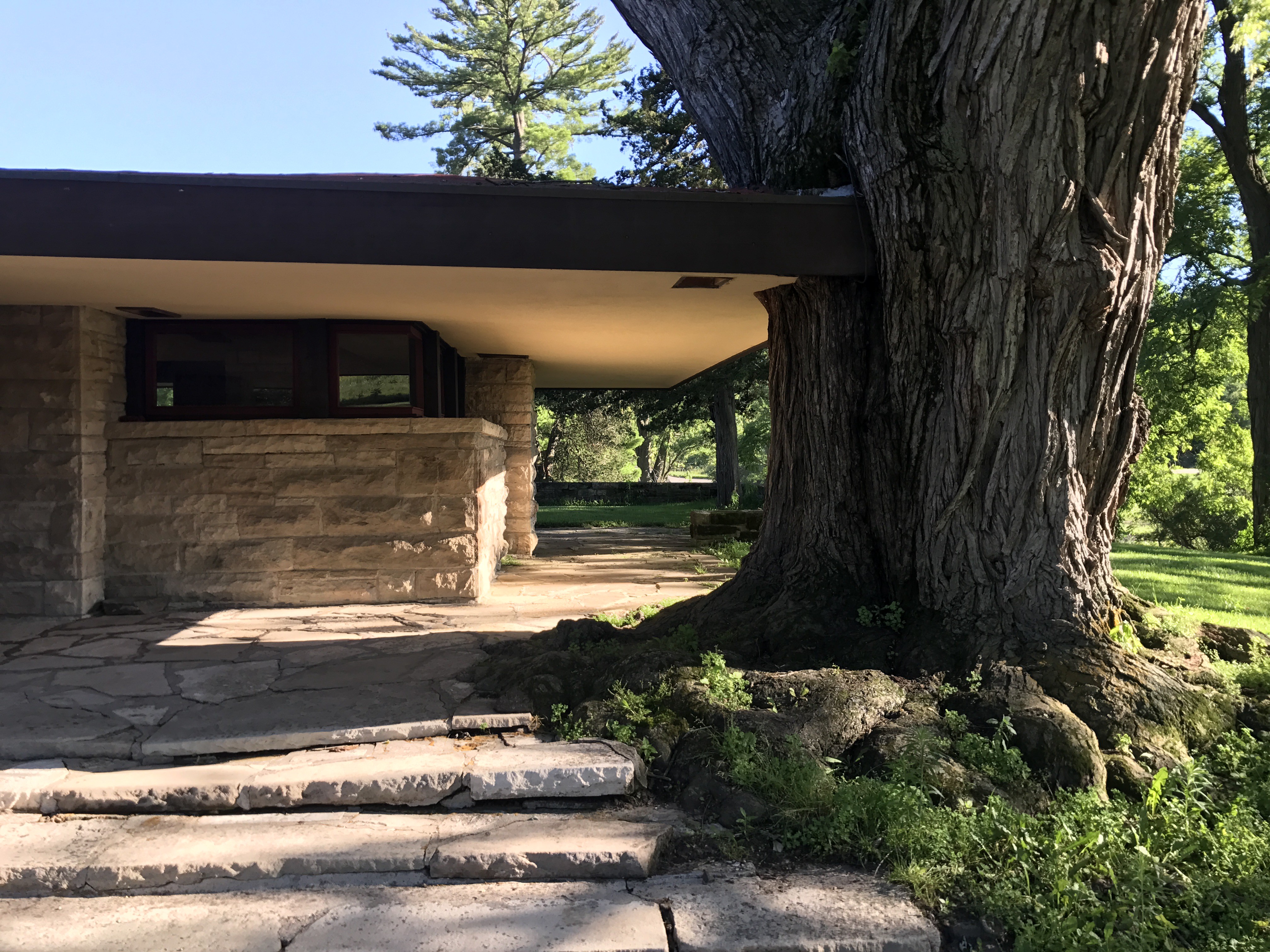
So here’s my advice: Look outward. Turn away from your industry and venture beyond the business world for inspiration. If you’re about to make software, instead of checking out the Top 10 apps in the App Store, try looking through a book on architecture.
Better yet, find a building that moves you and walk through it. Spend time understanding it. How do people flow from one part of the building to another? Is there signage? How do you know where you are in the building? How do you feel when you look at it from across the street? How does that feeling change when you walk inside? How do you feel when you leave?
All those experiences and observations relate to designing software. It’s about thinking through an experience, not drawing exact parallels. For example, bronze elevator doors tell you there’s a heft and heaviness and seriousness to the building. They make you feel secure. Contrast that with flimsy elevator doors that shake when they close, which gives you a sense of unease. How does your software make someone feel?
When I’m designing software, I try to draw from a variety of influences, including:
Nature
Want to find colors and patterns and shapes that go well together? Stop looking at catalogs of print designs or stock photos — look at trees and flowers and insects and animals. Their designs have been perfected over millions of years. They have beauty and utility figured out by now.
Watches
At their most basic, they all do the same thing — tell time with just three components: a minute hand, an hour hand, and markers on the dial. It turns out there are thousands of variations to accomplish this simple task, so don’t tell me there are only a few ways to display photos in your app.
Cars
I love looking at well-designed dashboards, instrument clusters, door handles, switches, and buttons. There’s so much to learn about what feels right and what falls flat. Sounds are telling as well — the engine, the snick of a manual shift, the click of the turn signal, the confident thud of a door that closes snug and tight. Those are all design features.
Chairs
A chair is such a basic device, but it can take thousands of forms. What does it feel like to sit in a chair that is nailed together, versus one that is glued or joined? What does a cotton-webbing seat feel like compared with wicker? Arms at different heights — or no arms at all?
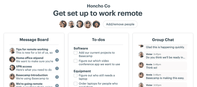
The details may be different in software, but the feelings are the same. Other companies may prefer a serious museum look, and there are plenty of products that resemble museum pieces. But if you want something that’s comfortable and welcoming, Basecamp’s going to be more your speed. It has a “come on in and get cozy,” living room feel, not a cold, modern, “don’t touch it or you’ll mess stuff up” vibe.
So figure out what objects and places inspire you and immerse yourself in them. Pay attention to those details. Then, instead of imitating competitors, you just might find your voice.
This article also appeared in the June 2017 issue of Inc. Magazine.

